Author Archives: Indigo Howard

Final Summary

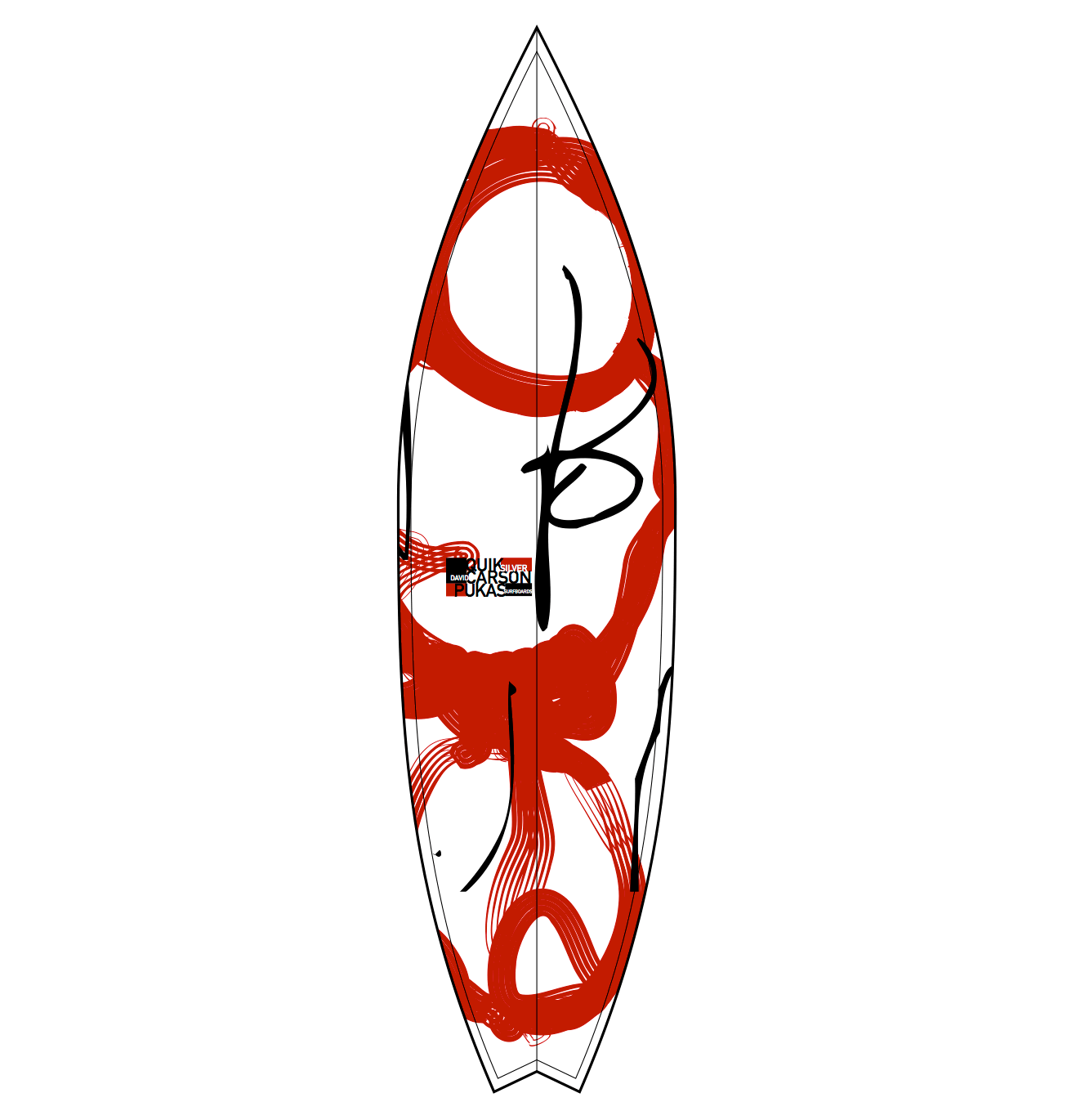
Throughout the research and communication I feel that I’ve developed my talents for analyzing an artist’s work. I believe that I look at artwork in a different way that before, such as previously I would see a piece and think about the way it was done, how they would have created it and what kind how art movement the artist would have followed, But now I have a deeper understanding of what this art represents and who did/ does effect and possibly inspire. For example the counter culture essay made me realize that the art wasn’t just about style or a fashionable trend to follow, but a symbol that fought against the way the system was running, anti war and a better way for the public to express how the people of there era felt, free, experimental and passivism.

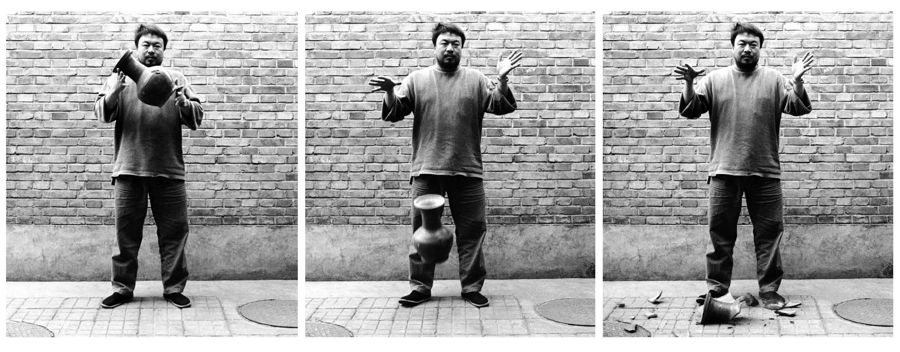
I also revisited the artist Ai Weiwei that I’ve done work on before and seen a few exhibitions that he had done, one in the RA in London and another exhibition in Greece. I love seeing his work mainly on the basis that the final result isn’t what’s spectacular, although sometimes it is, but its what each piece resembles and his thought processes behind them is what really inspires me. I wrote about his dropping of the Han dynasty pot that I actually based a project on in my art foundation where I made a replica pot from clay then, purposefully, dropped it in a crit in front of my assessors to try and relive the scene, but that attitude in his art is what really attracts my attention because he had a one million pound pot that’s two thousand years old and he smashes it for a cause that he was passionate about and a cause that needed a shocking piece of art work to show the public that it was a big issue. Although after researching him this time I realized that there is a totally other side to his art that people really dislike, and its his arrogance. I noticed that people looked at that dropping of the pot as not helping the cause he wanted to expose, but endorsing it and having no shame in destroying a historical artifact, also having a very violent approach towards it.

I feel that in conclusion the Research and development tasks have helped me creatively write and take time in researching every aspect of a topic and seeing every side to an art piece. It’s given me a better understanding on how to be a better designer in many ways but to look at thing from different perspectives. After watching ‘the happy film’ by Stefan Sagmeister in one of our early lectures I understood that to be a better that great graphic designer you have to open your mind to different experiences to really understand something and put yourself in situations that affect your standard thought processes in a way that challenges it, and personally writing isn’t my strongest asset at all in comparison to doing physical work but doing the research and development tasks has defiantly improved my ability to assess and write about artist work.

Publish or Perish

I decided to choose David Carson for my first designer, and I chose him because, like me, he follows the culture in surfing and creates a lot of branding for surfing based company’s/ magazines. The work I in particularly liked was the designs on the surfboards themselves, because as a consumer of the products and also an admirer of the art that goes onto them, I felt that this had a very eye catching design and also minimal. You can see on the board that it follows Carsons style because he’s known for a controlled/ scattered approach to his work, for example a lot of his typography based work is revolving around a few key areas then has a lot of different sizing and overlapping. You can see that process in this board where the quality and thickness of line is different and dotted around in what appears to be random but also tastefully placed.

Stefan Sagmeister is a graphic designer that took my eye and the style that he has in his art really grabbed my attention, especially the album cover he made for the rolling stones, Bridges to Babylon. It made me look twice because I saw a similar approach to another piece he did where he cut out shapes on his face then put a background behind it and I thought it worked really well, yet this one I much prefer the design he cut out and the background compliments the key feature of the album cover, the lion. “I had to come up with an idea for that new brief in time for another meeting that same day” (Heraldsun.com.au, 2017) he also showed he had a talent for creating ideas quickly and has a total understanding of his niche which I very much respect.

As I am a fan of a minimal approach to advertisement, I Thought Saul Bass’s posters for film were very clean and interesting. I personally liked the poster he made for ‘The Magnificent seven’ because of the striking red paint like strokes showing the number seven really makes you look and is easily distinguishable as that film after you’ve seen it once you’ll always recognize that it’s the film magnificent seven. It also doesn’t clutter your eyes with unneeded information just the key number that’s in the title is the only focal point and that is always easier to remember than a load of random images.

Postmodernism

The definition of Postmodernism is that it’s a movement that is filled with satire and finding a part of art that pushes the boundary’s on to modernist art movement. With the arrival of Neo-dada movement and pop art after the war for the Americans, the two art styles merged to create a breed of artists who named their art as postmodernists. Artists reacted after seeing this movement in full swing and it spilt into minimalism, conceptual art, video art, performance art and installation art all began during the next four decades after.

A good representation of satire in a postmodernist approach are the balloon animals made by Jeff Koons that personally I feel is a perfect contrast where hes used an object that is a basic balloon animal that usually would be valueless yet the material he uses is a hard strong valuable metal and he expands in to a much larger than life scale. “Since the 1980s, Koons has been a prevalent influence on contemporary artists who explore commercialism, advertising strategies, Duchampian conceptualism and pop aesthetics.” (The Art Story, 2017) Koons evidently had a very large effect on many different mediums in the art world and recently he’s joined the famous social media platform ‘Snapchat’ to create ‘virtual vandalism’ so that his sculptures can be placed using a phone anywhere in the world, which I feel could be the next level that pushes art into the virtual world even further.

Ai Weiwei I’ve followed for quite a few years and ive always thought the theory behind his works were much more beautiful and poetic than the actual physical piece. “This artwork is called dropping a Han Dynasty Urn and for me it is Ai Weiwei’s most provocative gesture. I feel highly provoked. It shows the artist letting go of an elegant object made with intelligence, imagination and love more than 2,000 years ago and letting it smash to bits on the ground.” (Jones, 2017) As this opinion shows, Weiwei’s art can be perceived very negatively if it had no description, and from what I’ve learned about the dropping of the Han dynasty piece is that its made to shock his audience to realise that the Chinese government is destroying huge areas with historical significance to rebuild brand new homes and power stations. The pot is resembling the thousands of other historical artefacts that are also being smashed without remorse.

A man that came from nothing and expresses that in his works is Robert Rauschenberg who creates his art using innovative combinations to have beautiful conclusions. His Almanac piece was the painting that caught my eye that he made in 1962, he printed images and took pictures from magazines then applied brush strokes that pointed to the abstract expressionism movement. “Like all these works, Almanac has no specific meaning or narrative. The images are organised in a loose, poetic manner, creating an impression of visual flux that allows the viewer to free-associate.” (Tate, 2017)

The Art Story. (2017). Jeff Koons Biography, Art, and Analysis of Works. [online] Available at: http://www.theartstory.org/artist-koons-jeff.htm [Accessed 6 Dec. 2017].

Jones, J. (2017). Who’s the vandal: Ai Weiwei or the man who smashed his Han urn?. [online] the Guardian. Available at: https://www.theguardian.com/artanddesign/jonathanjonesblog/2014/feb/18/ai-weiwei-han-urn-smash-miami-art [Accessed 6 Dec. 2017].

Tate. (2017). ‘Almanac’, Robert Rauschenberg, 1962 | Tate. [online] Available at: http://www.tate.org.uk/art/artworks/rauschenberg-almanac-t01135 [Accessed 6 Dec. 2017].

Counter Culture

The 60’s to 70’s was a iconic era for many things, famously it was a time for experimentation and fighting for change in the government across the western world. ‘Sex, drugs and rock and roll’ was a phrase that began during that time and all of them were known as topics that were taboo to talk about let alone endorse, which is why the movement was archetypal to the way we think in the present. For example the 60’s was the beginning of the positive progression of rights for different cultures, sexual preferences in the western society and a fast paced peace movement that expanded from one corner of the globe to the other, but most of all and an intensified explosion of colour affected our fashion, homes, lifestyle and largely art, and in nearly all forms such as films, paintings and music.

A poster that took my eye that can symbolise the change in the culture of art for me was the 1967 Jimi Hendrix Experience, although it was late 60’s when it was made I still feel that it gives the best idea of how art had developed in that time. A popular style was to have the text manipulated to help create the image in a intertwining form, this poster shows this perfectly with ‘Jimi Hendrix’ forming the iconic afro and created in a way that generates the wavy and frizz of the hair. Text I felt was a key factor of these posters and it was treated in a way, instead of just giving information, its fully incorporated into the main feature of the poster.

The second poster that caught my eye that was an important piece from that generation was the ‘Dylan’ poster mainly because of how popular it became. Its minimal silhouette highlighted the hair that was iconic to Bob Dylan and after this poster released it opened up this style of minimal art with highlighted key features that has recently come into fashion once again. Milton Glaser had apparently no contact with Dylan throughout the creation of this image yet it still is exceedingly reminiscent of bob Dylan. Glaser was a serial trendsetter through his career because he also made the ‘I love NY’ poster that exploded across the globe that also followed his minimal style.

Hollywood took to the approach to colour during the 60’s as well the best representation for me is the James Bond poster advertising casino royal. In true stereotypical Bond style they use a voluptuous woman although similar to the Hendrix poster, the text is used by the main feature and is manipulated to fit into the form of the model.

https://www.fastcodesign.com/3043692/milton-glaser-reveals-how-he-made-the-legendary-bob-dylan-even-more-legendary

https://www.artsy.net/article/artsy-editorial-iconic-artists-and-movements-of-the-1960s

Is it possible to be truly authentic?

With the way ideas are constantly evolving and technology also progressing, the opportunities given to people in this era are totally different to the people 100 years ago for example. “The advancement of the arts, from year to year, taxes our credulity and seems to presage the arrival of that period when human improvement must end.” This is a quote from Charles Holland Duell who was a commissioner in the US; he also famously said, “Everything that can be invented has been invented.” He was born in 1850 and died at the age of 69, yet 30 years later a television was created and cars rule the road and many more which in my opinion is a prime example of however many times we underestimate the development of our creativity.

I think that being authentic is to think outside of the box, it might sound cliché but for me to be truly authentic an idea has to be extraordinary but also an idea has to be strange or unfamiliar to the standard way the subject is done. A person who I believe to fit the category of being completely authentic is Gaudi, the famous architect created a space that even people today wonder how he designed. His Sagrada Familia cathedral is still being built today because of his completely original blue prints, and for me that is the epitome of authentic.

In conclusion i believe that people will always be capable of authentic ideas and creative thinking.

https://soundfaith.com/sermons/122861-tracing-the-quote:-everything-that-can-be-invented-has-been-invented

https://en.wikipedia.org/wiki/Charles_Holland_Duell

‘Technology is the mortal enemy or art’

During my time following the arts I’ve realised that ‘art’ moulds around the most influential people in art at the time or just after their time. For example, one of the most influential artist and technical genius of the past I believe was Leonardo Da Vinci, who in my opinion developed the way we look at art even now. The art in his time frame was very detailed and accurate and had a style that was used in portraiture all the way through too the late 1800’s. I’ve seen how paintings of king’s queen’s and aristocrats all have a similar style to that of Da Vinci’s Mona Lisa. So I think that technology goes hand in hand with traditional art and can add something to it that artists of the past would have dreamt of having access to.

Same goes for the contemporary style of today, which I belive was heavily influenced by art made to oppose the norm such as the Russian constructivist movement in 1913 that was created by Vladimir Tatlin. After reading the manifesto by Aleksandr Rodchenko, Varvara Stapanova, and Aleksei Gan based around Russian constructivism I saw that technology had motivated that style because the way it’s formed is a good representation of how the world was, such as the harshness and simple way the industry was and how black and white the mind set was.

In conclusion i feel that technology progresses as art does and both feed off each others success and develop as a pair.

Comparing Andrew Fairclough and Martin Fewell

Andrew Fairclough is a Graphic Designer that mainly creates Album covers and musician iconography. His style revolves around the pop art design of comic books, although like in comic books he brushes over reality and imaginary but I think he does it in a much more thought provoking way. A lot of his work has cosmic aspects to it such as stars and space being incorporated and some pieces have things fusing together as if in a Sifi film. Fairclough has done artwork for a few bands such as the pop punk band ‘Blink 182’, a more obscure band Art vs Science and a band called ‘Arkells’. The tone of voice in his artwork usually appeals to the more recent generations but it also to the generation growing up with reading graphic novels so the style speaks across a wide audience varying in age and of course the audience who enjoy the genre its self.

My comparison to this is a piece crated by Martin Fewell, a reasonably successful graphic designer who’s previously worked with Coke Cola, Ministry of sound and many other top brands. I chose the artwork he designed with DJ Shadow for his album cover and in addition, helped with his tour visuals. I thought the two albums have very different styles but follow simplistic designs, I quite liked how they both have block colours but incorporate various colours in a minimal sense, using either an airbrush effect or splashes. Both leave reality behind and create a scene that’s quite absorbing and eye catching.

the Terminal

The Terminal Bar is a 22 minute long documentary film made up of photographs taken in black and white. Sheldon Nadelman took the series of photographs and was then produced by Stefan Nadelman, Sheldon’s son. Nadelmans role at the Terminal bar was being a bartender which gave him the opportunity to document the customers that dwelled in the bar between the years of 1973 to 1981.

The Terminal bar was made in 2002 and received the lucrative award for the Best Short Film at the Sundance Film Festival in 2003. The Film is focused around observation and Nadelmans perspective through the slow change of time. Seeing the documentary filmed in that way gives the audience a far greater knowledge of how people lived and fine details that would usually  stay unnoticed.

The music that coincides with the images was clever, with the use of everyday bar sounds from that period of time. I Feel that it was there to create that extra sense of realism to the film and added a feeling of motion in the still photos and relates to the of rugged style that Nadelman was trying to convey. However it does begin to have an upbeat tone during the changing of the photos, this creates a clearer idea to view the photos.

Smooth transitions are used when introducing new images and articles, creating an easy watch for the audience. In addition to this, images are introduced at the correct time to match the spoken story lines helping to tell the narrative.