Author Archives: Lucy Moulton

Summary of what I have learnt and experienced

During this semester the research and communication skills course has educated me on how art and design has changed and progressed through time as a result of various artistic movements. Lectures by Steve Sanderson have informed me of how culture and society affect the style and approach of artists and designers from different artistic periods, from Avant Garde to Post-modernism and contemporary practices. This has helped me to think about what impacts contemporary culture and society can have on current designers as well as my own work.

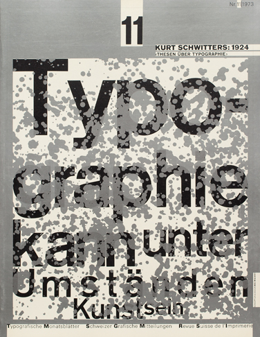
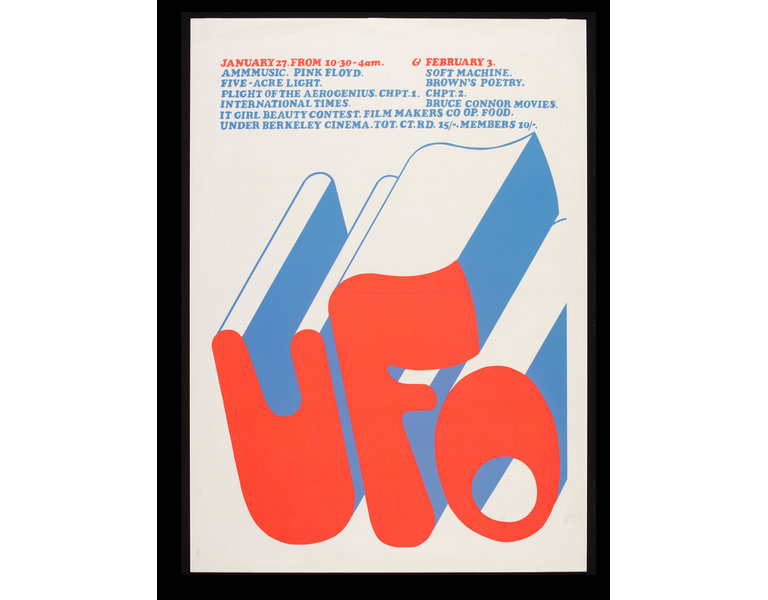
I found the lectures on modernism and postmodernism particularly interesting, seeing how design and type has changed between the two art periods is fascinating. I enjoyed learning and seeing how typography changed from the clean, ordered and Swiss style to a more complex and deconstructed style. The task I found most interesting was the most recent task about published images because I got to look at and explore the works of artists I hadn’t come across before. I love discovering new artists and designers whose work inspires me with my own practice and through last weeks task I was able to find three designers CĂ©cile + Roger, Bradbury Thompson and Barbara Dziadosz whose works are I think are visually aesthetic and beautiful graphic designs.

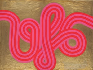
A designer from the post modern period, Rosmarie Tissi, who I came across when completing the week 6 task, has been an influential reference for me. Her playful use of letterforms is what I like most about her work and is what has inspired me to try and be more playful and creative with the way I use type and letterforms. Composition plays a key role in her work and is an element of my work that is also greatly significant. The works of designers like Rosmarie Tissi help me inform me of what is important in design and it also helps me to determine what is significant in my own work. It allows me to think carefully about what I am trying to convey and what the most successful way of conveying that might be.

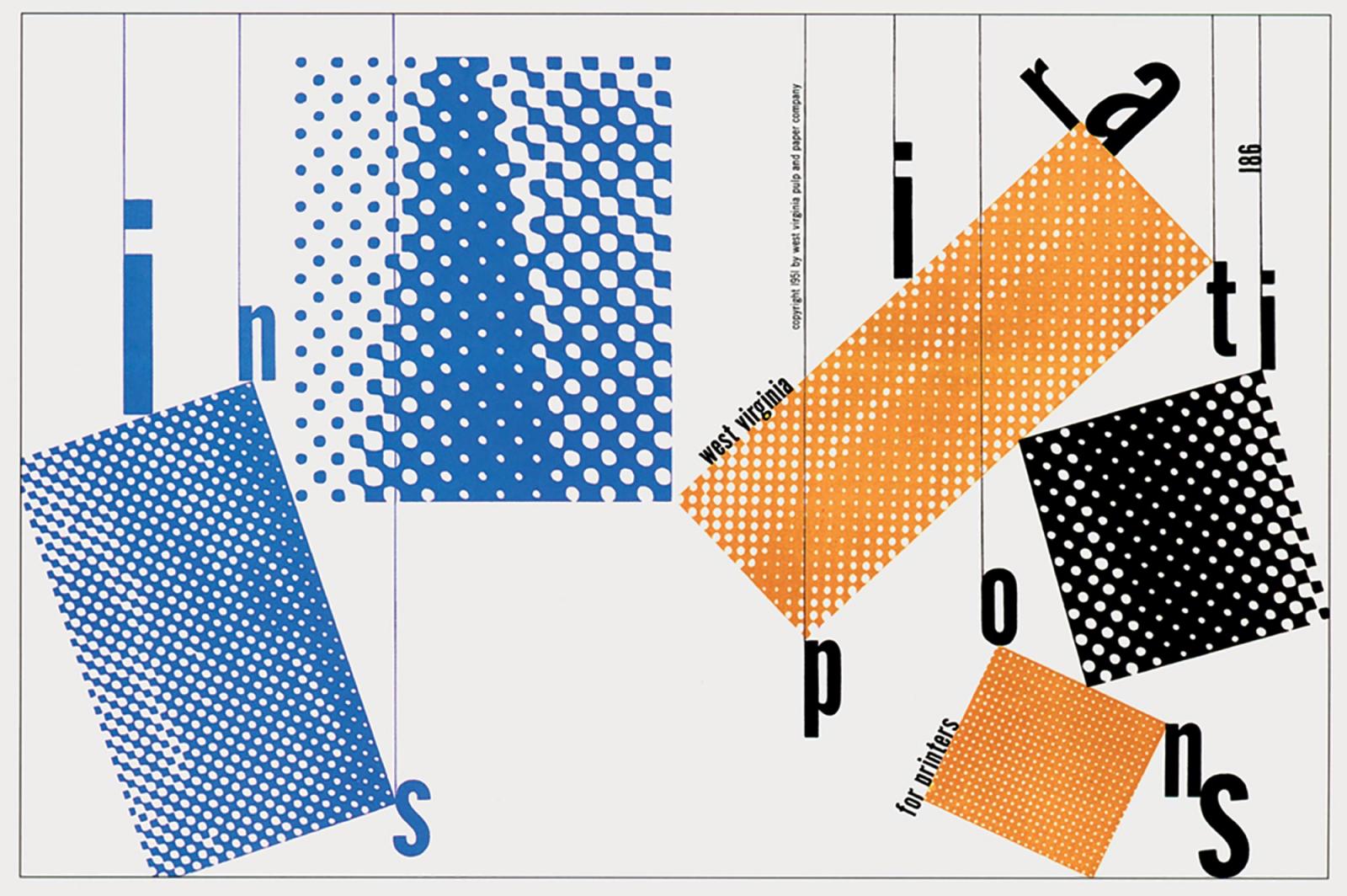
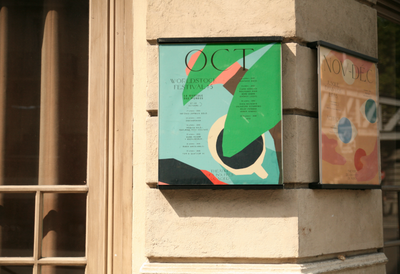
The weekly tasks have also helped me establish and confirm the pathway I want to study which is Graphic Design. I have found particularly during the more recent tasks I am drawn to images with a strong typographic influence like posters, confirming my interest to pursue Graphic Design as a specialist pathway in my degree and also a further career. Through these tasks I have also learnt that all elements of graphic arts are involved no matter what pathway you choose to take. Many of the practitioners I chose to look at combined multiple elements of graphic arts in their work, for example Bradbury Thompson combined photography with graphic design in many of his works, and I aim to also use elements from other areas of graphic arts in the work I do on the graphic design pathway and also in the work I will do as a graphic designer.


‘Publish or Perish’

Affiche Mirage Festival

(Mirage Festival 4e Edition Poster, 2016)

Cécile + Roger is a graphic design agency run by designers Cécile Nanjoud and Roger Gaillard. The two met during their study at the University of Art and Design in Geneva. My favourite pieces of their work are their posters for the Mirage Festival in Lyon, an art, innovation and digital culture festival. I particularly like their poster for 2016. Poster designs are a key interest of mine. They are pieces of work which are both informative and also pleasing to look at, through the designers use of type and colour often accompanied with a form of illustration or photography they create a design which draws the viewers attention and then provides them with the necessary information.


(Title Page of West Virginia Inspirations for Printers, 1951)


Bradbury Thompson was an American graphic designer and art director.

“When it came to the blending of photography, typography and color, nobody did it better than Bradbury Thompson (1911-1995). In his own quiet way, he expanded the boundaries of the printed page and influenced the design of a generation of art directors.”(Communication Arts, 1999)

Thompson was well known for his ability to successfully combine many different elements go graphic arts. In his Title Page of West Virginia Inspirations for Printers, 1951 he blends type, colour, pattern and shape. The ability to harmoniously combine many different elements into one piece of art is what I strive to achieve in my own work as a developing practitioner.


Silver eucalyptus 💙

(Silver Eucalyptus, 2016)

Barbara Dziadosz is a freelancing illustrator from Hamburg. Her works include a range of disciplines including printmaking, character design, illustrated recipes and also editorial work. Whether it be screen print or digital outcomes print is a key part of Dziadosz’s work. Prints are an element of illustration that interest me, the particular style of illustration and prints that most interest me are ones like Barbara Dziadosz print called Silver Eucalyptus with flat layers of colour, with very little or no tone, and linear elements.


Image 1: Mirage Festival 4e Edition Poster. (2016). [image] Available at: http://cecile-roger.com/projet/mirage16/ [Accessed 3 Dec. 2017].

Image 2: Title Page of West Virginia Inspirations for Printers. (1951). [image] Available at: http://a-g-i.org/design/westvaco-inspirations-for-printers [Accessed 3 Dec. 2017].

Image 3: Silver Eucalyptus. (2016). [image] Available at: http://basiadziadosz.tumblr.com/post/152151960749/silver-eucalyptus [Accessed 3 Dec. 2017].

Sources:

Communication Arts. (1999). Pioneer: Bradbury Thompson | Communication Arts. [online] Available at: https://www.commarts.com/features/pioneer-bradbury-thompson [Accessed 3 Dec. 2017].

Postmodernism

The postmodernism movement was a reaction against the modernism ideal.

Cover from 1973 issue 11

(TM SGM RSI 11/1973, 1973)

Wolfgang Weingart went beyond the modernist graphic and typographic style experimenting layout and type to produce complex and chaotic posters creating a style which is now associated with the postmodern movement.

“He taught a new approach to typography that influenced the development of New Wave, Deconstruction and much of graphic design in the 1990s.” (Flask, 2017)

I like the use of layers in his cover for a Swiss Typographic Monthly Magazine Typographische Monatsblätter (TM) in 1973. The textured pattern over the type creates a cut out look that reveals the layer behind the type without causing the text to be unreadable.


Rosmarie Tissi

(Direct mail folder for Anton Schöb printers, Rosmarie Tissi, 1981)

“Tissi whose career began in 1958 joined Odermatt and together they created highly controversial works dismissing the modernists stylistic approach. Their work took on a very playful manner and they relied on the subjectivity of their work by playing with letterforms and orientation.”(The New Wave Type, 2013)

This image really interested me because I loved the artists playful use of letterforms, taking the word offset and changing the composition and orientation of the letters to create an abstract composition and doesn’t appear to spell a word from first judgement. Type and letterforms play a key role in my works and therefore their composition and orientation are important like they are in Tissi’s work. Colour is another key element to my practice and I like Tussi’s use of multiple colours, carfully chosen so not to be overbearing. The use of several warm colours with a contrasting green made this particular piece of work by Rosmarie Tissi stand out to me.


Image result for April Greiman

(Your Turn, My Turn, 3-D, 1983)

I use computers and digital software a lot in the production of my work but graphic designers haven’t always used computers during their production. “April Greiman is regarded as one of the most influential designers of the digital age. She has been called a pioneer in this regard, making it acceptable for a graphic designer to explore their craft using a computer.”(Smith, 2009)


Image 1: TM SGM RSI 11/1973. (1973). [image] Available at: http://www.tm-research-archive.ch/issue/1973-11/ [Accessed 30 Nov. 2017].

Image 2: Direct mail folder for Anton Schöb printers, Rosmarie Tissi. (1981). [image] Available at: http://www.historygraphicdesign.com/the-age-of-information/postmodern-design/766-rosmarie-tissi [Accessed 29 Nov. 2017].

Image 3: Your Turn, My Turn, 3-D. (1983). [image] Available at: http://www.madeinspaceshop.net [Accessed 30 Nov. 2017].

Sources:

Flask, D. (2017). Wolfgang Weingart : Design Is History. [online] Designishistory.com. Available at: http://www.designishistory.com/1960/wolfgang-weingart/ [Accessed 29 Nov. 2017].

The New Wave Type. (2013). Type Heroes – Odermatt and Tissi. [online] Available at: https://thenewwavetype.wordpress.com/2013/08/25/type-heroes-odermatt-and-tissi/ [Accessed 30 Nov. 2017].

Smith, J. (2009). Design discussions: April Greiman on technology: idsgn (a design blog). [online] Idsgn.org. Available at: http://idsgn.org/posts/design-discussions-april-greiman-on-technology/ [Accessed 30 Nov. 2017].


Counter Culture

“A “counter culture” refers to a culture in opposition to or disregard of the mainstream culture or central aspects of the mainstream culture. It is exercised through protests against certain elements, contempt for a particular way of doing things, and, in extreme scenarios, the creation of a divergent culture from the culture in place.”(Chepkemoi, 2017)

The counter culture movement of the 1960s and 1970s was about the youth rejecting the social norms of the 1950s. The culture spread throughout the Western world in the 1960s before beginning to fade out in the mid-1970s

A poster for UFO Mk II 1967, designed by Hapshash and the Coloured Coat.

(A poster for UFO Mk II 1967, designed by Hapshash and the Coloured Coat., 1967)

The first image from counterculture that caught my eye is a poster for UFO Mk II 1967, designed by Hapshash and the Coloured Coat. I love the designers bold use of colour and line, colour is something which really draws me to artwork and is what I like to play around with in my own work. The counterculture used lots of bright and vibrant colours to which gives the artworks the spirit of the movement and make it recognisable to the movement.

“In 1970, “the hippies” were awarded the Sikkens prize, a Dutch award for groundbreaking work in the use of colour.”(Hoggard, 2016)


(Pink Floyd & Soft Machine – Original 1967 UFO Club Concert Poster, 1967)

The second image I chose is a Pink Floyd & Soft Machine  Original 1967 UFO Club Concert Poster by artist Michael English, I chose to look art this image because again the bold use of vibrant colours stood out to me but I also was drawn to the typeface used. I love soft font and love the use of shadowing especially with the contrasting green against the neon pink.


(Psychedelic poster by Michael English for UFO club, 1967)


The third image I chose to look at is a screenprint psychedelic poster by Michael English for UFO club. I like this posters use of white space to give it a stylish and minimalistic look. I like to use white space in my own works and I am drawn to works and practitioners with a minimalistic style. I also think English’s use of two bright and vibrant contrasting colours is really effective. I like have a contrasting colour in work as it helps to draw a focus to particular areas and elements.


Image 1: A poster for UFO Mk II 1967, designed by Hapshash and the Coloured Coat. (1967). [image] Available at: https://www.theguardian.com/artanddesign/2016/sep/04/revolutionary-artists-60s-counterculture-v-and-a-you-say-you-want-a-revolution [Accessed 25 Nov. 2017].

image 2: Pink Floyd & Soft Machine – Original 1967 UFO Club Concert Poster. (1967). [image] Available at: https://recordmecca.com/item-archives/pink-floyd-soft-machine-original-1967-ufo-club-concert-poster-pre-hapshash/ [Accessed 25 Nov. 2017].

Image 3: Psychedelic poster by Michael English for UFO club. (1967). [image] Available at: http://collections.vam.ac.uk/item/O129172/ufo-poster-english-michael/ [Accessed 25 Nov. 2017].

Sources:

Chepkemoi, J. (2017). What Was The Counterculture Of The 1960s and 1970s?. [online] WorldAtlas. Available at: http://www.worldatlas.com/articles/what-was-the-counterculture-of-the-1960s-and-70s.html [Accessed 25 Nov. 2017].

Hoggard, L. (2016). The revolutionary artists of the 60s’ colourful counterculture. [online] the Guardian. Available at: https://www.theguardian.com/artanddesign/2016/sep/04/revolutionary-artists-60s-counterculture-v-and-a-you-say-you-want-a-revolution [Accessed 25 Nov. 2017].

Authenticity

Authenticity by definition means the quality of being authentic, being real and genuine. “One’s authentic nature is revealed in their ability to express and share what they think or feel in a relatively unadulterated form.”(Schwartz L.C.S.W, 2012)¹

With aesthetics there are two types of authenticity which a piece of art must posses to be truly authentic. The first is nominal authenticity which is defined as “the correct identification of the origins, authorship, or provenance of an object, ensuring, as the term implies, that an object of aesthetic experience is properly named.” The second is expressive authenticity, “In this sense, authenticity is a measure of the degree to which the artist’s work is a committed, personal expression rather than derived from other work.”(En.wikipedia.org, 2017)²

In todays society we are constantly influenced and inspired by everything and anything around making it seem almost impossible to be truly authentic in the sense of expressive authenticity. We are encouraged as practitioners to look at others work as well as past artistic movements to aid and encourage the development and refinement of our own work. However the question is whether this influence makes our work an imitation of another’s work removing its authenticity or are we able to use this influence and create something new and innovative.

“The new artist does not imitate, he creates. He does not describe, he designs.” Theo van Doesberg (Croatian Review) 1931.³

This idea links to the principles of modernism; to make new, start again, fresh and move on, work created that is truly authentic holds the same principles as the modernism movement. I think this shows that the principles of modernism hold value in contemporary practice as new and innovative art will continually produced throughout time.

Sources:

Âą Schwartz L.C.S.W, M. (2012). A Shift of Mind. [online] Psychology Today. Available at: https://www.psychologytoday.com/blog/shift-mind/201208/seeking-authenticity D [Accessed 1 Nov. 2017].

² En.wikipedia.org. (2017). Authenticity in art. [online] Available at: https://en.wikipedia.org/wiki/Authenticity_in_art [Accessed 1 Nov. 2017].

³ Modernism, Designing A New World, Victoria & Albert Museum 2006


“Technology is the Mortal Enemy of Art.”

Rodchenko’s Manifesto of the Constructivist Group states “Technology is the Mortal Enemy of Art.”. However I disagree with this statement because I believe the practice of art wouldn’t be the same today without technology. Many forms of contemporary art involve a form technology in the process or the outcome.

“Throughout history, technology has provided artists with new tools for expression. Today, these two seemingly distinct disciplines are interlinked more than ever, with technology being a fundamental force in the development and evolution of art.”¹

Graphic arts are an example of how technology and art have become so connected. Photography would not be where it is without the development of DSLR cameras, motion graphics may not have advanced from zoetropes and kinetoscopes and graphic designers would not be able to experiment with ideas and designs so easily without the aid of digital softwares.

The use of digital software and programs has reduced the time artists spend on the execution of their artwork and has also allowed new artistic techniques to develop. I for one have experienced this benefit of the combination of technology and art. I use digital software like adobe Illustrator and Photoshop a lot in my practice, so technology has had a crucial impact on my style and technique, for example I like to digitalise my illustrations and I couldn’t do it so easily without the use of the adobe shape app.

¹ Gever, E. (2012). Tech & art: Engineering the future. [online] BBC News. Available at: http://www.bbc.co.uk/news/entertainment-arts-19576763 [Accessed 24 Oct. 2017].

Comparing Images

Tanning Bodil Jane, 2016

Théâtre des Bouffes du Nord 17-18, 2017


The first image I have chose to look at is an illustration by Bodil Jane a dutch Illustrator. Her work includes hand-made and digital techniques which gives her illustrations a style which I love as well as the quirky feel she is known for. This illustration is from a series of self-initiated works she did in 2016 called Botanical Scenes.

The second image I looked at is one of the new posters for Théâtre des Bouffes du Nord for the 17-18 season. The posters are by Jérémy Schneider and Violaine Orsoni who own an illustration and graphic arts studio called Violaine & Jérémy.

Théâtre des Bouffes du Nord’s poster is similar to the illustration by Bodil Jane by their use of forms in simplified shapes. They are also composed of similar elements, they both feature figurative and plant like shapes. However they differ in the realism of the shapes as the poster uses more abstract shapes than the Illustration. Their use of linear elements is contrasting while the illustration has linear outlines to its shapes the poster uses text to add a linear effect.

The two images also vary in the visual purpose, the poster aims to inform the viewer of upcoming performances while the illustration shows the viewer a story. The use of colour is also comparably with them both using soft bold colours and the colours in both pieces work well together. They also both use little or no tone and blocks of colour.

The style of both images really appeals to me, I love their use of shape creating their simplified forms and also their chosen colours and balance of colour throughout the image.

Image 1: Botanical Scenes. (2016). [image] Available at: http://www.bodiljane.com [Accessed 18 Oct. 2017].

Image 2: Théâtre des Bouffes du Nord 17-18 season. (2017). [image] Available at: https://www.commarts.com/project/25369/th-tre-des-bouffes-du-nord-identity [Accessed 18 Oct. 2017].

Terminal Bar

Stefan Nadelman’s film Terminal Bar produced in 2002 is a documentary of a New York City bar and its patrons. This pictorial history won the Grand Prize for Best Short at the 2003 Sundance Film Festival.

Stefan creates a visual narrative through the use of photographic stills taken by Shelly Nadelman, a bartender at Terminal Bar, to form the main composition of his film. The photographs are used to tell the story of the bar and its customers from 1973 to 1981. The chronological feel created the by Stefan’s display of images from past to present, gives the film a feel of a documentary as it looks at how individuals and the surroundings have changed over the 10 years.

The film is focused around observation, looking at change through time from a singular perspective, in this films case from the perspective of the camera lens of a bartender. The photographs Shelly shot during his ten years at the bar show the lives of people and the change that occurred which would otherwise go unnoticed if he hadn’t documented it.

While the film is predominantly made up of stills it also encompasses traditional elements of filming, text in the form of newspaper clippings, narrated voice and is also accompanied by music. The music is upbeat and has a quick pace. It links with the changing photographs, during the short break in the film with just music and stills this can be seen very clearly as the photographs create a kaleidoscopic effect which seems move and dance with the music.