Author Archives: Yujie Wu

Summary

In this semester, I take 8 lectures to learn the communication and research skills. Theses lectures talk about history and academic knowledge of art including Counter Culture, Postmodernism, Modernism and Postmodernism. I learn how to consider and appreciate an art project with their deep meaning, and it also let me know how to do research to help myself design work.

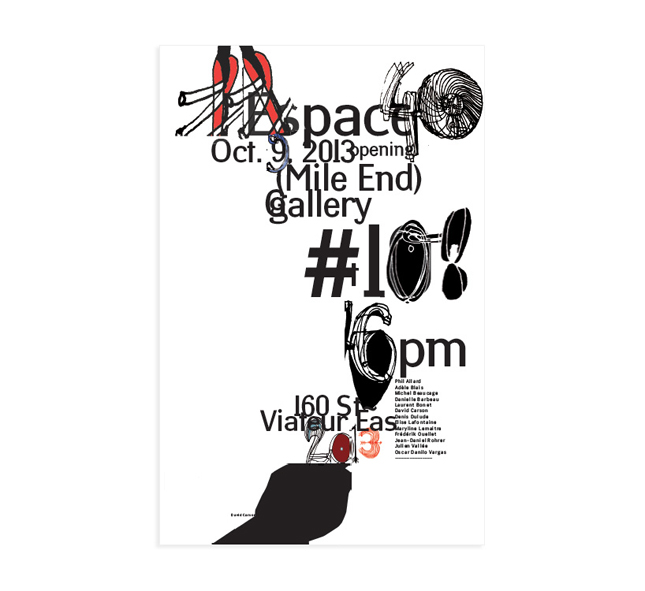
Research and communication courses benefit my graphic design skills. From my research I appreciate various famous graphic designer’s projects which form a new world for my design thinking. As for a poster, when I design it, in the beginning I will chose typefaces because it may influence the overall sense of the poster, and I will read text carefully to find a most suitable typeface for the expression of writer. ‘The Crystal Goblet ‘said that typography like a cup for text, so my design must around the sense of text. In my opinion, design is not self-expression, but communicate and text. Therefore, I need to use typography and consider the hierarchy, alignment, weight, space, margins, cropping, scale, contrast, and proportions of the poster to stop people. In addition, I should consider the key point of a text, and lead reader to catch the most important information in the first time.

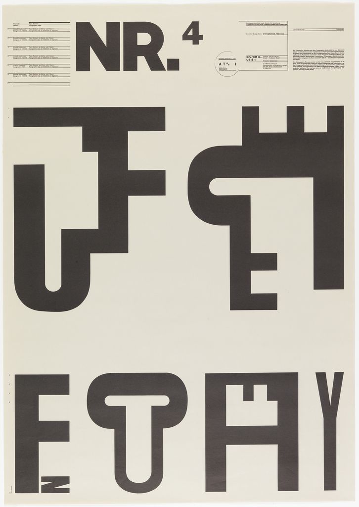
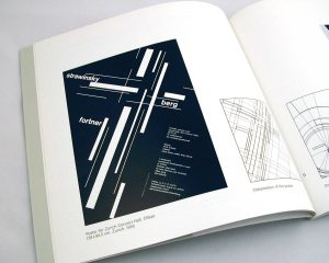
Kenya Hara is one of my favorite graphic designer. According my research, I gain lots of design ideas from this designer. He told that “Art is an expression of an individual’s will tosociety at large. Design is not self-expression. Instead it originates in society. The essence of design lies in the process of discovering a problem shared by many people and trying to solve it. I really like his projects about haptic and re-design, which is fantastic and innovative. Especially the haptic design, it let me know design need to communicate with pubic and infect them by my projects. Another my favorite graphic designer is J.Muller-Brockmann who is a swiss modernism graphic designer. The first time I know him is on the Modernism lecture. From my research about his artworks and read his books. I how to use the grid as an organizational too, harmony between image and type was achieved, resulting in a unified composition.

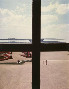
These lectures also take various photograph skills for me. when I do some research, I find a very special photographer who is Luigi Ghirri. He considers the ability and defect of photography, and good at using painting frames, windows, doorframe, and even ridges form the cutting of the photo. When I do my 15 photos work in the photograph course, I always consider the special form of frame and used different view and point to express a project.

Overall, Research and communication skill course let me know that as a designer, I need to gain more and more art history and academic knowledge, and I need to consider some society problems to communicate design and public. When I do a artwork I cannot only limit my idea in own work , and should do a lot of research from famous designers and history.

https://www.ndc.co.jp/hara/en/books/2011/05/haptic.html

https://www.moma.org/artists/4154

http://www.dazeddigital.com/photography/article/16236/1/luigi-ghirri

Publish or Perish

The first image is designed by Eduardo Muñoz Bachs who is a famous Guba designer. He is good at using powerful composition, bright and pure color, and beautiful handwriting type to organize a poster, and his screen printing poster became a beautiful and effective visual communication model. I really like this poster which was designed for a children’s book. There is a lazy and relaxed tiger, and it was drawn by simple and clear style of hand drawn but it is extremely vivid. In addition the poster r use complementary colors to make a visually intriguing but colors are low purity which are very soft. This poster is simplistic and naive, easily connected back to his background in children’s books, and he also do some marvelously intricate and free-flowing poster.

The second image is from a Chinese designer who is Hai Huang. This I s a movie poster for “Masters In The Forbidden City”, and the documentary shines light on the unsung life stories of restorers of cultural relics working inside the Forbidden City, together with the history of the antiques and the palace, the procedures of restoration and the development of cultural protection. The most important element of this movie is to show the craftsmanship spirit of restores. The poster express all the meaning of this movie, and it only one of the series posters of 6 precious cultural relics. This one is a part of “汝窑天青釉弦纹三足樽” . we can see this cultural relic was broken, and in the crack has a small restorer who is seriously repairing the cultural relics. This designer said that “I think the design poster is to do subtraction, to delete the scrap, to dig out the film’s core.”

The third image is a cover of my favorite magazine Colors. The magazine was founded by photographer Oliviero Toscani and Tibor Kalman in 1991. It’s a magazine about ordinary people’s life, culture and customs. Quarterly newsletter in 40 countries with 6 different languages. It is a magazine that promotes the harmony and diversity of all races and tells a few real events in simple and humorous ways. This cover is from “COLORS 87 Looking at art”, and the most interesting element is that the cover is a series of stickers, each of which can be uncovered and affixed to your fridge.

http://blog.sina.com.cn/s/blog_7c9c28070102v4nc.html

http://www.madisonboom.com/2016/11/14/masters-in-forbidden-city-launches-six-movie-posters/

https://www.zhihu.com/question/19803170/answer/99999837

http://www.colorsmagazine.com/

Postmodernism

This poster was designed by Wolfgang Weingart who is an internationally known graphic designer and typographer. In addition, he is a postmodernism artist. This poster use different method to reorganize letters which is newfangled and attractive.  The most important element of his projects is deconstructing. He is good at break the limits of media and technology and the conventional. His creative methods and media beyond the manual and mechanical to make typesetting, multiple film collage, photocopiers, letterpress and offset lithography. What’s more, He even attempted to use digital design tools. He broke the rules of typesetting including the dogma of the right angle, spacing out letters and words and creating stark typographic contrasts with the use of multiple type sizes at once. His flexible use of type and inventive choice of materials resulted in a distinctive visual quality in his (typo-)graphic composition. From his projects, I can see his understanding of freedom and the attitude of postmodernism artist

The designer of this image is April Greiman who is the student of Wolfgang Weingart. This image is that Greiman to design a page about the Walker Art Center for “Design Quarterly” magazine in 1986. She broken the traditional magazine form and created a 2×6 inch hinge. On the hinge, the designer’s nakedness is combined with multiple layers of text and images. In today’s view, Greiman’s use of the computer to create the work is not very noticeable, but then the computer only 1MB of memory, even black and white display is only 9 inch size. Greiman finished the hinge on the computer and printed it on the dot-matrix printer, and then instructed the print magazine workers to combine the pages and photos into a complete composition. She use different words to describe her work: “mixed images” “cross-media” “visual communication”, but she never calls it “graphic design”. The reason is that she thinks the most important thing of design is not pages but the space.

“Graphic design will be increasingly influenced by other media from outside of print, which will bring the most experimental and creative work, as the printing experience has previously”. Through this poster we can see that he is good at use chaotic typography and pattern to express the meaning and emotion, seemingly meaningless at the surface but holding a larger picture. Carson’s design has been assigned to the new life of words and he use his creative method to deconstruct the words, sentences, paragraphs and chapters. From his projects I learn about how to use type to stop the view of public.

http://www.famousgraphicdesigners.org/wolfgang-weingart

http://www.epubit.com.cn/article/947

https://www.ted.com/talks/david_carson_on_design


http://www.famousgraphicdesigners.org/david-carson

Counter Culture

Counter culture is one of the subculture. The norms and values advocated by this culture are often very different from the norms of the mainstream culture, sometimes even the opposite. In art area, I think it means breaking the boundaries of design. As Milton Glaser said that “art is whatever”.

The first image is a poster which was designed by Milton Glaser. He is an American graphic designer, illustrator, and cofounder of the revolutionary Pushpin Studio. This poster designed for a singer-songwriter Bob Dylan who suffer a motorcycle accident in 1966. The designer get inspiration by a self-portrait of the singer, and he depicted his curly hair with bright and vibrant colors. The energetic color and vivid curly hair are visible sign of counter culture. In addition, the colorful hair take extreme contrast with the black face and white background, which make the poster becoming very attractive.

The next image is a poster for UFO Mk which designed by Hapshash and the Coloured Coat. Hapshash and Colpured is very influential partner of graphic design and avant-garde music in the late 1960s. They developed silk screening techniques that merged two or three colours with gold, silver and fluorescent colour “because fluorescents came up very strongly in the black light at the UFO club”. This poster aboves elements of Mucha, Ernst, Magritte, Bosch, Blake and Dulac, pulling them together in a style that art critic George Melly called “Nouveau Art Nouveau” and Time was beginning to call “Nouveau Frisco”.

The last image come from Wes Wilson. It’s been 50 years since artist Wes Wilson invented the psychedelic font that was popular in the ’60 and ’70s. Wilson, fueled by the war in Vietnam and social tensions throughout the country, turned turmoil into art. This poster combines Wilson’s ability to fill all available space with vibrant, flowing letters together with his admiration and respect for the feminine form. The exciting color and the soft body of woman organized a vivid poster which like the following sound. I think the most ingenious point is the type which look very soft and like the feeling of women and voice.

https://www.moma.org/collection/works/8108?artist_id=2188&locale=zh&sov_referrer=artist

https://www.britannica.com/biography/Milton-Glaser

http://www.uisdc.com/classic-poster-design-in-history

https://www.theguardian.com/artanddesign/2016/sep/04/revolutionary-artists-60s-counterculture-v-and-a-you-say-you-want-a-revolution

Wes Wilson

Authenticity and Modernism

‘Authenticity’ is an extreme important word in art area. It has defined as ‘Of undisputed origin and not a copy; genuine’ by oxford dictionaries. The word authenticity is the state of something being authentic, or legitimate and true. Authenticity is important when the value of something is dependent on where it came from or how it was made.

When  artists do some works, they need to do lots of research. For example, they will find some paintings and works which created by famous artists and search on the website to find some idea which come from pubic. Therefore, unauthenticity may unavoidable for their works. Worse still, in the world, there are more than 7 billion people so we hardly create a truly authentic idea and work. Some amazing ideas which you think it only discover by yourself but it may has been created in many years ago. So in my opinion, as a designer I cannot and impossible give up to research and reference some excellent works. Besides I cannot avoid others have same idea as me. But I think that authenticity means that the sense of the work is belong you including the style, mark and emotion. The most important elements is emotion because people may have same idea and work, and cannot have the same emotion which is unique. As Theo van Doesberg (Croation Review 1931) stated, ‘The new artist does not imitate, he creates. In addition, in contemporary society designer need to do more work to solve problem than to go after truly authentic.

http://www.theartstory.org/artist-van-doesburg-theo.htm

Technology is the mortal enemy of art

“Technology is the mortal enemy of art”, this sentence has been repeatedly mentioned in recent years. Admittedly, technology can replace the work of some designers. For example, thousands of posters of this year’s Taobao double 11 shopping festive are made by AI(artificial intelligence), AI can store thousands of typesetting and materials so it can make a large number of different posters in a short time. This is much more efficient than designers to do these posters. However, in the other words, technology can encourage designers to create more and more new things because technology only can imitation other designers work and cannot create new design.

In addition, technology can help artist to do their work more conveniently and high efficient. Artist always tend to use Adobe App to complete their works. So we can see that the photoshop and lightroom can help us to adjust pictures, illustration can make graphic quickly and Indesign let typesetting becoming more easily. Artist can post their works on the web and social media to exhibit for publics. Therefore, technology offer a new platform for all artist especially some new artist and It is a positive impact for them.

I read a book in the summer, which name is “Design In Design ”and write by Kenya Hara. This book tells me that the design is not to surprise people with its new form and material, but it should be amazing that it comes from seemingly our daily life. Because design is communication with people and infect people. Designer need to focus on society to find and solve problem. It is technology cannot achieve. So technology is not the mortal enemy of art.


Kenya Hara’s latest book: Designing Design

Compare two image

In this task I would introduce a paiting wich name “ocean” by Etel Adnan.This painter is a 92 years old painter in Lebanon , and she always draws the river, ocean and hill. The color of her picture is not a simple response to what she sees, but it is decides by her senses. Her paintings were created using a palette knife to apply oil paint onto the canvas often directly from the tube in firm swipes across the picture’s surface. From this picture we can see the “immediate beauty of colour”, and the pure color with square sun organize a extremely attractive picture. I really like her color which is very simple but strong. From the picture, I can feel the purity of ocean and the impact of color on our vision.

In the meantime, I will introduce another photo by Luca Tombolini who is a Milan-based photographer. He enjoys exploring deaserts , and he thinks deaserts are attractive and mysterious. We can throungh this image see that the interaction between the self and its environment It is different from Etel’s painting, which is a real photo about a desert . But  these two images  also have various same points because they both have pure color and simple graphs which all coming from nature, and photo is more directly to describe the purity beauty of nature.These two picture one is painting about ocean, another on e is photo about desert all use simple nature elements, pure color and high contrast to stop people’s vision.

Luca Tombolini

http://www.serpentinegalleries.org/exhibitions-events/etel-adnan-weight-world

Terminal Bar

In the first week’s lecture, I saw a special movie which name is Terminal Bar. This is an American documentary short film directed by Stefan Nadelman. This film document a bar which is set in the middle of one of the dirtiest, toughest, wildest neighborhoods in New York. It’s an area where anything can happen, and does. The photographer took over 1,500 black and white portraits of the faces of the bar’s regular patrons. He worked for his father-in-law, who owned the place. He want to document the customers and their stories in this bar, to help people to remember these things and people that otherwise would be lost without trace.

I think the most special point in this movie is that all senses are organized by static photos, and the photographer zoom the senses of photos to make a motion feeling. In addition, he put pictures and newspapers together. We can through the date of newspaper and narratage to follow the senses, and give you extra details to part of this bar. Furthermore, we can hear the noisy background music in New York including horns of vehicle, talking of people and clinking glasses. All the thing takes us into that time to experience their life. However, If it do not have this movie and photos, who can remember the humble bar and these people in the rapidly growing city.

Therefore, as a designer , I think I need to document our life and some people who around with you. It help me to consider the society and discover some problems. Because in my opinion, design is a mothed to solve problem and communicate with public.

https://documentarystorm.com/terminal-bar/