Author Archives: Rachel Wignall

Summary

Throughout the duration of Research and Communication Skills for the past 10 weeks I have been able to learn about multiple art and design movements that have taken place that I otherwise might not have known about. These movements have helped contribute to politics and culture both in the past and now and their influence on artists and designers during those times as it helped to shape their beliefs which was interesting to see change by jumping to different movements in each lecture.

The lectures have also helped develop my research and referencing skills as prior I had struggled to gather information and respond to it as well as reference it with the Harvard referencing system.

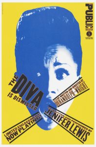
From these lectures, I am able to see that out of the movements we had looked at that I am most interested in the counter culture movement, and postmodern work as I feel that I my work can relate to them with my style of work and is able to be both influenced and I can learn from them further.

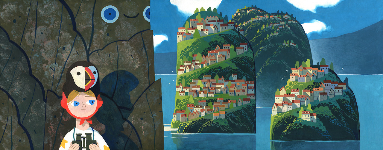
At the beginning of the course I was solely interested in the illustration pathway, but by looking at different types of work such as graphic design and photography where we had watched Abstract: The art of design [1], which showcased other artists and designers, it has opened my eyes to the other pathways and other ways of working. Such as taking another view on photography in Episode 7 with the photographer Platon whose main aim is to capture not just the physical form of the subject, but also their entirety in terms of personality and feelings which was something that I hadn’t thought about prior and will incorporate in future work.

Some of the tasks, such as the ones where we had to look at multiple images and discuss them and their relevance to our interests, has helped me to make connections between their work and my own as well as evaluating other people’s work. This has also helped me to realize that there are many mediums that I would like to try and get better at, and has inspired me to try some of the ideas that I wrote about from those images. Such as using a limited colour palette and one of similar colours and tones.

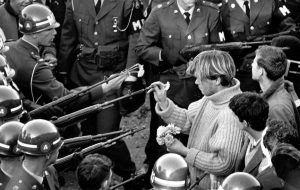
Overall, I have enjoyed the past 10 weeks and tasks, although at times difficult when trying to find older images such as for Task 5 which looked at counter culture and knowing whether the source was reliable. I will be looking further into some movements more in my own time, such as for counter culture and post modernism, as I feel there is more that I want to learn about those movements.


Bibliography:

[1] TV Series. Documentary. (21/01/17) Abstract: The Art of Design. RadicalMedia. Tremolo Productions. Netflix.

https://www.netflix.com/watch/80093804?trackId=14170286&tctx=0%2C6%2C7bf4c8a0-ca40-4bc4-a248-22d6e99d0df8-48197649

[Accessed 04/12/17]

Task 7: Publish or Perish!

The first image [1] is an illustration from Yvan Duque’s, a French illustrator, first child’s book ‘Comme Un GĂ©ant’, written by Marc Daniau. He normally works with gouache in a beautiful style and colour palette that is mesmerising to look at. The brush marks and other textures seen in his work add to the overall effect and is what I personally find very appealing in his and my own work which gives a personable feeling to his work.

This poster [2] is the work of Raewyn Brandon’s designed for their project for the WWF’s climate change brochure. The main requirements for this poster was for it to be a fold out publication of A3 size that would raise awareness. Throughout the publication they used clear and bold text with varying sizes to highlight its importance to the reader. In the posters such as the image to the left, the image of the animal is orange and black with the orange representing the statistic of the animals in risk of extinction.

Work such as this for the WWF is a key interest of mine that I would like to incorporate more into my work as it is a daily issue which many people don’t think they affect because their lack of connection even if it seems like a hopeless task. ‘Man is the only animal that is to be dreaded.’ (Jiddu Krishnamurti) [3].

This final image [4] is an excerpt from a graphic novel by Thomas Wellmann called Pimo & Rex published in 2013 originally in Germany and the UK. Wellmann is a freelance cartoonist who has also helped story board several episodes of ‘Adventure Time’ with Jesse Moynihan. Wellmann works illustrates his work digitally in a style that resembles lines that had been drawn traditionally which can be seen in videos that he had posted online [6]. [5] In his work the colour scheme is very consistent by using warm tones and colours, such as pinks, oranges and reds, which are very similar and makes details added subtle. The subtlety in his colours choices is something that I am interested in learning about and applying to my own work as I am unable to stop myself from adding more in terms of colours to my work to which I need to find a balance. ‘It’s unwise to pay too much, but it’s worse to pay too little.’ (John Ruskin) [7].


Bibliography:

[1] Yvan Duque. Tumblr. http://yvanduque.tumblr.com/post/166565692375

[Accessed 25/11/17]


[2] Raewyn Brandon. https://www.raewynbrandon.com/99u-conference-website-design/

[Accessed 25/11/17]


[3] Krishnamurti, J. (1987) Krishnamurti to Himself: His Last Journal. https://www.goodreads.com/quotes/tag/extinction

[Accessed 25/11/17]


[4] Wellmann, T. (2013) Pimo & Rex. Published 2013. Rotopolpress (Germany). Blankslate Books (UK).

http://www.thomaswellmann.eu/Pimo-Rex

[Accessed 25/11/17]


[5] Written by Chris McDonnell. Published 28/9/13.

http://www.cartoonbrew.com/artist-of-the-day/artist-of-the-day-thomas-wellmann-86248.html

[Accessed 25/11/17]


[6] Thomas Wellmann. Published 22/3/13. https://vine.co/v/bDmMY3KBVLP

[Accessed 25/11/17]


[7] Written by Kate Vitasek. Published 10/12/14.

http://www.vestedway.com/john-ruskin-and-penny-wise-and-pound-foolish/

[Accessed 25/11/17]

Task 6: Post Modernism

Postmodernism is ‘A late 20th-century style and concept in the arts, architecture, and criticism, which represents a departure from modernism and is characterized by the self-conscious use of earlier styles and conventions, a mixing of different artistic styles and media, and a general distrust of theories.’ [1].

This first image [2] is from the artist Roy Liechtenstein whose work was considered to be pop art. His style was influenced by advertising and comic books and had once said that pop art was ‘not ‘American’ painting but actually industrial painting’. [3] Liechtenstein’s work and others similar such as Andy Warhol were what I had looked at during my previous years of school and have been a huge interest of mine as I am drawn to the bold lines, simplistic colours, and small details used to create ‘lighter’ colours in a stippling manner.


This image [4] is a poster for theNew York Public Theatre designed by Paula Scher. Scher had created a trend in typography because of posters that she had designed for the Public Theatre which was a combination of mixed font weights and spacing as she had done when creating the theatre’s identity. Her work is often bold and graphic such as this poster which she has used a deconstructed photograph to create it.  Although the poster is an unusual colour combination it works well, and that draws me into her work as it shows that you can make any colour work together and draw attention without the need for any other elements to distract away from that. [5]


This third image [6] is a photograph by Sandy Skoglund, Revenge of the Goldfish (1981). Her aim was to take advantage of the viewers gullibility as at the time photography was for the most part staged with models and studio set ups. She created her own set with many sculptures of gold fish at varying levels with two main contrasting colours. Skoglund’s work is entertaining to look at and makes you question whether it is real which is the work that I personally find more interesting to look at and attempt to embody in my work.


Bibliography:

[1] Oxford Dictionary. ‘Post Modernism’. Oxford University Press (2017)

https://en.oxforddictionaries.com/definition/postmodernism

[Accessed 15/11/17]


[2] Written by Meg Kramer. Edited by A. Joseph. (Modified 30/10/17). http://www.wisegeek.com/what-is-postmodern-art.htm

[Accessed 15/11/17]


[3] Information used from Wikipedia.org. (Modified 6/12/2017) http://www.tate.org.uk/art/artists/roy-lichtenstein-1508

[Accessed 15/11/17 and 6/12/17]


[4] Smithsonian Design Museum.

https://collection.cooperhewitt.org/objects/18654247/

[Accessed 15/11/17]


[5] The Museum of Modern Art.

https://www.moma.org/collection/works/8837

[Accessed 15/11/17]


[6] East Tennessee State University.

http://faculty.etsu.edu/kortumr/humt2320/postmodern/htmdescriptionpages/goldfish.htm

[Accessed 15/11/17]

Task 5: Counter Culture

The Counter Culture ‘is a set of values, ideas, and ways of behaving that are completely different from those of the rest of society’ [1] which developed in the UK and the US which continued to grow and spread in the 1960s and 1970s.

The first piece [2] I chose to look at was the rock band, Ten Years After’s, album cover ‘Ssssh’ from 1969 which was an iconic album cover. The minimal yet contrasting colours drew me to the piece as it is the main element of the cover itself as it almost acts as a 3D image as how older 3D glasses looked. The other part which drew me to it is the image itself, which is a minimalistic illusion of a moving head which intercepts the multiple images used seamlessly.

I particularly enjoy pieces of work like this where the colours used have been the main thing which causes the interest in it, as without the contrast between the red and blue the image wouldn’t be as interesting to look at.


This is the cover from an issue of ‘it’ from 1972 [3]. ‘it’ ran from 1966 till 1974 which was during the counter culture period meaning that the content and staff during this period changed and became both more commercial and radical.

The cover is graphical and bold without incorporating bright colours. It interested me because it has a balance which I find is great between being graphic and having the detail from thestippling on the skull which is the main focus of the cover.


This photo [3] showcases hippies placing flowers into the guns to plead for peace showing their sensibility and

their peaceful spirits. The photo captures a moment in time which is actually somewhat beautiful to look at even though at the time it might not have been. I enjoy capturing moments in time through photos as a photo can speak a million words.


Bibliography:

[1] Collins. Collins English Dictionary.

https://www.collinsdictionary.com/dictionary/english/counter-culture

[Accessed 7/11/17]


[2] WordPress. Written by user 00individual. Published 24/1/15.

https://00individual.wordpress.com/tag/1960â€Čs-and-1970â€Čs-culture-archives/

[Accessed 7/11/17]


[3] The Guardian. The Observer. Written Kathryn Bromwich. Published 23/9/17.

https://www.theguardian.com/media/gallery/2017/sep/23/covering-the-counterculture-the-60s-underground-press-in-pictures

[Accessed 7/11/17]


[4] Widewalls Editorial. Written Andrey V. and Eli Anapur. Published 10/10/16.

https://www.widewalls.ch/counterculture/

[Accessed 7/11/17]

Task 4: Authenticity

To be authentic to myself, means to be the original, accurate or reliable when based on facts. It seems impossible to be truly authentic in the 21st century with the accessibility granted by the internet that shows hundreds of copies of a famous piece of artwork when searched. All are obviously the same painting, but it could have a slight variation or have been recreated by another person which makes us question if it is an image of the original painting.

The internet also allows for individuals to post their work and ideas anywhere which can be seen by anyone. As such, others can take that individuals work and ideas for their own use without the original person ever knowing or receiving recognition for it. But this can question how original our ideas actually are because that second person could have had that idea all along but the first person could claim that their ideas had been stolen.  But some ideas can be common and have been recreated thousands of time by different people meaning that the idea isn’t original. This is why it is difficult to judge what is authentic because many things have been created before when prior they had been seen as new or shocking.

 However, the main principles of modernism do still exist in contemporary practice as work is being “modernised” and made new to try and not recreate similar pieces of work although it is difficult to judge what is actually ‘authentic’.

Bibliography:

[1] Cambridge English Dictionary. https://dictionary.cambridge.org/dictionary/english/authentic

[Accessed 11/11/17]

Task 3: ‘Technology is the mortal enemy of art’

I both agree and disagree with the quote ‘Technology is the mortal enemy of art’ from Manifesto of the Constructivist Group. ([1]Rodchenko, A)

I believe that technology encourages laziness and plagiarism from new generations who refuse to create their own work and would step on the toes of other hard-working artists just to become more acknowledged by the public. There are many online who have stolen work and claimed it as their own just to get a viral piece of work which highly irritates me as there is no short cut to success and the satisfaction of your own success which those individuals are not receiving.

Technology however, is also a sign of progression such as with the letter press and computer software such as Adobe. It is another tool for us to choose to work with should we want to and new forms of art are being created daily from new advancements and inspiration from artists posting their work online pushing others to try new things. Technology is the encouragement needed to better ourselves and each other to keep evolving and as Aleksandr Rodchenko said ‘Future is our only objective’ ([2]The Art Story, www.theartstory.org) and technology is now used to aid in learning and producing work to a higher standard and larger audience then it would of in the past.

Technology does create a separation between the viewer and the work however, which galleries, where large volumes of people can view it, help to build that relationship to make it more personable and interactive. Balance is the key element meaning that we should still go back to more traditional methods and forms in our work whilst also using digital methods as well.

Bibliography: 

[1] Rodchenko, A, Who We Are: Manifesto of the Constructivist Group, https://issuu.com/rachelgweeks/docs/manifesto_issuu

[Accessed 21/10/17]

[2] The Art Story, www.theartstory.org, Aleksandr Rodchenko, http://www.theartstory.org/artist-rodchenko-alexander.htm

[Accessed 21/10/17]

Task 2: Comparison of Images

Robb MomaertsThe first image [1] is an illustration by Robb Momaerts. This piece, as with the majority of his work is created with ink and follow the theme of surreal and fantasy which are bold and easily recognisable. This piece follows the child’s story ‘The Tortoise and the Hare’ which is easy to see at first glance.

I love how even with the contrast of the black ink and the paper the effect of mid tones can still be found by using smaller brush strokes and leaving larger areas blank to show lighter tones. I particularly enjoy using stippling to recreate objects realistically and would like to expand my work further by using either stippling, or a similar method that Robb Momaerts has used with lines.

Matt Carlson
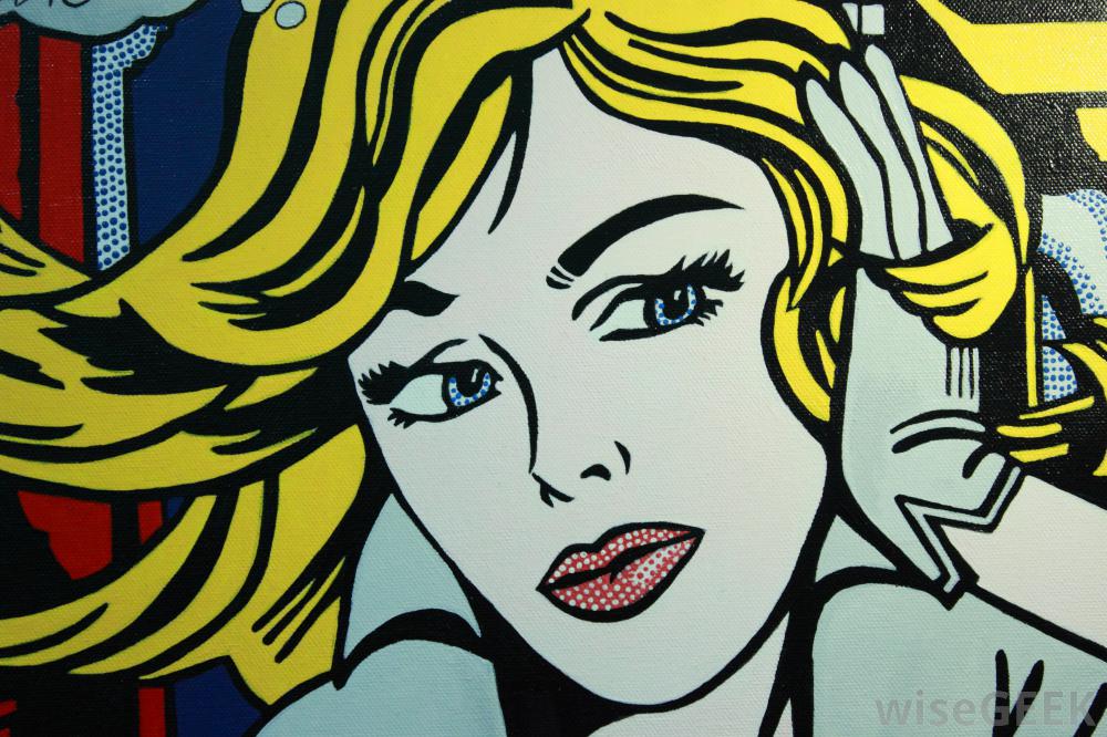
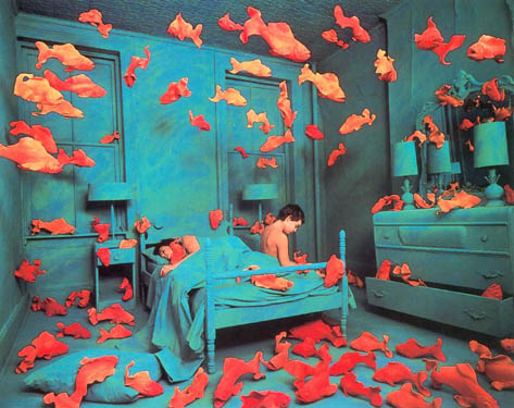
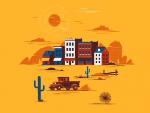
The second image [2] could be considered a cross between illustration and graphic design due to the digital nature yet illustrative nature of it. The creator of the second piece is Matt Carlson who is both a freelance illustrator and designer. He has only used around 5 colours for this piece which works well as it makes the i mage appear bold and very simple even with the small details by using other colours on top of others as shading.

This image doesn’t tell a story as the other image does but it is still interesting and aesthetically pleasing to look at maybe more so than the first due to it being more eye-catching due to its colours. It also doesn’t have as many details as the other image does but still achieves a contrast throughout the piece. I have only recently started to work digitally and am still working on it and would like to try to take into consideration only using a few colours so as to not overcomplicate the image.

Bibliography:

[1] Instagram. @robbmommaerts. Mommaerts, R. https://www.instagram.com/robbmommaerts/

[Accessed 16/10/17]

[2] Dribble LLC. Carlson, M. https://dribbble.com/shots/2884953-Wild-West-Town

[Accessed 16/10/17]

Task 1: Terminal Bar

In the documentary style, short film Terminal Bar (2003) [1] which was directed by Stefan Nadelman who used his father’s, Sheldon Nadelman’s, photographs which had been taken over 10 years (1972-1982) of the bar’s patrons. The bar was based on Eighth Avenue which was known to be one of the ‘roughest’ neighbourhoods in the city. The film combines the still images of articles and the photographs with narrative and videos of Sheldon talking about each patron when shown their photo.

Sheldon was the barman for the bar and was determined to document it because no one else would, nobody would know it had happened and he wanted to prevent people being ignorant of what he thought at the time would be the past. Many regulars appear in the photos and over the span of 10 years their aging is documented and is emphasised on. Alongside this the older crowds’ numbers slowly dwindle and there is an increase of younger generations appearing. The older generations are shown with slower paced music and slow transitions to other photos which speeds up when younger generations are shown to show the ‘new cycle’.

The relationship between Sheldon and the patrons is shown as he talks about each individual easily, even the disruptive customers who came from the ‘rough’ neighbourhood. The photos of those customers are shown with faster paced music and fast transitions to the next photo which are shown as a visual break between the old and the new and suggests that there was too many to count as time went by.

Later Sheldon revisits where the bar was and claims that nothing has changed since they left. The city was still the same with very little care for those around them which he suggests is the way of life in New York and that it will continue to be the way.

Bibliography:

[1] youtube.com. Terminal Bar. (2003). [film] touristpictures. Directed by Stefan Nadelman. https://www.youtube.com/watch?v=xfWBbZBqYjo

[Accessed 8/10/17]