Author Archives: India Dunn

Summary

This module was both incredibly challenging and utterly inspirational. While my time management and research skills definitely have room for improvement, I enjoyed pushing myself to deliberate on subjects I hadn’t thought much about previously. It was the first time I felt the transition between college level and univeristy level of fashion. Things I once just created are now considered, challenged and deliberated upon. This creates a new plane of inspiration which I’m sure will have a massive impact on my designs, with deeper meanings comes more original work.

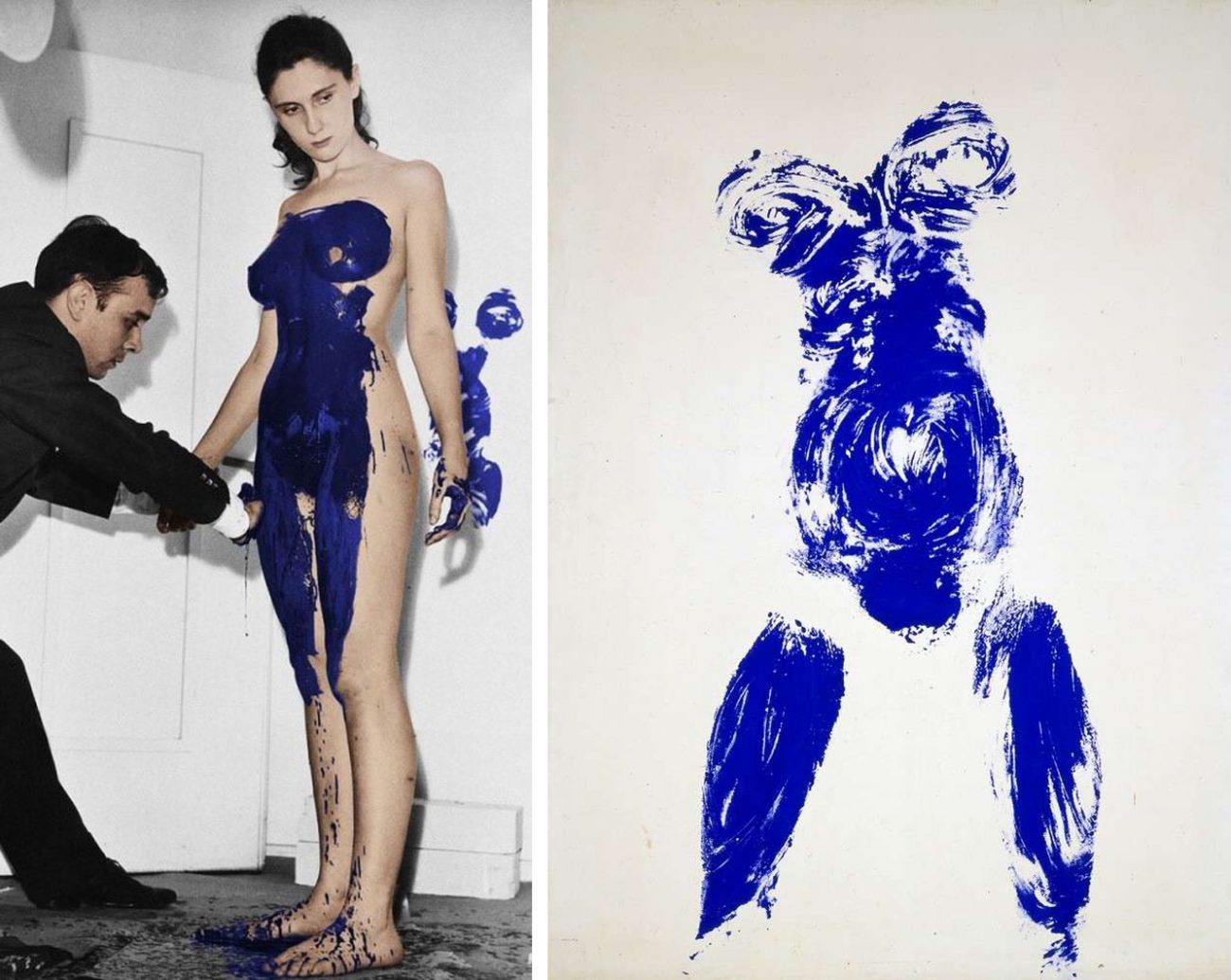
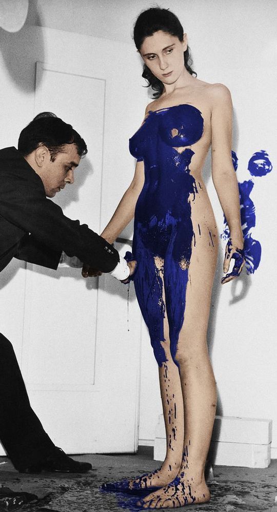
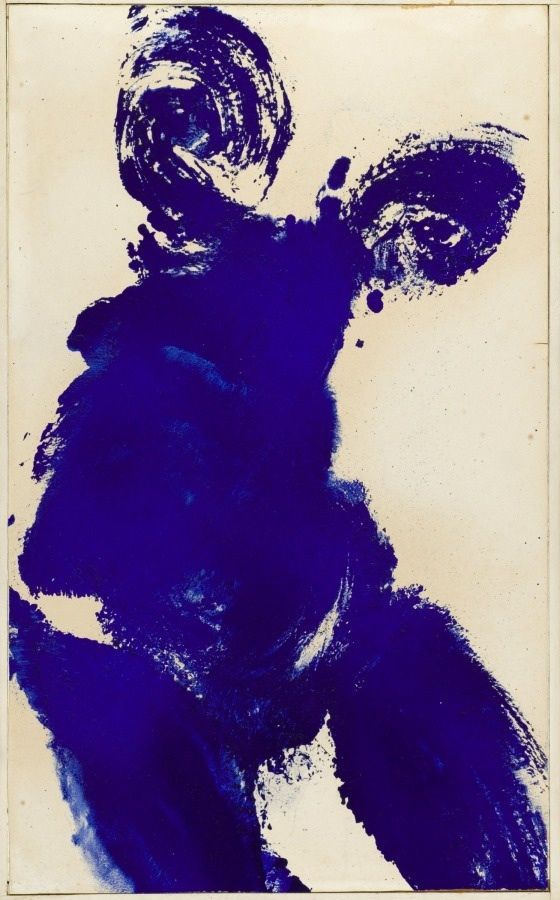
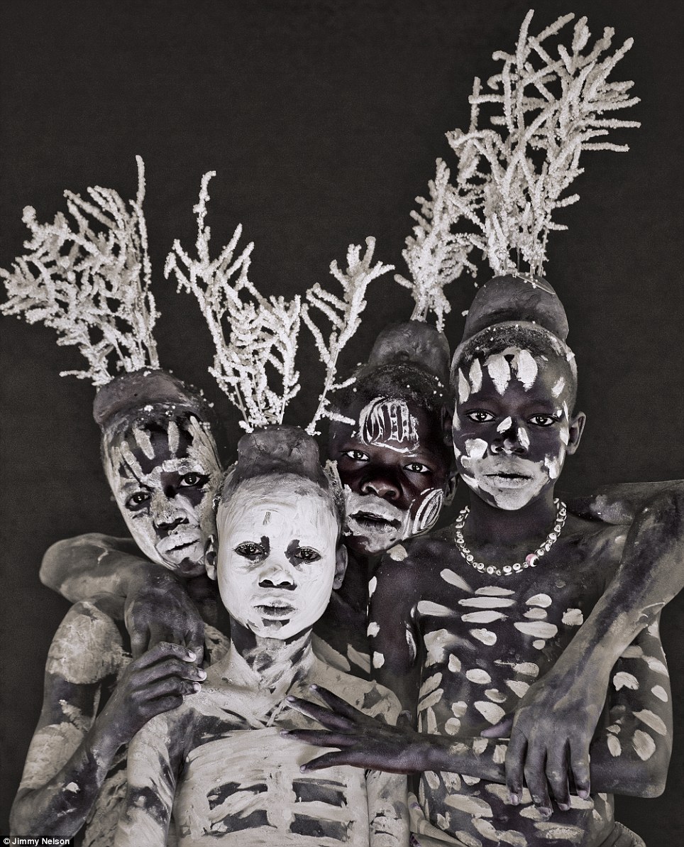
I think the most beneficial part of this module was beginning to humour my curiosity. i have always been majorly fascinated by art and design, yet seemed never to follow the trail. I would admire peoples work and move on, my contextual studies simply taught me to think and care. Learning the importance of primary visual research for inspiration showed the importance of the library; it’s far too easy to rely solely on the internet. Although useful for deeper more thorough research, books provide ideas you had never previously thought of. We then were shown how to take full advantage of online resources and how to pursue the origin of a source. There is nothing more satisfying than discovering the thought behind artwork you love, such as Yves Klein’s Zone de Sensibilité Picturale Immatérielle where he sold invisible pieces of art. I discovered his immaterial pictorial zones accidentally, as I was researching the stem of his Anthropometry of the Blue Period. Something I would have never known without my newfound curiosity for history and meaning.

During the projects I’ve been completing throughout the term I’ve noticed how different my approach to research is. My ideas become more intricate and interesting because I now prefer to think of them as initial research that I then further explore, which results in more complex, deeper topic. The thing I struggled with most is finding specific references for allocated topics, while browsing for research is straight forward and stimulating, actually searching for a particular quote is a lot more challenging. Time allocation also played a large part in this module; while one task a week isn’t much to ask, fitting research and writing around studio time and extracurricular activities is something I definitely need to work on.

This module has been a massive milestone in my development as a designer, I approach problems and topics in an entirely different matter. Listening to a tutor who spoke about subjects with such passion was infectious and so enjoyable, a personal favourite being the visual research talk.

7/8 Reflective Writing: Fashion as Communication

In Fashion as Communication, Malcolm Barnard challenges and explores the complex meaning of “fashion” and the many different interpretations around the world. Challenging social structures, tradition and psychological factors that dictate the direction of “fashion” trends.

What I found most interesting was the summarisation of both “fashion” and “anti-fashion”. Barnard stated that fashion predominantly existed in first world countries where hierarchal structures existed to climb, where personal style becomes communal style and everyone longs to belong. He also stated that the only people that truly embraced “fashion” were the ones that wanted to achieve social status and climb from their current step on the social ladder. “Anti-fashion” was then said to either subsist in primitive societies, religion or in communities where there wasn’t a step higher to climb; where things were accepted as they are and had no incentive to change. Fashion was regarded as a purely egocentric and tainted industry, as opposed to the liberating and personal practice I believe it to be. Another point I found fascinating was the double standards he spoke of in the fashion industry, regarding gender equality and the arts superiority to fashion; a point I whole heartedly believe to be true.

Malcolm Barnard failed to acknowledge the French. In a country where men and women dress for practicality and timeless elegance as opposed to ulterior motives and social climbing tendencies. Rich or poor, you see Parisians in simplistic clothing that pride quality over quantity. While the rest of the Western world use their wardrobe as a platform to reach higher places, the French get dressed to make the climb to the top more comfortable. Men and women alike have the freedom and confidence to wear what makes them comfortable, they aren’t restricted by words like “feminine” and “masculine” (the words that should really be studied), they merely choose pieces they like and wear what makes them feel content and relaxed. As said in Chanel’s fashion memoir: “simplicity will undoubtedly be the last word in luxury”.

I think what they, and the many followers of French fashion possess is a heightened appreciation of individuality. English designer Bella Freud put it perfectly in her interview with ‘The New Garconne’ saying ‘All my interest in fashion is in identity’. I think its pointless to stereotype and restrict this incredibly freeing term embraced world wide. I don’t think “fashion” is something that can be studied and result in a definitive answer; I think the reason its such a bewitching industry is its meaning is endless and personal. In regards to art surpassing “fashion”, I think its a continuation of chauvinistic white male domination of previous decades. Personally I believe “fashion” is the more practical approach to art, what makes art better than being able to whip it up into a design that will keep you warm and protect your modesty.

Batliwalla, N.B (2016) The New Garconne. London: Laurence King

Baudot, F.B (1958) Fashion Memoir Chanel. London: Thames and Hudson.

Task 9/10: Ethical Issues

One of the most controversial brands of the 21st century, American Apparel originated as a wholesale supplier. It became synonymous with high quality cotton t-shirts and favoured by merchandise printing companies. Soon moving on to becoming one of the largest retailers specialising in preppy American basics, with over 250 stores in 2010.

Responsible for creating and printing their infamous campaigns, American Apparel faced massive criticism for their sexually charged advertisements. While they continuously boast about their ‘Made in USA’ and sweatshop free production, they seem unbothered by the fetishisation of young girls. Continuously romanticising sexual objectification and degrading girls for attention. The lack of airbrushing doesn’t compensate for their psychological scarring on young girls. While sexual liberation is beautiful and should be respected, it shouldn’t be morphed to fit the male fantasy; it should be personal and selfish.

The photograph in mention contains a young woman laid on a neatly made bed in a sparsely decorated room that appears uninhabited and cold. Based on AA’s advertising campaigns, I think this is constructed to resemble the ‘classic bachelor pad’, the girl representing an innocent and willing guest. Wearing nothing but nylon tights slipped down to her knees with her legs in the air. She’s pulling her tights towards her body instead of off her body, as if out of urgency or non-committal convenience. The most disturbing part of this image is that she’s pictured with a completely emotionless expression, as if powerless and trapped. The photograph is predominantly white, the colour of virginal purity, further advocated by the age of the girl; yet her dark features and black stockings reveals a more seductive layer. It’s taken from above, giving the illusion of domination and superiority. The bottom of her breasts and buttocks are in direct eye line down the centre of the image, cleverly placed hands and a bold white logo cover the bare minimum, just enough to be marketable.

While I believe the brands identity was influenced by the style of the 90’s supermodel where child like qualities were favoured: doe-eyed, shapeless, skinny girls with innocent expressions (who were made to model in the nude, in their seemingly pre-pubescent bodies). I think the desire was to capture what the majority of generations wish they still had: youth. While the intention may have been harmless enough, the standardisation and insensitivity of pedophellia  and sexual exploitation is unforgivable.

I sometimes imagine American Apparel had Vladimir Nabokov’s ‘Lolita’ (1962) playing continually in the back ground as they brainstormed their advertising campaigns. At the time of this campaign the company solely stocked woman’s clothing, and it disgusts me that they used their massive influence to broadcast this image of a powerless and desperate girl with no other want than to be objectified. Strong and independent is just as sexy, it just puts the power in the woman’s hands. The fetishisation of young girls, or boys, is something that cannot be allowed. We have a moral obligation to protect and defend whats right and wrong, especially when it compromises the safety and happiness of future generations.


Task 5/6 Part 2: Celine

Yves Klein Untitled Anthropometry

Sans-titre-1-1-1300x1035

Victoria V., V.V. (2017) Yves Klein Anthropometries de l’époque bleue. Available from: www.wipplay.com/blog/2017/06/21/yves-klein-anthropometries-de-lepoque-bleue-vers-1958/ (Accessed 1st Nov 2017)

Steve Klein has always been one of my favourite artists, completely insane but achingly clever. The humour he brought into galleries is unparalleled. The first conceptual piece to be shown at the Galerie International d’Art Contemporain, Klein gathered one hundred people to witness the creation of this magnificent, career altering piece. He set the show to The Monotone Symphony, a tune consisting of a singular note. Klein had substituted paintbrushes with naked women who to rolled in his signature shade ‘Klein Blue’ and press their bodies against walls covered in paper. 

I love imagining the feeling in the room: a night out in Paris, the city of glamour and sophistication – a hundred guests all show up in black tie expecting an evening of glamour and art, only to witness multiple nude models dragging their bare bodies drenched in paint across the walls and floors. The effectiveness of this piece stems from its duality, figurative yet abstract.

YvesKlein

Beatrice Lartigue, B.L. (2015) Empreintes. Available from: www.epure.it/empreintes/ (Accessed 2nd Nov. 2017)

Klein’s works most obvious characteristic is more literal than most, he vowed to only use the shade ‘Klein Blue’. One of his later works ‘Portrait Relief of Claude Pascal’ in 1962 consisted solely of his signature blue embossed on bronze and gold leaf painted on wood. The piece was a part of a series Klein wanted to produce of his friends; each to be set in the same colour scheme, Yves Klein’s own portrait was meant to instead be in a contrasting gold against a blue background. Meant to imitate Roman statues, each would hold the customary rigidity and certain unfinished limbs. The authoritative bodies amalgamated with the two tone colour palette make this piece appear regal. Unfortunately he only completed three before his early death, presumably because of the significant cost.  Klein had this incredible ability to capture human expression and harmonise it with a contemporary edge. I think it’s this consistent sense of self that inspired Celine to feature his work in their designs; a fashion house with one of the strongest identities in the business.


Tibor Kalman, T.K. and Maira Kalman, M.K. (2005) Unfashion. New York: Abrams.

unfashion2small

Daniel Miller, D.M. (2013) The Daily Mail. Available from: www. dailymail.co.uk/news/article-2472272/A-vanishing-way-life-captured-forever-British-photographer-travels-world-record-dozens-dying-tribes-danger-disappearing-forever.html (Accessed 24 October 2017)

article-2472272-18EAD22E00000578-629_964x1193

Katherine Brooks, K.B. (2014) This Is The Last Generation Of Scarification In Africa. Huffington Post. 23rd September, 8-9.

original

As usual I was drawn to the book that stuck out like a sore thumb in the fashion section. A book I had previously read before, ‘Unfashion’ is one of the most humorous and captivating journals of worldly fashion ever written. A book you will constantly go back to, eager to travel through its pages once more. What I liked most about this image was that it made the West’s approach to fashion pale in comparison; these tribes using every surface and every object imaginable to decorate and accessorise their bodies. The organic feel of his cracked painted skin, and the seeds around his neck, compared to the modern keys hanging from his neck show that there is no line between what is and isn’t acceptable, something I think holds us back in the West. Its merely an art and a form of self expression, as it should be.

Continuing on this theme I found this etherial image of four little tribesmen, painted head to toe and decorated with frosty, delicate headpieces. The fact that these boys are encouraged to decorate their bodies in whatever they see fit is something I really admire, as men in Europe are shamed when it comes to self expression and beautification. Not only is this a striking image with the tonal variation, it again widens our perspective and hopefully makes us question how we raise our own boys.

Lastly, I thought I would include a more permanent decorative aspect: scarification. An extreme, bold decision that makes a mark in more than one way. Beautiful and shocking, this process isn’t for the weak.

Task 1/2: Dali and Schiaparelli’s Lobster Infatuation.

Salvador Dali’s Lobster Telephone 1938 (Tate)
The Lobster Telephone is one of my all time favourite sculptures; Dali had this unique ability to make madness seem normal. I’ve always been fascinated by his creative process, and the fact that I’ve never questioned the absurdity of most of his work. With this piece I loved the use of the traditional rotary dial telephone and the pastel colour palette set off by this bizarre, vibrant shell fish. Its unexpected and original, the way that the tail echoes the curve of the phone create such harmony that it almost seems normal.

The Lobster phone was a collaboration between Dali and Edward James. Pairing the two unrelated objects was an attempt to reveal the secret desires of the unconscious, as well as having strong sexual connotations. On this particular piece Dali placed the tail (where the sexual organs are located) directly over the mouth piece of the telephone. He also created a multi media piece called “The Dream of Venus”, where he covered live models genitals with lobsters. In the same year Dali submitted a drawing of the same telephone with a lobster receiver but this time surrounded by flies, titled: ‘TÉLÉPHONE APHRODISIAQUE’. A similar drawing is printed in his book, captioned “I do not understand why, when I ask for a grilled lobster in a restaurant, I am never served a cooked telephone; I do not understand why champagne is always chilled and why on the other hand telephones, which are habitually so frightfully warm and disagreeably sticky to the touch, are not also put in silver buckets with crushed ice around them.”. Both lobsters and phones featured in a large portion of his work, but this particular piece was said to have saved the Surrealist movement. It resurrected an ageing art form and added excitement and energy

Elsa Schiaparelli’s Lobster Dress 1937 (Philadelphia Museum of Art)
Close friends Elsa Schiaparelli and Dali collaborated on many occasions, but their most famous piece was the Lobster dress. Schiaparelli asked Dali to paint one of his heavily featured lobsters on her dress, said to symbolise sexuality. Alongside the Lobster were sprigs of parsley, Dali apparently requested to slather real mayonnaise on the dress but undertsandably Schiaparelli would not allow it. Dali once said “Like lobsters, young girls have a delightful exterior. Like lobsters, they turn red when you get them ready to eat”. The white, silk dress symbolising virginity and innocence in contrast with the ginormous vivid red lobster created this dichotomy between classicism and exhilarating excitement. The fact that the lobster is painted right between the woman’s thighs makes one question the intention and meaning behind it.

The combination creates a sensual, fun garment that challenged their time. I love that Schiaparelli was one of the first to combine art and fashion, jumping straight into the surrealist movement. Unfortunately, while the dress became the pinnacle of Schiaparelli’s career, the erotic tension Dali aimed to create destroyed the purpose of Cecil Beaton’ shoot with Wallis Warfield Simpson. The dress was deemed too provocative and the photographs weren’t approved for public viewing.

Lobster Telephone 1936 Salvador Dal? 1904-1989 Purchased 1981 http://www.tate.org.uk/art/work/T03257

Tate (2017) Salvador Dali Lobster Telephone 1938. Available from: www.tate.org.uk/art/artworks/dali-lobster-telephone/

Rogers, L.W.R (2009) Elsa Schiaparelli: Shocking-Pink. Available from: www.lisawallerrogers.com/tag/schiaparelli-and-the-lobster-dress/