Author Archives: Briony Fairbairn

Summary

Throughout this 10 week Research and Commination Skills brief, I have learnt multiple skills, improved my critical thinking, strengthened my research and referencing ability and widened my knowledge of art movements and artists. I have learnt much more about art history and how society, politics and culture can affect whole art movements and brand new styles of working through acting against the ‘norms’ of that culture. Towards the end of the 10 week module I understood the connection between Research and Communication Skills and studio practice, learning the history of the art movements is influential and teaches you to think in different ways and allow your social, cultural or political surroundings to inspire your work for the majority.

These lectures and further research on the topics have led me to realise and understand the importance of art movements and how strongly art and design can impact social and political decisions. I will use this point of keeping up with contemporary issues to further impact my future work. I was also thoroughly entertained by the ‘Abstract’ Netflix series we watched after the last 3 lectures; this really helped me to understand how different artists work and what influences and inspires them to do so. It was fascinating seeing what a day to day life for an artist involves and this helped me to further research artists and answer the relevant weeks task by using quotes from the Abstract series revolving around a specific designer.

Personally, I really enjoyed the lectures about postmodernism and publishing images and found these most interesting. I particularly enjoyed learning and researching about postmodernism because it allowed artists to be freed from the ‘norms’ of that culture and design what they liked. Like stage designer Es Devlin said “design should show, reveal and deconstruct”, I feel like this quote fits perfectly into the postmodernism movement.

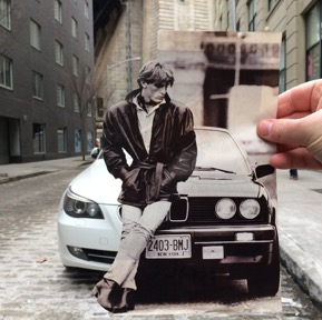
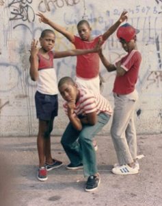
One of my favourite artists when researching postmodernism was Jamel Shabazz, a photographer who documents and captures various aspects of life in New York city. He photographs the Urban areas to show perspective. I found this really inspiring as his photos prove that even urban life is cultured and beautiful. By going into the unknown you capture difference and this was a big deal within the postmodernism art movement. ‘His work is testament to the beauty that can be found in the places considered least likely to provide it’.

Overall, by completing this module it has allowed me to understand previous art movements and the art history timeline. This has also helped me to differentiate between the graphic art pathways and has helped me to confirm which pathway I want to pursue. By researching specific artists, it has helped influence my choice to choose the graphic design pathway, also within this I am going to continue to practice and improve my photography skills and incorporate this within my graphic design briefs and design work, also personal work.

Publish or Perish

Planton, a photographer within the film Abstract quoted, ‘what’s important is the story, the message, the feeling, the connection, how do you make this reach people?’. This is very important to show through photography because it allows the photograph to tell their own story.

Kalen Hollomon is a photographer based in New York. He travels around with paper cut outs of photographs which fit perfectly into todays New York. His photographs each tell different stories by juxtaposing the past and present day, this creates an immediate connection with the audience and within the photograph as they contrast but also fit together so well.

“I am always concerned with what lies beneath the surface,” says Hollomon. “I hope to create conversation that is rooted in questions related to learned social rules, identity, the subtext of everyday situations and perception. Above all, I try to capture a sense of romance in images that are spontaneous and slightly unnerving.”

Selman Hosgör is a graphic designer and collage artist who mixes photography and illustration in his work. He tends to use ‘spirited colours’ throughout his art work; ‘they are the fruits of individualistic spontaneous inspiration’. This collection of work ‘Midnight in Woddy’s Colour’ is very vibrant and fun which gives the feeling of informality and humor. This sense of relaxation that the viewers gets allows them to connect with the images. The colours peruse happy and friendly vibes which allows the viewers to interact with the artwork.

Victoria Villasana weaves colorful graphic patterns on portraits of people using colorful threads. She is influenced by different cultures and the human spirit, her creations focus on “the way people interact with each other in a fragmented and post-digital world.” This image is from one of her exhibitions at the Saatchi Gallery. She uses photographs of models with their eyes shut, ‘holding themselves in the intimate space between outer and inner identity’. The coloured string is to show a hidden strength, from the exposure of the model, but also a feeling of vulnerability shown by the viewers intake of the image itself.

Bibliography

Hollomon, K. (2015). Kalen Hollomon. Retrieved December 02, 2017, from Kalen Hollomon: http://www.kalenhollomon.com/work-1/#/thumb-ass/

Hosgor, S. (n.d.). Midnight in Woody’s Colours. Retrieved December 02, 2017, from Studio Selman Hosgor: http://www.selman-hosgor.com

Villasana, V. (2017, November 06). Altered States Saatchi Gallery Group Show. Retrieved December 02, 2017, from Victoria Villasana: https://victoriavillasana.com/category/work/original-work/

Postmodernism

Postmodernism, in art was a reaction against modernism. It came about around the 1970’s yet there is not a single piece of postmodern art, style or theory that it is hinged to. Modernism art style is very much focused around idealism and reason, playing with form and techniques. Whereas postmodernism art style was more focused on suspicion and contradicting meanings. This movement embraced many different art techniques, mainly because it allowed artists to break out of the ‘norm’ and experiment with their own styles. Stage designer, Es Devlin says in the film Abstract, design should show, reveal and deconstruct.

Banksy is an anonymous graffiti artist known for creating surreal artwork that doesn’t follow the ‘norms’ of society. His street art combines political and social visuals mixed with dark humour. This image of the ‘Flower Bomber’ has a very strong sense of juxtaposition, combining riots and flowers. To me this personally looks as if he’s pre-empting the deaths of people and the flowers resemble the after mass and tragedy for loved ones. The vibrant colours used within the flowers makes that the main attraction of the image, taking all the focus of the rioter.

Jamel Shabazz is a photographer documenting various aspects of life and cultures. His images really deconstruct and capture the raw emotions and sense of culture of the surrounding area. He has captured images from urban New York for the last 40 years, putting him in some violent areas which he was keen to show a different perspective of. ‘His work is testament to the beauty that can be found in the places considered least likely to provide it’.

“It’s an interesting mashup of the elegance of humanity in spite of the decay of the city and those photographs had a warm, yellowy, upbeat quality to them.” – Bradford Young

David Carson is a graphic designer, best known for his typography work. This Pepsi campaign uses minimal colours and simple design, this is very effective and aesthetic. The red writing on each container relates to a very wide audience, lots of people want to be young and have fun, by drinking Pepsi, you become a part of that, and that was Carson’s intentions. I really like his layout of the information put inside the bottles/cans and the block colours to break up this information a little.

Bibliography

Design, E. D. (2017). Abstract, The Art of Design. Retrieved November 25, 2017, from Netflix: https://www.netflix.com

Postmodernism. (n.d.). Postmodernism. Retrieved November 25, 2017, from Tate: http://www.tate.org.uk/art/art-terms/p/postmodernism

Banksy. (2014). Overview of Postmodern Art. Retrieved November 25, 2017, from On Postmodernism: http://www.onpostmodernism.com/art

Shabazz, J. (2017). Biography. (C. Media, Producer) Retrieved November 25, 2017, from Jamel Shabazz: http://www.jamelshabazz.com

Walik, J. (2015, March 03). 40 Years on NYC’s streets with Jamel Shabazz. Retrieved November 25, 2017, from Dazed: http://www.dazeddigital.com/photography/article/23870/1/40-years-on-nyc-s-streets-with-jamel-shabazz

Parker, M. (2014, October 13). David Carson – Pepsi Cola Ad. Retrieved November 25, 2017, from 1323parker: http://1323parker.blogspot.co.uk/2014/10/david-carson-pepsi-cola-ad.html

Counterculture

‘Counterculture’ is a culture in opposition to the mainstream culture exercised through protests. In the 1960’s the movement involved mainly college youths who didn’t agree with their societies morals or values, they fought against this through peaceful protests. This counterculture movement created a spark of new design and ways of life. Paula Scher discussed in the film Abstract, design having sensibility and spirit and if you combine these two together with meaning, that’s spectacular and can been seen throughout this collection of work.


Oz magazine was launched in 1967 and became Britain’s more renowned underground magazine, today Oz is a very iconic and symbolic representation of the 60’s as a whole.

‘They were pretty dull stuff,’ remembers Richard Adams, who worked as a designer on the magazine. ‘And then the drugs took hold. And suddenly there was this complete explosion – colour, design, subject matter.’

The magazine designs follow the culture from the era, showing the counterculture in its true state. “Oz celebrated psychedelic drugs and new sexual freedoms, radical politics, philosophy and rock’n’roll” says Felix Dennis. I really like the sense of psychedelia you get from the typeface alone; the slight italic tilt and swirly lines added to the outline of the letters really captures that known 60’s trippy vibe. It shows sensibility within the image, just like Paula was saying.


Victor Moscoso’s first independent poster series was named ‘Neon Rose’. His work is very aesthetically pleasing to look at, this is through the use of a vibrant colour pallet throughout his posters; creating the well-known psychedelic effect within his art.

Moscoso says “The musicians were turning up their amplifiers to the point where they were blowing out your eardrums. I did the equivilant with the eyeballs
”.

Besides his amazing colour pallet, I particularly like his use of composition and spirit.


My third image is a photograph of a young innocent woman protesting the counterculture movement through anti-violence with the tagline ‘make love not war’.

The mixture of the helmet, slogan, females beaming eyes and flowers create this surreal juxtaposition and sense of innocence, therefore again adding to the fact it’s a peaceful protest. The helmet is a connotation of WW2 and it has been used to show that even though this movement isn’t violent, the importance and meaning is still a battle.

Bibliography

Abstract, The Art of Design. (2017). Retrieved November 24, 2017, from Netflix: https://www.netflix.com

Sharp, M. (n.d.). Oz. Retrieved November 24, 2017, from Pinterest: https://www.pinterest.co.uk/pin/253749760227298982/

Brown, M. (2017, July 28). Sex’crazed Rupert the Bear and other stories…The obscenity trial that brought down Oz Magazine. Retrieved November 24, 2017, from The Telegraph: http://www.telegraph.co.uk/men/thinking-man/sex-crazed-rupert-bear-stories-obscenity-trial-brought-oz-magazine/

Moscoso, V. (1967, March 28). Neon Rose Posters. Retrieved November 24, 2017, from Classic Posters: https://www.classicposters.com/Neon_Rose

Magazine, E. (n.d.). Eye Magazine. Retrieved November 24, 2017, from Pinterest: https://www.pinterest.co.uk/pin/279082508130188283/

Is it possible to be truly authentic?

‘Authenticity is a term used by philosopher and critic Walter Benjamin to describe the qualities of an original work of art as opposed to a reproduction’. Walter Benjamin says an original work of art is authentic because it ‘has presence in time and space’. He used the word ‘authenticity’ firstly in his essay The Work of Art in the Age of Mechanical Reproduction where he stated,

“A reproduction of a work of art lacks ‘authenticity’ as it is not possible, when reproducing the work of art, to establish the exact conditions in which the original artwork was created. But it is possible, by reproducing a work of art, to call into question the original artwork’s authenticity, as reproducing it has undermined the artwork.”

In my opinion, in modern day society I personally think that it is very hard to create truly authentic work because everywhere you look there is design and artwork; to be able to not let this inspire and possibly even influence your own work as a designer is truly impossible. However; I think that being truly authentic is completely personal and shouldn’t match up to what’s happening in today’s society or what the current trend is. An authentic piece of artwork should be passionate and proud.

The more I read up about the word ‘authenticity’ the more negative I seem to think the word can be. Yes it’s good to have a truly authentic piece of artwork, but to constantly point things out that aren’t authentic and ‘just a replication’ of someone else’s original work isn’t a good way of using the word authentic. In conclusion, in todays era it is highly unlikely to produce a truly authentic piece of artwork or design.

Bibliography

Authenticity. (n.d.). Retrieved November 20, 2017, from Tate: http://www.tate.org.uk/art/art-terms/a/authenticity

You wont believe how companies steal logos from one another. (2014, October 03). Retrieved November 20, 2017, from Pencilnex: http://www.pencilnex.ro/blog/tag/famous-logos-that-look-the-same/

‘Technology is the mortal enemy of art’

Within Rodchenko’s manifesto of the constructivist group he makes a statement “technology is the mortal enemy of art”. Personally, I have to disagree with this statement for multiple reasons. At the time this quote was said was during the constructivism art movement within the Avent Garde. Constructivism fought the idea of creating art just for art, and went on to explore different ways to work and how they can incorporate it within everyday life. They created a variety of ways to promote the propaganda through different advertisements which still today inspire designers and artists. I came across an exhibition showcasing this month (July – October), the constructivist work and the whole exhibition is keeping the momentum of their ideas across all art form alive through this modern-day show. (Heide Museum of Modern Art, 2017)


Technology has benefitted many artists, not only within the way they produce their work but how they show and exhibit their work on the web. Constantly we as artists are pushing these technological boundaries to create new and much more creative artworks to be tried, played with and displayed. Technology has even allowed social media to take off for artists in the way that it makes it so much easier for unrecognised artists to get their name and work out.

Although I disagree with Rodechenko’s statement, I understand his intentions when saying it. It also states ‘we are also your last slave-workers’ (page 9 Who We Are; Manifesto of the Constructivist Group), this to me seems as if he felt under control by technology and by becoming part of the constructivism movement therefore allowed him to do whatever art forms he wishes, a sense of freedom.

Bibliography

Aleksandr Rodchenko, V. S. (2014, January 21). Who We Are: Manifesto of the Constructivist Group. Retrieved October 25, 2017, from issuu: https://issuu.com/rachelgweeks/docs/manifesto_issuu

Heide Museum of Modern Art. (2017, June 23). Call of the Avant-Garde: Constructivism and Australian Art. Retrieved October 25, 2017, from Vimeo: https://vimeo.com/222785276


Comparing images – task 2

Image result for inglorious fruits and vegetablesInglorious Fruit and Veg, is a campaign created by IntermarchĂ© in order to help reduce food waste by selling deformed fruit and veg at a 30% discounted rate. The name is printed onto the campaign posters at the bottom left, this shows that they don’t want to hide away and be rejected. The word inglorious is bold and in upper case, and the fruit and vegetables is below this in lower case, this makes it clear that the point of the campaign is showing that the fruit is inglorious.

The inglorious ‘ugly’ fruit and vegetables have been photographed in a studio environment with the white backdrop and bright lighting. The white backdrop allows the beautifulness of the fruit or vegetable to be bold and stand out over the background so that the whole
object is seen. The bright lightng against the white background makes the ugly fruit and vegetables feel clean and clinical, adding to the beauty of the object and making it feel vulnerable.

Image result for without ketchup advertIn comparison, this ‘without ketchup’ advert uses very simplistic photography and layout.

Much like the inglorious advert, Heinz have used colour to promote the main product of the advert. The dull background and meal make the Ketchup bottle stand out more as the red is a very vibrant colour and contrasts against the rest of the advert strongly.

Both of these adverts portray taste. Heinz portrays the thought of what lots of people think their dinner tastes like without adding ketchup to it, not necessarily cardboard but boring, plain and tasteless. Whereas Inglorious fruit and veg is portraying the idea that looks don’t change the taste, ‘In a soup, who cares?.

http://www.dailymail.co.uk/femail/food/article-2693000/Forget-ugli-fruit-meet-ugly-fruit-bowl-French-supermarket-introduces-lumpy-misshapen-fruit-vegetables-sold-30-discount-combat-food-waste.html

http://www.adsoftheworld.com/media/print/steak_1

Terminal Bar

The Terminal Bar is a photographic documentary about one of New York’s roughest, toughest and most notorious bar directed by Stefan Nadelman using a collection of Sheldon Nadelmans black and white photographs. These photographs were taken over a period of 10 years, from 1972 to 1982.

The photographs show personal portraits of the different people who entered the Terminal Bar and the bar itself; these images have been combined with newspaper clippings, upbeat music and narrative throughout to create a realistic and scenic atmosphere of the bar. When Sheldon Nadelman is describing a person within a photos, they get enlarged and zoomed into, this creates motion within the photographs and portrays the aspect of Terminal Bar being a film in today’s era. The movement within the still images and the transition between the images and newspaper articles really flow together.

The music in the background plays to compromise the specific memory he has of that person. I really liked the use of background bar noise throughout the film, it had a really good effect on the images and set the scene of the bar. Towards the middle of the film there was a break in narrative and stories and it just focused on the portraits that Sheldon Nadelman had taken, this showed all the portraits he had collected over the 10 years and were displayed against an upbeat song.

The ending of the film shows the modern-day reality of what the Terminal Bar was to become and how even in the present day, Stefan Nadelman says nothing has really changed. If I were going to create a document I’d defiantly look into trying out this style of photographic media.

http://www.touristpictures.com/SHORT-FILMS.html