Author Archives: Emma Gardner

500 Word Summary

Over the first semester, I have attended all but one of the RCS Lectures. I have thoroughly enjoyed learning about different art forms that I haven’t covered before.

What have you learnt?

One key skill that I have picked up on from attending and researching after the lectures is how to reference properly, the Harvard way. I feel this skill will be beneficial in the years to come when studying Graphic Arts. Furthermore, I have also learnt how to properly research using a variety of different sources. From books in the library and to books that I personally read and am interested in.

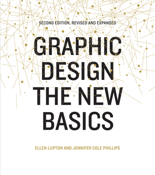
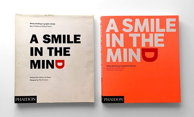
Two major texts that have helped towards my understanding of all of the topics covered in the lectures is the book entitled ‘A Smile in The Mind’ by Beryl McAlhone, David Stuart, Greg Quinton and Nick Asbury and ‘Graphic Design the New Basics’ by Ellen Lupton and Jennifer Cole Phillips.

The first book entitled, ‘A smile within the mind’ covers how people came up with their design ideas and the methods and thought processes that helped them develop them into pieces of graphic art and design. Moreover, the second book, ‘Graphic design the new basics’ helped me understand from a beginners point of view what elements help make up a piece of graphic design or artwork.

It is evident that I have used many internet based resources as many of my blogs have the links to the websites that I have used. However behind the blogs, I have mainly used the library to help me have a deeper understanding of the lecture topics.

Do you see the connection with these ideas and your developing practice?

I am able to use the knowledge and research used/found when researching for the blog post in class frequently and have used it to develop my ideas further in practice. Whilst looking at the ‘History of Graphic design’ Johanna Drucker and Emily McVarnish to expand my knowledge in the specific areas of design covered in the lectures, I have used it in class and it has been a key resource that I found in the WSA library when researching after lectures about key points in design history to understand the basics before I proceeded with the blog post and with my work within class and when completing my sketchbook. This helped me fully understand what I was talking about in my blogs. It covers all of the art history in the lectures and I would personally recommend it to anyone who isn’t familiar with different movements within art and design.

Whilst completing and adding to my sketchbook, I have found that the artwork from the Avant Guard period has influenced me the most because I am drawn to abstract art and design and the message behind it. My sketchbook suggests my interests as I use many bold colours to lay it out. A personal favourite style is De Stijl, developed by Piet Mondrain, Theo Van Doesburg and Bart Van Der Leck.


Books:

B.McAlhone, D.Stuart, G.Quinton, N.Asbury : A Smile In The Mind : Publisher: PHAIDON Published: 1996 revised/updated version.

E.Lupton, J.Cole Phillips : Graphic Design The New Basics : Publisher: Princeton Achitectural Press NYC Published: 2008,2015

J.Drucker, E.McVarnish : Graphic Design History (A critical guide) : Publisher: Pearson Published: 2013

Published Images

Story, Message, Feeling, Connection

Having visited the famous artists work, Sir Francis Bacon at Tate Liverpool, I am drawn to the message/story he tells through his images. In the image on the front of the booklet that was available for purchase shows one of his most famous pieces describing the mental abuse people who experienced the horror of war were coping with. Moreover, I connect with this image as it shows clearly that the woman is distressed suggesting Bacon really thought about people’s mental state and put this idea into his work. (1)

‘Study for the nurse from the Battleship Potemkin, (1957) a painting to be experienced, not interpreted.’

‘Inspired by a distressing Odessa Steps scene in Sergei Eisenstein’s film, “Battleship Potemkin” (1925). Bacon kept photographic stills from the film in his studio and referred to them throughout his career as a source of inspiration.’

Being interested in images that have meaning, I found this advert over a year ago that suggests how ‘Kinder Eggs’ the sweets are more harmful to children than weapons. The message behind the image is that children are being exposed to the wrong media and that this type of media will have an effect on them. Furthermore, the simplicity of the image suggests that the children are unaware of the potential dangers of weapons. The setting is in a classroom highlighting that they are still learning and are being brainwashed into thinking that the possession of guns is normal.

My third image is from a book entitled, “YEAH YEAH! YEAH!” designed by Timothy Goodman. In this book cover design, Goodman uses bold and striking colours to attract a reader. The square like background that is making the letters look 3D is very cleaver and looks as if the words are coming out of the page. Furthermore the content of the book, is about todays current pop music. This is something that i relate to as a follower of the charts. Overall this is my favourite image as it conveys through bright colours that the music of today is modern and colourful.(4)


Frenetic Happiness. 2017. Frenetic Happiness – Francis Bacon & Maria Lassnig at Tate Liverpool, 2016. Catalogue . [ONLINE] Available at: https://www.frenetichappiness.com/product/francis-bacon-maria-lassnig. [Accessed 29 November 2017]. (1)
stoplookart. 2017. Francis Bacon – stoplookart. [ONLINE] Available at: https://stoplookart.com/2016/05/17/a-little-bit-of-bacon/. [Accessed 29 November 2017]. (2)
Moms Demand Action For Gun Sense In America Print Advert By Grey: Kinder Egg | Ads of the Worldℱ. 2017. Moms Demand Action For Gun Sense In America Print Advert By Grey: Kinder Egg | Ads of the Worldℱ. [ONLINE] Available at: http://www.adsoftheworld.com/media/print/moms_demand_action_for_gun_sense_in_america_kinder_egg. [Accessed 29 November 2017]. (3)
Some new work : Timothy Goodman. 2017. Some new work : Timothy Goodman. [ONLINE] Available at: http://tgoodman.com/news/detail/new_work. [Accessed  29 November 2017]. (4)

Postmodernism

What is Postmodernism?

‘In art, postmodernism was specifically a reaction against modernism which had dominated art theory and practice since the beginning of the twentieth century. The term postmodernism is also widely used to describe challenges and changes to established structures and belief systems that took place in Western society and culture from the 1960s onwards.’ (1)

In this image that I found on Pinterest, I was firstly drawn to the rainbow colours suggesting something magical. Within this image, many layers are used, images of clouds have been layered leading up to the roman style statue of a head. The off colours within the image reveal a 60’s/70’s vibe highlighting the postmodern era.

The image is by an artist called Sam Chirnside.

‘Blurring the line between physical and digital practice, his artwork has been described as “A mixing of natural elements with cosmic & spiritual phenomena that aims to delve beyond the edges of consciousness, exploring areas of order & incomprehension.”’ – Quote from his website. (2)

This is my second image, it is by the same artist. When looking into his work I learnt about his practice and was particularly drawn to his website design, I found this to be very relevant to my personal interests as during my A-Level I looked into inks and how inks blend together when dropping them into water. The image captured is a freeze fame of his website front page that uses motion to show moving flowing inks. Image (3)

The second designer that I looked into is the Graphic Designer David Carson.

He uses type and bold coloured shapes to create famous outlines of products. In this image, he has stuck to the branding colours of Pepsi, red white and blue. The text on the ‘can’ all suggests that the drink can help you ‘have fun’.

I especially like how symmetrical the can is and how the type is central aligned meaning that the type is formatted to fit the outline of the can perfectly.The words highlighted in red make sense on their own however when you read them together, ‘i wanna, be young, have fun’ they also reveal another meaning.

Tate. 2017. Postmodernism – Art Term | Tate. [ONLINE] Available at: http://www.tate.org.uk/art/art-terms/p/postmodernism. [Accessed 19 November 2017]. (1) Text

CHIRNSIDE. 2017. Home – CHIRNSIDE. [ONLINE] Available at: http://samchirnside.com. [Accessed 19 November 2017]. (2) Quote

CHIRNSIDE. 2017. Home – CHIRNSIDE. [ONLINE] Available at: http://samchirnside.com.. [Accessed 19 November 2017]. (3) image

jinu1025. 2017. David Carson | jinu1025. [ONLINE] Available at: https://jinu1025.wordpress.com/2014/09/15/david-carson/. [Accessed 19 November 2017] (4) Image.

60’s and 70’s Counter Culture

What is the meaning of `Counter culture’?

‘The Counterculture of the 1960s was an anti-establishment culture that spread throughout the Western world in the 1960s and lasting into the mid-1970s.’ (1)

When looking into 60’s/70’s art, I found that contrasting coulors and bold lines stood out to me, I also like how the designs fill the whole page from corner to corner. The first artist that I looked at is the designer who created the magazine covers for the famous underground magazine, Kesey / Leary / Grogan. (image (2))

‘OZ was an underground alternative magazine. Appeared in London, England from 1967. The original Australian OZ took the form of a satirical magazine published between 1963 and 1969, while the British incarnation was a “psychedelic hippy” magazine which appeared from 1967 to 1973.’ (3)

The image of the famous painting Mona Lisa has been clearly manipulated in a comedic way suggesting the nature of the magazine and what it has to offer to the readers. Furthermore I also like how the designer has kept a similar colour scheme throughout.

The second illustration, was found online. Created in 1968 and designed by Ken Geering it was a poetry book published by ‘corgi books’.

In this illustration, I have interpreted that the woman is a ‘spirit’ looking over the world, looking to guard/ take care of it. I like how the type is separated into two sections inside of the circle that the spirit/woman is holding, this circle clearly represents the world as it says within the circle, ‘Its world’ and the shape is suggestive of the earth.

Another observation that I made was that the separated type is designed to look like the Yin+Yang sign. The meaning of the Yin+Yang symbol fascinates me and I’ve seen that in many artists in the 60’s and 70’s era used it. (image (4))

The final illustration I have found is by, Polly Apfelbaum.

‘The key visual motif comes from the 1963 book, The Potential of Woman, published in conjunction with a symposium of the same name.’ (5)

The simplicity of this retro design suggests that two women (who are different hence their different colour’s) are either looking at one another or looking ahead. Personally I like the colour’s within this illustration/piece of graphic art as it is very sharp and simple. (image (6))

WorldAtlas. 2017. What Was The Counterculture Of The 1960s and 1970s? – WorldAtlas.com. [ONLINE] Available at: http://www.worldatlas.com/articles/what-was-the-counterculture-of-the-1960s-and-70s.html.. [Accessed 17 November 2017].(1)

oz magazine – Google Search. 2017. oz magazine – Google Search. [ONLINE] Available at: https://www.google.co.uk/search?q=oz+magazine&rlz=1C5CHFA_enGB767GB767&source=lnms&tbm=isch&sa=X&ved=0ahUKEwiPlv32wrLXAhVBDcAKHYyCC1wQ_AUICigB&biw=814&bih=635#imgdii=oBhe-4rnIn1XeM:&imgrc=qFeQFSqK7qn9YM:. [Accessed 17 November 2017].(2) image of issue 3

OZ (magazine) – Wikipedia. 2017. OZ (magazine) – Wikipedia. [ONLINE] Available at: https://en.wikipedia.org/wiki/OZ_(magazine). [Accessed 17 November 2017]. (3)

Pinterest. 2017. It’s World That Makes The Love Go Round – front by smashingbird, via Flickr | Art | Pinterest | Rounding, Psychedelic and Psychedelic art. [ONLINE] Available at: https://www.pinterest.co.uk/pin/196821446188303303/.. [Accessed 17 November 2017]. ‘Its the world that makes the love go round’ Image (4)

Widewalls. 2017. Polly Apfelbaum Presents The Potential of Women at Alexander Gray Associates | Widewalls . [ONLINE] Available at: https://www.widewalls.ch/polly-apfelbaum-art-alexander-gray-associates/. [Accessed 17 November 2017]. (5)

Pinterest. 2017. The Potential of Women | Alexander girard. [ONLINE] Available at: https://www.pinterest.co.uk/pin/282882420314659496/. [Accessed 17 November 2017]. (6) Polly Apfelbaum, The potential of Women.

Is it possible to be truly authentic?

What is ‘Authenticity’?

Authenticity: noun [ U ]-The quality of being real or true: The poems are supposed to be by Sappho, but they are actually of doubtful authenticity.) (1)

The meaning of being authentic or having authenticity is to ensure that the work/object is genuine and not copied from another person.

Is it possible to be truly authentic?

Many artists and designers have inspiration from other artists today and I believe that it is difficult to have new ideas and capture audiences. It is evident through the modernist period that artists that had ideas had them developed by other artists and designers, expanding ideas, and moving them further forward. E.g with ‘Building Utopia’ it is clear the features of the building have been copied/developed by artist Van Der Rohe who designed ‘Barcelona Pavilion’. The smooth lines on both of the buildings are similar and the contemporary feel that they both have is refreshing. Furthermore I also believe that artists, designers and architects do have ‘authentic’ ideas, otherwise people wouldn’t pick up on the work.

Do the principles of Modernism hold value in contemporary practice?

Modernism: ‘rejection of existing ‘traditional’ methods and principles, and the second; a desire to work towards something completely new or avant-garde’ (2)

I believe that the principles of Modernism do have a place in todays contemporary practice, as many artists try to discover new ways of how to develop ideas and designs to make new and contemporary work. Moreover the ‘rejection of existing ‘traditional methods and principals’’ suggests that artists today refrain from using ‘traditional methods’ to keep up with contemporary practice, stay up to date with design and appear as authentic.

authenticity Meaning in the Cambridge English Dictionary. 2017. authenticity Meaning in the Cambridge English Dictionary. [ONLINE] Available at: https://dictionary.cambridge.org/dictionary/english/authenticity. [Accessed 7 November 2017]. (1)

Nevermind Design.. 2017. The Core Principles of Modernism (overview) | Nevermind Design.. [ONLINE] Available at: https://charlotteroe.wordpress.com/2011/12/06/the-core-principles-of-modernism-overview/. [Accessed 7 November 2017]. (2)

‘Technology is the mortal enemy of art’

Photography

Being interested in old film photography/photography today, I believe that technology has taken over it’s traditional forms (film). When photographs were taken with film, photographers would consider what they were taking carefully as they wouldn’t have the option to take multiple images at a time. They also wouldn’t have the option to edit and delete the ones not needed/wanted.

In relation to the quote, I agree  ‘Technology is the mortal enemy of art’ however there are opposing arguments that would make me question the quote. For example with the power of new technologies we are able to capture very high quality images and use editing software that enables companies to produce magazines, zines and edited images. Furthermore, artists are now able to showcase their own work to the world via social media, making them available to people across the world making me believe that technology is beneficial to todays artwork.

I would say that because photography has developed over the years and new technology has been introduced, it’s interfered with the natural way that photographs develop, the emotion behind them and the real meaning. For example, the artist Robert Frank, within his images he suggests his own story as he goes through the death of his two children.

Through his short trailer online, film images hold many memories for some people and it should still be practiced and taught today in order for people to understand how the camera and digital image has progressed.

Overall, I agree that technology is the mortal enemy of art however I believe the progression of photography is for the best as people now can experience higher quality images.

dbrf_rf_bylisarinzler(1)

Don’t Blink – Robert Frank. 2017. ABOUT — Don’t Blink – Robert Frank. [ONLINE] Available at: http://www.dontblinkrobertfrank.com/about. [Accessed 25 October 2017]. (1)

Comparing Images

Photography Vs Graphics

Lorena Cosba ‘Possibility with students-a self portrait, and a contrasting image to show what's underneath.’

Having studied photography and how images taken in black and white can have as much meaning as a coloured, I feel this image suggests the old vs. new.

In this image by Lorena Cosba, ‘Possibility with students-a self portrait, and a contrasting image  to show what’s underneath.’ the old is highlighted by the black and white and the new, the ageing woman is highlighted via coloured image.

Having developed my skills in the darkroom before and with film cameras to create black and white photographs, I find this image interesting as the mix of colour and non-colour make it stand out. The tears in this image also are interesting as it made me think why the artist/photographer did it.

As technology has progressed, the black and white image is less used and the coloured images taken by quality cameras are used more as they perfectly capture the moment.

Furthermore I believe that the meaning behind the image is that as time passes, the older people get and the more the world moves on.Scott Townsin ‘You’ve Got Enough on Your Plate’

In contrast, I have selected a piece of Graphic Design by Scott Townsin, ‘You’ve Got Enough on Your Plate’. In this image, text is used to describe the emotion of, overwhelmed. The jumbled up words on the poster are legible however, messy. I would describe this as organised chaos.

I believe the two images are alike as they both have scattered sections, for example, the letters are scattered across the page in the poster and the rips are also in a scattered format on the layered photograph.


Lorena Cosba. 2017. Pinterest. [ONLINE] Available at: https://www.pinterest.co.uk/pin/449797081514762417/?autologin=true. [Accessed 17 October 2017].

Scott Townsin. 2017. Pinterest. [ONLINE] Available at: https://www.pinterest.co.uk/pin/275282595954221801/. [Accessed 16 October 2017].

Terminal Bar NYC- Stefan Nadelman

When the film, Terminal Bar was created, I noticed the whole video was based around a newspaper article and what events happened at the bar in New York 1972-82. The events at the bar were documents by Stephan’s Father, Sheldon Nadelman who was a bartender. The events are documented in this film by narration of the newspaper article, still images and visual text.

The clean cut images in black and white stood out in this film and created a sense of history taking the viewers back in time when watching the film.

I noticed through the music that the creator of the film, considered the effect music has on people. As music is played throughout the whole film even over the narration, it creates an upbeat vibe suggesting that the place was somewhere people gather to have a drink. Furthermore as the images flew in and out the frame, they moved to the beat of the music suggesting that Nadelman focused on his audience and their reactions to the film.

The way that the images moved across the screen reminded me of how film rolls when played, I would describe the film like this as the images were rolled out and in film format (squares). The old style film was skilfully put together as when two stills were played one after the other it made a moving effect, tricking the viewer into thinking that it is motion.

The collection of still images were all bevelled at the sides suggesting that all the people in the photographs shared memories.