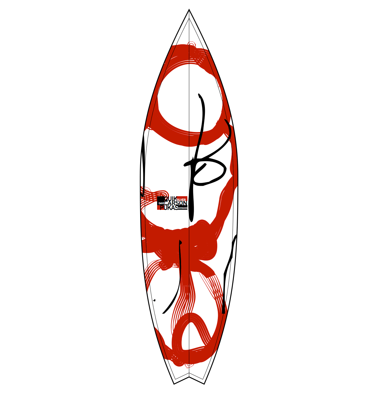
I decided to choose David Carson for my first designer, and I chose him because, like me, he follows the culture in surfing and creates a lot of branding for surfing based company’s/ magazines. The work I in particularly liked was the designs on the surfboards themselves, because as a consumer of the products and also an admirer of the art that goes onto them, I felt that this had a very eye catching design and also minimal. You can see on the board that it follows Carsons style because he’s known for a controlled/ scattered approach to his work, for example a lot of his typography based work is revolving around a few key areas then has a lot of different sizing and overlapping. You can see that process in this board where the quality and thickness of line is different and dotted around in what appears to be random but also tastefully placed.
Stefan Sagmeister is a graphic designer that took my eye and the style that he has in his art really grabbed my attention, especially the album cover he made for the rolling stones, Bridges to Babylon. It made me look twice because I saw a similar approach to another piece he did where he cut out shapes on his face then put a background behind it and I thought it worked really well, yet this one I much prefer the design he cut out and the background compliments the key feature of the album cover, the lion. “I had to come up with an idea for that new brief in time for another meeting that same day” (Heraldsun.com.au, 2017) he also showed he had a talent for creating ideas quickly and has a total understanding of his niche which I very much respect.

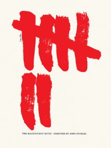
As I am a fan of a minimal approach to advertisement, I Thought Saul Bass’s posters for film were very clean and interesting. I personally liked the poster he made for ‘The Magnificent seven’ because of the striking red paint like strokes showing the number seven really makes you look and is easily distinguishable as that film after you’ve seen it once you’ll always recognize that it’s the film magnificent seven. It also doesn’t clutter your eyes with unneeded information just the key number that’s in the title is the only focal point and that is always easier to remember than a load of random images.