Author Archives: Kyle Edwards-Williams

Conclusion

In developing as a creator and designer I not only need to gain practical skills and techniques to become well balanced. In order to mature to my full potential growing my skills in communication, investigation and research of information will enable me to grasp better understandings for situations in my creative future. Through out the past weeks the Research and Communication Skills lectures has shown me a variety of past and present artist, all in which can give me beneficial inspiration, as well as that, learning about the changes throughout the 20th century betters my understanding of why things are the way they are now.

Looking into individual art movements in the 20th century one by one was very intriguing. Through using research resources such as the Internet and library I could delve deeper into these specific art movements. I could see how certain events, political situations and public ideals shaped these movements, such as Constructivism and artist Aleksandr Rodchenko who was “promoting the ideas of the government, particularly with his graphic design”.

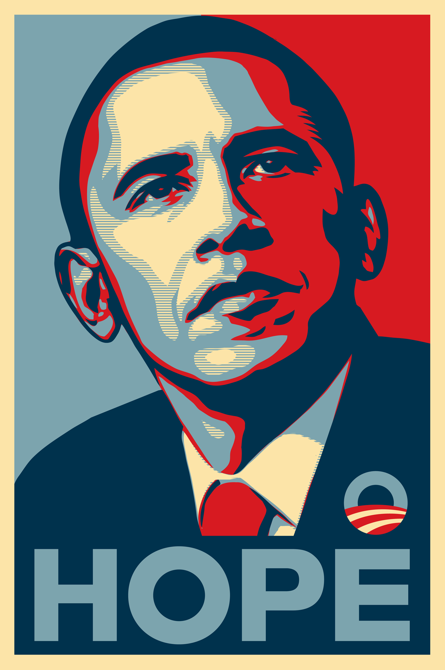
Being interested in graphics design and illustrations, the ‘Research and Communication Skills’ module has shown me the progression of things I find interesting, widening my prospective and views. Also I’ve been able to find artist like El Lissitzky, a Russian Designer who developed Suprematism which uses shapes in a minimal manner as the key values. As a designer who prefers a minimal approach to design, finding out information like this ultimately helps me to create a variety of different work. I can now even notice popular artist currently who have taken inspiration from older movements, one being Shepard Fairey whose work resembles constructivism. A lot of his work might be screen printing but what inspired me in his work was the powerful messages that can be transferred across to an audience and that relates to who I am as a designer and where want to be heading.

Image result for El Lissitzky,Image result for shepard fairey we are the people

As well as learning about connections between my work and the past. There has been task where I’ve needed to express my opinion. I’ve played devil’s advocate in situations where I needed to give valuable reasons for and against in certain topics. Learning to research is just as important as my communication of what I’ve learnt, me being able to give constructive opinions will help in many ways – “engage with their audience, and effectively communicate their skills and expertise.”.

Overall I found this module very useful. To begin with it has already given me a greater in sight into art, inspiring me with a variety of new learnt movements and artist. Already I am reaping the benefits of this research, in my current work I have been able to come up with more creative ideas and been more willing to test the boundaries within my own work.


Bibliography

Kate Makie “engage with their audience, and effectively communicate their skills and expertise.”, (2017) : https://artrepreneur.com/art-student-communication/

El Lissitzky “5. Globetrotter (in Time)”, (1923) : http://www.tate.org.uk/art/artworks/lissitzky-5-globetrotter-in-time-p07142

Shepard Fairey “Greater than Fear”, (2017) : https://obeygiant.com/people-art-avail-download-free/

Publish or Perish

For this task I’ll be choosing three published images, which in some way share some relevance with me. Then by using the words story, message, feeling and connection to analyse my images. The first published image is a magazine cover from Little White Lies. The illustration on the cover was created by Joe Wilson depicting a character from the movie ‘Attack the Block’. Wilson’s illustration has a very dramatic style; the use of lines has this hand drawn aspect which carry’s a lot of texture in the image. Due to the blues and dark blues this illustration comes across with a mysterious tone giving off a spooky message, however this works well because these feeling correspond with the movie shown.

Image result for attack the block little white lies

There are lots of images that can carry many emotions with in them and this specific poster by Shepard Fairey is exactly one of those. What is very powerful about this poster is the genuineness coming across in Obama’s face this directly links with the overall massage, “HOPE” its even written across the bottom of the poster in large just to reinforce the point. Additionally I really like how Fairey has decided to use these patriotic colours, the blue representing the democrats and the red being the republicans. These colours to me are trying to connect the people and show them that they can move forward together.

Image result for obama hope

Another one of my interest also includes photography, so this next image was very fascinating to me. This last image is a photograph taken by Aleksandr Rodchenko, “The Stairs”. The photo shows a woman alone carrying her child holds some expression to the image. The emptiness of the photo forces you to focus on the loneliness of the woman as she walks up the stairs, you think about why she’s alone in the middle of a city setting. I found very appealing the sharp contrast and the heavy shadows in the image, this just adds to the barren tone of the photo.

Image result for Aleksandr Rodchenko, The Stairs


Bibliography

Joe Wilson “Little White Lies – Attack the Block”, (2011) : http://www.joe-wilson.com/little-white-lies-covers/

Shepard Fairey “Obama Hope”, (2008) : https://obeygiant.com/obama-hope/

Aleksandr Rodchenko “The Stairs”, (1930) : http://davidsartoftheday.blogspot.co.uk/2015/04/aleksandr-rodchenko-stairs.html


Postmodernist Art

The postmodernism art movement developed as a departure from modernism, which was wide-spread since the early 20th century. It was around the 1960s where postmodernism took place; it was used to express changes and challenges to do with beliefs and structures around western society.

This first postmodernist piece of art is an acrylic painting by artist Roy Lichtenstein, “Whaam!”. What caught my attention about this piece initially was how Lichtenstein uses of line; the thickness of the lines are very striking giving off this comic book look which has a softer and more fun tone. The tone fits with how Lichtenstein likes to create, using commercial sources or advertisements that might contain emotional material; he would like to draw over them. Later he would do this through paint; creating powerful pieces through this medium causing onlookers to understand the deeper meanings.

Image result for whaam roy lichtenstein at tate modern

The next postmodernist work is a screen-printing by Shepard Fairey, “Power and Equality”. Many of Shepard Fairey’s designs have a strong resemblance to original constructivism posters, designs that carried ideals of people’s true expression. With this design comes a powerful message and that’s what initially caught my attention. Through printmaking the artist illustrates the black community of the 60s through this woman, she is depicted looking strong and independent, her eyes envisioning a future where a promised equality can be held. The eye-catching colours drew me into this design and because of the use of reds contrasting strongly with the blacks I almost felt like the message being carried within the colours. “The way I make art – the way a lot of people make art – is as an extension of language and communication” said by Shepard Fairey, this is very much in the way I want my art to be also, to translate meaning messages.

Image result for shepard fairey power and equality

Lastly I have work from designer David Carson. Well known for his Ray Gun magazine covers this design like many others caught my attention through the use of typography. The types layout is very unconventional whilst being very creative at the same time and keeping this minimal esthetic. Overall a fun and lively way to design type.

Related image


Bibliography:

Roy Lichtenstein “Whaam!”, (1963) : http://www.tate.org.uk/art/artworks/lichtenstein-whaam-t00897

Shepard Fairey “Power and Equality”, (2007) : http://www.artnet.com/artists/shepard-fairey/power-and-equality-DyjglHAejqMXtw7EhXJW6w2

Shepard Fairey ““The way I make art – the way a lot of people make art – is as an extension of language and communication” : https://www.brainyquote.com/quotes/shepard_fairey_624136

David Carson “Ray Gun – Sweet Jane’s” cover, (1997) : https://janesaddiction.org/gallery/articles/raygun-sweet-janes-november-1997/

Counter Culture of the 60’s and 70’s


The Counter Culture movement took of in the 1960s and was popular throughout the west especially in countries such as the USA and the UK. This anti establishment culture focused on breaking the views of what was once acceptable. Topics relating to woman’s rights, drugs, and racism were all slowly becoming possible.

For my first image I chose a front cover from The Chicago Seed, an underground newspaper formed by artist Don Lewis and Earl Segal. This front cover was published in 1967. I’m unaware of the specific designer however what caught my attention was the use of colour coupled with the typography. Using minimal colour and sticking to a basic colour scheme appeals to me because this is the way in which I like to design. The combination of the photography intertwined amongst the text captured me because of its edgy and unorthodox approach.

My next piece of work of interest is a poster by Victor Moscoso, a San Francisco artist who’s known for is a psychedelic poster during the 60s and 70s. This specific poster is “The Chambers Brothers”, compared to his other designs this one is quite tamed yet this is the reason this is my favourite poster by this artist. Once again this poster combines imagery and type, the composition of the photo is centred and being a fan of photography a can approach this symmetry. My favourite aspect of this design is the colour pallet, while being vibrant and visually representing the psychedelic era of the 60s. Moscoso uses a hue of colours representing a sunset giving off a visually alluring appeal.

Finally, the last image is slightly different from the other. This image is a Record cover designed by Reid Miles, he’s most known for his work for Blue Note Records. Described as “A genius, ahead of his time, and the way he treated the typography as visual elements that can be broken apart and form something new still feels fresh.”. A very true stamen in my opinion, the typography used is unconventional its uniqueness is very creative especially for its time. Also the layout on the whole is rather basic but this fits my less is more mentality.


Bibliography

The Chicago Seed, (1967) : http://www.jhalpe.com/items/view/9803

Victor Moscoso “The Chambers Brother”, (1967) : https://americanart.si.edu/artwork/chambers-brothers-54527

Riles Ried “The Rumproller”, (1965) : http://www.bluenote.com/artists/lee-morgan/the-rumproller

Viljami Salminen “A genius, ahead of his time, and the way he treated the typography as visual elements that can be broken apart and form something new still feels fresh.”, (2015) : https://viljamis.com/2015/the-iconic-work-of-reid-miles/

Is it possible to be truly authentic?

In the world of work and even education the value of your work will be judged immensely on its credibility, its authenticity to whom ever it was created by. For me the definition of something that is authentic is something that is genuine, of undisputed origin. However on inspection of this definition in my opinion I find it near impossible to say a piece of any work can be solely authentic with no inspiration, despite that; lets say an art design does take small inspiration from something else, it would be wrong to discredit the artist of his or her authenticity. Subconsciously or not we all take inspiration from the things we see and hear in our environment and it will be translated into our work, even in my own work I notice this. Whilst at college a front cover I made was original and authentic to me, all be it I know that I took inspiration from minimalism, artist Kenjiro Sano, typography techniques, etc. Nonetheless from my point of view this doesn’t remove my authenticity as a designer.

Modernism was a movement in the early 20th century focused on deliberately rejecting the styles of the past and experimenting in new techniques that reflect the progressing society and moving towards the future. Artists AndrĂ© Derain and Henri Matisse are co-founders of Fauvism. A movement “to break with traditional methods of perception” – Tate. These artists used vibrant and exaggerated colours unlike those before them. In my opinion, this was a period of time where artist were trying to break the mould and create their own authenticity .


Bibliography

Tate Modern, “to break with traditional methods of perception” : http://www.tate.org.uk/art/art-terms/m/modernism


“Technology is the mortal enemy of art”

As time progress and new forms of technology and programs are made, with that comes inventive and new art techniques created by artist all the time. In contrast to that, in the book ‘Manifesto of the Constructivist Group”, Aleksandr Rodchenko states his view by saying “Technology is the mortal enemy of art”. Although I believe that there comes many more benefits with technology but I can grasp and understand the view of Rodchenko.

Modern art is infused with technology, digital work is the norm now a days. Traditional standards seem to have been but on the side, medias such as stencil work, oil painting and the use of actually ink are rarely seen and viewed by the majority. Through modern technology many traditional techniques can be achieved through the screen, furthering new artist from the physical side of art, which I agree with however it’s through technology making some situations of creating easier allowing for more interaction for humans entering our creative world.

“Where would the Impressionists have been without the invention of portable paint tubes that enabled them to paint outdoors?” quote by Randy Rieland. Yes I agree fully with this opinion, new technology and inventions of current and even those of the past will draw us further from what was but ultimately, there were made to progress us creatively.


Bibliography

Randy Rieland (2014), “Where would the Impressionists have been without the invention of portable paint tubes that enabled them to paint outdoors?” : https://www.smithsonianmag.com/arts-culture/7-ways-technology-is-changing-how-art-is-made-180952472/

Compare and Contrast

Related image

Japanese artist Hirohiko Araki created this first piece of artwork. “Rohan At The Louvre” is the graphic novel created by Araki from which this image comes from. This poster is a hand drawing and through Araki’s unique art style where he likes to use these harsh lines and black areas to create depth and contrast on the page; this creates a vintage tone in his work that appeals to me. The use of colour is one of the most striking aspects of this poster, the purples contrast against the blues yet at the same time these colours work well with each other. These colours unify the page top to bottom. In fact the way Araki uses his colours reminds me of Victor Moscoso, these colourful and psychedelic arrangements that immediately catch the eye. The compassion and angle of even how this drawing was formed is quieting dramatic, adding to the bizarre features that caught my attention.

This next poster was created by another Japanese artist, this time a graphics designer named Kenjiro Sano. Kenjiro Sano made this poster for the Tama Art University, if was a collective series of posters called “Made by Hands” and this specific poster is one of 40 variations. Between these two posters I feel like they represent the two sides of my own interest of design. Kenjiro Sano’s poster is minimal; the use of black and white keeps the simple tone. It’s through the creative use of typography and imagery where the design excels, the repetition of the lettering and images creates this mirror illusion on the page.

Tamabi art ads by Kenjiro Sano (6)


Bibliography

Hirohiko Araki “Rohan At The Louvre”, (2009) : https://www.reddit.com/r/StardustCrusaders/comments/5tbaoe/absolutely_glorious_kishibe_rohan_pose/

Kenjiro Sano “Made by Hands”, (2013) : http://www.spoon-tamago.com/2013/05/09/made-by-hands-tama-art-university-ads-by-kenjiro-sano/


Terminal Bar

The short film “Terminal Bar” directed by Stefan Nadelman in 2003 is an award-winning American Documentary. The documentary is unique in the way it tells its story, mainly through the use of photos of the patrons of the bar taken by bartender Sheldon Nadelman over a ten-year period stretching from 1972 to 1982.

Typically you may think of a documentary being dry or slow-paced in its structure, however Terminal Bar surprised me with its fast paced and energetic tone through the use of the photographic portraits and a combination of music. In fact this style works well in building the environment in which this short film takes place, Time Square New York City. The fast paced non-stop life of New York is matched with the tone, enabling the audience to immerse themselves with in Sheldon Nadelman world. As well as portraying the lively atmosphere there are times where the movie shifts tone, slow pans into portraits, real audio from the streets, dramatic photographs, all of these aspects takes away the glamour of the City and show the grittiness of the bar and the surrounding area. Being able to see these darker conditions allowed me to sympathise and truly understand what the Terminal Bar genially meant for these regular bar inhabitants, this place allowed them to escape the stress and pressure of their lives and I can only imagine the solicitude between each other.

Overall Stefan Nadelman does a great job at visually showing the documented information from Sheldon Nadelman of the Bar in a way that will make understand what I might have been like to be there.