Author Archives: Sarah Willcocks

Summary

The research and communications module this semester has given me a newfound appreciation of the influences behind contemporary art movements. Learning about the development of art and design from the Avantgarde movement to Postmodernism has been fascinating. It has forced me to explore areas and styles that I have not researched before – for example I discovered I now love the style of 60s psychedelic underground culture, where garish, clashing colours were effective in engaging the viewer while having typography that was a statement against clear communication.

Learning about the transition of movements and understanding the reasons why change occurred has also helped me recognise the importance of design. Counter cultures I researched were interesting because of their various styles; they went against convention whether it was Shepard Fairey’s politically charged graffiti or jazz album covers by Reid Miles – they were made in retaliation of mainstream style. This is important because mainstream design and ideas should evolve and improve. In the future I want to look into more depth of these styles in order to develop my own style.

The connection between theory and practice is vital, knowledge of history in both its successes and failures educates us for the present. On reflection the lecture on postmodernism has aided me in discovering a major influence on my future graphical practice. Swiss Style had always appealed to me but I could never address what the style was. I am now conscious of the”less is more” approach in my future work and I now recognise why the appeal of work from Wolfgang Weingart and Armin Hofmann has stood the test of time; researching their experimental practice in regards to manipulating typography and image through layering and photography while observing what I like about their work has encouraged me to take inspiration and experiment to create my own style. This has been beneficial to my graphic design rotation where in studio based work I have struggled to manipulate typography; now I have a basis of knowledge to aid my decisions by comparing with the work I like and use the processes I’ve learned are behind it, this also gives an idea of the impact certain design can produce in order to improve my own.

This module has also exposed me to different ways of thinking making me more mindful of the factors that are influencing how art has changed and how it is changing. The quote “technology is the mortal enemy of art” from Rodechencko’s 1922 constructivism manifesto was an interesting concept that has made me reflect on how technology has had an effect on not only how I experience art but also how I make it. This has influenced my opinion on finding inspiration for my studio based work; I now think I should go to more galleries try and look for inspiration everywhere rather than rely on the internet to find something that relates to my research, if I’m struggling with designing on a screen i should try designing off screen.



Publish or Perish!


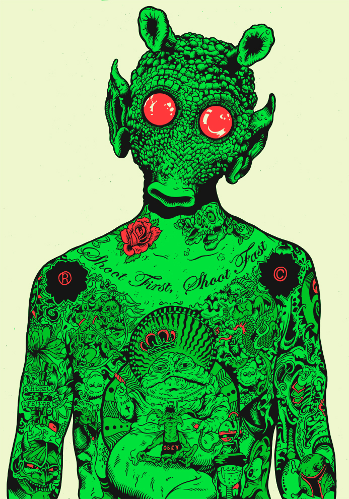
Tim McDonagh is a freelance illustrator that I connected with after attending a presentation by him in my foundation art course. My interest started with his ink pen and digital techniques that produced an amazing colourful style.


Greedo.jpg

“Greedo” Pen ink on paper,2015. Illustrator: Tim McDonagh[6]

“Greedo” is a unique piece of work; rather than for a client this illustration was made out of his own interests – the story being his love of Star Wars. It was from this image that he was noticed by Egmont uk to create illustrated STAR WARS: GALACTIC MAPS. His advice to aspiring illustrators was to “be sure to create work that you love and that you enjoy working on.” The work and clients will come later on” as an aspiring illustrator I connected with this because there is usually such heavy focus on tailoring style and design to a brief(or client) where developing my style should also have more emphasis.[2]


Image result for david foldvari witches liberia

“Witchcraft in Liberia”, Animation, 2016. Illustrator: David Folvari.[3]

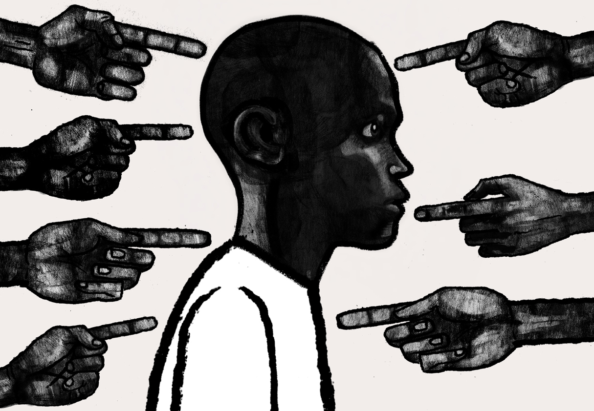
David Foldvari is another illustrator I find relevant to my interest in illustration and in developing my own style; this image was from an editorial for the Telegraph on child witches in Liberia that was about the unfortunate story of a child accused of witchcraft.[5] Foldvari’s saturated black ink on a white background is an example of how style can influence the feeling of the subject; his style can cover darkly political subjects with its dark appearance. I also connect with his concern “that we’re going to go back to the ’80s and people are going to think illustration is nicey-nicey and not saying much”[4] I think its important that illustrations say something in order to help educate and communicate, Foldvari does this though editorial illustration that articulates news articles, issues and viewpoints from just an image, otherwise why have an illustration?

"Stadt Theater Basel" offset lithograph,1963. Designer: Armin Hofmann

“Stadt Theater Basel” offset lithograph,1963. Designer: Armin Hofmann[1]

I am interested in the manipulation of photography with typography and one of my favourite graphic designers Armin Hofmann does just this. This poster shows how condensing simple visual elements (in very much Swiss design style) can be incredibly effective for communication. For me it gives the feeling of movement and performance like shadow puppets which is fitting for message of Basel theatre. It is also a good example of how effective photography can be without the clearest resolution. “Sensible and meaningful form of advertising can be achieved by simplification of the formal language and by restraint in the treatment of the verbal message” I connect with this because in a world bombarded with colour, imagery and information it is important to remember sometimes simplification is most effective to communicate graphically.

References

[1] AIGA | the professional association for design. (2011). 2011 AIGA Medal: Armin Hofmann. [online] Available at: https://www.aiga.org/medalist-arminhofmann [Accessed 3 Dec. 2017].

[2] Floyd, J. and Floyd, J. (2017). Star Wars: Galactic Maps Illustrator Tim McDonagh Interview | StarWars.com. [online] StarWars.com. Available at: http://www.starwars.com/news/charting-the-galaxy-an-interview-with-star-wars-galactic-maps-illustrator-tim-mcdonagh [Accessed 2 Dec. 2017].

[3] Foldvari, D. (2016). Witchcraft in Liberia. [Blog] davidfolvari. Available at: http://davidfoldvari.blogspot.co.uk/2016/08/witchcraft-in-liberia.html [Accessed 3 Dec. 2017].

[4] Ideastap.com. (2016). David Foldvari: Illustrator. [online] Available at: http://www.ideastap.com/ideasmag/the-knowledge/david-foldvari-interview [Accessed 3 Dec. 2017].

[5] Rowley, T. (2016). The child witches of Liberia. [online] S.telegraph.co.uk. Available at: http://s.telegraph.co.uk/graphics/projects/child-abuse-witches/index.html [Accessed 3 Dec. 2017].

[6] TIM MCDONAGH. (2017). PORTFOLIO. [online] Available at: https://www.mcdonaghillustration.com/#/greedo/ [Accessed 2 Dec. 2017].

Remake, Remodel: The Postmodernism Condition


Postmodernism emerged in the 1960’s that opposed Modernism. Focused on individual interpretations it rejects a single style that collapses barriers between high and popular culture. It is an idea that focuses on deconstruction for understanding.[6]

“Kunstkredit Basel 1976/77” Worldformat poster for Kunsthalle Basel, film layering, 1977 Designer: Wolfgang Weingart (First worldformat poster)

“Kunstkredit Basel 1976/77” Worldformat poster for Kunsthalle Basel, film layering 1977 Designer: Wolfgang Weingart (First worldformat poster)[1]

Graphic designer and typographer Wolfgang Weingart demonstrates deconstruction in the experimental nature of postmodernism with his heavy focus on typography.

 “I was motivated to provoke this stodgy profession and to stretch the typeshop’s capabilities to the breaking point,” Weingart in the retrospective Weingart: Typography—My Way to Typography, published by Lars Müller in 2000[1]

This poster demonstrates Weingart’s experimentation of creating image and type; the use of ben-day dots with halftone screens, using a high accuracy repro camera to manipulate type was a profound new way of meshing image and type to make graphical masterpieces.[1] This is relevant to my own work; it displays fearlessness to experiment with typography. In my own practice manipulating type can often feel limited to a screen but Weingart demonstrates analogue manipulation can have impressive results. I love the style of layering images; line and photography is presented in a visually appealing way that inspires me to experiment with composition and develop my own graphical eye.


The Who,Quadrophenia (1973) photographed by Ethan Russell

The Who created an album based on a young Mod named Jimmy. The photographs visually narrating the character in the album were captured by Ethan Russell.[2][3]

“My work always was rooted in what I found interesting and I always had this interest and engagement with the singer-songwriter that would inform the way I might take an image.” Ethan Russel interview with Chris Owyoung by Andew Fingerman.[5]

This photograph inspires me because it shows how narrative can effectively give direction to a photograph. It shows collaboration where somebody who communicates through music is translated perfectly with image; therefore is a successful design. What has drawn me to this particular photograph is Russell’s deconstruction of what the artists wanted in the narrative then building the perfect photograph to match the atmospheric story as well as working graphically to present the band in the cover; producing a visually stunning image.


(Fairey, 2013) Sedation Pill

Shepard Fairey’s bold and vibrant style originated from DIY graffiti stickers and evolved within the skateboarding scene to the Obey brand today.[8]

Fairey’s work has deconstructed the barriers between street art and the high-art world and has exploited politically charged concepts whether in an act of rebellion or an ironic nod to propaganda. This image “Sedation Pill” shows his signature bold style while reveals a statement on America’s “indifference and complacency about important issues” Fairey, (2013); originally he has been lighthearted with the impact of his work but is now using his notoriety to mention more serious issues. This poster holds relevance to my work because it is communicating concepts that are important to him as a designer, which is a goal of my own.[7]


References

[1] AIGA | the professional association for design. (2017). Wolfgang Weingart. [online] Available at: https://www.aiga.org/medalist-wolfgang-weingart [Accessed 11 Nov. 2017].

[2] Apple Music. (2017). Quadrophenia (Remastered) by The Who on Apple Music. [online] Available at: https://itunes.apple.com/us/album/quadrophenia-remastered/id705360660 [Accessed 11 Nov. 2017].

[3]En.wikipedia.org. (2017). Mod (subculture). [online] Available at: https://en.wikipedia.org/wiki/Mod_(subculture) [Accessed 12 Nov. 2017].

[4] En.wikipedia.org. (2017). Shepard Fairey. [online] Available at: https://en.wikipedia.org/wiki/Shepard_Fairey [Accessed 13 Nov. 2017].

[5] Fingerman, A. (2017). History, Rock ‘N’ Roll and The Many Lenses of Ethan Russell. [Blog] Photoshelter Blog. Available at: https://blog.photoshelter.com/2010/03/history-rocknroll-ethan-russell/ [Accessed 12 Nov. 2017].

[6] Hodge, S. (2011). 50 art ideas you really need to know. London: Quercus Publishing plc, p.205.

[7] Obey Giant. (2017). Sedation Pill – Obey Giant. [online] Available at: https://obeygiant.com/prints/sedation-pill/ [Accessed 12 Nov. 2017].

[8] Shepard Fairey and Postmodernism. (2017). [Blog] Design Dialogue. Available at: https://wordpress57027.wordpress.com/2017/04/06/shepard-fairey-and-postmodernism/ [Accessed 13 Nov. 2017].

Sensibility, Spirit and Meaning – Underground 60’s and 70’s Culture


The 60’s and 70’s birthed an underground movement of the psychadellic era; its bubble lettering, op art graphics and collage effects expressed a new culture in a form challenging the previous professionalism of what graphic design had become.

Victor Moscossoco

Moscoso, V. (1967). Rites of Spring. [Colour offset lithograph] San Francisco.

“The goal of my posters was, ideally, if somebody was across the street, they’d see the vibrating colors and say, What’s that?” – Victor Monscoso, the PARIS REVIEW [2]

Moscossoco work is acclaimed to be iconic in the psychedelic era;[1] utilising vibrant colour to attract the attention of his audience, Moscossoco’s work opposed mainstream capitalised graphics in a way that made the counterculture stand out. The spirit of his work was to design for the new psychedelic era; the core of this was a newfound output for creative liberation though sexuality, music and art. The meaning of his work was the communication between the physical rules of perception and psychic effect.[3] What is relevant to my work is the deconstruction of rules to stand out to his audience, to communicate sensibility, spirit and meaning with image and text is what I think all illustrators and graphic designers aspire towards.

Hapshash and the Coloured Coat

Poster by Hapshash and the Coloured Coat (Michael English and Nigel Waymouth)
London, 1967

Michael English and Nigel Waymouth formed Hapshash and the Coloured Coat to produce posters for the underground scene in London [4] They utilised gold and silver inks with fluid typography contrasted with the use of vivid colour; very distinctive in comparison to London flyer posters at the time. ‘People who were interested would find out the hidden messages rather than having them shoved in their face.” Nigel Waymouth [5] Hapsash wanted maximum visual impact with minimum text.

Much like Moscosos work the sensibility of these posters was to draw attention to a movement that was under the radar that was colourful and new in comparison to mainstream design. What is also apparent from the work of Hapshash and the Coloured Coat is the experimental freedom that designers expressed through this movement.

Blue Note Records- Francis Wolff and Reid Miles 

Herbie Hancock: My Point of View   Label: Blue Note 4126   12″ LP 1963 Design and photo: Reid Miles

Jazz “Hard Bop” was another underground culture gaining solid footing in the 60’s. Blue Note Records was an alternative music label where Stephan Wolff was a major photographer in documenting performances of musicians capturing the evocative atmosphere of each musician. Designer Reid Miles “Artfully cropped” these images and inventively manipulated colour with punchy typography creating iconic album covers of Blue Note Records.[6]

This particular cover captured my attention because of my interested in how the composition of photographs makes a photo become a structured piece of aesthetically appealing graphic design in simple form. The use of a photograph cropped down with neutral colour and negative space makes something quite ordinary appear abstract.


References

[1] Victormoscoso.com. (2017). Victor Moscoso >> Neon Rose Series. [online] Available at: http://www.victormoscoso.com/gallery1.htm [Accessed 6 Nov. 2017].

[2] Rudick, N. (2015). [online] Available at: https://www.theparisreview.org/blog/2015/03/30/only-the-dreamer-an-interview-with-victor-moscoso/ [Accessed 6 Nov. 2017].

[3] transpersonalspirit, V. (2017). Psychedelic Poster Art: Victor Moscoso. [online] Transpersonal Spirit. Available at: https://transpersonalspirit.wordpress.com/2012/11/10/psychedelic-poster-art-victor-moscoso/ [Accessed 6 Nov. 2017].

[4] Vam.ac.uk. (2017). UFO Club poster by Hapshash and the Coloured Coat – signed screenprint. [online] Available at: https://www.vam.ac.uk/shop/ufo-club-poster-by-hapshash-and-the-coloured-coat-signed-screenprint-147334.html [Accessed 7 Nov. 2017].

[5] Hoggard, L. (2017). The revolutionary artists of the 60s’ colourful counterculture. [online] the Guardian. Available at: https://www.theguardian.com/artanddesign/2016/sep/04/revolutionary-artists-60s-counterculture-v-and-a-you-say-you-want-a-revolution#img-1 [Accessed 7 Nov. 2017].

[6] Michael Cuscuna Talks About Francis Wolff. (2011).

Technology is the Mortal Enemy of Art?

Technology is impossible to avoid in the modern western world, technological advances have increased the living age, made it easy to travel, communicate and educate. But when it comes to creativity some claim technology is the “mortal enemy of art” Alexander Rodchenko, 1922. I think this is an interesting discussion as a designing practitioner in the 21st century.

Constructivist Manifesto written by Aleksandr Rodchenko, Varvara Stapanova, and Aleksei Gan.[1]

In history technology has pushed the innovation of art, it has been a tool of expression that has made ideas easily “pointed out” and “announced”- which ironically matches a line of Rodchenkos manifesto (p12). An example of this is Dziga Vertov’s Man With a Movie Camera. (1929) This film challenged mainstream filmmaking and did so using a new way of filming [1]. This is one small example of how technology, in the past, has enabled change and evolution of art that is still celebrated today.

Dziga Vertov’s classic, experimental ”Man With a Movie Camera.” (Walker Film)[3]

To agree with Rodechenko, technology was probably the mortal enemy of the art that he had known: traditional fine art that is viewed in a gallery and studied in person rather than from an abundance of art from a screen. But even then film and photography were developing at an exponential rate from the early to mid 1900’s.

However I have grown in an age where there is so much information, tools and access to art at my fingertips from technology that I could not have an unbiased view. I have not witnessed a change of what art has been to what it is now. I do think technology is not the mortal enemy to all art but I believe it has aided some more than others.

References

[1] issuu. (2017). Who We Are: Manifesto of the Constructivist Group. [online] Available at: https://issuu.com/rachelgweeks/docs/manifesto_issuu [Accessed 27 Oct. 2017].

[2] Twincities.com. (2017). Walker’s summer movie series obsessed with pop culture. [online] Available at: http://www.twincities.com/2016/06/01/walker-summer-music-movies-series/ [Accessed 27 Oct. 2017].

[3] Walsh, D. and Laurier, J. (2017). Dziga Vertov’s “The Man with a Movie Camera”: One of the films you must see!. [online] Wsws.org. Available at: https://www.wsws.org/en/articles/2017/05/06/sff4-m06.html [Accessed 27 Oct. 2017].

Bryce Wong and Armin Hoffman, So What? Task 2

Bryce Wong is a contemporary illustrator educated in industrial design. His illustrations break away from the rules of formulaic drawing as would be encountered in the technicalities of industrial drawings; this not only makes his illustrations unique but appears as a counter culture of creativity against the cold industrialisation of drawing [5]. For example his ‘Deep Down’ illustration dissects an iconic silhouette of Christianity’s Mary to reveal a red cracked skull; this breaking down of a widely recognised subject with a creative and jarring red image can be seen as appealing to his audience as countering the culture of iconic art.

[4]

Similarly Graphic designer Armin Hoffman was an influential educator when it came to unorthodox techniques in his time. Hoffman was a proponent of Swiss style and of Modernism that reduced design to the basics of colour and Graphic form.[1][2] In his Giselle poster Hoffman used a soft black and white blurred photograph with a column of clean sans serif Helvetica typeface; very different to the mainstream use of illustration and serif typefaces. The result; his poster and use of the Swiss style has continued to appeal to audiences even 58 years later.[3]


Hoffman took the visual formula that was popular at his time and created a simplified style that has been manipulated to engage the same audience. Wong has done the same on a smaller scale. What is also interesting is the simple use of colour. Both utilise black and white, this has been a key part of engaging audiences in a world where colour is the norm in visual design.


References

[1] En.wikipedia.org. (2017). Armin Hofmann. [online] Available at: https://en.wikipedia.org/wiki/Armin_Hofmann [Accessed 7 Oct. 2017].

[2] En.wikipedia.org. (2017). International Typographic Style. [online] Available at: https://en.wikipedia.org/wiki/International_Typographic_Style [Accessed 7 Oct. 2017].

[3] Heller, S. and Anderson, G. (2016). The graphic design idea book. London: Laurence King Publishing Ltd, pp.12-13.

[4] Instagram. (2017). Instagram post by Bryce “The Sandman” Wong • Aug 7, 2017 at 7:02pm UTC. [online] Available at: https://www.instagram.com/p/BXgOpgBBXK3/ [Accessed 6 Oct. 2017].

[5] Jung, I., Chatschatrian, L. and Kimoto, Y. (2017). Interview with 100FOR10 artist Bryce Wong – 100 FOR 10. [online] 100 FOR 10. Available at: http://100for10.com/interview-100for10-artist-bryce-wong/ [Accessed 6 Oct. 2017].


Is it Possible to be Truly Authentic?

A definition of Authentic:

“Of undisputed origin and not a copy; genuine.” Oxford Dictionaries[1]

From this definition authenticity is “not a copy”. This could be interpreted that creative work can be authentic as long as it does not copy.

During the early development of the Modernism movement photographer Paul Strand captured abstract angles (as inspired by the Constructivism movement) that created a Utopian effect, from this Artist Edward Hopper was influenced by this style and produced paintings with a similar effect.

These examples are relevant today because modernism as a principle strips away old convention to the bare bones of simple style in pursuit of making new, this still holds value in modern practice, we see these principles in our everyday lives with the use of abstraction and sans serif design.

The argument to Hoppers authenticity could be the differences in subject matter and media. He was influenced by an artists work but interpreted with his own style and ideas to create an original concept.

Strand, P. (1915). Wall Street. [Platinum palladium print] New York: Whitney Museum of American Art, New York; Gift of Michael E. Hoffman in honor of Sondra Gilman. [2]

Nighthawks by Edward Hopper 1942.jpg

 Hopper, E. (1942). Nighthawks. [Oil on canvas] Chicago: The Art institute of Chicago. [3]

However it can be disputed that elements of one work have been copied, the specificity of what makes a copy is open to interpretation; one definition being “A thing made to be similar or identical to another” Oxford Dictionaries [4]. If Hoppers Nighthawk shares similarities to Strands work such as the lighting contrasts and abstract subject matter but is different in media then is it truly authentic?

I think it is impossible to be truly authentic; we learn from history with even new ideas and styles can be related to another even subconsciously in some way.


References

[1](Oxford Dictionaries | English, 2017) Oxford Dictionaries | English. (2017). authentic | Definition of authentic in English by Oxford Dictionaries. [online] Available at: https://en.oxforddictionaries.com/definition/authentic [Accessed 28 Oct. 2017].

[2] Collection.whitney.org. (2017). Whitney Museum of American Art: Paul Strand: Wall Street, New York. [online] Available at: http://collection.whitney.org/object/7841 [Accessed 29 Oct. 2017].

[3] Artic.edu. (2017). Nighthawks | The Art Institute of Chicago. [online] Available at: http://www.artic.edu/aic/collections/artwork/111628 [Accessed 29 Oct. 2017].

[4] Oxford Dictionaries | English. (2017). copy | Definition of copy in English by Oxford Dictionaries. [online] Available at: https://en.oxforddictionaries.com/definition/copy [Accessed 28 Oct. 2017].


Terminal Bar

“If you don’t put it down on paper nobody knows” Sheldon Nadelman who between the years of 1972 and 1982 was the manager of Terminal Bar in 8th Avenue New York. Nadelman documented the life of the bar by photographing the people who passed through its doors for 10 years; this included the faces of actors, cooks, pimps and drug addicts. His collection now acts as a record of a bar with many stories. In 2002 his son Stefan Nadelman created a film dedicated to the forgotten story of the life in and around Terminal Bar.

The soundtrack was a fundamental part of editing, starting with street noise that paired with the rolling photographs of New York City transitioned like the rolling out of old film. What follows is the chronological appearance of black and white photographs of many rugged faces holding the gaze with the viewer; this shows a closeness with Terminal Bar, these people are its identity- all of which fade back to black as a metaphor of them disappearing from the streets. A panning in and out of news articles of the narrative dialogue gave the effect that what’s going on in Terminal Bar is the newest and most exciting scene.

The beat of the film adapts like the bar does to its customers, staying true to his father’s still photographs panning and zooming in on details to match the point of narration gives them movement. The photos further come to life with his fathers accounts of certain characters grouped together in relationships, any focus of a character darts into another, with period of photos flashing and moving to a slow or high tempo beat mimicking the movement of people in and out of the bar.