Throughout this Research and Communication Skills module I have enjoyed exploring the history of art, its development from movement to movement and seeing how artists respond to social, political and cultural issues of their time through their artwork. I have now realised how important it is to understand and to keep up with contemporary issues as I can use these as a source of inspiration or as a starting point in future projects. Understanding how artists of different art periods responded to their issues can help me to understand how to respond to contemporary issues in appropriate and relevant ways. For each art movement a set of designers, illustrators and photographers were presented and I see this collection of creatives as resource I can look back to if I need inspiration or am stuck whilst working on a project.
A lecture that was of particular interest was about the Avant Garde and discussing the influence of technology in the industry. Throughout my projects I almost never used technology to aid me and the same goes for my own personal projects, which is probably why I haven’t developed a reliance on it and why I never understood why artists revered it so much as a creative tool. It was only at art foundation where I first came into contact with software such as Dragonframe, Adobe Illustrator and Indesign that I fully understood its potential. Without the help of technology the comics that I read would not be as captivating as they are. Furthermore, during this lecture I understood that using technology to create art doesn’t have to be considered as ‘cheating’ but can be used to aid creatives to fully realise their ideas. However, I also believe that it is important to not be heavily reliant on technology as it does not give you all the answers and it is helpful to go back to basics with pen and paper.
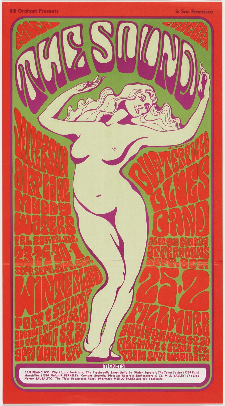
An influential reference I came across in the lecture series was Wes Wilson, who designed some of the most well known concert posters of the 1960s, work “that combines an incredible kaleidoscope of vibrant acid colors with highly creative hand-drawn lettering and illustration”1 As an illustrator who finds it difficult to employ typographical skills his work is of most interest to me due to the fact that he is working with both image and text, so whilst creating fantastic imagery he is still applying typographic rules. I struggle to combine the two elements together so it is always helpful to explore how other designers use them in their work and see what I can learn and then use in my own practise. Additionally, Wilson uses the lithograph technique to create his posters and after completing the illustration rotation with a screen-printed comic, I am much more interested in the printing medium and I like to see the different outcomes it can produce whilst also exploring and pushing its limits.
 2
2 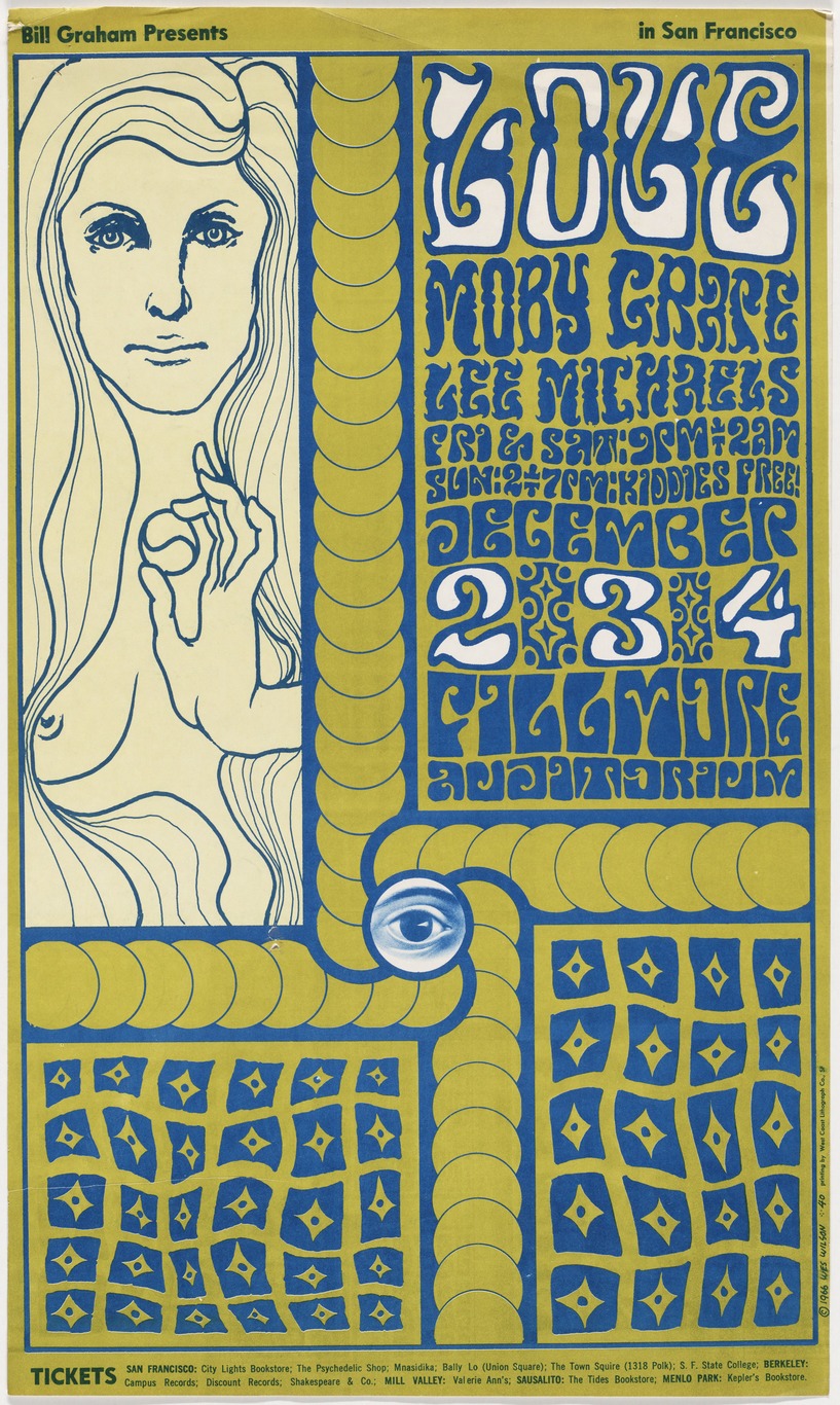 3
3
1Brignall, C. (n.d.). The Psychedelic Poster Art of Wes Wilson. [online] Wes Wilson. Available at: http://www.wes-wilson.com/the-psychedelic-poster-art-of-wes-wilson-by-colin-brignall.html [Accessed 4 Dec. 2017].
2Wilson, W. (1966). The Sound. [Lithograph] Museum of Modern Art.
3 Wilson, W. (1966). Love, Moby Grape, Lee Michaels. [Lithograph] Museum of Modern Art.