Author Archives: Rachel May

TASK 11 & 12

Reflective Writing

Overall, I have found the research and communications module surprisingly useful. I have gathered many techniques for finding better sources of information, which I previously did not know. Looking forward I will be using these techniques in my research for my projects, to make them more well-rounded.

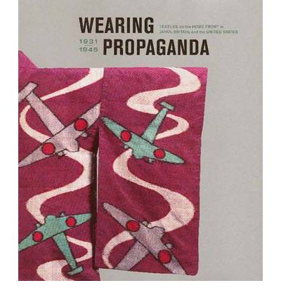
Firstly, for task 1 and 2 I decided to look at the works of Dieter Ross, from a book I found in library. The task was to scan an image from a book, and then find a photograph of an object, garment or textile from a website that relates to it. Furthermore, identify a museum or archive that provides information to broaden my understanding of the image and object. Considering I had never had to find online archives in museums, I found it rather easy to locate the one specified for my image of the book I choose. On this front, I believe I was lucky as the description of the image said that it was displayed at the Schimmel Museum. I think this was useful as on the museum website, although a bit sparse of the information I wanted, provided extra information which I did not know. I believe this would be useful to look out for and use in upcoming projects.

Task 3 and 4, the introduced me to Harvard referencing. Before this task, I never realised the true importance of correctly referencing work, and how if not doing so is plagiarizing others work.  This is not just importance for the artists which work we draw inspiration from; but also for myself as an artist, and be to protect my work and my rights. At first, I found the referencing very slow, especially when looking on websites and for newspaper articles. On many websites, you had to really dig for the information you wanted, and it was interesting to see how on some, few websites credited the actual author, and were defaulted to the websites overall publisher. Going forward I will use the Harvard referencing system on my referencing, but due to how time consuming it can be; will now be more selective with my sources, to not over extend myself with referencing too many things.

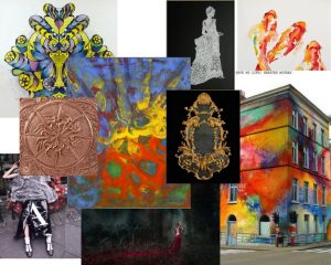
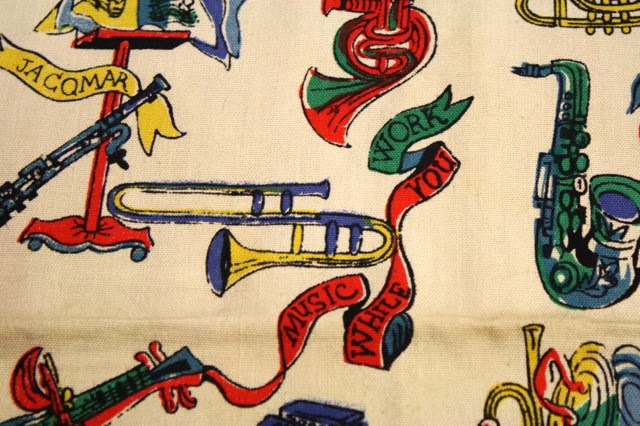
Moving on to task 5 and 6, we were tasked to create a mood board of the visual references, which we had selected to relate to what we thought a selected designer would have been inspired by. Then, we were asked to select one of these images, and write an analysis on it.   I found this rather refreshing, because it made me as a designer, really think and research about the inspiration behind my inspiration. For this task, I looked at Timorous Beasties, a relatively well-known print company. Visually when I looked at his work I could see some of his inspiration but it wasn’t until I went and looked on their website a visited their description, that I found what was truly behind Timorous Beasties. I liked the process of searching keywords from their over view to find more in-depth inspiration. It really opened my eyes to how many useful and inspirational sources their work was made up of. And through this I found the abstract painter Bill Jenson, whose work I found very interesting to analysis. Going further, I think I will use this method to steer away from using as many ‘big name’ designers, and go along this path of seeing where their inspiration came from to inspire me further; and broaden my research.

Task 7 and 8, I found very challenging. The task was to respond and reflect on a given text, in this case I those ‘Taste, Fashion and The French Fashion magazine’. I had never personally come across a text so difficult to read, and it was a real challenge to continuously look up complicated words and phrases. However, all the same, rather interesting and rewarding to discover the deeper meaning of the text. Usually, when gathering inspiration, I would steer clear for this kind of text, just because of how confusing it can be. However, going forward I think I might give it a second chance, as the quotes you can obtain and almost invaluable and I feel could add much depth to work.

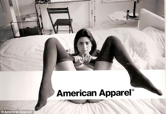
Finally, for task 9 and 10, this was one of my favourites out of the tasks. For this task, we were given two controversial images and had to choose one to explain the ethical issues displayed. For this I chose the American Apparel image. I find ethical issues such as these displayed in American Apparels advert very interesting. I liked visually picking apart the image and describing what I saw and what it suggested. It reminded me, as a designer to be more judgemental and voice my opinion on such matters. Maybe even use such ethical issues to create a more interesting project; and to go forward with my analytic debating skills more forwardly and freely.

I feel everything I have learned this module, has been justified useful to take forward in my upcoming projects. And to use these skills to make these projects more well-rounded and interesting, as it has shown me that research is just as important as the work later produced.

TASK 9 & 10

Ethical Issues


I have chosen to talk about American Apparel’s controversial advert, although I felt both were equally shocking in their own respects I was first drawn to the American Apparel, maybe due to the focal point of the picture.

First of all, American Apparel is a very well-known North American clothing manufacturer exporting clothes in and out of America, so when this brand was thriving, this image was probably advertised largely around the world and seen by many audiences. Not only is this image unapologetically indiscreet and leaves nothing to the imagination in the creative direction of the image; but it is over sexualising women in a vulgar way, especially how they are promoting their brand name within the region which is sexualising the model in this photograph.

Even though her lady region is strategically covered by their logo it might as well not have been.  It is very clear that she has no underwear on and the position which she has assumed is a very sexually anticipated one, suggesting that sexual activity is about to occur. This suggests many things about how the ‘American Apparel’ women shopper or in that fact any women who sees this image, that the brand is promoting the sexualisation of women and not the actual clothes. And glorifying their brand over the idea that women are sex objects. The fact that none of the brands clothes apart from some very ordinary knee-high socks and a barely there top, shows that in this image they were not trying to sell their clothes. Here I feel they were trying to sell their image, and this image is the sexualisation of women.

This comes no surprise as American Apparel has a background with models which previously worked in the adult film business. So, the brand is meticulously picking their models from an industry where is this their profession to be sexualised. This immediately brings forth unattainable standards from the shoppers, the models are supposed to depict the brand and ‘who you could be’, if you wore their clothes. Models shows the type of women you want to be when you wear the clothes, and American Apparel has gone too far with their message.

They have also selected a very small audience to focus on, and have discounted the younger generation and the effects this image could have on younger children seeing this advert. Especially if they purchase the clothes or know someone who buys the clothes who is older. It leads to the question how are people supposed to view them wearing the brands clothes, if this is their message to their customers. And how the only way to be accepted or good looking is to over sexualise yourself.

Stern, C.S. (2015) American Apparel plans to launch ‘enlightening’ blog about social issues such as LGBTQ rights in a bid to revamp its controversial and overtly-sexy image. Available From: http://www.dailymail.co.uk/femail/article-3059412/American-Apparel-plans-launch-enlightening-blog-social-issues-LGBTQ-rights-bid-revamp-controversial-overtly-sexy-image.html [Accessed 21015]

TASK 7 & 8

‘Taste, Fashion and The French Fashion magazine’, by Sandra Miller delves into the rise of the first publicity of Fashion during the emergence of the 17th century, by which the age of enlightenment had much influence. The Age of Enlightenment (1685-1815) was marked by the influence of new era of thinking and changed mindsets.’ Ideas of politics, philosophy and art, to name a few, needed to be challenged, and fashion was one of them. The 1700s was the rise for France in fashion and it had become ‘the fashion capitol of the world’, so of the release of Le Mercure Galant was anticipated, however not well received and was ahead of its time.

This was due to the fact fashion during the early 18th century was only for the wealthy and elite. So, the gazette’s ideas of fashion or ‘taste’, were rejected, possibly due to the fact the sector was only limited to a small group of society and not deemed a posing enough category for debate.

However, ‘by the middle of the eighteenth century, fashionable dressing was no longer the exclusive privilege of the elite but something in which men and women of the middle class could indulge.’ Clothing became the mirror of one’s refinement, it was no longer the purposeful labourer clothes, and fashion became an art form. Which started the debate of ‘aesthetic contemplation to its subjective appreciation’. And for the magazine and others alike this took a hold a debate to what would be published and what is ‘tasteful’.

In the writing, it quoted David Hume who stated that ‘the great variety of Taste, as well as of opinion which prevails in the world, is too obvious not to have fallen under every one’s observation’ (Hume 1965:3). I think at this period it had come to agreement that everyone’s view of taste, and even art that ‘Beauty is in the eyes of the beholder’. So, magazines for fashion and lifestyle became more accepted, as tasteful and things considered untasteful, could still be shared, and rather appreciate the art for whatever it is considered. However, Edmund Burke later stated that he believed that the concept of taste is ‘no more than that faculty or those faculties of the mind’ (Burke 1990: 13), this means everyone has their own preferences and their own ideals of what ‘tasteful’ and therefore become biased with their own preferences to which tasteful should be. From this Hume also acknowledged critics to have a ‘delicacy of imagination’ also showing how individuals opinions are bias.

Furthermore, James Shelly states that ‘the eighteenth-century theory of taste held the judgment of beauty to be immediate; against egoism about virtue, it held the pleasure of beauty to be disinterested’ (Shelly 2009). This tells a story that this time, held judgement by other opinions and not by the technique or context of the artwork. Overall, I feel everyone has their own opinions to what is athletically pleasing artwork and to what is not. Everyone will always have their own taste and preferences, because that is what makes everyone individual. On the contrary though, I do understand where the likes of Hume and other opinions ventured from, as they tried to solve an unsolvable predicament to what makes art successful. At the end of the day art is to the value of its beholder and that could be priceless.


Plato.stanford.edu. (2017). The Concept of the Aesthetic (Stanford Encyclopedia of Philosophy). [online] Available at: https://plato.stanford.edu/entries/aesthetic-concept/  [Accessed 22 Nov. 2017].

History.com Staff (2009). Enlightenment. Available at: http://www.history.com/topics/enlightenment  [Accessed 06 December, 2017].

Jones, J.J. (2009) The Fleeting Art: Fashion and Culture in Eighteenth Century France. St.Leo: Julia Jones

TASK 5 & 6


For this task I decided to look at the work of Timorous Beasties, particularly this colourful print from the Omni Splatt collection.

Omni Splatt Wallpaper – Timorous Beasties WIDTH (MM) : 520 REPEAT (MM) : 1860


Bill Jenson’s abstract paintings are widely known for their profound sense of colour and unconventional compositions. His paintings came into prominence with “the return to painting” in the late 70s and early 80s. For Jenson, a painting is only successful when the artists ‘initial impulse and his material properties harmoniously converge.’ Often inspired by Chinese poetry and Buddhism he creates landscape-like abstractions, where shape, line, and intense colour follow unpredictable yet harmonious paths.

Jenson comments, ‘Change is good for art but hard on the artist,’ there

Locus 39″×32″ oil on linen 2001-2003. Courtesy of the artist and Mary Boone Gallery

fore has never really been interested in developing and maintaining his own signature style. I personally like Jenson’s ‘free’ approach to art, and being able to produce what you feel and not be categorized is an excellent way to create more unique pieces of art; all with their own individuality.  So much so, looking more deeply into this specific painting, you can see that individuality. It has allowed Jenson to explore contrasting colours, and freely play with lines. In this painting, I can see inspiration from India through the vibrant colours; it could almost be symbolising the Indian Holi festival. In India Holi is known as the festival of colours. The festival signifies the victory of good over evil, the arrival of spring, end of winter. Therefore, the painting I feel could be symbolistic of love and hope. The rich colours providing warmth and a sense of rejoicement. However, the enjoyment of Jenson’s piece is that it can signify many things. On a second glance, I see inspiration from urban streets, stimulated by vibrant graffiti. His work looks like layered graffiti motifs, with the bright blue at the top covering the hidden messages of the yellow and red paint. His brush strokes almost mimicking that of the smooth rounded outlet of a spray canister.


Brennan, M.B. (2003) The Brooklyn Rail. Available From: https://brooklynrail.org/2003/06/artseen/jensen [Accessed 2003]

Beasties. T.M. Omni Splatt Wallpaper. Available From: http://www.timorousbeasties.com/shop/wallcoverings/1822/omni-splatt/ [Accessed 2017]

TASK 3 & 4

I have always been fascinated with fashion and how it relates to its time. So when I saw the ‘Wearing Propaganda’ book, I was intrigued. The book contained lots of useful pictures and different types of references to the different propaganda fashion in the UK, Japan and the United States. I found this interesting because all these countries listed had their own propaganda. It shows how even at this time, (1921-1949) fashion was increasingly becoming a very important symbol, especially for women at the time; and being accepted for the advertisement of political propaganda.

Atkins, J.M.A., and Dower J.W.D (2005) Wearing Propaganda: Textiles on the Home Front in Japan, Britain, and the United States, 1931-1945. New York: Yale University Press


I wanted to consider more detail about propaganda and found this very interesting website about Propaganda Scarves. What really interested me was the fact these scarves were produced during WWII depicting ‘militaristic iconography, patriotic flags and maps’ and then sold to profit the war effort. It was very fascinating to know that something a trivial as selling scarves could help the war effort, and it showed every means of raising money was accepted. Paired with the fact the prints took a much needed ‘jolly’ twist on the what was a gruesome war.

Alfiesantiques (2014) Propaganda Scarves. Available From: http://alfiesantiques.blogspot.co.uk/2014/01/propaganda-scarves.html [Accessed 24 January 2014]

Finally, I found this newspaper article about the famous ‘Women Also Serve’, which was a political milestone for the acceptance as women as capable workers. And how the efforts of women helped drive the war to success. The article explains simple things that women could do to help the efforts, including something as simple as mending soldier’s clothes.


The Australian Women’s Weekly (1939) Women Also Serve. The Australian Women’s Weekly, 30 December, 30-31.

TASK 1 & 2

Sugar Tower (SchimmelMuseum)

Hamburg . 1994 . 445 x 96 x 96 cm

Wood, glass, sugar, food and acrylic paint

I found this interesting art installation in a book by Dieter Ross called Unique pieces. I chose this because of the interesting use of materials used to create this piece; the incorporation of food items such a sugar in an art installation intrigued me. In the description, it tells you its displayed in SchimmelMusuem; Upon heading to the Museums website I find that this Museum brings two floors of Dieter Ross installations to life. I believe this gave his work more of an experience to see and a proper setting to house his installations. The building is described as ‘somewhat mouldy’, and with its slightly worn, damp walls’. The piece I am looking at was from the ‘Sugar Kitchen’ room, however annoyingly on this website there is no explanation about what the sugar kitchens purpose was and why it was created. It just had details about how the little sugar statues were created, which is not what I wanted to know. Apart from a brief description in the Foundation section of the website which stated ‘individual pieces on show to represent each of his creative phases but also their individual mode of presentation’. The mystery behind his work and the museum really intrigued me, especially since Dieter Roth’s most consistent art forms was printing and binding books, which is completely different to his textural almost completely unexpected and random art installations. Upon further looking for more information about the artist I stumbled across another Museum website which housed another of his installations called Hauser & Wirth.

Self Tower(Schimmelmuseum) Hamburg · (Idea: 1969) 1994 · 740 x 77,5 x 77,5 cm Chocolate casts of portrait heads of D. R. as an old man, between sheets of glass, held together by steel supports

‘Fueled by artistic restlessness, Roth’s wildly experimental approach to drawing, printing, and book making eventually found its way into ambitious large-scale sculptural installations’ and ‘shared by the father and son artmaking team, that includes furniture, books, and an array of personal items reflecting not just the Roths’ practice but a defining philosophy in which art and daily life are indivisible. In seeking to pulverize traditional boundaries, Dieter Roth elevated the processes by which things happen, embracing accidents, mutations, and accretions of detail over time.’ So now I start to have an understanding of what his installations in the Schimmel Museum might be about, however it is still very loose.

I decided to revisit the original book for more information about his art installations. Interestingly I found out his introduction of more complex materials such as sausa

Dieter Roth, Zuckerturm (Sugar Tower) (1994-2013)

ge, cheese and this case sugar; was to introduce a fourth dimension to his work – ‘his works were left to age and decompose, two characteristics diametrically opposed to conventional ideas surrounding works of art. In a section called The Dieter Roth Foundation’s Schimmel Museum, I find my answer. The Selbstturm (Sugar Tower), consists of self-portrait busts, recreating a sculpture from 1968, ‘at that time Roth Parodied James Joyce’s A Portrait of the Artist as a Young Man, by portraying himself, then aged 38, as an old man. The towers were described to be arranged in almost military formation, and upon first glance quite menacing.

I look on Spark note to get a brief over view of the book, to see if I can find out anything else; it was genuinely about the life story of a catholic boy and his life struggles, sins and family and about him trying to find wings to become an artist. This leads me to believe that Dieter Roth, maybe was atheist or didn’t like the ‘dreamlike’ approach James Joyce had on being able to become and artist. You could almost argue that Dieter Roth’s sugar statue and even the whole of the Schimmel Museum was an act against the genuine ‘pretty’ artist, and using time and decay was his retaliation to the boundaries of what art can be. And that being an artist wasn’t as simple as ‘finding wings’ and being a in a dreamland, it was a competitive industry and career and required thinking out of the box; which he most certainly did with his Sugar Tower and the whole of the Schimmel Museum.