Author Archives: Ellessia Donaghey

Final summary post

This module has improved my critical thinking and reflection on another artists work. It has helped me to contextualise and evaluate artist’s work and idea process. This unit has amplified my understanding on the timeline of art and design movements and how they evolved along with contemporary culture. The tasks have developed my knowledge on artists such as, Paula Scher, David Carson and other graphic designers, that will benefit me in my research and ideas for my practical practice. All the tasks have also helped me investigate context and theoretical thinking and analysing artists work.

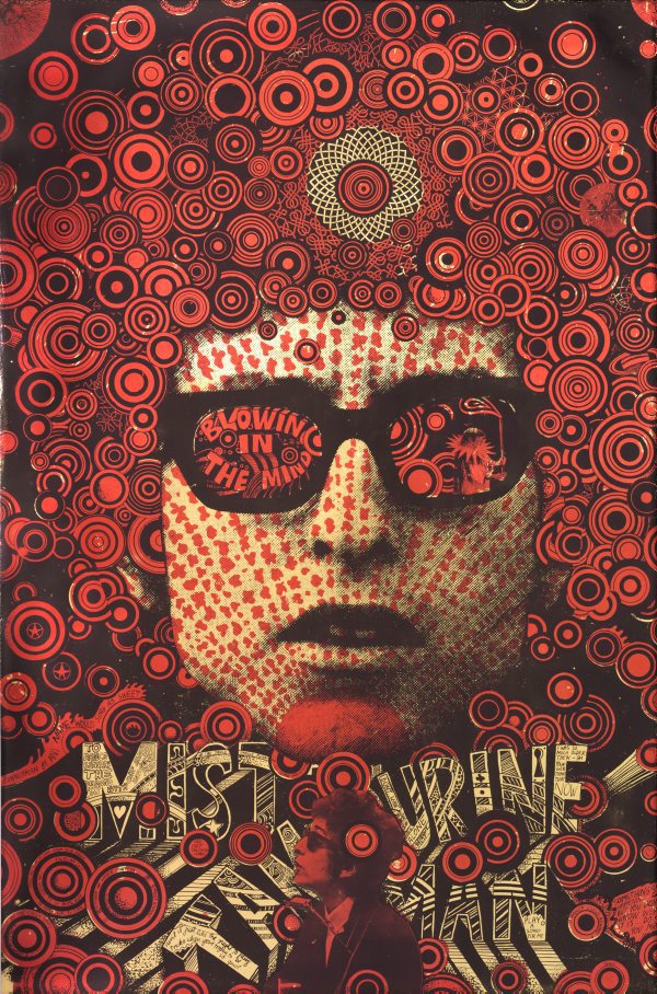
From this module, I have a greater understanding on the connections in the tasks and the artist’s work that I have analysed. The exercise that I found most engaging and highly relevant to my practice is Counter Culture and Underground Culture in the 1960’s and 1970’s, and how it’s influenced contemporary art. I looked at graphic designers which have produced different outcomes, in similar styles that expresses Counter Culture. My selected artist’s produced their work in a bold vibrant appearance to portray joy and spirit. Looking at previous work I’ve researched for example, Paula Scher produced an album cover “Changes One and Two”, Milton Glaser constructed a logo “I heart New York” and Martin Sharp created a poster “Blowing in the Mind”. I found that these different outcomes inspiring and developed my ideas for further outcomes and will be beneficial to me in my future studio practice. The main element that can support me in my practice would be the typography work created by Paula Scher, digital and hand rendered.

Looking back at the lecture programme there is a key reference that I find significant and helpful in my practice. This extract is from a book written by an author that’s a Professor in History of Design.

“Part of the clamour for change was a critique of the professionalization of design in the service of Americanization and global capitalism. This found expression in the underground presses and the psychedelic posters of London and San Francisco.” – Aynsley, Jeremy. A Century of Graphic Design.

This reference is significant to my studio practice as it proves that art and design was “clamour” wanting to evolve and change for its audience. Design has also become more professional and direct through expression and communicational visual language. This can still apply to contemporary art and is a key element in my practice graphic design is to communicate visually or through type. I found expression has evolved in the underground press and Psychedelic art which Jeremy Aynsley quotes. As a result, I researched into the Australian psychedelic artist Martin Sharp “Blowing in the Mind” and the Oz Magazine. I found the psychedelic style colourful and saturated alike the artist Wes Wilson “Byrds”- 1966, this can be incorporated in my practice graphic design to express a visual message through the use of vibrant colours, simplistic imagery and shapes. My specialism focuses also on typography which I have researched throughout this module and found most constructive and will continue to research and discover new artists and fonts.


Jeremy Aynsley (2001) A century of graphic design, Hauppauge, N.Y. Barron’s Educational Series.

Wes Wilson (1966) Byrds, Wildflower, New Stage Company, Available at: https://theredlist.com/media/database/graphisme/History/poster_kodeine/wes_wilson/001_wes_wilson_theredlist.jpg [Accessed at: 3rd December 2017]

Publish or Perish

For my research on published imagery I established a World Press Photographer Platon and he captured portraits of 150 current world leaders in a period of 12 months at the United Nations “Power: Portraits of World Leaders” Book, 2011. Platon is a story teller through his portraiture photography he says, “A portrait to me, is about closeness, it’s about truth.” Before taking his shots, he likes to connect with the person he is photographing and not being intimidated by the leader’s authority. He wants to express his connection with the leaders and a simplified message to the viewers that weren’t present. “…even with all this incredible technology and social networking there’s a great need for a human connection.” Human connection through photography makes the viewer feel and understand the leader’s honest character and realistic features and expressions.

Continuing my research, I discovered a graphic poster demonstrating Revolutionary Art by Emory Douglas promoting the Black Panther Party stimulating gender equality. The Black Panthers used posters in order to spread messages across to others that were likewise struggling for gender equality. He connects with his audience by using visual communication that is familiar to them. The poster is illustrating a story to make the women feel hope and a chance of freedom and equality, through powerful imagery of a women appearing heroic. “What an amazing creative way to magnify, and illuminate the courage of 30 Sheroes whose courage, leadership and character is symbolic of the many unsung Women Sheroes of past and present.” -Emory Douglas.

The final image is by Jamie Reid, an English artist that has connections to the Situationist international. It was created for the Sex Pistols album cover “God Save the Queen.” connecting to the audience in an informal manner, contrasting to the queen’s status. “All that I have been doing is re-adapting my work from the late-6o’s and early 70’s into different contexts and continuing with the same themes and messages.”-  Jamie Reid. In my opinion, this cover gives a rebellious feel through the ripped collage method that makes the cover memorable. Despite the aggressive appearance, flag symbolism has been introduced on the cover, providing a message to the viewers that it’s based on British pride.

Platon (2011) Power: Portraits of World Leaders. Available from: https://cdn.waterstones.com/bookjackets/large/9781/4521/9781452100586.jpg [Accessed at: 29th November 2017]

Emory Douglas (1969) The Black Panthers. Available at: http://www.reimaginerpe.org/files/styles/large/public/AP1069-african-american-solidarity-black-panther-poster-1969.jpg?itok=nR3I2Td8 [Accessed at: 29th November 2017]

Jamie Reid, (1977) “God save the queen” Available at: https://kingydesignhistory2012.files.wordpress.com/2012/03/godsave1.jpg?w=529&h=368 [Accessed at: 29th November 2017]

Platon, British Photographer, Youtube, Photographer Platon gives us a tour of his studio – Profiles. The New Yorker. Published on 22 Jul 2014. Time 2:32. Available at: https://www.youtube.com/watch?v=SAoUL8Kca2E [Accessed at: 29th November 2017]

Platon, British Photographer, Youtube, How photographer Platon gets up close to capture a person’s truth. Author: PBS NewsHour. Published on 6 Apr 2017. Time 0:05. Available at: https://www.youtube.com/watch?v=xBcVIqCx3fY [Accessed at: 29th November 2017]

Platon, British Photographer, Abstract: The Art of Design | Netflix Official Site, Netflix.com. Available at: https://www.netflix.com/gb/title/80057883 [Accessed at: 23rd November 2017]

Emory Douglas, A-Z Quotes, QUOTES BY EMORY DOUGLAS. Available at: http://www.azquotes.com/author/43616-Emory_Douglas [Accessed at: 29th November 2017]

Jamie Reid, Poster Designer, graphic design history and theory. Available at: https://kingydesignhistory2012.wordpress.com/2012/03/27/jamie-reid-poster-designer-by-ciannait/ [Accessed at: 29th November 2017]

Postmodernism

I continue with my research on Postmodernism and found three artists which have given me an insight in that movement. The first designer I discovered was Terry Jones who was a graphic designer and magazine-editor. He’s well known for the British, street-style magazine i-D in 1980. The front cover he designed reveals an aggressive ripped collage style in high saturated colours, and experimental typography that contrasts with the dark purple background. Jones has generated work in a Postmodernism style where he has deconstructed (simple) materials such as photocopies and tissue paper to form new directions of work that is rough and bold. “We live in the postmodern world, where everything is possible and almost nothing is certain.” Václav Havel. This suggests that artistic ideas can be achieved and applied to design an unknown outcome.

The second artist David Carson is an American graphic designer and type designer. He is well known for his deconstructive typographic designs such as “grunge typography” the peak of his design career and became more popular in 1990’s which then influenced new designers. He sustained by constructing a magazine design “Ray Gun”. The grunge type appears messy and placed in a chaotic layout. All the words, vintage textures and red dotted patterns transforms the magazine cover to attract the viewers before reading. “the message that’s sent before somebody begins to read, before they get the rest of the information.” David Carson.

The final designer which I found inspiring is Keith Haring who was a street artist and a social activist. I’m most fond of his colourful figures that are iconic symbols in popular culture and commercial appeals. He based lots of his work on themes such as, politics, sexuality and war, combined with the street culture in New York. He became well known in 1982 for these figures by using the medium white chalk on blackboards. They’re contrasting and stand out in his advertisement space and the environment. He would graffiti in the New York subway where the artwork can be seen by the public that walk by. “I am interested in making art to be experienced and explored by as many individuals as possible.” Keith Haring.

Terry Jones (1985) i-D magazine. Available from: http://newsevents.arts.ac.uk/files/2016/09/IDCover.jpg [Accessed 10th November 2017]

David Carson (1984) Ray Gun, Magazine cover. Available from: https://visualartsdepartment.files.wordpress.com/2011/05/david-carson.png [Accessed 10th November 2017]

Keith Haring (1982) Subway Drawing, chalk on paper, 124x172cm. Available from: http://publicdelivery.org/wp-content/uploads/2013/07/Keith-Haring-Subway-Drawing-1982-chalk-on-paper-124-x-172-cm-.jpg [Accessed 10th November 2017]

Václav Havel, Vaclav Havel Quote, A-Z Quotes. Available from: http://www.azquotes.com/quote/654861 [Accessed 10th November 2017]

Valentina Palladino (2013) Angst, imagination, and the Ray Gun Effect: a history of grunge typography. The Verge. Available from: https://www.theverge.com/2013/12/27/5247944/the-awl-history-of-grunge-typography [Accessed 10th November 2017]

David Carson, David Carson Quotes, BrainyQuote. Available from: https://www.brainyquote.com/quotes/david_carson_627891 [Accessed 10th November 2017]

Keith Haring, Keith Haring Quotes (Author of Keith Haring Journals) Goodreads.com. Available from: https://www.goodreads.com/author/quotes/123100.Keith_Haring [Accessed 10th November 2017]

Es Devlin: Stage design (2017) Abstract: The Art of Design, Netflix.com. Available at: http://www.netflix.com/gb/title/80057883 [Accessed at: 9th November 2017]


Counter Culture

For my counter culture research I found an album cover by Paula Scher employed by CBS Records to design and promote. This was her first record sleeve, vibrant and unusual typographic work for Charles Mingus duo album “Changes One and Two” 1974. During this period Helvetica typeface was fashionable in the 1970’s but she states “the cleanest, most boring, most fascistic, and repressive typeface.” She started to explore other forms of typefaces by drawing some ideas for her first album design. This album cover gives a sense of happiness and spirit through the use of vibrant colours. The typography she used is based on wood type that had a thick heavy lined appearance. This may suggest that art and design is changing as well as music – jazz. The high saturation also creates the meaning that jazz is joyful and exaggerated.

The second image “I Heart New York Logo” by Milton Glaser and first used in 1977 to promote the city and state. Glaser’s idea was originally a doodle on a back of an envelope which then became the most successful advertising campaign in America. The font has been created in a slab serif typeface- American Typewriter giving an indie style, combined with the abstract simplistic appearance. This logo has an important meaning to represent New York and the simple red heart is to illustrate spirit and love. This was a simple way to communicate with the people crafting a truthful message that is memorable.

Finally the last image illuminates the pop and psychedelic art of Martin Sharp “Blowing in the Mind” 1967. A period of music, colour, drugs and youth culture. “Want to know what the 60s were like? Then look at Martin Sharp’s work.” – Germaine Greer, 2009. It was constructed by the technique silkscreen print in red and black on silver metallic foil reflective paper. This poster was produced to signify it’s time and cultural youth spirit, peace and love through the use of saturated colours. Additionally the use of repetition of circles creating a pattern with the black bold background to connect with the “Blowing in the Mind” element.

Paula Scher (1974) Changes One and Changes Two. Available from: https://eyeondesign.aiga.org/wp-content/uploads/2016/01/Paula_Scher_Changes_One_and_two.jpg [Accessed 2nd November 2017]

Milton Glaser (1977) I Heart New York. Available from: https://upload.wikimedia.org/wikipedia/commons/thumb/d/d5/I_Love_New_York.svg/196px-I_Love_New_York.svg.png [Accessed 2nd November 2017]

Martin Sharp (1967) Blowing in the Mind – Mister Tambourine Man. Available from: https://media.artgallery.nsw.gov.au/collection_images/Alpha/DA17.1970%23%23S.jpg [Accessed 2nd November 2017]

Paula Scher (2014) Paula Scher – Designer at play. Process & Skills. Available from: https://processandskills.com/2014/10/25/paula-scher-designer-at-play/ [Accessed 3rd November 2017]

Abstract: The Art of Design (2017). Netflix Official Site. 6. Paula Scher: Graphic Design. Available from: https://www.netflix.com/gb/title/80057883 [Accessed 2nd November 2017]

Michael Organ (2014) Blowing in the Mind. Martin Sharp’s 1967 Bob Dylan poster, Greer, 2009. Available from: http://sharpbobdylan.blogspot.co.uk/2014/05/martin-sharps-1967-poster.html [Accessed 2nd November 2017]


Authenticity and Modernism

In my opinion, you can be authentic through art and design to create artwork reflecting new styles and express your personality. Work can be authentic if it’s real and not forged “Genuine” and “true” – Denis Dutton. Nevertheless, artwork can be reproduced to make fakes. In my belief by not being authentic is by copying and artists work and now can be seen as plagiarism. The Modernist movement still holds value in contemporary practice as it contains culture and has changed Western societies. The Modernist movement explores culture, politics, and social ideology that’s still used in contemporary practice. The form of Conceptualism in the 1960s symbolises the rotation where Modern art gave way to contemporary art.

Contemporary practice has been influenced by the Modernist movement as it’s inspired to create new ways of working and new movements such as, Earth art, Digital art, Neo-Expressionism and Performance art. From this I feel that you can still be authentic by constructing work that is influenced by either themes or elements in the modernist movement including styles, composition and method. You can likewise use the movement to help you gather ideas and research that can lead to new techniques and media work. Although, not by duplicating work produced by others or already exists, that can be seen as unauthentic.

Overall, I feel that you can be authentic through contemporary practice, as long as you’re not replicating work nor taking away elements of other artist’s ideas and claim ownership.


Christoph Niemann: Illustration (2017) Abstract: The Art of Design, Netflix.com Available at: https://www.netflix.com/gb/title/80057883 [Accessed 28th October 2017]

Denis Dutton (2003) Authenticity in Art. The Oxford Handbook of Aesthetics. Available from: http://www.denisdutton.com/authenticity.htm [Accessed 28th October 2017]

Contemporary Art Movements (1970-present). ENCYCLOPEDIA OF ART. Visual-arts-cork.com. Available from: http://www.visual-arts-cork.com/contemporary-art-movements.htm#conceptualism [Accessed 28th October 2017]

Manifesto of the Constructivist Group  “technology is a mortal enemy of art”

As a graphic arts practitioner, I have a biased view relating to the quote “technology is a mortal enemy of art”. I direct that technology has evolved the art industry creating new ways of working and styles. Although, some traditional practices and mediums such as, oil painting have faded through time and digital work like photography has advanced the world of art. Film director John Lasseter states “The art challenges the technology, and the technology inspires the art.” As a practitioner, I sense that it creates a true understanding that technology produces new forms of artwork. It additionally gives the viewer a new experience through technology and social media, artists use technology as a channel to promote their artwork. The artist Jeff Koons quotes “Art is obsolete now. New technologies are taking over.” This expresses that technology is dominating the world and the art industry. In the first short sentence, he states that “art is obsolete” giving that traditional art is no longer produced or used often and technology is taking over traditional methods. This gives you the sense that the artist appreciates traditional ways of working. He has created reproductions of objects and sculptures, such as balloon animals “Balloon Dog” constructed in stainless steel with a mirror surface (sculpture). Both of these artists approach technology in a different way, it’s more helpful to the director than the sculpture artist. In my opinion technology can advance different forms of artwork such as, cameras, computer software – Adobe and promoting by social media, and is now a faster process.

Jeff Koons (1994 – 2000) Balloon Dog, 121x143x45 inches, 5 versions (Blue, Magenta, Yellow, Orange, Red). Available at: http://www.jeffkoons.com/sites/default/files/artwork_sm.jpg [Accessed 20th October]

Alex Danchev (1922) quote: 100 Artists Manifestos from the Futurists to the Stuckists, Modern Classics, Penguins

John Lasseter, John Lasseter Quotes, BrainyQuote. Available from: https://www.brainyquote.com/quotes/john_lasseter_413108 [Accessed 20th October 2017]

Jeff Koons, Jeff Koons Quote, Quotefancy.com. Available from: https://quotefancy.com/quote/1278644/Jeff-Koons-Art-is-obsolete-now-New-technologies-are-taking-over [Accessed 20th October 2017]

Research and critical thinking

The first image by Barbara Kruger I consider striking through the use of layout, text, colour and imagery. The artwork addresses media and politics through critical character and cultural hierarches. From my research, this poster was formed in 1989 for the women’s march on Washington supporting reproductive freedom. The type “Your body is a battleground.” In my opinion, suggests the Feminist theory as the text relates to the portrait of the female. The divide down the middle of the artwork is a positive and negative exposure. The negative/dark divide indicates hardship “battleground” and may illustrate that some women are pressured to be perfect. In comparison, to the second piece that is a photograph by Luigi Scuderi. The photograph is captured in a natural method and represents current societies and the juxtaposition of rich and poor people. The deprived women struggling to stand all dresses in black while a wealth woman dressed in white walks past ignoring the reality of her current society. The black and white filter also contributes to the divide of the wealth and poverty. The overall photograph relates to the Marxist theory demonstrating social inequality as current societies are based on pursuit of wealth and it doesn’t benefit all. Comparing both sources, they reflect similar elements such as, the technique used to construct the images in a de-saturated style. They both have foundations of critical and political views through the use of imagery or text, which I will find beneficial to my future upcoming projects.

Barbara Kruger (1989) Your body is a battleground, Designishistory.com Available from: http://www.designishistory.com/images/kruger/battleground.jpg [Accessed 16th October 2017]

Luigi Scuderi (2010) The rich and the poor, DeviantArt. Available from: https://minotauro9.deviantart.com/art/The-rich-and-the-poor-151873239 [Accessed 16th October 2017]

Terminal Bar 2003 Short Film

Terminal Bar is a documentary by Stefan Nadelman in 2002 and it’s a short film about Stefan’s father, Sheldon Nadelman. The bar is located on time square known as the roughest bar in the city. This film has been constructed by using photographic material that Sheldon collected over 10 years of working there. He captured portraits of 2000 costumers from all different backgrounds. He had documented the people in a way to clearly demonstrate their emotions, expressions and state. The film goes through certain costumers that come to the bar like the celebrity Gene Tierney. The structure of this film is made of stills containing photographs and newspaper articles of selective people and events that happened during the busy period. Throughout the film there is a combination of animation, live action and desaturated photographs. In my opinion, the portraiture photographs were taken to examine the nature of the establishment from an Irish bar transforming into a gay bar. I also feel that the documentary provides the viewer a window of history in New York with a humorous effect.  While watching the short film I felt that the narration and the music creates a dark sense that contrasts with the humour in the live action interviews with Stefan Nadelman. By reviewing the short film, I continued to find significant themes such as, alcoholism, broken lives and gay culture in the 1970. Overall, the costumers are the main topic and the structure of the whole documentary and makes it intriguing by giving the viewers personal details and individuality.

Stefan Nadelman (2002) Terminal Bar: Official 2002 film in HD, YouTube, Avalible at: https://www.youtube.com/watch?v=xfWBbZBqYjo [Accessed at: 5th October 2017]