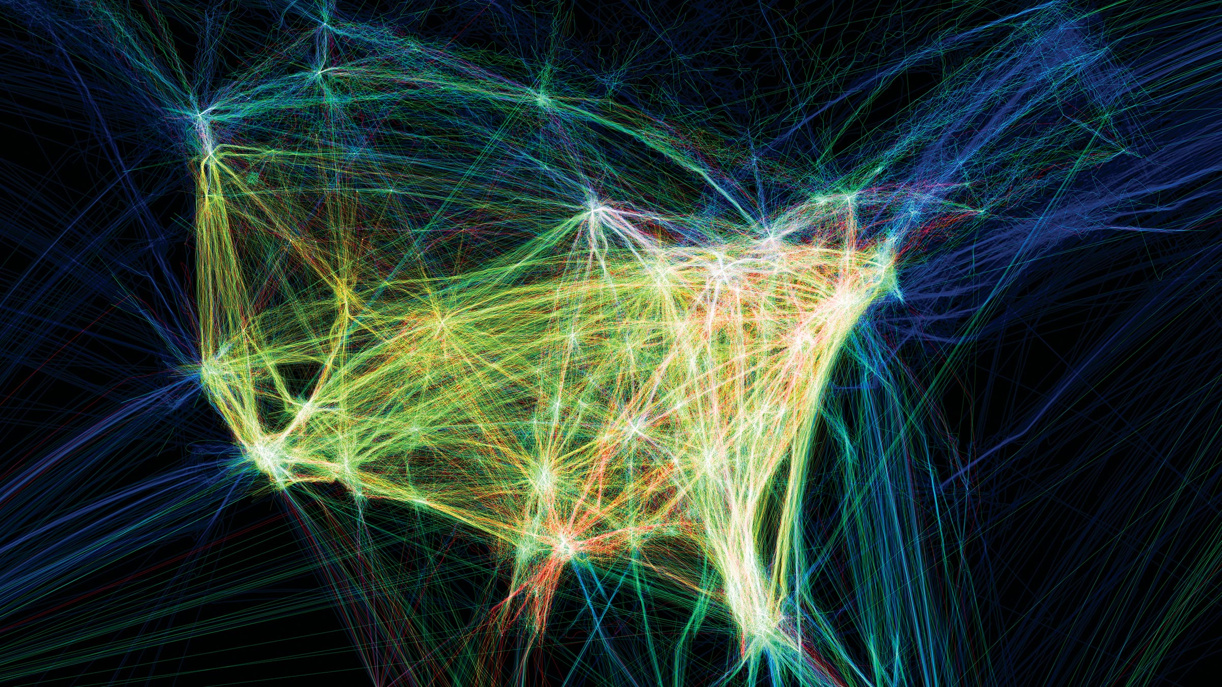
Author Archives: Kerry Mercer

Kerry Mercer – Research and communication skills / Task 12

Although the painting titled ā€˜Suspensionā€™ by Dan Hays is on a large scale already (150 x 200cm), Iā€™m imagining it billboard size or bigger. Because the painting has been made to replicate a screen that is showing a snowy landscape, the way the painting has been created is the part that drew me to this piece. Pixels in a screen are made by red, blue and green dots. this dot increases or decreases intensity of their red, blue or green colour depending on what tint or tone is required to make up the image. Hayā€™s has painted this piece using thousands of tiny red, blue and green dots to replicate that of a screen. This is not so obvious though when seen itā€™s original scale, so therefore enlarging it will make these dots more evident. This in turn will obscure the image, and will make it almost unrecognisable as to what it originally showed. It would give the piece a whole new perspective which might make it overwhelming. It will lose some of its original qualities which make the painting effective, such as the fine detail behind the work. Making it smaller however wouldnā€™t have the same effect, but would almost make it easier to see what itā€™s trying to represent which is a snowy scene. This loses the point behind why the artwork was made which was to represent an image in relation to how technology shows it.

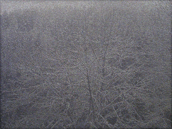
Suspension by Dan Hays (2014)

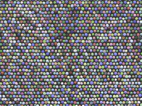
The use of dots to create the painting up close

Kerry Mercer – Research and communication skills / Task 11

Upon reflection within my blog, I can see how my art took a dramatic turn from more traditional ways to creating work, to more of a new media approach. This was evident from Task 2 where my work was considering Anselm Kiefer and the type of painting/sculptures he creates, compared to Task 8 where I distorted an image through editing software. This distortion is a key theme to my art now which allows me to see how the impact of the blog was more influential than I first thought.

Benefits from doing the blog was that it allowed me to focus on other aspects to art other than my own. Task 3 (analysing NikkI S Leeā€™s Part 14 photograph) and Task 5 (reflecting upon Bathers at La GrenouillĆØre seen in the National Gallery) allowed me to think more in depth into otherā€™s artwork and to focus on what I can take from those. In doing this, it inspired me within my own artwork, which also encouraged me to look more closely into other artists to get the same result.

At times the blog also proved challenging, this was most evident in Task 6 when being asked to create a mode of practice. Creating an original technique proved a struggle seeing as there are already so many ways out there. This I adapted and overcame by focusing more on pre-existing processes, pilling them together and placing emphasis on what people can take from the result. This did not come naturally too me, however forced me to focus on an innate original idea that would go on to strongly inspire me in my work to come.

The blog allowed me to focus on elements, concepts and theories to art that I otherwise would not have focused on. Most of these being fundamental to my work and more importantly to the art world around me, thus informing me in more ways Iā€™d like to admit.

Kerry Mercer – Research and communication skills / Task 10

10 chosen words:

Technology, Evolve, Atmosphere, Effects, Distortions, Perspective, Progression, Questions, Exploring, Variety

Although my practice originally started with no connections to technology at all, nor did I aim to explore into it, I find myself centring my work fully around it now. I found this evolved through the Contemporary Project. I begun looking at Monetā€™s impressionism and seeing how he slightly altered the way we see a scene, which inspired me to do the same using a variety of methods to do so.

Here I began focusing on creating an atmosphere to my work through using certain types of effects and distortions. I emphasised this in the Film Project where I took ordinary videos Iā€™d captured over time, of both people and places, and edited them using adobe premiere pro (a 21st century piece of technology). This gave a whole new perspective too the videos and completely altered from what they originally showed.

Throughout I found myself asking, although I can make these effects completely change the image which has progressed from years of technology evolving ā€“ does this make my artwork any better, than simply viewing it via how it was originally captured? This can also be said in relation to Monetā€™s work, where you could question whether impressionism really brought something to the world of art, or simply took away what was really there. This kind of question is the main theme around my art, and one I wish to continue exploring.

Captured image from the Film Project titled – Is This Better Now

Kerry Mercer – Research and communication skills / Task 9

Technology and art have always had an intertwining relationship, that has revolutionised one another. So much so that in the 21st century there are endless ways to produce art through technology, this is often categorised under the title of ā€˜New Mediaā€™. This has evolved from simple spouts of mechanical technology used to create art, such as the printing press, which dates back as far as 1440 (1). Ā To electronical technology or ā€˜digital electronicsā€™ which made its first appearance from the 1970ā€™s (2). The sweeping change from mechanical to electronical came under the ā€˜Digital Revolutionā€™ which brought sweeping changes to how an artist created their art during the latter 20th century.

This in-turn has lead up to the creation of Aaron Koblinā€™s work of Flight Patterns. This is a video that ā€œvisualization of airplane traffic over North America during a 24-hour periodā€ (3). Each colour represents a different type of aeroplane that travelled in and across north America on this day in August 2010. This highlights how almost every single bit to his piece of work has originated from some type of digital data. From obtaining the flight patterns, to creating the actual video, Koblin has relied solely on technology to reflect upon how interlinked we are with it and how our lifestyles also reflect this.

Iā€™m inspired from this piece as it show the capabilities of what ā€˜New Mediaā€™ art can involve. It also highlights how using technology is a completely new art form, as ā€œtechnology in art allows us to stimulate our sensesā€ (4) in ways that might not have been possible one upon a time.

Aaron Koblin – Flight Patterns (2010)

Ā 

Bibliography

Ā 

(1)Ā Ā Ā  https://en.wikipedia.org/wiki/Johannes_Gutenberg – reference to printing press

(2)Ā Ā Ā  https://www.barbican.org.uk/hire/exhibition-hire-bie/digital-revolution

(3)Ā Ā Ā  https://www.seditionart.com/aaron_koblin/flight_patterns

(4)Ā Ā Ā  https://makezine.com/2013/11/15/art-technology-new-art-forms-not-just-new-art/

https://www.smithsonianmag.com/arts-culture/7-ways-technology-is-changing-how-art-is-made-180952472/


Kerry Mercer – Research and communication skills / Task 8

As previously talked about within my blog, Iā€™m very much interested in making people question what they see. Currently within my work Iā€™m looking to use a double convex glass and using that to view a scene. This has been inspired from the 17th century notion of the ā€˜Claude glassā€™ which originates from Claude Lorrainā€™s curved style of work (1). Often just referred to as a black mirror, it was used for sketching and examining landscapes. This gives a slightly distorted image when looking through it, which is something I wanted to replicate here.

The image Iā€™ve appropriated is one of Monetā€™s Water Lillie series. I used this painting as it already gives an unrealistic impression when depicting water lilies, using warm vibrant hues instead of the traditional subtle blue ones. To replicate something like the Claude glass effect, I used photoshop to ā€˜spherizeā€™ multiple sections of the image. I layered this to create an over-emphasised representation and to show the obvious distortion. This only became more apparent with Monetā€™s signature expressive brush strokes being blown out of proportion. For me, this shows how modern pre-industrial art can be altered and disfigured by 21st century technology. It also questions whether you can still call this one of Monet’s paintings now it’s been digitally altered.


Bibliography

(1) https://en.wikipedia.org/wiki/Claude_glass – reference to the ‘Claude glass’ origin

Kerry Mercer – Research and communication skills / Task 7

Whilst reading Leo Steinbergā€™s ā€˜Other Criteriaā€™, he describes a key feature in modern art as the ā€˜flatbed picture planeā€™. This describes a horizontal pictorial surface, that even when itā€™s distorted through cubism or abstraction etc, it still has a set context to the up-right human figure. As Steinberg describes it ā€œThe top of the picture corresponds to where we hold our heads aloft; while its lower edge gravitates to where we place our feet.ā€ (pg. 949.). He notes that Robert Rauschenberg changes this Modernist layout, to a ā€˜opaque flatbedā€™ (pg. 949.) horizon that revolutionized how art can be viewed today. Steinberg notes in his own words how Rauschenberg allowed us to see beyond the up-right human figure plane, and more into the philosophy behind the art itself.

In the second text, ā€˜Serra (b. 1939) from The Yale Lectureā€™ Serra talks about his interest in working with 3D heavy-duty materials and focusing on their innate properties. He looks upon the representation of certain types of processes, such as wielding, and notes how modern artists simply viewed them as a way of joining materials together, instead of it being part of journey towards the outcome. This throughout is emphasised as a key element to sculptures, and can be argued as a type of development in how we view art from the modernist period. As he puts it – ā€œthe evidence of the process can become part of the contentā€ (pg. 1125).
With his passion lying in site-specific work, he notes how modernist artwork can only be judged in relation to works of its own medium, therefore limiting its correspondence. Site-specific work however, opens for new languages in which the art can be talked about, thus allowing a continuous dialog for each language to criticize and debate with the other. This keeps the art forever current.

When comparing the two texts, it becomes clear that both are referring to changes in how we create, view and understand art. This evidently spans back over the last century, featuring key modernistic viewpoints compared with post-modernistic viewpoints referencing when each article was published. They both highlight highly influential developments such as Rauschenbergā€™s ā€˜opaque flatbedā€™ and Serraā€™s site-specific work. These allow the reader to recognise how far the art world has revolutionised itself from the modernistic era, and also allow one to understand how contemporary art is influenced by such major developments today.

Kerry Mercer – Research and communication skills / Task 6

Whilst thinking of a way to ā€˜devise a mode of practiceā€™, artist Jessica Warboys came straight into my mind. She takes her work outside the studio and creates paintings whilst working on the beach. She does this by ā€˜casting mineral pigments directly onto a damp, folded canvas, which was then submerged under the sea before being pulled ashore.ā€™ ā€“ (reference 1) This not only creates a spectacular display of colour (figure 2), but does so using natural resources.

Capturing what could be described as contemporary abstract art in such a unique way is truly what inspires me about her work. It could be argued that, as the waves are the ones making the impressions onto the folded canvas, nature itself is the true artist behind Warboys’ work. Here weā€™re not just looking at a 2D array of colour, but more importantly we are looking at array of energy powered behind a natural source which creates a dramatic display.

For me, this inspires me to question more upon what we are truly seeing when we view art. For this reason, my mode of practice would include altering and editing many processes of art together, to latch on to the idea that you should question what you see. As a simple example, I may start out creating a photo which I then work into with paint. Finally, I scan the artwork back into the computer to manipulate it once more. through the altering of a single image, it might become that it is no longer recognisable from what it once was – this would pose many questions and this process of editing and manipulating an image from a single point, is what I’d aim to focus on in my mode of practice.

Figure 2

Bibliography:

http://www.tate.org.uk/whats-on/tate-st-ives/exhibition/studio-and-sea/jessica-warboys

ā€“ Reference 1 and Figure 2, examples of Warboys mode of practice.


Kerry Mercer – Research and commuincations skills / Task 5

During a recent trip to Trafalgar Square in Central London, I decided to check out the National Gallery. The gallery houses a collection of 2,300 paintings from the mid-13th century to the 20th, and was founded in 1824.

Whilst in the National Gallery I found myself surrounded by the impressionistic artists of the late 19th century. For the first time I noticed a few paintings that I hadn’t paid much detail too. This was the case when I came across ‘Bathers at La Grenouillere’ painted by Monet. Although I had seen the painting online when researching him in the past, I never really cared for the piece. However, seeing it within the gallery was a real eye-opener for me, and allowed me to see why it’s in the galleries top 30 highlighted paintings.

First thing I noticed was the scale of the piece. As mentioned, from seeing it prior to the gallery visit online, I imagined it to be bigger than what it was (73 x 92cm). upon reflection however, many of Monet’s works were around this size. From being within the gallery seeing the painting first hand, it put everything back in to proportion to me. This almost forced me to get close to the painting to appreciate it. Once doing this, I noticed how free-flowing this piece was compared to some of his other paintings. Upon looking at the piece once more online, I’ve discovered it says;

“The exceptionally free handling of Monet’s painting may in part be due to the canvas being a sketch for what was to be a more ambitious composition painted back in the studio.” (1)

This stuck out to me because although the piece is highly praised within the gallery, it isn’t the traditional way Monet created his paintings. The artist is famous for painting in a ‘Plein Air’ (the act of painting outdoors) style, which contradicts how Bathers at La Grenouillere was created. This is something I may have not noticed or pondered upon if I didn’t see the painting first hand.

Bathers at La GrenouillĆØre
1869,Ā Claude Monet


Bibliography

(1) https://www.nationalgallery.org.uk/paintings/claude-monet-bathers-at-la-grenouillere

Kerry Mercer – Research and communication skills / Task 4

During a recent trip to Trafalgar Square in Central London, I decided to check out the National Gallery. The gallery houses a collection of 2,300 paintings from the mid-13th century to the 20th, and was founded in 1824.

Once inside, I instantly noticed why it’s one of the most visited art museums in the world. Panning around every wall you see the works of many great artists, a few being; Van Gogh, Matisse, Renoir and of course, Monet. Being an impressionist myself, the area where Monet and other impressionistic artists where being held drew me in. This area was most memorable as although these artists are categorised within the same genre, they all gave a unique flare to the style. To think that when these artists first began making their art, they were rejected from galleries is truly beyond me. How wasn’t this style favoured compared to the realism movement beforehand? From seeing more realistic approaches to painting the landscape within The National Gallery, such as Alexandre Calame’s painting of a solitary pine tree – ‘At Handeck’, I noticed how abstract the impressionistic movement really was. Once walking among the works, I started to understand that this rejection to the impressionistic movement, accompanied by the backlash of work that Monet etc. produced, is the reason why impressionism was a turning point within modern art. Within the gallery it gave me a sense of appreciation for not just impressionism, but for all approaches. The beauty of it is, although the sheer size of the gallery can be overwhelming, the high volume of work allows you to take a journey back through the ages, as I did, and reflect upon how styles have changed. You can even do this with the building itself, which can be argued as a notable structure of the 19th century.

Kerry Mercer – Research and communication skills / Task 3

Nikki, S. Lee ā€“ Part 14 (2002)

Nikki, S. Lee ā€“ Part 14 (2002)

From simply analysing the image I see before me, it’s apparent Nikki’s eyes quite clearly staring out of the car, looking off into the distance. It’s as if she is staring into space, lost in thought. For the viewer, this represents a cold demeanour that she is giving off. As it is not inviting, it therefore could come across as passive from the viewer’s perspective. The viewer is made to believe her disinterest is because of the assumed male figure (as no facial or distinctive masculine features are displayed) who is sitting next to her. She is not looking at him or in his direction which can only be assumed to be a bad sign. This is also emphasised through the blackness of seats behind, which connects the two of them, as black is often referred to as an empty void.

Outside the white light is pouring in around her head, representing a halo type effect. This could be portrayed as innocence within the woman. But this is very much counteracted by the black eye-liner the lady is wearing also. Black could also represent elegance in the woman. Her eyes have been made to look seductive in such a way, and to the audience this could make her come across as more appealing. This refers straight to the male gaze, and how male viewers might be attracted to the dramatic eye and subtle lip make-up. The image being made more attractive to a male’s gaze, is once again supported by the fact the male has his arm draped around the lady, as if to say he likes what he sees.

The dark blue of her clothing represents a seriousness and maturity, and coming from the point of the male gaze once more, shows us how adult the woman is. This would strike as more appealing to the onlooker, as to be sexualised one should be of age, and the dark blue reiterates this.