
These Research and Communications Skills lectures have definitely given me more of an insight into art history throughout the years and how art has developed.
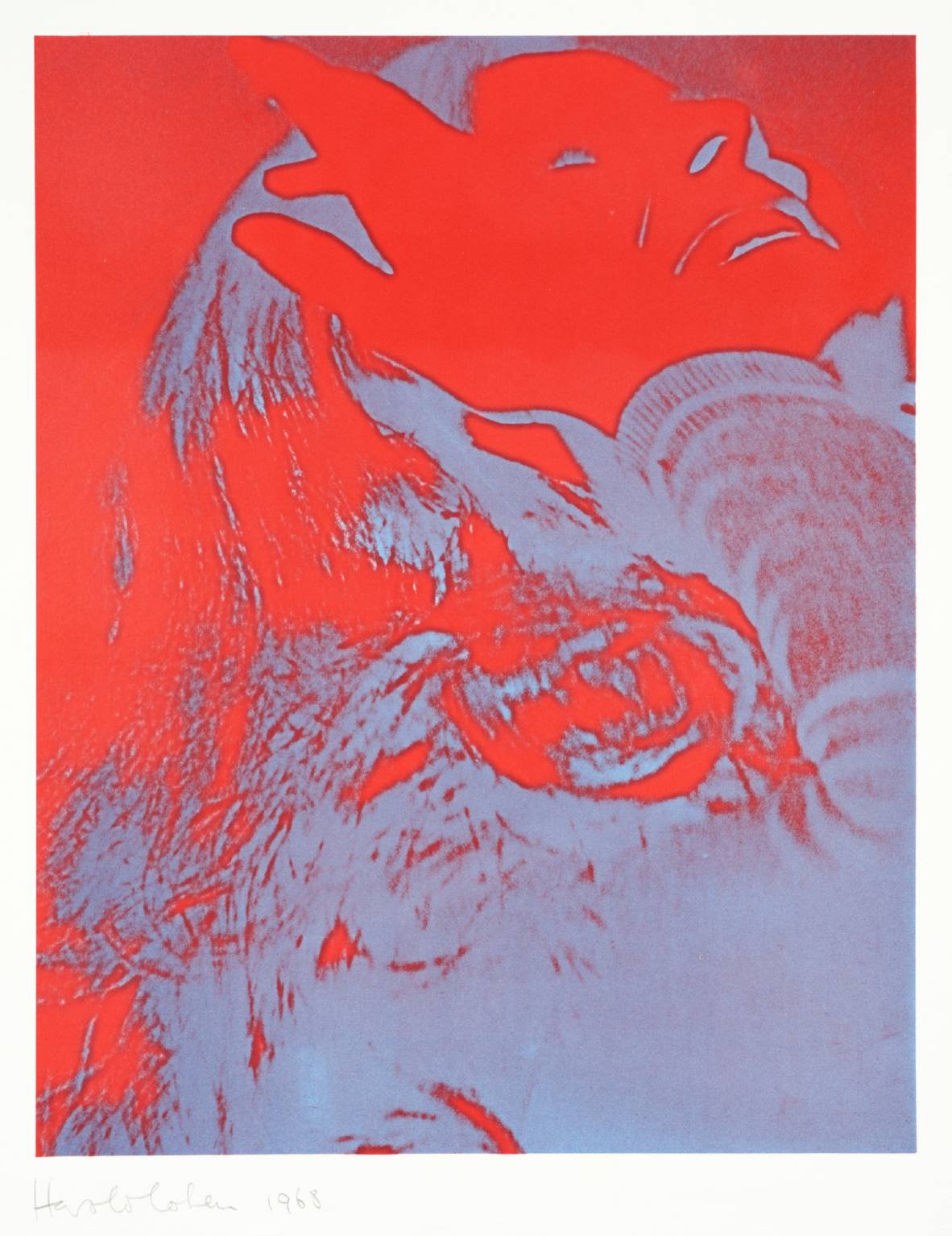
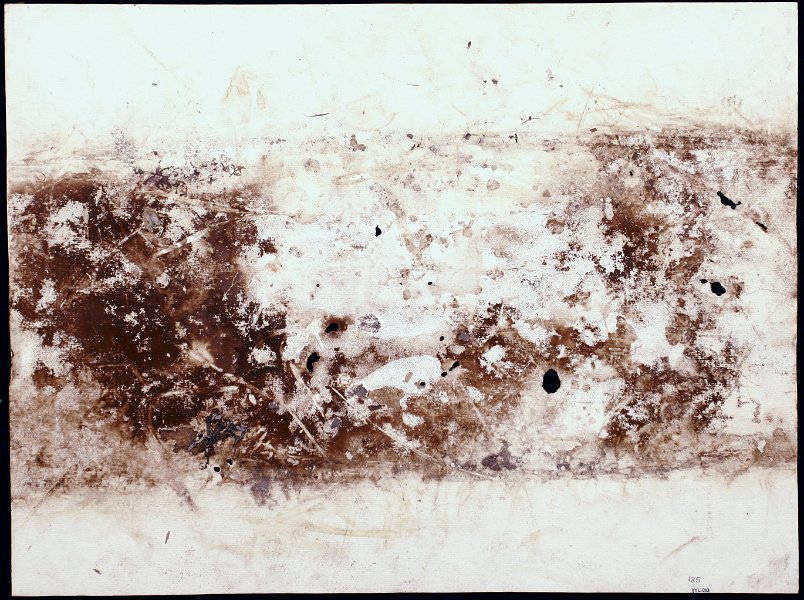
[no title] Harold Cohen, 1968
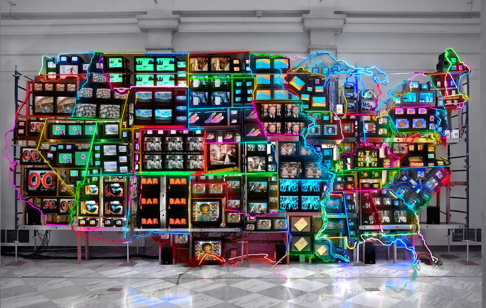
As for the lectures, I think the one I learned the most from was the ‘Avant Garde’ presentation, as we looked at all the Avant Garde art movements such as abstract, surrealism and suprematism etc. I learnt all about the different art movements and what happened within them, and I now feel much more confident in knowing what they mean and how they changed and challenged the boundaries of art and design.
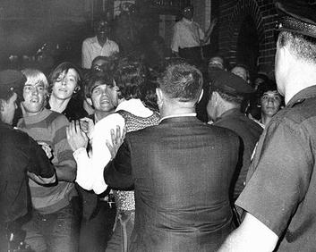
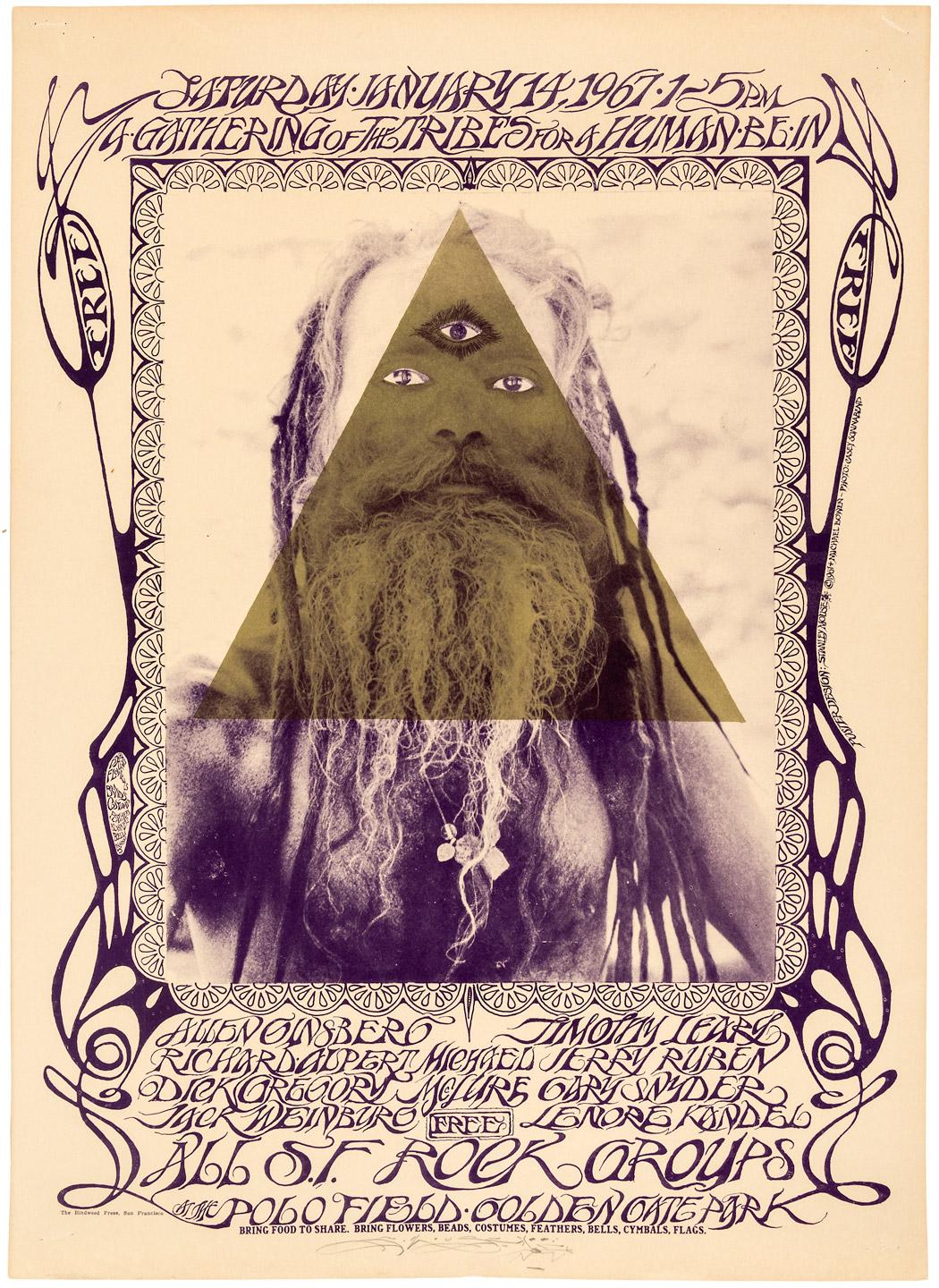
I also liked the lecture ‘Notes from the Underground’, as I enjoy learning about the 60s and 70s and their aesthetics. This lecture taught me about more art movements such as retro, counterculture and psychedelia, which I found interesting and useful, as it helped with my task for that week.
I will make sure to use some of the things I’ve found out in my contextual research as a way to dig deeper into meanings and analysis. I can use annotations to point out particular elements that interest me and expand on them more, as well as mentioning why those elements work or don’t work and whether they’re good or bad in achieving the effect the designers set out for.
In the future, I will try to bring in elements of different pieces of work that I’ve looked at, such as colour, type of line or style/aesthetic. I think this could help me in my artwork by giving myself a different style to work with and broaden my horizons with. Experimenting with these different techniques will be a good idea, as I may find a style I’m more comfortable using or one that I like better.
In conclusion, the things that I have learnt in Research and Communications Skills are useful in that I accumulated knowledge of a lot of the different movements and Art and Design throughout the years, and I will be able to apply these techniques to my work in studio practice.
Image: [no title], Cohen, H., 1968 [online] available from: http://www.tate.org.uk/art/artworks/cohen-no-title-p02291 [accessed: 6 December 2017]

