Author Archives: Rebecca Withers

Rebecca Withers – Task 8: Summary

In this module, I have explored the history of design and seen how major events in society have influenced design. This is evident in counter culture where rebellion and underground movements caused a new style of art to emerge. When researching these topics further, I have been able to find out about designers I had previously not known and also find links with other disciplines that cross over with design. Discovering new designers and artists in more detail has also allowed me to explore new styles of design.

From researching in more detail and discovering designers, I was able to find new influences and styles I like and start to use them in my own practice, allowing me to push my ideas further and create more interesting work as I have new concepts. I am also not only relying on research I have learned in this module but am also exploring designers, styles and movements and their influences in my studio practice to create new ideas. This module has also allowed me to understand further, as mentioned before, how society influences your work whether as a style or as a topic that needs more recognition as the counter culture movement did.

Understanding previous design movements and events in society and how they both affected society, influences your work by providing new ideas and styles. When designing, it allows you to understand the style you’re aiming for and your work fits in. I had previously studied art movements, including modernism and post-modernism, however, with this module, the focus was on more modern art movements and events that are still used and seen today.

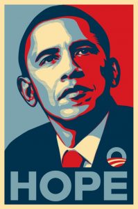
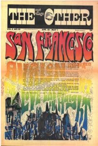
What I found most interesting were the three episodes of ‘Abstract: The Art of Design’ as they gave in-depth profiles on designers. The tasks from these weeks then focused on specific thoughts that are an essential part of the designers’ work. When watching the first episode on Paula Scher, I took particular interest due to her being a graphic designer. I then further researched her and found other designers, such as Michael Bierut, for another task outside of this module.

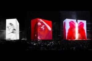
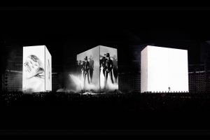
As much as graphic design is what I am most interested in, the episodes with Es Devlin and Platon influenced me the most. Devlin inspires me the greatest due to her success and working with the likes of BeyoncĂ©, Jay Z and Kanye West, among others. Her work involves everything working together and creating a story. She said design should ‘show, reveal and deconstruct’. Although she is applying this to set design, I feel this crosses over to graphic design with needing to clearly convey ideas, reveal a concept and allow it to be broken down to be understood and interpreted by the audience. Photographer, Platon also discussed design having a ‘story, message, connection and feeling’. This again applies to graphic design in order to communicate messages and connect with audiences. These insights into the behind the scenes of the designers’ work have advanced my understanding of what is needed for design to be successful in its purpose.


References

  • Abstract: The Art of Design – Season 1, Episode 6 – Paula Scher: Graphic Design (2017) TV series. USA: Netflix.
  • Abstract: The Art of Design – Season 1, Episode 3 – Es Devlin: Stage Design (2017) TV series. USA: Netflix.
  • Abstract: The Art of Design – Season 1, Episode 7 – Platon: Photography (2017) TV series. USA: Netflix
  • DEVLIN, E. (2011/2016) All Es Devlin work. JPEG Image. [Online] esdevlin.com. Available from: https://esdevlin.com/work/ [Accessed 3 December 2017]

Rebecca Withers – Task 7: Published Images


Photographer, Platon said that design, specifically photography, should have a ‘story, message, feeling and connection’ (Platon, 2017). Published images must all have this to attract the audience and be appealing for them.

Image one is Selena Gomez’s Billboard magazine cover. This combines graphic design and photography. The logo stands out along the side and the cover is relatively simple with limited text. The lighting and colours also work well to bring another element in. In terms of Platon, the image has a story which marries with the cover story because of her wearing a suit-style outfit which conveys power and would especially connect with woman who want to be empowered.

Image two is a Starbucks Christmas print/billboard advert. It is very simple but clearly conveys that Christmas drinks are back at the coffeehouse due to the creation of a Christmas tree from the whipped cream and star at the top. This is clever design as the images haven’t been distorted, just well edited or photographed. This has a message due to what it’s advertising. Christmas is also associated with spending time with family and would, therefore, create a connection with the audience, especially as there are three drinks which implies three people.

Image three is of several drinks bottles arranged by colour in order of the rainbow. This image is visually appealing to the audience because of the way the images have been positioned for the photo, especially because of the colour order and because you can follow the trail from top to bottom. This image contains older bottles which may make some audiences connect with the image due to the nostalgia they feel but in terms of a message and story, is more about exploring colour in everyday objects.

Joe Sparano said ‘Good design is obvious. Great design is transparent’.This is true as when a design works well, a message starts to come through that the audience can understand and interpret. Images one and two do this the most whereas three has less of a message/story. Han Hoffman once said ‘Design is the intermediary between information and understanding’. This works for these images as the design allows the audience to create a connection and feeling to interpret the information in order to understand the message/story.

References 

  • Abstract: The Art of Design – Season 1, Episode 7 – Platon: Photography (2017) TV series. USA: Netflix
  • bb30-selena-gomez-cover-2015-billboard-510 (2015) Selena Gomez Billboard Cover. JPEG image. billboard.com. [Online] Available from: https://www.billboard.com/photos/6429433/billboard-2015-the-covers [Accessed 24 November 2017]
  • Starbucks Christmas drinks print (2016) JPEG image. fespa.com [Online] Available from: https://www.fespa.com/en/news-media/features/top-20-christmas-print-adverts-from-around-the-world [Accessed 24 November 2017]
  • Drinks bottles (2017) Julie Ream. Encyclopedia of Rainbows: Our World Organized by Color [Hardback]
  • SPARANO, J. (N/A) Joe Sparano Quotes [Online] goodreads.com Available from: https://www.goodreads.com/quotes/510598-good-design-is-obvious-great-design-is-transparent [Accessed 24 November 2017]
  • HOFMANN, H. (N/A) The Digital Designer of the Future [Online] medium.com Available from: https://medium.com/bridge-collection/the-digital-designer-of-the-future-72cc0765f3e8 [Accessed 24 November 2017]

Rebecca Withers – Task 6: Postmodernism

Set designer, Es Devlin stated art should ‘show’, ‘reveal’ and ‘deconstruct’ (Devlin, 2017). These three elements are present within Postmodernist design. Postmodernism began in the 1970s/80s, rejecting modernism by contradicting the functional style.

Image one is the Obama Hope poster designed by Shepard Fairey in 2008 as a grassroots project to get Obama elected. This is one of my favourite works due to the limited and patriotic colour palette and the message promoted. It’s deconstructed due to the different colours separating the face and creating shadow. This separation reveals, and shows, as you are drawn to all the different parts as the contrasting colours highlights different areas.

Image two is a Pepsi Cool Cans advert from 1990. Part of Postmodernism is the bright colours seen in the branding and packaging design with the block colour backgrounds and cans themselves. Pepsi’s brand colours, red, blue and white, are evident on the cans but the pop art style is what distinguishes them from the standard cans. There was controversy around the cans as when stacked, sex was spelt out down the side. This revealed a message, said to emphasise the idea of being sexier in the summer. The usual graphics would’ve been deconstructed and reinterpreted in a pop art style for these cans.

Image three is a VHS tape cover. VHS tapes were used to watch movies in the Postmodernist era. This Polaroid VHS uses five stripes of vibrant colour, reflecting the movement. The cover deconstructs as it separates information, especially on the back. Polaroid is an established brand in photography and the use of colour shows how the brand uses colour and reveals that the tape is in colour.

Marshall McLuhan played a large part in Postmodernism and said ‘art is what you can get away with’ (McLuhan, 1951). This is true as anything can be seen as Postmodernist and it’s about pushing the boundaries. Unknown Twitter author ‘overlyxclusive’ wrote ‘Art is freedom. Being able to bend things most people see as a straight line’ (Overlyxclusive, 2013). This works for Postmodernism as it is seeing things differently and exploring things in a new way to push art further.

References

  • Abstract: The Art of Design – Season 1, Episode 3 – Es Devlin: Stage Design (2017) TV series. USA: Netflix.
  • Obama-hope-shelter-copy (2008) JPEG digital image. obeygiant.com. [Online] Available from: https://obeygiant.com/obama-hope/ [Accessed 14 November 2017]
  • jpg (uploaded 2011) JPEG digital image. blog.signalnoise.com. [Online] Available from: http://blog.signalnoise.com/2011/11/02/pepsi-cool-cans/ [Accessed 14 November 2017]
  • Polaroid-High-Standard-E180 (N/A) JPEG digital image. cdn1.goughlui.com. [Online] Available from: http://cdn1.goughlui.com/wp-content/uploads/2014/02/Polaroid-High-Standard-E180.jpg [Accessed 14 November 2017]
  • OVERLYXCLUSIVE (2013) Overlyxclusive [Online] Twitter. Available from: https://twitter.com/overlyxclusive/status/377835684348067840 [Accessed 14 November 2017]
  • MCLUHAN, M. (1951) Andy Warhol & Marshall McLuhan: The Artist & the Visionary [Online] mcluhangalaxy.wordpress.com. Available from: https://mcluhangalaxy.wordpress.com/2011/12/08/andy-wharhol-marshall-mcluhan-the-artist-the-visionary/ [Accessed 14 November 2017]

Rebecca Withers – Task 5: Counter Culture

Counter culture was developed in the 1960/70s with underground design adapting to the style to attract a new audience. Graphic designer Paula Scher discussed design having sensibility, spirit and meaning (Abstract, 2017) which are all seen in the movement.San Fran

Image one is an example of underground press. As I am interested in graphic design, including magazines, I felt this piece was interesting as the bright colours, warped text and overlaid body text make it difficult to read the cover. San Francisco was the main city for this culture and is why it is so prominent. Following Scher’s words, the cover doesn’t seem overly sensible as it’s somewhat illegible but clearly expresses the spirit and meaning of the movement.

David-Edward-Byrd-Hendrix-800x500

Similarly, image two shows the spirit and meaning but is more sensible as it clearly conveys information. It uses vibrant, psychedelic colours. The psychedelic nature is enhanced by using geometric shapes in the hair of Jimi Hendrix. Hendrix was a rock and roll singer/guitarist and his music was what the counter culture listened to.

Image three is a photograph, as photography is another interest of mine. The image was taken at the DetrAlwyn_Scott_Turner
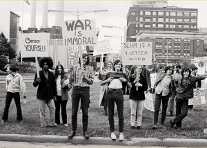
oit riots by A.S. Turner. The riot was one of the main race riots. The counter culture is also represented through the style of each of the individuals. The movement was looked down upon, creating an underground culture and being segregated as races were. The signs also fit the hippy culture with the ideas of peace and love. In terms of Scher, the photo holds the meaning and spirit of the movement.

Paula Scher (2013) also said ‘Identities are the beginning of everything. They are how something is recognized and understood’. Within all three of the images there are clear identities present whether in the individuals or the culture. It’s also true that through this you are able to recognise and understand the movement more. Author Sebastyne Young said ‘a picture can tell a thousand words but a few words can change its story’. This quote is relevant to these images as they each have a strong message but a caption on the photograph, for example, could say so much more.

References

  • Abstract: The Art of Design – Season 1, Episode 6 – Paula Scher: Graphic Design (2017) TV series. USA: Netflix.
  • East Village Other Image – EVOv2n1 (uploaded 2005) JPEG digital image. wikipedia.org. [Online] Available from: https://en.wikipedia.org/wiki/East_Village_Other#/media/File:EVOv2n1.jpg [Accessed 4 November 2017]
  • David-Edward-Byrd-Hendrix-800×500.jpg (uploaded 2015/created 1960s) JPEG digital image. lamag.com. [Online] Available from: http://www.lamag.com/culturefiles/the-godfather-of-rock-n-roll-poster-art-discusses-his-art/ [Accessed 4 November 2017]
  • Hippy Protest in Detroit image (uploaded 2013) JPEG digital image. sensiseeds.com. [Online] Available from: https://sensiseeds.com/en/blog/counterculture-detroit-declared-bankrupt/ [Accessed 4 November 2017]
  • SCHER, P. (2013) Design Quotes: Paula Scher [Online] Eye on Design. Available from: https://eyeondesign.aiga.org/paula-scher/ [Accessed 4 November 2017]
  • YOUNG, S. (n/a) Sebastyne Young Quotes [Online] Good Reads. Available from: https://www.goodreads.com/author/quotes/4489284.Sebastyne_Young [Accessed 4 November 2017]

Rebecca Withers – Task 4: Authenticity

Art poses the question, ‘what does it mean to be truly authentic?’. The dictionary definition of authentic is ‘of undisputed origin and not a copy; genuine’ (Oxford Dictionary). But can entirely genuine work ever be achieved?

Artists and designers all take inspiration from one another’s work. Surely, this means the artist that ‘copied’ isn’t truly authentic as it isn’t entirely their idea. But this is seen all the time with copyright issues appearing in order for one to have themselves and their work seen as authentic. Designers are influenced by art movements too. Modernism is still present in today’s society and contemporary practice. This makes it harder for designers to be truly original when they are trying to follow the current trends.

As an aspiring graphic designer, Pentagram partner, Michael Bierut’s words resonate with me – ‘No one loves authenticity like a graphic designer’ (Bierut, 2005). If a graphic designer creates a logo or a poster, whatever the product may be, no designer wants to see their work copied after all the time spent designing it.

However, even the best designers take inspiration from somewhere; signs on the street or art galleries. Everyone sees work and wonders if they could incorporate it into their own. Fashion designer Yohji Yamamoto said ‘Start copying what you love. Copy copy copy copy. At the end of the copy you will find yourself’ (Yamamoto, 2011). This is true as the more you try different things and work out what you like and dislike, the more your individual style emerges.

References

  • Anon, (n/a) Oxford Dictionary [online] Available at: https://en.oxforddictionaries.com/definition/authentic [Accessed 4 November 2017]
  • BEIRUT, M. (2005) Authenticity: A User’s Guide [online] Design Observer. Available from: http://designobserver.com/feature/authenticity-a-users-guide/2997 [Accessed 4 November 2017]
  • Yohji Yamamoto – In Conversation (2011) Video. London, UK: SHOWstudio. Available from: http://showstudio.com/project/in_conversation/yohji_yamamoto [Accessed 4 November 2017]


Rebecca Withers – Task 3: Manifesto of the Constructivist Group

‘Technology is the mortal enemy of art’.

I do not agree with the statement ‘technology is the mortal enemy of art’ (100 Artist Manifestos,  page 220) as technological advances have allowed people to become artists themselves, moving from consumers to producers, similarly to Web 2.0 in film production. People are now able to find out much easier how to do certain things that before only some would’ve known how to do/had access to. Technology has meant boundaries of art are being pushed further through experimentation, creating new and exciting projects that haven’t been done before.

Pixar director, John Lasseter stated ‘art challenges technology, and technology inspires art’ (Berkowtitz, 2012). This statement sums up how art and technology can marry together and be used in harmony. The creation of the letterpress and newer, modern computer software such as the Adobe products, have allowed artists to start adding new elements to their work that take them in a new direction.

I do, however, understand the view of Rodchenko, Stepanova and Gan with technology being the enemy of traditional styles of art rather than modern forms such as abstract art which would only benefit from new technologies by enhancing work. Rodchenko wrote ‘artists relax with technology’ as if saying they are giving into technology instead of fighting back against it and should stick to traditional art. This is where I disagree as technology can be used in many different ways to further one’s work. However, technology can cause copyright issues as artists’ work is more readily available to access online.

References

  • BERKOWITZ, J.  (2012) Pixar’s John Lasseter Weighs In On Art and Technology [online] Fast Company. Available from: https://www.fastcompany.com/1680857/pixars-john-lasseter-weighs-in-on-art-and-technology [Accessed 21 October 2017]
  • DANCHEV, A. (2011) 100 Artists’ Manifestos: From the Futurists to the Stuckists. Page 220.UK: Penguin

Rebecca Withers – Task 2: Image Comparison

The album artwork for Jake Miller’s ‘2:00am in LA’ uses photography for the main image. The image looks as if it has been edited together but the bedroom setting was taken to the location. I feel that the album cover helps to support the title and theme that runs throughout the songs by creating the idea of wanting a quiet and relaxed lifestyle in a busy city. The artwork’s made up of three elements: the title, artist name and image. However, it still feels busy despite these being the only elements. The tone, therefore, feels hectic and contradicts the implied meanings of the image and title. Two different typefaces are used, one which is a marker-pen style, handwriting typeface whilst the other is serif typeface which creates a more serious tone and consequently represents the artist to be serious as his name is written in the typeface.

The other image I looked at was ‘All the Buildings in Sydney’, an illustration by James Gulliver Hancock. I usually prefer digital work like the album rather than illustration. This is relatively simple with most of the buildings being line drawings and only two colours being used for detail. The artist grew up in Sydney so the work is personal which is similar to the album as it has personal meaning for the artist. Both appear to be quite busy yet are actually minimal in their design by only having key features. Both also use a city as the main focus but is what makes the images appear busier but represents the city lifestyle well.

Jake Miller 2am in la


All the buildings in sydney


References

  • Jake Miller 2am in LA album cover (2017) JPEG digital image. Allaroundnewmusic.com. [Online] Available from: http://allaroundnewmusic.com/jake-miller-palm-blvd-new-video/ [Accessed: 16 October 2017]
  • Hancock, J.G. (2015) JPEG digital image. Allthebuildingsinsydney.com. [Online] Available from: http://allthebuildingsinsydney.com [Accessed: 16 October 2017]

Rebecca Withers – Task 1: Terminal Bar Summary

Terminal Bar (2002) is a short documentary by Stefan Nadelman, focusing on the history of the bar and its location. It represents New York and its culture despite only focusing on 8th Avenue. The film is comprised of photographs taken by Sheldon Nadelman, between 1972 to 1982, who comments on the photos briefly throughout. The film has a strong emphasis on time passing as the customers age. This is further implied by Sheldon reflecting retrospectively on people and their stories as he talks in the past tense. There’s a direct comparison between old and new when Sheldon revisits where the bar was at the end.

The images create the narrative through the customers’ identities. It focuses on the ‘rough’ customers, locals and area. The bars identity is therefore based on the customers. The images are in twos/threes. Transitions are used by changing the proximity of images to one another, implying relationships growing closer/distancing when discussing acquaintances. Zooming in/out adds motion so it flows easily for the audience. When the image moves across the screen and is zoomed in on, it feels similar to a cameras point of view shot as the viewpoint of what you see changes rather than the still image.

Sound is key from the start with hectic New York life being heard. Without images, the sound would clearly portray New York. As the soundtracks play throughout, images interact in time with the beat. The music would’ve been chosen before editing to match the pace. The narration is taken from newspaper articles, creating an accurate representation from factual reports, supported by the photographs. The quotes from locals/customers also create a personal tone.

References:

  • Terminal Bar (2002) Film. Directed by Stefan Nadelman. USA: Tourist Pictures. Available from: http://www.touristpictures.com/terminal_bar/ [Accessed: 9 October 2017]