
I have enjoyed the tasks that I was given throughout these 9 weeks. Having research to do once a week really did help me find artists that inspired my work. There were a lot of new work that I came across during the 9 weeks, which pushed me to looking more into those areas for future ideas. Also some of the questions that were given really got me thinking. The “Is it possible to be truly authentic?” Question was probably my favourite. I enjoyed giving my opinion on this topic, it was also something that I have not previously thought about. So having received a question like this automatically made me research into artists and authenticity, I realised I had a lot to say on this question. I looked at designs and compared them with each other, trying to figure out where most inspiration comes from. Trying to figure out which artists works are familiar, who inspires who etc. This is an amazing example of how research gives you important knowledge for the future.
I realised that I certainly go for the posters/publications and illustrations that include big and bold typography. Typography that grabs your attention. For most of the tasks I used examples of typography, which shows where most of my interests are based on.
Research like this can help and show you what you are interested in, if you are not sure yourself. What I mean by this is, you will find yourself using examples of things that draw you in, which in the end means it is what you are fascinated by. This module also helped us to look into areas of each four pathways. For example being able to choose an illustration, or a photograph for the tasks. This is a positive thing because it did not limit us down, we had good options.
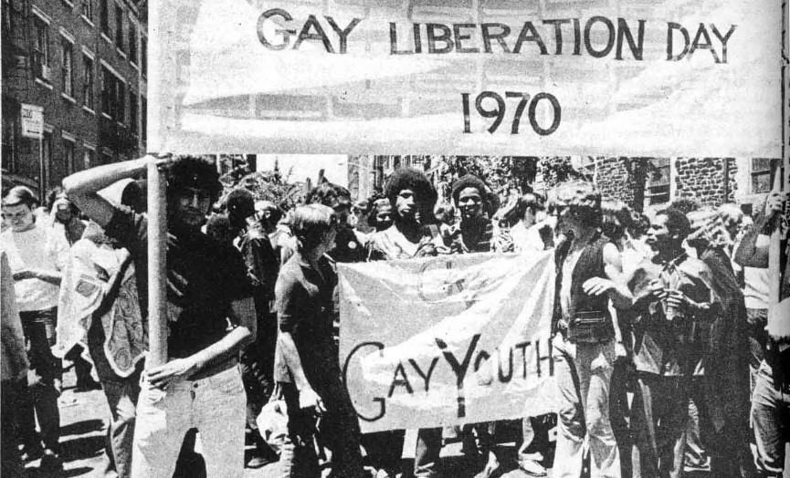
I looked at Postmodernism art which was one of the tasks. It reminded me how much I previously enjoyed this particular style of work, and I ended up looking into more. I wanted to relook at something that I was fascinated by in the past, something that research reminded me to go back on. This is why I think having research to find along with studio work is a very important factor. It helps you find a variety of different artists/work that you probably have not come across before, which helps to inspire you for your studio practical work. It helps you expand your knowledge. Also having knowledge on many designers will always be a positive thing for your own sake, it means you are more aware of different styles etc. Theory is what should always come before your practical.
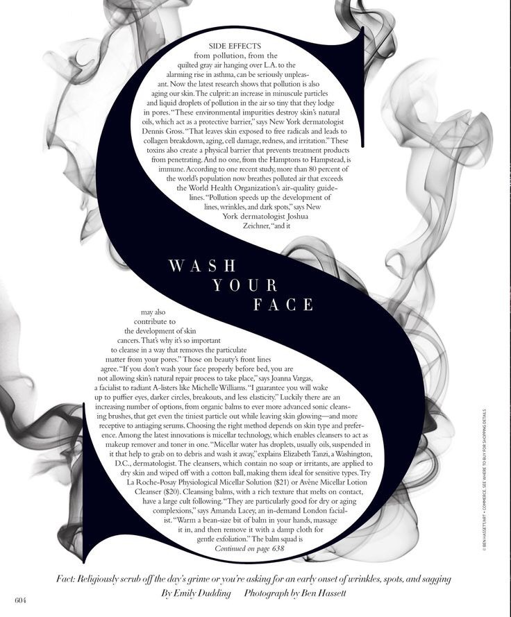
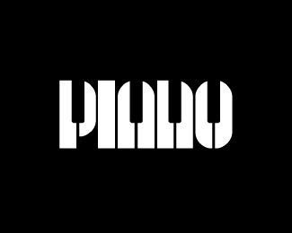
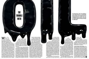 The second one is from a magazine. This is great hierarchy, with exaggerated “OIL” placed on the double spread. The “OIL” really catches the audiences eye, dragging them in. Also they have created this dripping effect, relating to the word oil. The first poster and this relates, as they are both classed as visual puns. It is a smart design, the paragraphs beneath are placed around the dripping of the oil, which makes it look unique and different. The article is all about the trouble with oil, so a very dark and unpleasing colour is used to portray the oil. Just like a very dark colour was used for the “PIANO” poster. Black is a colour that is very powerful. It is dark, gooey, sticky looking. An all round a negative image. This works with putting across their opinions on the troubles with oil.