Author Archives: Jordan Warwick

Jordan Warwick – Task 12: Exhibition Piece

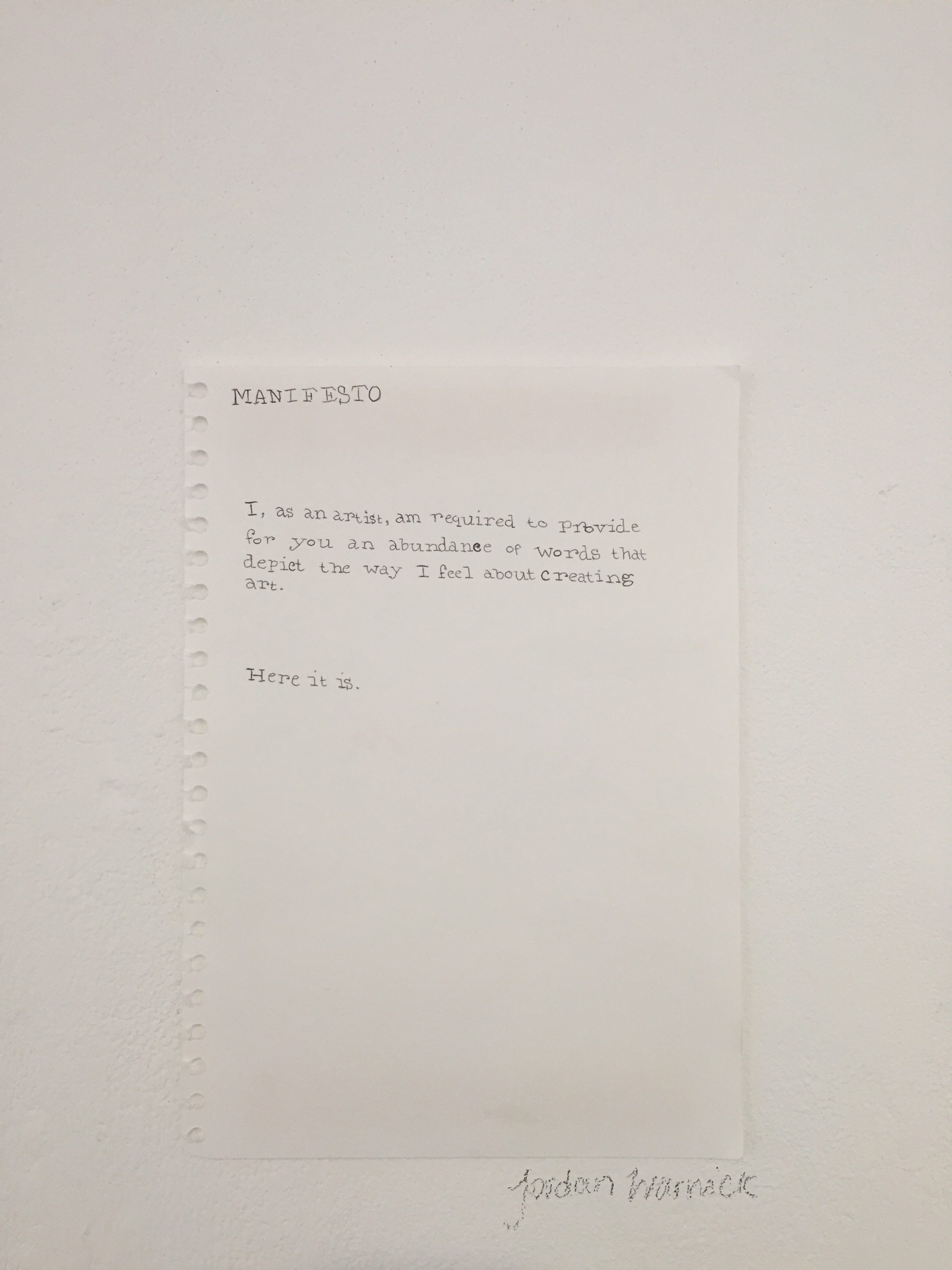
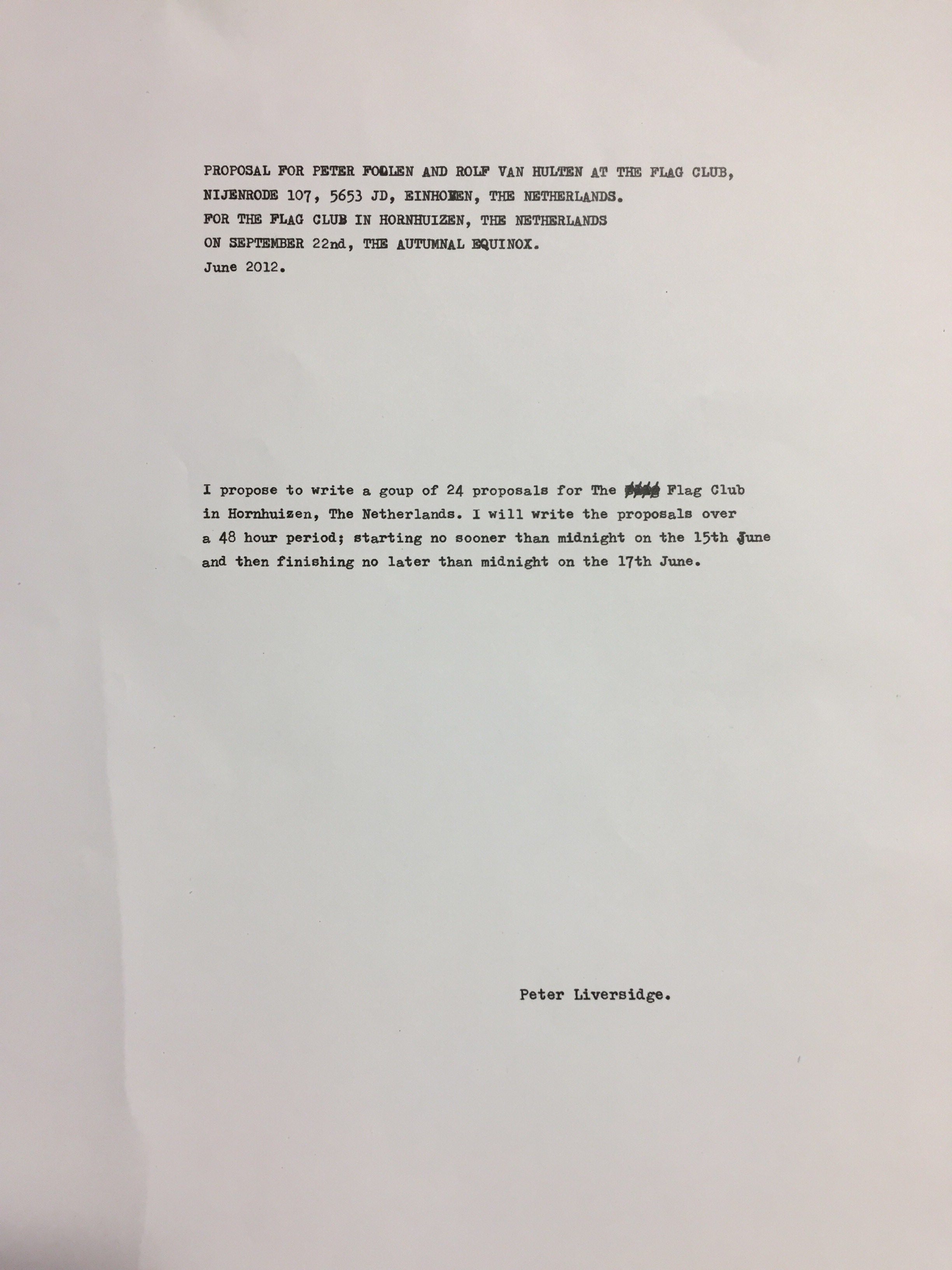
If I were to change an aspect of a piece of work I would make my exhibition piece for the Manifesto project a lot bigger.


The idea behind my piece was to create something that had elements of mischief and rebelliousness running through it, whilst also showing that a good amount of effort and thought had gone into the creation of the piece – I wanted contradiction.
I believed that creating a proper manifesto was too ‘on the nose’, I wanted to make something that made people think, whilst also being very simple in its format.

The piece had the text;

“MANIFESTO


I, as an artist, am required to provide for you an abundance of words that depict the way I feel about creating art.


Here it is.”

This text was written – in a way that was supposed to resemble a typewriter font – onto a piece of A4 sketchbook paper and ripped out. The intention was for the piece to be a very ‘to the point’ text, written in a very formal font and on a very scrappy looking piece of paper, so that it both stood out and was hidden from the audience. However I feel this was something that really didn’t work. In hindsight, there was enough contradiction within the piece already, and so the size was a step too far. The piece ended up being lost in a sea of other pieces that were of very similar size, and thus didn’t get across the message of contradiction quite so easily and shockingly.

Therefore, if this piece had been bigger, A1 or A0 for example, then it would have brought in a lot more interest and thus made more of an impact.

Jordan Warwick – Task 11: Reflection

To put it simply, my blog is honest.

At the beginning of this project, I never intended to create such an honest collection of analysation, anecdotes and opinions within every task; it just happened. Eventually as I got to task three or four I noticed how much I used storytelling as a pathway of writing about myself, and from then on would try and involve it somehow into everything I produced – as long as it was appropriate. Therefore, there is more often than not an introduction that provides a small personal flare, even if I’m writing about something that has nothing to do with myself.

Through this technique of writing, I have learned that sometimes writing comes more naturally to me than any other form of art. To me, writing is good for the soul, it expresses directly how the writer is feeling but can also be manipulated to sound very different. Furthermore, through this discovery I also found that a contradictory nature is a concept I find very exciting, and wrote about recognising it within the works of my own and of others within a few of the tasks that were set.

My blog is personal, it is not something that requires the reader to be in their ‘Sunday Best’, nor does it try to be overly pretentious and fancy. My blog is simply just honest, and a small fraction of what I intend to offer and produce within my own art and writing in the future.

Jordan Warwick – Task 10: Ten words, One image


Discovery, experimentation, past, future, open-minded, growth, passion, communication, colour, fear.

Above are ten words and an image that describe my practice. ‘Discovering’, ‘experimentation’, ‘future’ and ‘growth’ relate to the idea of hope. This is something that is a strong trait within my practice. I have hope that I’m insanely proud of my next piece, and that my techniques will evolve and become a stronger version of what I already create.
This shows through the image. The photo of a work-in-progress self-portrait painted in Gouache onto sketchbook paper shows the many layers of skin tone as well as the still plain paper. This could be a metaphor; sometimes a concept entices me and I spend hours on it, but other times I have trouble – much like a writer’s block.

I see myself as someone who wants to learn new things and grow from them, thus why I describe my practice as being ‘open-minded’. However, there is a strong ‘fear’ of failure, anxiety and paranoia that sometimes knocks me back and convinces me to stay in my comfort zone and to not branch out and try new techniques. This is also apparent in the image as, I have created many a painting onto paper with Gouache paint, and I was too scared to try out oil painting at that moment in time.

‘Past’, ‘future’, ‘passion’, ‘communication’ and ‘colour’, are words that I picked to describe my practice because they are what I aspire to. I want to learn from my past so that my future is brighter and I want to create art that ignites a passion in both myself and the onlooker through my version of visual communication and colour.

Jordan Warwick – Task 9: Ruth Speer


Ruth Speer is an upcoming contemporary artist that focuses on oil paintings on a wooden/mdf surface. Her work involves art movements such as the Renaissance and the pre Raphaelite, but with a supernatural twist.
This painting of her’s is entitled; ‘Allmercy.’

I found Speer’s work on Instagram and then found that she has a portfolio online devoted to all of her pieces.
Something that Speer heavily references when posting about her work is religion; specifically, Christianity.

The verse: “For the teraphim speak iniquity, And the diviners see lying visions And tell false dreams; They comfort in vain Therefore the people wander like sheep, They are afflicted, because there is no shepherd.” – Zechariah 10:2, is a verse from the Bible and ‘Allmercy’ relates to this through the lack of sight that beholds the being within the painting – thus creating the idea of being lost and trying to find a pathway forwards.

In addition, this painting resembles classical paintings usually seen in churches depicting characters such as Jesus and his mother the Virgin Mary. These paintings depict them with gold or yellow circles around their heads, much like the painting above – putting forth the idea that part of the inspiration for this piece was Christianity.

Bibliography:

https://bible.knowing-jesus.com/topics/Sorcery-And-Magic

Jordan Warwick – Task 8: Appropriation

When tasked to appropriate an image, I decided to comply the research I am doing for the Manifesto project and use it for this task. I am looking at the proposals of an artist called Peter Liversidge, he is known for creating hundreds upon hundreds of proposals for his artworks; in fact he has created so many that you can buy books full of them… and I decided to appropriate one.

The idea behind a manifesto or a proposal is that you are announcing to whoever will read it, what you intend to do and what you believe in. There are political manifestos, dating back to the early 1900s where socialism and change really started to set in in many countries across the world, but there are also art manifestos, and the more contemporary ones have been created in a very satirical manner in which inspired me to create something a little bizarre.

Jordan Warwick – Task 7: The Histories of Art

Leo Steinberg (b.1920) from ‘Other Criteria’ published in March 1972 and was a breath of fresh air against the strict regime that swallowed the early 1970s. Steinberg distinctly mentions the changing view of art and the way that it is created for the onlooker. He specifies that art is transforming into something new and that the ‘Old Masters’ are the artists who lived within the realm of Renaissance painting and he perceives this type of art as ‘flat’.

The 1970s were still the years of change, in a political, social and cultural sense. Therefore this piece of text by Steinberg would have helped push the minds of the modern world alongside the ever-changing society that the artists of that time grew with.

Richard Serra (b.1939) from The Yale Lecture published in Amsterdam in 1990 and the lecture was in January of 1990 in the middle of a period where a lot of controversy surrounded him and one of his sculpture pieces. Serra refers to the people who helped him create his sculptures as his ‘new studio’ because he needed professionals who knew the industrial sector very well in order to create his pieces. Serra specifies during his lecture that his works “never decorate, illustrate or depict a site”, they become part of it – this is most possibly why he got into trouble with his sculpture as it was deconstructed and ripped down from where it had been displayed due to making the people in the area unhappy as it was not aesthetically pleasing enough.

The similarities between these two texts are that Steinberg and Serra discuss their work as being something that society is not yet used to, these artists aspired to change the way that art was created and perceived, but to also shock in the process.

Jordan Warwick – Task 6: Mode of Practice

During my time at school, I was told to stay away from paint as I had more talent with chalk and charcoal. However, when I went to college I decided to finally experiment with paint and I fell in love with it.

Fast forward to the present day, I devise that my mode of practice still lies within the genre of painting, but the style I worked in was always very fast and rough with large, expressive brushstrokes whereas now I want to push myself and my patience into trying to replicate and emit the atmosphere of Renaissance paintings. Instead of creating three paintings in one day, I want to take the time to study a piece and work on it over a number of days, weeks or even months. I want my mode of practice to involve paintings in a range of oil paints, Gouache, watercolour and Acrylic and to emit a real sense of the elegance that paintings by Leonardo da Vinci and Michelangelo managed to create. However, the concepts behind these are unlikely to be traditionally Renaissance. My pieces will involve elegance but usually with an air of humour behind it. I enjoy the process of contrast and I believe a beautiful piece in the style of a Renaissance painting, with humorous undertones is something that contrasts together really well.

Jordan Warwick – Task 5: Mona Lisa

Mona Lisa – The Louvre, Paris

Last year, I visited the Louvre in which I managed to see the Mona Lisa by Leonardo Da Vinci.
As we were walking through the building, I noticed how magnificent it was in size and that there were so many rooms filled with different exhibits from a variety of eras, and so we knew we definitely could not do the entire museum in one day. Therefore, we decided to pick the exhibits we really wanted to see; the Mona Lisa being one of them.

The design of the room that the Mona Lisa rested in was quite comical. The piece itself is as big as an A4 piece of paper – surprising me as the piece is so well known yet so small. On the opposing side of the room there was an enormous piece of work titled; Wedding at Cana by Paolo Veronese. The piece was massive and probably the largest painting inside the Louvre, and the fact that this magnificent piece, unknown to most, was opposite one of the most famous paintings in the world that was so much smaller, was very amusing.

 Mona Lisa, Leonardo da Vinci

 Wedding at Cana, Paolo Veronese


Jordan Warwick – Task 4: Queer British Art

Queer British Art – Tate Britain

This exhibition moved me like no other ever has, it showcased the works of artists who identified as gay, lesbian, bisexual, transgender and queer. An exhibition like this has never taken place before, where the entirety of the works involved in the exhibition are created by LGBTQ artists and as I am bisexual: this was very touching.
There were pieces dating back to 1800s, costumes from actors who would dress up as the opposite sex, the prison door of Oscar Wilde and love letters from gay lovers. These gay lovers were called Montague Glover and Ralph Hall and in these letters they’d call each other ‘my darling’ and ‘my dear’. It was very touching to finally see such normal behaviour that usually occurs between couples, being openly displayed between two men.

At the end of the exhibition, the last room was large and square, shelves all around, holding white cards. The idea was, you write how the exhibition made you feel and how it impacted you.
When reading these cards, some were filled with gratification for an exhibition such as this, whereas most were all anecdotes and stories from actual people. Words of encouragement to fight prejudice, anecdotes about coming out, and many stories about love.

I had never experienced such a personal and emotional exhibition and it is one I will never forget.


IMG_1765

Bibliography: 
Gay love letters through history: http://rictornorton.co.uk/hall.htm
Queer British Art: http://www.tate.org.uk/whats-on/tate-britain/exhibition/queer-british-art-1861-1967
Queer British Art review: https://www.theguardian.com/artanddesign/2017/apr/03/queer-british-art-review-tate-britain


Jordan Warwick – Task 3: Everything was as it had been

Image result for muntean and rosenblum

Muntean / Rosenblum Untitled [Everything was as it had been a minute ago
], 2001 [painting]

There is a sense of awkwardness within the poses that the three characters are in, and reading the text below implies this awkwardness was intended.

Two out of three of the characters are looking directly at the viewer – as though we are onlookers, unwelcome in the environment. The overall feeling from this painting is that something unwelcome has just happened, whether its a secret becoming known or an unwanted act, and suddenly the fourth character (the viewer) has walked in, unannounced, and created the suspension that the text describes.

When discussing the exhibition that this image belongs to, Rosenblum says, ‘We are fascinated by, and investigate, how far you can go with the construction of the gesture of the figure. Because, we think the more artificial it gets, the more moving it is, even though, in the normal sense it is the natural that is the thing that moves you’.
This passage represents the image because the male character is squatting on the floor in an odd manner, representing Rosenblum and Muntean’s approach towards artificial stances. This adds more to the awkwardness in the painting because the context is now known that the artist’s were pushing the boundaries about what is relatable, and not only do the positions of the characters reflect this, also the viewer is the forth character adds a strong relatable aspect to the painting.

Bibliography:
Rosenblum quote: http://www.tate.org.uk/whats-on/tate-britain/exhibition/art-now-munteanrosenblum