Author Archives: Sophie Percy

Summary Post

From this module, I have learnt a great deal about design history and what influenced its development. There are key points in history that determined the style and meaning of design being produced through the years. Movements we’ve looked at show how issues in society influenced designers. An example of this is counter culture, which started in the 1960s, the Vietnam War created a revolt within the youth of this time. This feeling was reflected in the artwork and music being made. This shows how things going on in the world around us have an impact and that as designers we should be aware of this. To create meaning in my own work is important to engage an audience. Postmodernism also started around the 1960s and was a movement of change, to move away from modernism.

The values of postmodernism, link to my way of working more than any other movement we looked at. Having the freedom to create without following rules. However, doing so with an understanding of what you’re doing as a designer. I have gained a good understanding of the relevance to this critical thinking and applying these ideas to my own practice. When researching I know to think about bigger issues such as equality, feminism, war, homophobia and socio-political issues. By researching these issues, then applying them to my practise it will create a story and a meaning.

Theory is important so I understand why I’m doing something in my practise. To be able to explain the theory behind the work I do will benefit me as a developing practitioner. Theory and practise must work together to communicate ideas visually. I think the relevance of research and theory is also key to enjoying the work I produce. By researching first and then starting my practise I will be more informed of choices I make, leading to a much better outcome.

An artist I discovered on this module is Jean Michel-Basquiat his work excited me as it looks fun and not controlled. This has influenced how I now want to do my illustrations. In my studio practise he influenced my approach to photography. I thought a lot about layers and taking images through glass or creating filters. I then want to apply this thinking to my illustration work for next semester, looking at layers and composition to create an original style. “I don’t think about art when I’m working. I try to think about life.” (Basquiat ) I think this quote sums up what we have learnt in this module. How thinking about the bigger picture in our work is better than comparing yourself to other people or thinking about achieving something that someone else has already done. I will try to approach my practise more like Basquiat, I believe this will help me improve as a designer.

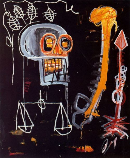
(Basquiat 1982, Black Skull)

Basquiat, J.M (1982) Black Skull. Available from: http://fuckyeahbasquiat.tumblr.com/ [Accessed 6 November 2017]

Basquiat, J.M Quote Available from: https://www.illustratedimpact.org/home/2017/1/31/71o27qg47em6eom974c2pep1e4eb7t [Accessed 6 November 2017]

Publish or Persish story, feeling, meaning, connection

(Douglass, E. 1969 The Black Panther)

(Kruger, B. 1990 I shop therefore I am)

(Crabapple, M. 2013 Guantanamo Bay)

“Today, the independent spirit is more vital than ever.” (Poynor 2004, p.9) makes a point of how mass media organizations give no room for independent publishing houses, newspapers and magazines. And that independent publishers are vital in creating different communication within design. An example of a self-published magazine was the Black Panther. It created a voice for the black community in the 1960s. Emroy Douglass was the illustrator who created the iconic graphic style of the magazine. The illustrations he produced captured an uprising in equality for black men and women. Douglass has a collection of work for Black Panther magazine that documents a time in history that connects people and tells a story today.

The next published work I found was by Barbara Kruger, a feminist graphic designer. ‘I shop therefore I am’ I found on the (Adbusters 2017) website, a group of artists and writers who believe in changing the world order. I think that Kruger’s interest in bigger issues in the world creates feeling in her work. Feminism in design is a topic which I think needs to be brought up more and Kruger as a female designer is doing this. (Roberts 2015) touches on the difference of recognized male designers to female designers. That publications, conferences and awards have a responsibility to represent females as they are equally talented.

(Lupton 2011, p.60) explains how “In an age of self-publishing and social media, the author function has splintered and multiplied… “Author” is now a role that anyone can play. I believe that this is a good thing regarding feminism and an equal playing field for designers. Molly Crabapples has a following created through her online presence, which has given her a career and appreciation for her talent in illustration. She is also a journalist and goes to document places all over the world in a state of civil unrest or crisis. The image I chose by her was one of Guantanamo Bay which has a lot of controversy involving the humanity of the prison. The way in which she documents the stories of these prisoners with interviews and drawings gives her work meaning and the viewer a better understanding of the world around us.

Barbara Kruger, B. (1990) I shop therefore I am. Available from: https:// [Accessed 3 December 2017]

Crabapple, M. (2013) Guantanamo Bay. Available from: https://mollycrabapple.com/reportage/ [Accessed 3 December 2017]

Douglass, E. (1969) The Black Panther. Available from: https://letterformarchive.org/news/emory-douglas-and-the-black-panther [Accessed 3 December 2017]

Lupton, E. (2011) Graphic design: Now in Production, Reading and Writing. New York: D.A.P.

Poynor, R. (2004) Communicate! independent British graphic design since the sixties. London: Laurence King Publishing

Roberts, C. (2015) Splendid new book showcases 75 industry-defining graphic designers. London: It’s Nice That. Available from: https://www.itsnicethat.com/articles/caroline-roberts-graphic-design-visionaries [Accessed 3 December 2017]


Postmodernism, Show, Reveal, Deconstruct

Postmodernism is difficult to categorise (Tate) describes it as ‘anti- authoritarian’ and that it has no defined style. When I think of Postmodernism I think of mixed media and collage, the style of Jean Michel-Basquiat embodies this. The layering of paper, paint and pen is a style I enjoy working with. Basquiat’s work always had meaning behind it, he was religious and had an African Caribbean heritage, these themes inspired his art. However, it may not be obvious to an audience. The names he gave to his work made it clearer and didn’t hide the meaning from the viewer.

Postmodernism I see as having more freedom. The ideas of letting people interpret things for themselves really resonates within me. I think this gives an audience a way to connect more with what you design. David Carson a graphic designer, moved away from using grids and templates. I’ve looked at his spread in Ray Gun using only dingbats on an article about singer, Bryan Ferry. It is purely design rather than to be read. You would have to deconstruct the dingbats to be able to get any text or meaning from it, although the text was printed at the back of the magazine. (Poynor 2003, p. 11) explains in ‘No Moe Rules’ how postmodernism levels the playing field for designers and erodes old boundaries. Creating endless possibilities for design and new hybrid forms to blossom.

Ed Fella mixes fonts and challenges the rules of design. “The alphabet is a construct of fragmented bits and parts which have no semantic meaning in themselves, and which must be strung together in a line, bead-like, and in a prescribed order.” (McCluhun, Fiore, and Agel 1967, b p. 44) I think Ed Fellas commercial art alphabet shows a meaning in the mixed fonts. Its interesting design, opposing the idea of a ‘prescribed order’. This is what postmodernism is about and Ed Fellas work really encapsulates the playful values that it holds.

(Carson, D.1994, Raygun)

(Fella, E. 2005, Commercial Art Alphabet)

(Basquiat, J.M. 1981, Bird on Money)


Basquiat, J.M. (1981) Bird on Money. Available from: https://d2jv9003bew7ag.cloudfront.net/uploads/Jean-Michel-Basquiat-Bird-on-Money.-1981.jpg [Accessed 22 November 2017]

Carson, D. (1994) Raygun. Available from: http://www.csun.edu/~pjd77408/DrD/Art461/LecturesAll/Lectures/PublicationDesign/images/carson/RG-1994.jpg [Accessed 22 November 2017]

Fella, E. (2005) Commercial Art Alphabet. Available from: http://www.edfella.com/images/lettering/letteringcurrent/aprojects/6.jpg [Accessed 22 November 2017]

McCluhun, M. Fiore, Q. and Agel, J. (1967) The Medium is the Massage New York: Bantam Books

Poynor, R. (2003) No More Rules, Graphic Design & Post Modernism London: Laurence King

Postmodernism Art Term: London: Tate. Available from: http://www.tate.org.uk/art/art-terms/p/postmodernism [Accessed 22 November 2017]

Counter Culture Sensibility, Spirit, Meaning

(Willock, H. 1969 Revolution, from The Beatles Illustrated Lyrics)

(Mouse, S and Kelly, A .1966 Skeleton and Roses)

(Rothschild, A. R. 1966 Frank Zappa and the Mothers of Invention perform with Joshua Light Show)

The artwork from the 1960s was about revolution and rebellion. The generation of the time found a way of responding to the Vietnamese war and government through music and art. The idea of flower power and peace spread through the 60s and 70s. Harry Willock an illustrator made the revolution poster for the Beatles. I like the use of text and the busy composition, really representing the ideals of the youth of the 1960s. “Multiculturalism, feminism, gay liberation, environmentalism and community spirit all draw on the idealism of the 1960s.” (Montreal Museum of Fine Arts, 2017) The counter culture revolution has made a difference in society today, my ideals match up with the themes of anti-war, environmentalism, feminism and equality.

Psychedelic artwork became very popular, an aesthetic influenced by drugs and sex. Skeleton and Roses by Mouse and Kelly has a different mood to other psychedelic artwork being produced. His style is darker than other psychedelic artwork and the colour scheme is less hypnotic. I think the big curled text is very much an iconic style of this period. The design also looks to be influenced by art nouveau, which I am a big fan of. “Comics, cartoons and ‘pop art’, the paintings and icons of Far Eastern mysticism, decorative embellishments from art nouveau and art deco, and the fat, chunky alphabets of old circus and theatre playbills all came into play.” (McQuiston, 1993 p.142)

Another way in which rock bands added psychedelia into their aesthetic was concerts. Joshua White developed the light shows for these bands. Layers of oil and alcohol move under heat and change colours, creating hypnotic patterns. These where then projected behind the band at a concert. By taking the focus off the musicians, perhaps, a liquid light show has a way of dissolving the divide between performer and audience member. It equalizes.” (Farberman, 2017) I think this quote really gets the message across of what the sixties was about and that was equality. The artwork and music had real meaning and that’s why it is so iconic today.

Farberman, B. (2017) Inside Joshua Light Show’s 50-Year Quest to Make Rock & Roll Visual. New York: Rolling Stone. Available from: http://www.rollingstone.com/music/features/joshua-light-show-founder-on-fillmore-east-janis-joplin-w501262 [Accessed 17 November 2017]

McQuiston, L. (1993) Graphic Agitation: social and political graphics since the sixties, London: Phaidon

Montreal Museum of Fine Arts. (2017) Revolution. Montreal: Montreal Museum of Fine Arts. Available from: https://www.mbam.qc.ca/en/exhibitions/past/revolution/ [Accessed 17 November 2017]

Mouse, S and Kelly, A (1966) Skeleton and Roses. Available from: https://3.bp.blogspot.com/-TAJog7lUjKg/WOYnzzb2yCI/AAAAAAAAAwo/UqcpDKcULa0-YoJ-ruPhR2sdODz6n8B2wCLcB/s640/Rick%2BGriffin.jpg [Accessed 17 November 2017]

Rothschild, A. R. (1966) Frank Zappa and the Mothers of Invention perform with Joshua Light Show. Available from: http://img.wennermedia.com/760-width/joshua-light-show-zappa-9b01e8ef-54c7-4477-afab-5cd9786f2621.jpg [Accessed 17 November 2017]

Willock, H (1969) Revolution, from The Beatles Illustrated Lyrics. Available from: http://www.peopleofprint.com/wp-content/uploads/2016/11/7._The_Beatles_Illustrated_Lyrics_Revolution_1968_by_Alan_Aldridge__Iconic_Images_Alan_Aldridge.jpg [Accessed 17 November 2017]

Authenticity and Modernism

Authenticity means “to be of undisputed origin and not a copy; genuine”. Stevenson. A (2010, p. 107) The idea of being truly authentic in a world that we take inspiration from seems impossible. I believe that you can create work that is your idea. However, you would have been influenced by something on the way. “Modernism is characterised by a deliberate rejection of the styles of the past; emphasising instead innovation and experimentation in forms, materials and techniques to create artworks that better reflected modern society.” (Tate definition). But although this sounds as though it is authentic, modernists still took inspiration from work that had been done before. They just made it new and different, creating work that was forward thinking. An example I found was the work by Paul Harvey, a Stuckist artist who took inspiration from Mucha. Harveys work is a modern twist on the style Mucha did at the start of the 20th century.


(Mucha. A 1899 Moet and Chandon White Star)             (Harvey.P 2002 Madonna)

The term ‘authenticity’ was first used to describe art work by Walter Benjamin. This was meant that it wasn’t a reproduction of anything before. So, it is easy to be authentic, if your artwork isn’t a complete copy of someone else’s work. The idea of reproduction and forgery then comes into play.  “an original work of art is considered by the art market to have a higher value over a reproduction because it contains this authenticity”. (Tate definition)

I think it is possible to be authentic and that the principles of modernism also allow for this to happen. Even though true authenticity may not be possible you can still produce work that is done differently in some way. Through colour, line, technique, medium and many more aspects of art and design.


 Authenticity Art Term: London: Tate. Available from: http://www.tate.org.uk/art/art-terms/a/authenticity [Accessed 4 November 2017]

Harvey, P. (2002) Madonna. Available from: http://www.paulharveypaintings.com/NewLook/2002/027.htm [Accessed 4 November 2017]

Modernism Art Term: London: Tate. Available from: http://www.tate.org.uk/art/art-terms/m/modernism [Accessed 4 November 2017]

Mucha, A. (1899) Moet and Chandon White Star. Available from: https://www.alfonsmucha.org/Moet-And-Chandon-White-Star.html [Accessed 4 November 2017]

Stevenson, A. (2010) The Oxford Dictionary of English, 3rd ed. Oxford: Oxford Univ. Press

“Technology is the mortal enemy of art”

If we look at modern technology and design today, they work together in producing art but also to advertise it. Social media being one of these. There are many websites in which we can upload our work and gain a following. “Traditionally, artists would go to a gallery with their portfolio and the gallery would decide if their work was good enough to display or not. Now artists can simply use the internet to exhibit and display their work themselves.” (Gebore 2017) From this statement, I found myself agreeing with the idea that social media could make galleries obsolete. I think this would be a great shame, at a gallery there is more interaction. Whether we are looking at conceptual art or graphics. We also see the work printed instead of viewing something through a computer screen which could give a different appearance.

The benefits of using technology means we can create exciting new design. “Every efficiency that I gain through technology, the void is immediately filled with the question, ‘Can I make it more complex?’” (Standley 2013) Standley’s work is made better than it could ever be with the use of a laser cutter. The detail achieved would be near impossible by hand.

I would have to disagree with the statement “Technology is the mortal enemy of art.” I think with the use of technology we can do far greater things and reach our imaginations potential. I believe that galleries will live on through culture and people like me visiting them.


(Standley 2013)


Gebore, D. (2017) Artem ex machina: Technology’s impact on the changing world of art. Greely: The Mirror. Available from: https://www.uncmirror.com/arts/2017/08/20/artem-ex-machina-technologys-impact-on-the-changing-world-of-art/ [Accessed 21 October 2017]

Virginia Tech: Eric Standley (2013). YouTube Video. USA: Virginia Tech


Compare & Contrast

I chose an illustrated book cover of Alice in Wonderland by Ralph Steadman. Famous for his Fear and Loathing in Las Vegas illustrations. His drawing of the rabbit uses a lot of line and is done with pen and ink. Steadman uses messy lines contrasting with the border that the rabbit is stood on. The border appears to surround the typography in the middle of the page. The style is modernising the Victorian appearance of the old Alice in Wonderland illustrations.

The book cover reminded me of Shepard Fairy’s posters, a graphic designer and artist. I found this poster from his ‘Make Art Not War’ collection. I think the two are similar in style, the border used on both looks very similar in aesthetics. The typography is enclosed in their borders and the colour scheme uses black, red and off white. Both have the appearance of Russian Constructivist Propaganda posters. They also appear to be influenced by Art Nouveau, Mucha and William Morris. I see this in the design of the borders used in both works.

In contrast, the scale of each piece is largely different as Shepard Fairy’s poster is painted on a wall. I would also say the book cover isn’t as bold in colour and has an older style compared to the poster which uses thicker lines in the drawings. If you study each image in depth you can see they have taken inspiration from similar sources. However, they are both individual designs from different disciplines.

Terminal Bar

Terminal Bar by Stefan Nadelman is a short film documenting a corner in Times Square New York. Stefan Nadelman’s father was a bartender and he spent ten years taking photographs of people who came to Terminal Bar. The film tells the history and stories of the bar through portraits. As well as documenting 1972-1982 in this specific place through black and white photos, we get a biography from Sheldon Nadelman (Stefan’s father). He gives an account of these ten years and the background of the people in the photos. I imagine this would be a very interesting project for Stefan as he learns about his father’s past.

From this interest in his father’s life and the chance to collaborate together they probably started this project looking through Sheldon’s photographs. Then having Sheldon give his account on who the people where and in chronological order. Doing their own contextual research, I’m sure, was critical in reflecting the mood and feel of the 70’s on screen. This in-depth research and the accounts from Sheldon attributed to the choice of music, narrator, sound effects and pace of the film.

The film follows this pattern of stills, voice over and video, telling the journey of the bar. Working in a chronological time frame works well and gives the film flow. I think it’s important to take this away and use it in my own practise to create a project that is easy to follow and has a start and an end. Looking at somethings history or background and discovering hidden narratives through contextual research could lead to exciting outcomes.