Author Archives: Asia Marti Sobrepera

Task 11 and 12: What Students Say

I have to admit that when I found out we had a Research and Communication module I wasn’t particularly thrilled about it, as writing has never been one of my strengths. For this last task I will be analysing my experience from all previous exercises. Notwithstanding, I have to say that although not every part was enjoyable, it definitely broadened my knowledge and encouraged my own self-discovery.

The module started with Task 1 and 2: Online Resources. I got particularly invested in the research of this first writing and was glad to use a book somehow. I found it such a pleasurable feeling when I was able to link past knowledge and new one together. It was like all the information was just sinking in and I didn’t even have to intentionally learn it.

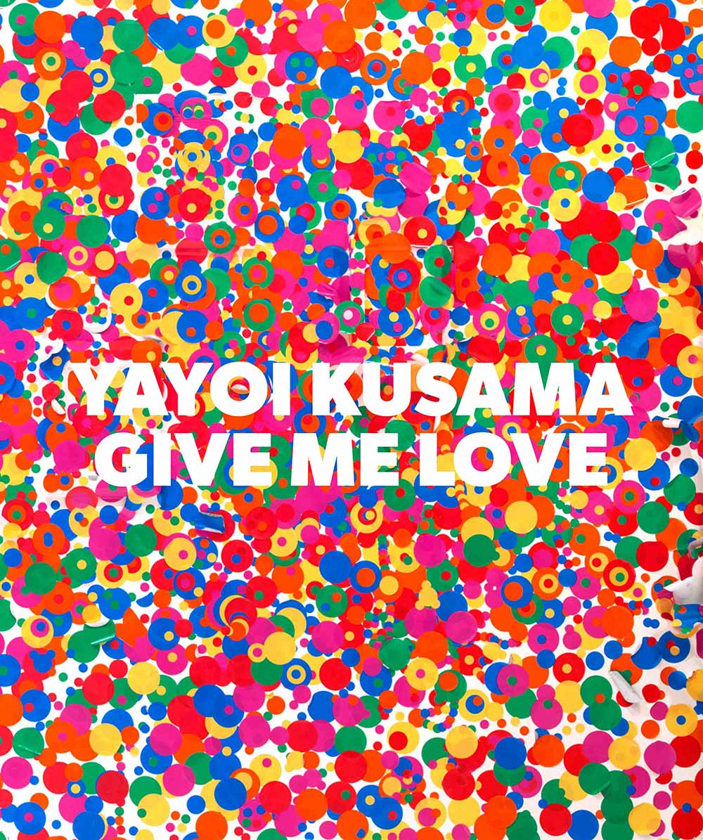
For my second piece of writing: Academic Integrity, I searched one of my favourite artists, Yayoi Kusama. Something I thought would help, however, I was feeling completely uninspired and my research felt quite vague. Nothing, not even websites or books were supporting my thoughts. For this reason, I decided to look for more dynamic and visual sources of information such as videos. These were told first-hand by the artist and were very useful.

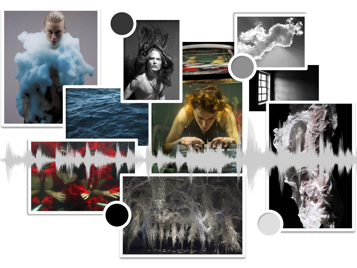
Task 5 and 6 was all about Visual Research. I was surprised to find out that this time I was enjoying myself. I guess that thanks to the experience from previous tasks I started finding which process helped me best to potentiate my skills. Instead the mood board was slightly challenging, as a tactile person, having to create a computerised version supposed an added difficulty.

The following exercise was Reflective writing something that required academic reading. This one was definitely the most time-consuming and difficult. I needed to constantly push it aside to let the ideas sink in. For instance, there was so much to talk about and so many complex concepts that it was hard to select and keep the work count to only 500 words.

 My “final” task, number 9 and 10 was Ethical Issues.  This was the only task I found myself looking forward to write. I am genuinely concerned about this topic and it was a wonderful experience to be able to know more about it. I was so pleased to find myself using words with quite precise meanings. Not all the time, however, did I have the exact word in mind, so I, likewise, searched for extra synonyms or word definitions to make sure that the text were varied and fluid.

Writing, in my opinion, is complicated but it is essential to be able to communicate our thoughts through this media. Although I learnt a lot, I realise still how many online sources I used. Something I believe must be improved. On the other hand, I absolutely loved the creative freedom we where given. Improving in this aspect is all about practise and dedication and this has showed me that the harder I push myself, the greater things I am able to produce.

Task 9 and 10: Ethical Issues.

Duncan Quinn, (2008), Advert [ONLINE]. Available at: https://www.trendhunter.com/trends/duncan-quinn-suit-ad-depicting-strangled-woman [Accessed 4 December 2017].

Advertisement can be the first contact we can have with a brand that we’ve never known before. Most adverts hope to influence the consumers on what products to buy or inform them about new goods on the market. Therefore, this industry is a constant war to capture the viewer’s attention and to do so companies have to take risks to fulfil their goals.

Duncan Quinn, a high quality brand specialised on men clothing released in December of 2008 an advert that many considered to be disturbing. It featured two main characters, a man and a woman, in a black and white picture. The man located on the top right-hand side is dressed in a suit and poses with an expression of joy and satisfaction. He represents an individual from upper class with high income who depicts the poorest example of mannerisms and gentleman behaviour. He’s holding a tie wrapped around the victim’s lifeless body pulling it hard against him while he looks straight to the recording device. Meanwhile, the woman is lying on a car hood with nothing else than lingerie and her dark hair is lying on a puddle of what I imagine is blood.

The image seems to reveal a crime scene where the damage has already been done. Its almost like the picture is a prize to be kept by the murderer as a reminder of his accomplishments. On the other hand, the fact that the woman is lying defenceless on what seems an expensive car only communicates ideas of male superiority, woman slavery and dependency, as if women were inferior and only to be used as objects for pleasure.

I believe this is not the right way to capture the consumer’s attention, especially if we take steps back in the development of society to promote violence, sexual harassment and gender inequality. However, as unfair as it looks “Nobody counts the number of ads you run; they just remember the impression you make” (William Bernhart, 1911-1982); and without realizing here we are taking about the impact that this commercial had in the society of the time. What about all the other adverts that stayed inside the ethical limits? Who talks about those?

It is quite a delicate situation when a brand decides to take these risks. Whenever a company launches a new campaign they must select their public target and create an advert that they believe will result in higher profit. Nevertheless, it is essential that while doing this, they respect the rest of the possible consumers of the brand. For instance, the woman that will be buying suits for their close male relatives might take into consideration whether to buy from this brand again after seeing such publicity.

In conclusion, it is important for a company to sell themselves differently from the rest and cause an impression. However, I do not agree when they surpass the ethical boundaries to accomplish this. The consequences of this advertisement can be deeply devastating. Our eye gets easily used to seeing situations like this, and the more often we are exposed to these images the more likely events like this will appear to be normal.


Bibliography: 

UKEssays. 2017. Ethical issues in advertising. [ONLINE] Available at: https://www.ukessays.com/essays/marketing/ethical-issues-in-advertising.php. [Accessed 04 December 2017].

TrendHunter.com. 2017. Disturbing Sexist Ads: Duncan Quinn Suit Campaign Depicts Strangled Woman. [ONLINE] Available at: https://www.trendhunter.com/trends/duncan-quinn-suit-ad-depicting-strangled-woman. [Accessed 04 December 2017].

Advertising Is Good For You. 2017. Duncan Quinn. Suits for men who hate women. – Advertising Is Good For You. [ONLINE] Available at: http://pzrservices.typepad.com/advertisingisgoodforyou/2008/12/duncan-quinn-suits-for-men-who-hate-women.html. [Accessed 04 December 2017].

Kent Spiers. 2011. Student Example. [ONLINE] Available at: http://hcaldwell.typepad.com/files/student-example-1.pdf. [Accessed 4 December 2017].

Venture Harbour. 2017. 32 Great Quotes From Advertising & Marketing Experts. [ONLINE] Available at: https://www.ventureharbour.com/great-quotes-advertising-marketing-experts/. [Accessed 04 December 2017].

The Economic Times. 2017. Definition of “Advertising”. [ONLINE] Available at: https://economictimes.indiatimes.com/definition/advertising. [Accessed 4 December 2017].

The Guardian. 2017. Shopper’s eye view of ads that pass us by | Media | The Guardian. [ONLINE] Available at: https://www.theguardian.com/media/2005/nov/19/advertising.marketingandpr. [Accessed 05 December 2017].
Office/Bureau. 2017. Bill Bernbach Said | Biography. [ONLINE] Available at: http://www.ddb.com/BillBernbachSaid/more-about-bill/biography.html. [Accessed 05 December 2017].

Task 7 and 8: Reflective writing.

Text selected: Taste, Fashion and the French Fashion Magazine by Sandra Miller.


We all know what a fashion magazine looks like. Pages packed with brands, luxury items and ads with thin figures in designer clothes; things that many seem to think of as unnecessary and unimportant. However, these publications play a fundamental role as trendsetters and act as a examples of “good taste”.

Magazines emerged in 1672 around the Age of Reason or also called the Enlightenment. This movement believed that reason provided the only way for humanity to evolve and thereupon, magazines were influenced by it as well. In fact, time after they originated, these publications started featuring both fashion and “taste”. This so-called “taste” came to life to describe a reality influenced by the judgement of the individual and its cultural, economic and political surrounding, something that magazines seize to effectively communicate visually era after era.

For these philosophers of the Enlightenment, “taste” was a way of setting a base for all judgement of any aesthetic experiences. The purpose of it was being able to express individual thoughts in a way that they could be understood universally. In other words, establish what meant the idea of “disliking” or “liking” a work of art. However, although everyone can determine their own idea of beauty, these philosophers considered that only those qualified could distinguish between “good and bad taste”.

In my point of view, I completely agree with what Sandra Miller describes in the text. For instance, someone’s background, their traditions and culture will affect their appreciation towards art. However, I disagree with the idea of an existing “bad taste”. To me all subjective matters are far too attached with someone’s personality and what they are used to see. What good taste might be considered in the Western world will be completely different in an African or Indian society. For this reason, I consider “bad taste” to be only possible when it doesn’t adapt itself to your style or your individuality.

I do believe that with the high impact of adverts we receive every day, it is very easy to get influenced by trends and mimic these in our outfits, making our personality almost invisible through our outer appearance. However, it is time to take advantage of the broad market offer and push our taste to the surface. Taste is something to embrace and never to be ashamed of.


Bibliography: 

HISTORY.com. 2017. Enlightenment – Facts & Summary – HISTORY.com. [ONLINE] Available at: http://www.history.com/topics/enlightenment. [Accessed 01 December 2017].

2017. Why Fashion Magazines Matter – The Atlantic. [ONLINE] Available at: https://www.theatlantic.com/entertainment/archive/2015/02/why-fashion-magazines-matter/385457/. [Accessed 01 December 2017].

Already Pretty | Where style meets body image. 2017. What is Taste? – Already Pretty | Where style meets body image. [ONLINE] Available at: http://www.alreadypretty.com/what-is-taste/. [Accessed 01 December 2017].

Fashion: A look at Style vs Taste | Smart Creative Women. 2017. Fashion: A look at Style vs Taste | Smart Creative Women. [ONLINE] Available at: http://smartcreativewomen.com/fashion-a-look-at-style-vs-taste/. [Accessed 03 December 2017].

HuffPost. 2017. What Is Fashion Sense and Why Don’t I Have Any? | HuffPost. [ONLINE] Available at: https://www.huffingtonpost.com/taylor-jackson-/what-is-fashion-sense-and_b_9276598.html. [Accessed 03 December 2017].

The Devil Wears Prada, 2006. [DVD] David Frankel, United States: 20th Century Fox.


Task 5 and 6: Iris Van Herpen

Designer: Iris Van Herpen

Collection: Aeriform AW 2017.


Three fashion designs from Iris Van Herpen Aeriform AW 2017 collection.

These garments seen above belong to Iris Van Herpen’s collection for 2017 called Aeriform. The innovative artist explores in these garments the fluidity of both water and air and the contrast within them incorporating surprising materials and textiles.


Moodboard of 10 references for Iris Van Herpen Aeriform collection.


“Between Music” band while playing on Iris Van Herpen Aeriform fashion Show.

In the image above we observe quite an interesting event happening. It is a band member of Between Music playing with a submerged instrument during their underwater concert called Aquasonic. These musicians and their work transcend and transform the conventional and natural relationship between our bodies and the elements”(Iris Van Herpen website, Aeriform Collection). In other words, they challenge the body and the instruments to a completely different medium.

For years they have explored the different sound possibilities and have been able to produce custom-made instruments developed specifically to be played underwater. It is not only striking and surprising to hear the sounds they are able to make, but also the actual elements that are needed to produce these.

For instance, at the bottom of the vertical image, we can see this transparent instrument full of cables, tubes and pipes as well as small holes that the musician uses to create these sounds. We can see clearly that the person is inside this water tank and is surrounded completely by glass. There is also a strong spotlight that lights up the scene and falls upon her back and shoulders. In fact, thanks to this lighting we are able to distinguish different colours such as red, green and orange. Even though it is a still picture, movement comes across thanks to the slight diagonal angle with which the image was taken. This dynamism, however, comes across as well with the moving surface of the water and her floating-like hair.

Although this doesn’t look like a reference, the Dutch designer actually thought about their “hypnotic biophonic sound” (Iris Van Herpen Website, Aeriform Collection) when creating her designs and it is afterwards that she invited them to perform in her fashion show while the delicate garments made their way into the catwalk.


Bibliography:

Nicole Phelps. 2017. Iris van Herpen Fall 2017 Couture Collection – Vogue. [ONLINE] Available at: https://www.vogue.com/fashion-shows/fall-2017-couture/iris-van-herpen. [Accessed 03 November 2017].

Iris van Herpen. 2017. Aeriform | Couture | Iris van Herpen. [ONLINE] Available at: http://www.irisvanherpen.com/haute-couture/aeriform. [Accessed 03 November 2017].

3D Printing Blog | i.materialise. 2017. The New Craftsmanship: Iris van Herpen and her Inspiration | 3D Printing Blog | i.materialise. [ONLINE] Available at: https://i.materialise.com/blog/the-new-craftsmanship-iris-van-herpen-and-her-inspiration/. [Accessed 03 November 2017].

YouTube. 2017. Dutch Profiles: Iris van Herpen – YouTube. [ONLINE] Available at: https://www.youtube.com/watch?v=9vZktNvLCaI. [Accessed 04 November 2017].

Dezeen. 2017. Iris van Herpen explores contrasts between water and air with Aeriform. [ONLINE] Available at: https://www.dezeen.com/2017/07/05/iris-van-herpen-explores-contrasts-between-water-air-aeriform-couture-collection-design-fashion/. [Accessed 09 November 2017].

The New Yorker. 2017. Iris van Herpen’s Hi-Tech Couture | The New Yorker. [ONLINE] Available at: https://www.newyorker.com/magazine/2017/09/25/iris-van-herpens-hi-tech-couture. [Accessed 04 November 2017].

YouTube. 2017. In Fashion: Iris Van Herpen interview – YouTube. [ONLINE] Available at: https://www.youtube.com/watch?v=bjp8uxXEZHI. [Accessed 04 November 2017].

YouTube. 2017. Iris Van Herpen – YouTube. [ONLINE] Available at: https://www.youtube.com/watch?v=7sdeiVYHsm8. [Accessed 04 November 2017].

YouTube. 2017. Iris van Herpen Interview Video – YouTube. [ONLINE] Available at: https://www.youtube.com/watch?v=ZcaPhkSWkMc. [Accessed 04 November 2017].

Naomi Shavin. 2017. Iris Van Herpen Is Revolutionizing the Look and Tech of Fashion | Arts & Culture | Smithsonian. [ONLINE] Available at: https://www.smithsonianmag.com/arts-culture/iris-van-herpen-revolutionizing-look-and-tech-fashion-180958969/. [Accessed 04 November 2017].

Task 3 and 4- Yayoi Kusama

For my current project I wanted to expand my monochromatic palette into a more colourful range. That is why, I turned to one of my favourite colourful artists and looked at the catalogue for her past exhibition called Give Me Love, that I found on the WSA Library.

Tatehata, A., 2017. Yayoi Kusama: Give Me Love. David Zwirner Books.

Tatehata, A., 2017. Yayoi Kusama: Give Me Love. David Zwirner Books.

This book contained her distinctive style and her mesmerizing patterns whether it is her polka dots or the repetitive eyes in her paintings. With them, the artist “invites the viewer into her world, sharing her inner thoughts” (Tate, 2012, video called “Yayoi Kusama: Obsesionado con los lunares”) and is known for her environmental installations that submerge the spectator into a totally new reality based on her hallucinations and infinity.

Due to my admiration for her style and self-preserving art I kept researching towards a more biographical direction. Apparently, Kusama had had a traumatic childhood that had affected her mental state. However, her constant energy for creating art soon forged her a bright future. In fact, Kusama decided to open a museum in Tokyo for her fellow locals, something that the New York Times captured in one of its articles.

Motoko Rich. 2017. Yayoi Kusama, Queen of Polka Dots, Opens Museum in Tokyo - The New York Times. [ONLINE] Available at: https://www.nytimes.com/2017/09/26/arts/design/yayoi-kusama-queen-of-polka-dots-museum-tokyo.html. [Accessed 01 November 2017].

Motoko Rich. 2017. Yayoi Kusama, Queen of Polka Dots, Opens Museum in Tokyo – The New York Times. [ONLINE] Available at: https://www.nytimes.com/2017/09/26/arts/design/yayoi-kusama-queen-of-polka-dots-museum-tokyo.html. [Accessed 01 November 2017].

Unsurprisingly, behind such peculiar creations, there is a unique individual. The Japanese artist is not only known for the art that she makes, but for making it part of her lifestyle and wardrobe. With bright orange hair and red lips, the 88-year-old artist has collaborated with brands such as Louis Vuitton and incorporated her style into fashion.

Motoko Rich. 2017. Yayoi Kusama, Queen of Polka Dots, Opens Museum in Tokyo - The New York Times. [ONLINE] Available at: https://www.nytimes.com/2017/09/26/arts/design/yayoi-kusama-queen-of-polka-dots-museum-tokyo.html. [Accessed 01 November 2017].

Motoko Rich. 2017. Yayoi Kusama, Queen of Polka Dots, Opens Museum in Tokyo – The New York Times. [ONLINE] Available at: https://www.nytimes.com/2017/09/26/arts/design/yayoi-kusama-queen-of-polka-dots-museum-tokyo.html. [Accessed 01 November 2017].

Unknown, (2012), Louis Vuitton- Yayoi Kusama Collection [ONLINE]. Available at: http://www.vogue.co.uk/gallery/louis-vuitton-unveils-yayoi-kusama-collection [Accessed 1 November 2017].

Unknown, (2012), Louis Vuitton- Yayoi Kusama Collection [ONLINE]. Available at: http://www.vogue.co.uk/gallery/louis-vuitton-unveils-yayoi-kusama-collection [Accessed 1 November 2017].


Task 1 and 2 – Marcel Duchamp and The Armory Show


Marcel Duchamp in Hollywood. Photography captured by Beatrice Wood Book called Marcel Duchamp: The Bachelor Stripped Bare: A biography Published by MFA Publications, a division of the Museum of Fine Arts, Boston, ©2002. Chapter: A Fond Memoir, Page 313.

Marcel Duchamp in Hollywood.
Photography captured by Beatrice Wood
Book called Marcel Duchamp: The Bachelor Stripped Bare: A biography
Published by MFA Publications, a division of the Museum of Fine Arts, Boston, ©2002.
Chapter: A Fond Memoir, Page 313.

After the lecture I made my way to the library and randomly took out the book Marcel Duchamp: The Bachelor Stripped Bare: The Biography. When flipping through the pages I came across a black and white picture of Marcel Duchamp in Hollywood. It was quite an intense photo, almost a portrait of the artist taken by a friend of his: Beatrice Wood.

The Armory Show (also called The International Exhibition of Modern Art) in February 17, 1913 Opened at the 69th Regiment Armory on Lexington Avenue in New York. Smithsonian Institution Archives of American Art Photographer: unknown

The Armory Show (also called The International Exhibition of Modern Art) in February 17, 1913
Opened at the 69th Regiment Armory on Lexington Avenue in New York.
Smithsonian Institution Archives of American Art
Photographer: unknown

It was a surprising factor to find a French artist in the cosmopolitan American city, so I decided to look for Marcel Duchamp in America”. An article in The New Yorker magazine caught my attention. There it explained how he became popular in this region and the purpose of his stay. Apparently, Duchamp’s “Nude descending the staircase”, a painting with cubist influence, was presented in one of the most significant shows ever held in the States: The Armory Show of 1913. Thanks to the enormous attention that his piece caught during this exhibition, Duchamp became well renowned.

The New-York Historical Society, a museum and library, explicitly created a website based solely on the Armory Show and its 100 year anniversary. Through this reliable source I gathered a considerable amount of data related to it and the impact it supposed on the society of the times and the development of future art practices. In fact, I found out thanks to a review in the New York Times that in 2013 the exhibition: The Armory Show at 100: Modern Art and Revolution was held. This show had historical purposes and brought back together some of the pieces that were originally displayed in 1913.

The Armory Show at 100. Website created by the New Work Historical Society, Museum and Library Website Available at: http://armory.nyhistory.org/about/ Accessed on the 18th of October of 2017

The Armory Show at 100.
Website created by the New York Historical Society, Museum and Library
Website Available at: http://armory.nyhistory.org/about/
Accessed on the 18th of October of 2017

 Marcel Duchamp, as previously mentioned, was a participant of the show, however, I yet hadn’t had the opportunity to discover more about him. Through the website of Tate Modern, I found further information not only of his life and artworks, but also of his personal vocabulary when expressing and talking about his pieces (for example: readymades).

Apart from artists like the French, I came across others like Picasso and his Blue Nude painting in some press releases of the NY historical society. It was impressive being able to read the reactions of people of those times: “You know, she’s a nude. You can tell she’s a nude, but she’s in all of those colours you never imagined you would see on a woman before, she looks very primitive, almost childlike” (viewer talking about “Blue Nude”).

Quotes like this made me perceive the realness of these events and somehow made them more human and interesting. I deepened myself into history websites to see if there were any historic events that could explain the need of this radical change in art aesthetic, and there clearly was. By reading the online Encyclopaedia Britannica I realised that between 1914 and 1918 World War One took place. Such a conflict gave rise to a moment of great tension and chaos. This breaking of art had now more of an origin, and it made sense that Dadaism, the art movement that all these different artists belonged to had emerged in a neutral country such as Switzerland.


Bibliography (Books and Websites).

Marquis, A., 2002. Marcel Duchamp: The Bachelor Stripped Bare: A Bibliography. 1st ed. Boston: MFA Publications, a division of the Museum of Fine Arts, Boston.

The New Yorker. 2017. DUCHAMP AND NEW YORK | The New Yorker. [ONLINE] Available at: https://www.newyorker.com/magazine/1996/11/25/duchamp-and-new-york [Accessed 12 October 2017].

Keats, J for Forbes Website. 2017. The Naughtiest Picture of 1913 ‘Nude Descending a Staircase’ Returns To New York City. [ONLINE] Available at: https://www.forbes.com/sites/jonathonkeats/2013/11/05/the-naughtiest-picture-of-1913-nude-descending-a-staircase-returns-to-new-york-city/#525497556c45 [Accessed 12 October 2017].

Continue reading