Author Archives: Tia Leigh Allen

TASK 11/12- THE SUMMARY

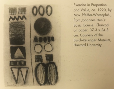
This module has been a real learning curve for me as writing hasn’t always been one of my strongest areas. The weekly lectures that we had entailed: slideshows and group discussions, all in which were very engaging. I was introduced into a new way of processing information and having time to reflect and write my response, this was then uploaded to an online platform. The online blog was something that first daunted on me as I was unsure how I felt about everyone being able to see what I’d written and the opinions I’d put across. I believe this has made me feel more confident about my work and not to worry as much.

I was first introduced to Harvard referencing and although it’s such a simple skill, I never knew what it was before and I now realise how much of a necessity it is and the importance behind it. Furthermore, the module as a whole has massively helped with my researching techniques and not to always rely on the Internet. I feel like I can confidently use the library to the best of my abilities unlike before. This is highlighted throughout my work in all off the pathways and it definitely makes my work more personal to me and not something just found off Pinterest which x amount of people could be looking at.

Task 7/8 faced me with some challenges, as I found the chapter we was given was quite complex and confusing. I had to re-read it multiple times in order for me to be able to break it down and re-word it so I could understand it. Even then, I felt my outcome wasn’t completely right. In addition, the time in we were given for all the tasks to be was vast but I’m glad I kept on top of them and had each task completed before the next lecture. Over the past 2 weeks, I re-visited the blog and went back through the previous tasks and was able to identify some mistakes and was able to change them and I can really see a difference in my writing over a short amount of time.

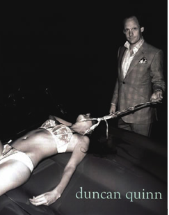
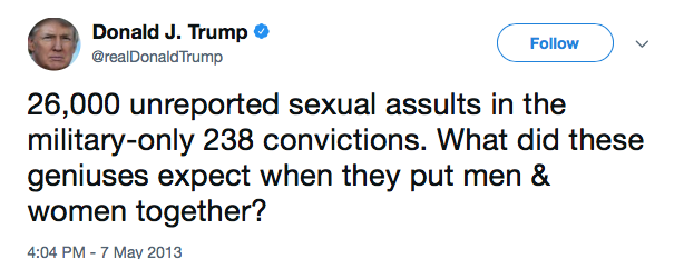
I thoroughly enjoyed task 9/10 and being able to reflect on the ethical issues within fashion advertisements. Beforehand, this was something I didn’t pay great attention to and it’s seen in our everyday lives so I should’ve been more aware of it. After this task and researching into it, I’ve realised how much it actually affects me and how passionate I feel about certain points.

To conclude, the only thing I would like to see on the next module is, having a recap of the previous task each week so I could outline where I may be going wrong and can improve for my next task.

Nevertheless I think I’ve learnt more techniques than I expected to just in the first module and I will definitely be taking these forward into future practises, I look forward to the next module and what it has to give.

TASK 9/10- ETHICAL ISSUES IN ADVERTISING

Duncan Quinn, a menswear designer typically known for his bespoke tailoring in the U.S.A, kicked up a stir within the media with his shocking 2008 advert[1].

What exactly was he trying to promote?

With a tie wrapped around her neck and by the looks of it, killing her, this disturbing advertisment brings up many emotions and questions for the audience. The image screams male dominance and power from the suit, to the car with the exposed woman sprawled across it and the uncomfortable grin he’s ever so confidently giving off. Worryingly, this is something us females are getting far too familiar with seeing within the media.

Japanese female writer Natsuo Kirino once said [2]“The pain of being treated like a mere object. And a sense that this pain would turn into pleasure.” Looking back at the image, it massively relates to the quote and makes you realise that issues like domestic abuse are wrongly being generalised and glamorised within the media. Mistakes like this can be easily avoided. Instead, it gives the company a bad reputation and could possibly influence certain members of society but surely it’s okay to abuse a woman if you’re dressed well and own a fancy car, right?

GQ Magazine previously described the brand as “savile row meets rock ‘n’ roll” this could propose his rebellion used in this advert. In my opinion, I think this is a very poor and insensitive tactic used throughout the media industry to possibly get it spoken about more but this is in no way acceptable.

In addition, advertisements in further years are still strife with sexism, the well known brand, [3]Calvin Klein had their billboard advert taken down in 2016 as it massively objectified women.

The two images are very contrasting without even reading the text written in small across the middle. I found myself feeling extremely annoyed after seeing this because why is the woman the only one seen as a sexual object when both genders are meant to be promoting the underwear? From the text they’ve chosen to use, I’m confused as to how the two images show that either one of them makes money nor seduces and how a pair of underwear can do such thing. Moreover, the colour palettes they’ve used strikes me as white usually suggests purity but yet she supposedly seduces and red reflects danger, so there’s few mistakes I’ve managed to find within this advertisment. Furthermore,the female audience must feel incredibly triggered by advertisements like this, as they’re being perceived as something their not and degraded.

I’ve identified this error in multiple American brands and thought to who is in unfortunately in charge to this present day. Donald Trump. [5]I’ve read through a list of the horrid remarks he’s made towards women over a period of time (in and out of charge as president) and it makes me question how someone like that can have so much power in the world. It gives off an awful impression for someone who a country is meant to look up to, follow and be inspired by.

I’ve only focused on the most common aspect within fashion advertising but there’s a handful of things that should be taken into consideration when trying to promote a brand. To conclude, I think advertising should be fair to all and not to draw attention from what they’re actually trying to sell.

Bibliography:

[1] Winn, Sarah,(2008),trendhunter, available from: https://www.trendhunter.com/trends/duncan-quinn-suit-ad-depicting-strangled-woman [accessed 28th November]

[2] Kirino,Natsu,(2016),goodreads, available from: https://www.goodreads.com/quotes/7343847-the-pain-of-being-treated-like-a-mere-object-and [accessed 28th November]

[3] Reed, Sam,(2016),hollywoodreporter,available from: https://www.hollywoodreporter.com/news/calvin-klein-billboard-removed-petition-876784, [accessed 28th November]

[4] (2013),Twitter, available from: https://twitter.com/realdonaldtrump/status/331907383771148288?lang=en. [accessed 28th November

TASK 7/8 – REFLECTIVE WRITING

Upon reading this chapter, I have devised my own opinion ad have reflected on the opinion of others expressed to get a clear understanding of the issues raised in this period of time within the industry.

During the 18th century, there was a movement called ‘The Enlightenment’ also known as [1]‘The Age of Reason’, this was intellectually based on the progress within: the arts, philosophy and politics. The progress, being people’s freedom of opinion.

Can art and fashion be one?

Through people’s strong opinions and disagreements, it sparked the French Revolution. However, during this time, it was thought that the first fashion magazine to combine both fashion and art was published by Le Brun Tossa but it was short lived and ended in 1793 after already being renamed twice.

[2]“we wonder how concerns about taste and fashion were possible at all.” This quote shows that many were shocked that people were still being so open with their opinions and taste within this new magazine as all this freedom caused san up raw in France at the time.I believe this is why Miller and many others questioned whether it was a fashion magazine or a journal of taste as it didn’t last long. This caused a huge gap within the fashion media.

[3]“All of Europe was paying attention to fashion.” 1912 saw the rise in fashion magazines when Vogel inspired Bidou to take a risk in bringing back fashion and art magazines and for them to be seen as one.

Furthermore, the way that I interpreted it was that although Bidou wanted them to be seen equally, he still wanted art to be superior to fashion. This could possibly be because there was concerns that history could repeat it’s self and it would be an embarrassment on Bidou’s behalf in thinking it would be a success . To support this {4}“ the silhouettes which would become the true trendsetters for the season” and “Another set of watercolours would represent the outfits invented” This gives the impression that Bidou was subtly trying to separate the two which would later inform as to why the  fashion industry felt threatened by art in this period of time.

For my second source, I wanted to use a more modern source and show where this is still happening within the fashion media and how I’ve approached it. “fashion magazines can be addressed to men or to women, but also to both” I feel like there’s a lot of importance buried in this quote as I’ve noticed gender fluidity is being explored more and openly spoken about in this day and age than ever before. Especially in the fashion industry, for example a great number of brands/designers are doing unisex clothing .

Comparing the two sources, it shows us that if genders, which is a more serious and sensitive subject can be seen as one then why can’t fashion and art?

To conclude, I agree that fashion and art do in fact work together and is definitely more generalised in the 21st century and doesn’t get as criticised like it was when referenced within this chapter. I personally think the fashion industry is growing a lot faster now and there’s more of a demand for it in comparison to art.


Bibliography:

(1) Historywiz,available from:http://www.historywiz.com/enlightenment.htm, accessed 25th November

(2)Bartlett, D and Cole, S and Rocamora, A (2013) Fashion Media: Past and Present, 1st Edition, London/New York, Bloomsbury Academic. – Page 18 Line 17

(3) Bartlett, D and Cole, S and Rocamora, A (2013) Fashion Media: Past and Present, 1st Edition, London/New York, Bloomsbury Academic. – Page 19 Line 9

(4) Bartlett, D and Cole, S and Rocamora, A (2013) Fashion Media: Past and Present, 1st Edition, London/New York, Bloomsbury Academic. – Page 19 Line 25,26 and 27

[5]Rocamora,R,2009,fashioning the city Paris, fashion and the media,I.B. Tauris &Co Ltd – Page 61 Line 27

TASK 5/6-VISUAL RESEARCH

I’ve chosen to look at Craig Green’s A/W 15 collection, as his garments entail a lot of structure and shape. The actual designs don’t look ovelry complicated but the accessories Green adds make the garments such as: belts, ties, pockets etc.

To get an overview of the collection itself, I’ve decided to also look at some of the earlier work of photographer Nick Knight who directed Green’s first campaign video and compare the two.

In 2011 a short fashion film called ‘dynamic bloom’ was created by combining contemporary Screen Shot 2017-11-01 at 21.11.16dancers and mainly women’s wear. Knight has captured the figures in movement, gliding through the air and forming silhouettes with the deep red sheer fabric which looks like flowers.

4 years later,the campaign in which Green and Knight worked together on ,looking at this image, it reminds me of martial arts because of the pose they’re paused in and the colour palette used. Black is commonly known to suggest Screen Shot 2017-11-01 at 16.11.59
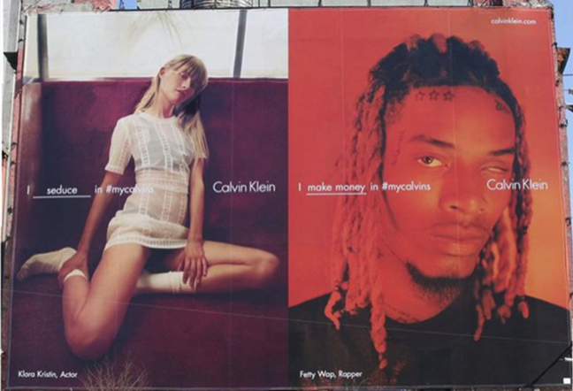
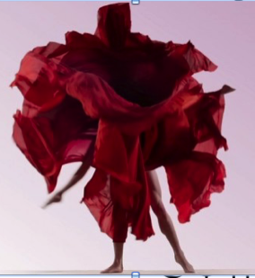
fear and death whereas red symbolises strength and passion. Immediately you can see the difference between them, this one includes bolder and more abrupt shapes. Even the use of a plain white background makes everything stand out and look more current and modern in comparison to the dimmed pink backdrop used in 2011.
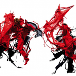
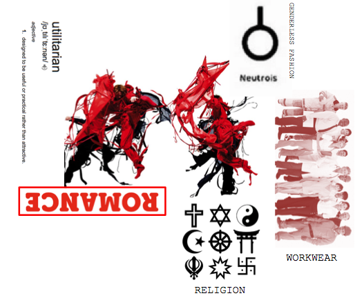
In conclusion, I think this sums up Green’s style as a whole as all of his collections are very consistent in the sense they’re very uniform and structured but the different colour palettes and materials he explores with makes them slightly different each season.


TASK 5/6 – VISUAL RESEARCH – THE MOODBOARD


Screen Shot 2017-11-01 at 20.37.32


REFERENCES

(2011),showstudios,Available from: http://showstudio.com/project/dynamic_blooms/fashion_film

(2015) , showstudios, Available from: http://showstudio.com/project/craig_green_aw15 ,

(2015),pinterest, Available from:

‘ROMANCE’ screenshot of logo, mint and berry Available from:https://theworldneedsmoreromance.mint-and-berry.com/en/

(2016),wikimediacommons,Available from: https://commons.wikimedia.org/wiki/File:Symmetric_religious_symbols.svg

(2017),readytogo,Available from: http://getreadytogo.nl/coachaanbod_voor_werknemers/outplacement


TASK 3/4 – INTEGRITY AND PLAGIARISM

(1) London 1993-8

In the late 1800’s the denim jacket was created, it was mainly worn by your typical workers such as miners and other hard grafting jobs. They were the perfect garment because of the heavy-duty fabric.

The image to the left shows a teenager of the 90’s wearing denim on denim, this shows that it was to become a general trend in years to come also suggesting the jacket was a universal item of clothing, loved by all walks of life.

(2) Jim Goldberg wearing the original jacket, comparing it to West’s version

‘Kanye sold a jacket inspired by a homeless teen for $400 ’ The title in which Vice used for this article is completely wrong in my opinion. I don’t believe it was inspired as the jackets are identical.

There’s a difference.

Members of the public were not impressed, as it seemed someone’s pain and suffering was effortlessly turned into money in a very insensitive and greedy way. Initally the jacket was a canavas of all emotions the teen experienced from his drug abuse to family issues and the general loneliness of being homeless and I think for someone to exploit this is selfish.

(3) Spotted at Glastonbury

In conclusion, this small article on the Daily Mail shows celebrities Cara Delevingne and Brooklyn Beckham casually wearing denim jackets at Glastonbury festival. It shows that your classic Levi Strauss or even Primark denim jacket is stills a necessity in this day and age.

To conclude,it’s important to pay attention to plagiarism as at the end of the end of the day it could be you happen to you in the future and it’s disheartening when someone gets credit for your hard work.


Bibliography

(1)Manandhar,N,(2014) what we wore a people’s history of British style,page 67,1st edition,Slovakia,Prestel

(2) Watamanuk,T,(2016),available from:https://i-d.vice.com,[accessed 22nd October]

(3)Griffiths,C,(2017), Daily Mail,25th June

TASK 2/3 – ONLINE RESOURCES

For my first pathway (knit) I’ve decided to focus on architecture and public transport interiors. I’m drawn towards bright colours and repeat patterns. I think we often dismiss the full depths of our transport, so it would be a fun idea to put interior and fashion together to get playful knitwear outcomes. i will do this through use of appliquĂ© and knitting techniques.

[1] charcoal on paper 37.3 x 24.8

The image on the right is from a book called ‘The abc’s of the Bauhaus and design theory.’ Max Pfeiffer-Watenpfuhl was a student at Bauhaus in Germany, he created this simple charcoal drawing in 1920. It reminded me of the geometric designs from the 80’s which I’ve been looking at for my first pathway (knitwear) so this links in well.

Wallace Sewell is a UK based company that specialises in the weave industry, making everything from scarves to rugs.  In 2010, they won a competition to collaborate with ‘Transport For London’ in designing the moquettes for the underground.

116-large

(2) Transport for London – underground moquette

This is the most commonly known design on the underground. The use of primary colours gives a very post modern feel to the overall design and they smartly merged 4 of the main London landmarks (Big Ben, London Eye, St. Paul’s Cathedral and Tower Bridge).  This can only be recognised through great attention to detail. Not only that, they designed many of the scarves in the Tate galleries over the United Kingdom.

Furthermore, Sewell’s work was immensely influenced by the Bauhaus art college for their simple, yet effective graphics and this can clearly be identified throughout their woven designs.Although, many could argue that they’re bored of seeing the same design, i personally think the design it’s self can never really age.


Finally, I chose to look at a similar website that linked to Wallace and Sewell’s work as a vast amount of their work is on there.The London Transport Museum holds a lot of textile based works that have been commissioned and can

(3) overground moquette desing – wool rug

also be purchased online.There’s a huge range of unique furnishings that will give your home a little bit of London but it comes at a steep price. There’s something really sentimental about this website as the materials used aren’t available anywhere else.

In conclusion, I found this research task helpful for my current project as I’ve found new sources and artists that link to my work. Not only that, it’s inspired me to look at different websites which i wouldn’t normally look besides Pinterest which I think I sometimes overuse.

When researching, I also find it beneficial  to cross over between the arts as it can broaden my initial concept in ways I wouldn’t expect and takes you down many different avenues. For example, I tend to look at photography and graphics to help inspire me with more innovative ideas for fashion and print.

Bibliography

(1) Book – the abc’s of the Bauhaus and design theory

(2)(2010),wallaceandsewellavailable from: http://www.wallacesewell.com/project/transport-for-london–underground-moquette   [accessed 14th October]

(3)itmuseumshop,available from: https://www.ltmuseumshop.co.uk/homeware/doorstops-mats-rugs/overground-moquette-design-wool-rug [accessed 14th October]