Author Archives: Matthew McNeil

Final Summary

Throughout the weeks, writing each research and communication task has led to a considerable amount of research into all types of art that I personally would not have looked at due to its lack of similarity to my work. Despite this I have been able to start to look into movements rather than singular artists which has broadened my knowledge of the different artistic era’s. The need for a wide range of research and the depth needed to really answer the questions has enriched my cultural knowledge of the different style that designers have and how they differentiate themselves from each other, even when they could be part of the same specific movement.

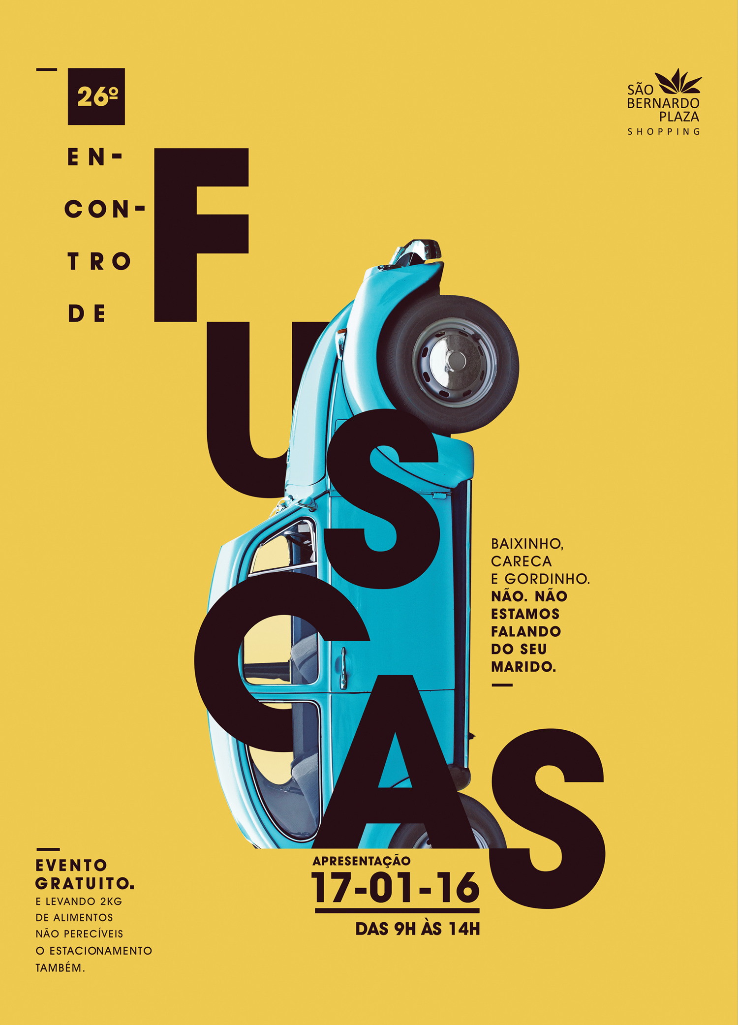
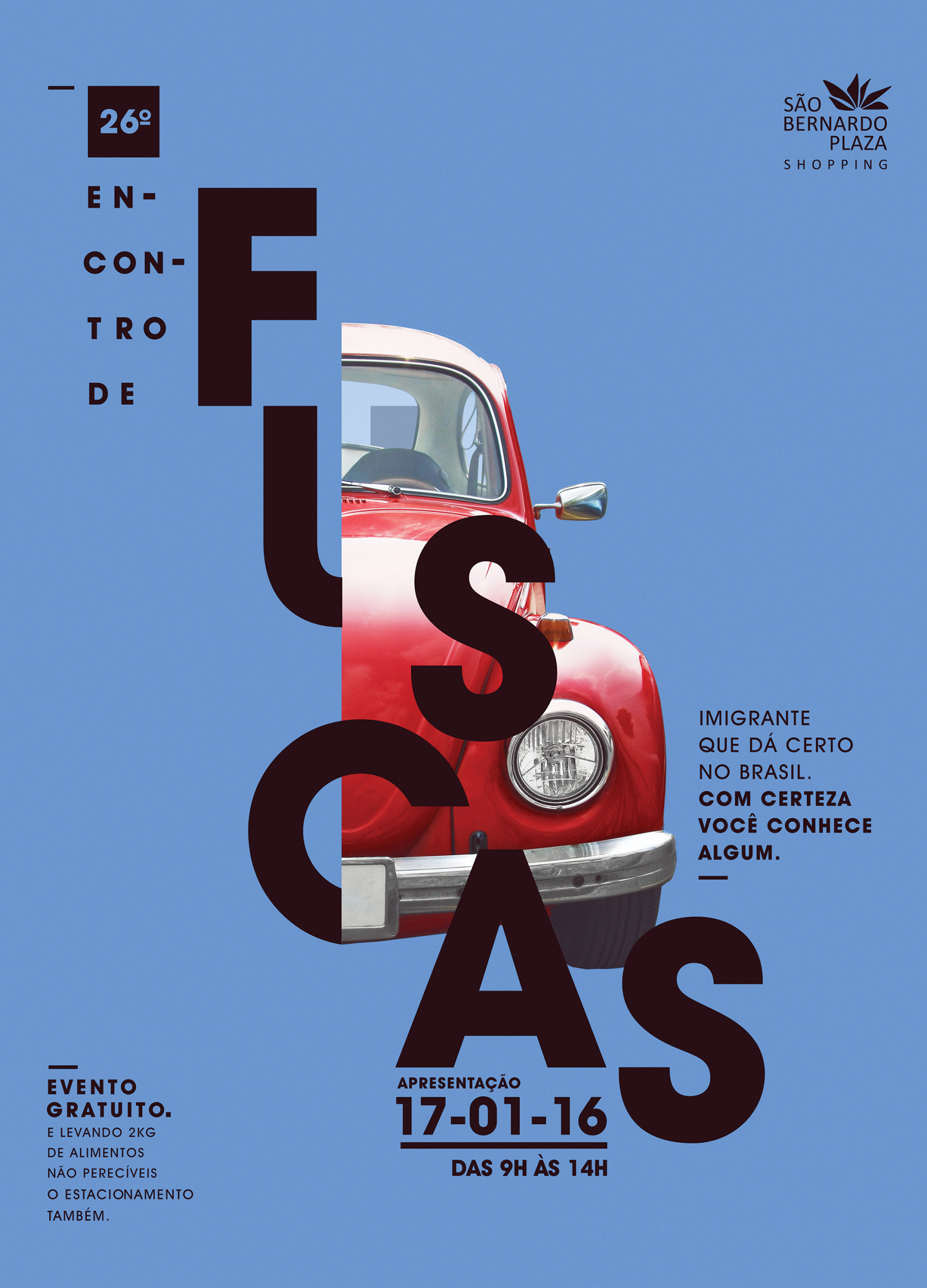
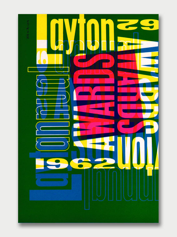
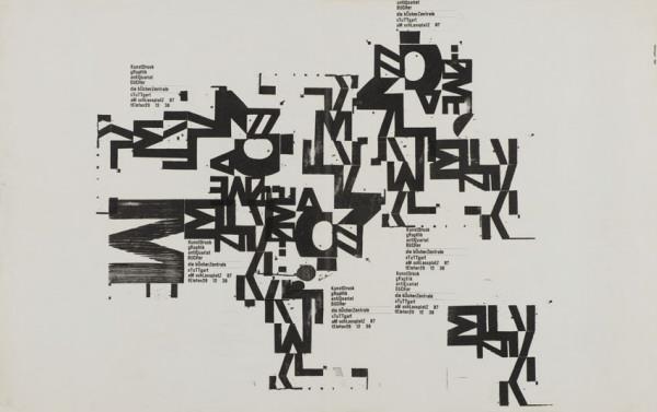
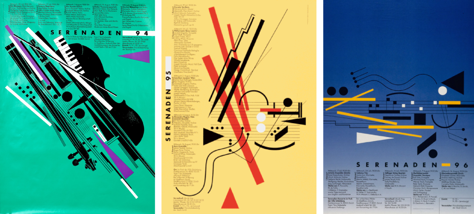
By looking at each movement in chronological order enabled me to understand in which order the most influential artists and movements came, and therefore allowed me to decide which pieces inspire me the most. When analysing a movement I would find that there was an obvious style throughout movements such as the postmodernists who specifically would go against the modernist movement, this led to their abstract methods arising and taking control of their pieces. Artists such as Weingart who would use the same simple and straightforward typefaces as those used on modernist compositions. Weingart would then deconstruct the already perfectly constructed Swiss design. Throughout my study and research of Weingart I enjoyed looking at how he pushed and still pushes the limits in typography. His ability to look at typography in a certain way that has not been seen by anyone else really gives you a sample of the grandeur of his creativity. This drive to explore new methods through different techniques has pushed my own work and has helped me respond to artists when using their techniques to create my own version.

The question that I found most interesting to answer was that of “Is it possible to be truly authentic?” This enabled me to ask myself if any of my own pieces were actually authentic original ideas. I came to the conclusion that to create your own pieces you must do research and can take inspiration from other artists; this is a technique that will help you boost your creativity. There is nothing wrong with discovering something new from an artist/movement when doing research and then to implement what you have discovered into your own work. The perfect example is that of the modernists and the postmodernists. The Modernist era had created their own movement by using clean lines and simplistic typefaces which created clear and perfectionist style designs. This was then followed up by the Postmodernists who manipulated the modernist style. The postmodernists created a whole new movement by countering another movement. This therefore means that the straightforward and perfectionist practice of the modernists helped drive the postmodernists to create a countering approach to art. Asking myself the question and analysing these movements is key to finding and discovering an approach to the art world that suits me best and pushes me to continue researching to further my work.

To conclude, the Research and Communication skills tasks were extremely useful thanks to the need to look into certain parts of arts history in enough depth to find a method that I would use in my work and when creating my work. I know can ask myself questions before working or creating an idea that will help me look at the idea in a new light. The lectures drove me to become a better designer in all aspects of my work.

Publish or Perish!

Dennis “, a graphic designer and art director uses the typography and photography to produce amazing posters which flow in an abstract way. His ability the make the typeface flow through the poster in a controlled way enables the viewer to see the shape and form of the car through the curves of the type.

The two posters above (created and designed by Dennis Silveira) advertise the Beetles exhibition in January 2016 called Fuscas. I find a certain attraction towards these posters due to the colour scheme which I believe is an aesthetically pleasing style. The colours attract and stand out which therefore catch the eye of people in society and will transfer the message on the poster. This simplistic style is something that I would like to develop in my own personal work, this simplicity is also combined with Silveira’s use of the grid which he effectively uses on both posters.

Another artist that has influenced me and who still inspires me is FHK Henrion. Hendon was a german graphic designer, who was a celebrated poster and exhibition designer who used typography as his tool to translate messages. He eventually became “founding father of modern European corporate identity”(En.wikipedia.org, 2017) which led to a wide range of clients for all sorts of design.

I enjoy typography very much and this piece created by Henrion let’s you appreciate how simple it is to create an attractive piece of art. His use of the same typeface and a variety of his colour palette allows him to create an organised mess which still portrays exactly what he wants. This piece was created in 1962 which was during the time when Henrion was a lecturer at the Royal College of Art. The overlaying of the words and colours makes certain pieces of information more visible than others. This use of hierarchy creates a connection with the posters designed by Dennis Silveira, this enables people to view what is most necessary first. I find that hierarchy is fascinating due to how simplistic it is but can change the whole layout of a design.

 When looking at the grid and hierarchy  I discovered an artist called Kate Moross who doesn’t use the grid technique at all but still creates pieces that have an obvious theme. The chaos on the page is controlled by the hierarchy as seen on the image above. The centre piece showing the ‘Bestival’ is viewed immediately and thus the main info surrounds it.

Refrences:

En.wikipedia.org. (2017). Henri Kay Henrion. [online] Available at: https://en.wikipedia.org/wiki/Henri_Kay_Henrion [Accessed 3 Dec. 2017].

Postmodernism

Postmodernism is a movement that counters that of the modernist movement. The postmodern designers pushed a new style against the typical modernist straight edge definite answers. Artists such as Heidegger, Derrida, Foucault and Lyotard were known as the most influential postmodernists. Peter Drucker described the period of 1937 to 1957 as the “nameless era”(En.wikipedia.org, 2017), which then later on became the postmodernist era. Some have said that Jasper Johns was the original postmodernist “who first rejected sense-data and the singular point-of-view as the basis for his art, and treated art as a critical investigation”.

Wolfgang Weingart, a known postmodernist developed his own style through his posters.

As you can see this is nothing like the style of the modernist movement. This style of controlled chaos combined with the same typefaces used by the modernist designers shows he has managed to manipulate them in a far more expressive way. The creation of these posters led to this style being associated with the postmodern movement. I find that this piece may seem chaotic however it has a certain attraction about it that makes people want to look closer to really and truly understand his thought process and what the piece is really translating to society. Weingart explores the limits of typography which has helped push design in many ways as it has helped expand the certain areas that are now seen as normal.

Rosemarie Tissi was born in 1937 in Switzerland and then studied to be a graphic designer in Zurich. she was influenced a lot by the postmodern style. This is evident in her pieces shown above. Tissi “puts her unique twist on it by breaking the rules and creating more dynamic designs”(Hey there. I’m Danielle, 2017). This is easily seen in the obvious shapes and placement of the type across her posters which, when all the posters places together, presents her very own style. I like the use of bold colours and clean/simple type which helps catch the eye of the public when they are presented. Her composition is very abstract which also helps catch the eye of the passersby. Following the postmodern style Tissi’s work is very controversial towards the modernist followings and this controlled chaos is what attracts me to her work as it is what I strive to achieve in my own personal work.


Refrences:

En.wikipedia.org. (2017). Postmodernism. [online] Available at: https://en.wikipedia.org/wiki/Postmodernism#Origins_of_term [Accessed 2 Dec. 2017].

Hey there. I’m Danielle. (2017). Rosmarie Tissi: Flexible Postmodernist. [online] Available at: https://heythereimdnvallee.wordpress.com/2015/03/12/rosmarie-tissi-flexible-postmodernist/ [Accessed 3 Dec. 2017].

Stephenhicks.org. (2017). Heidegger and postmodernism [EP] – Stephen Hicks, Ph.D.. [online] Available at: http://www.stephenhicks.org/2009/11/30/heidegger-and-postmodernism-ep/ [Accessed 3 Dec. 2017].


Counter Culture

Counter Culture was a movement that was created in the 1960’s and 1970’s which promoted rebellion and revolution. The desire for change pushed people to find new ways of spreading the message around. This was a response to the war and the different governments actions around the world. The 1960’s and 1970’s were known as the hippie era’s as this was when the pro-peace and anti-violence protests were in full force. The combination of the want to spread a message and the hippie style produced a new style of art which is known as psychedelia. This era was known for its stereotypical saying ‘sex, drugs and rock n roll’ which led to many artists becoming more free with their styles.

Above is the album cover for the the famously known musician/artists Jimi Hendrix. This was was designed in 1967 and was released on the 1st January by the graphic designer Karl Ferris. ‘Hendrix wanted “something psychedelic”‘(En.wikipedia.org, 2017) which tells us that the psychedelia era was in its prime. This era didn’t just affect the people but the typography. As you can see the bubble/funky style was the way of expressing the mood at the time. This typeface was also completely different to the previous modernist style which was compiled of the clear lines and simplistic type. When looking at the album cover you can see that the photograph of Hendrix, Mitchell, and Redding it is obvious that there has been a style of manipulation which makes the photograph look morphed.

Hendrix’s love for the psychedelic style of albums continued, Karl Ferris continued to work with Hendrix and created the album cover for ‘Axis Bold as Love’.

“The record label chose an Indian based painting of the band for the cover because at the time, “All Things Indian” was the fad of the music world” (FeelNumb.com, 2017). This album cover was released in December 1967 showing us that the bright colours seen on the psychedelic posters and albums were still embedded in the art and design world. This cover became very popular very quickly and so was the first ‘Are you experienced’ cover. This was not just because of the music but because of the era they had been created in. This was the popular style at the time and it depicts the exact era due to its colourfulness and boldness.

The psychedelic era was a time when art started to present what was going on in society far more than ever and was able to portray what the people felt.

The poster above was created for the Miami Pop Festival in 1968. This was when Hendrix decided to release his recordings to the public which became important. Due to this Hendrix wanted to create a poster that would attract both the public and fellow artists. Hendrix decided to follow his psychedelic style in his albums by injecting the morphed and manipulated typeface which is now linked to the hippie era. The colour palette used on this poster is wild and this stands out. The colours, technically, go well together and this makes it aesthetically pleasing.

Refrences:

En.wikipedia.org. (2017). Are You Experienced. [online] Available at: https://en.wikipedia.org/wiki/Are_You_Experienced#Album_cover [Accessed 30 Nov. 2017].

FeelNumb.com. (2017). The Jimi Hendrix Experience “Bold As Love” Album Cover Artwork. [online] Available at: http://www.feelnumb.com/2013/07/02/jimi-hendrix-bold-as-love-albun-cover-artwor/ [Accessed 30 Nov. 2017].


Is it possible to be truly authentic?

In this day and age with the use of the internet it has become much harder to be authentic. The ability to find every article out there and to then imitate rather than influence is inevitable as there are so many. The definition of authentic is ‘of undisputed origin and not a copy; genuine’. I believe that this is extremely hard however is possible.

To create a piece of art you do your research which enables your creative thoughts, this shows that other artists’ work will influence your work just through the slightest details. You’ll find that you take in and absorb information from every day situations. Graphic Design has a massive role in society in the 21st Century and therefore can be seen everywhere.

Despite it being hard to be authentic in the 21st Century, in 1925 Herbert Bayer did exactly that and created an authentic style of typefaces that Germany had never seen before. This then pushed him to continue and ‘In 1959, he designed his “fonetik alfabet”, a phonetic alphabet for English'(En.wikipedia.org, 2017).

Bayer’s idea to push for a new style in Germany was the start of his authenticity as he was on of the few who were trying to be unique.

‘Bayer’s typeface has since become synonymous with the Bauhaus, though it was never manufactured as a metal font for printers’ (The Art Story, 2017). This quote helps us understand the after effects of an authentic piece of work. From this revolutionary act of uniqueness came new styles of art that were influenced by Bayer’s typefaces.

Refrences:

En.wikipedia.org. (2017). Herbert Bayer. [online] Available at: https://en.wikipedia.org/wiki/Herbert_Bayer [Accessed 21 Nov. 2017].

The Art Story. (2017). Bauhaus Movement, Artists and Major Works. [online] Available at: http://www.theartstory.org/movement-bauhaus-artworks.htm#pnt_2 [Accessed 21 Nov. 2017].

Technology is the mortal enemy of art

The quote ‘ Technology is the mortal enemy of art ‘ (Rodchenko, A. Gan and Stepanova, 1922, pg.220) is from the Avant Garde movement which originated in Russia. Due to the quote being written back in 1922 when the level of technology was by far not as advanced as nowadays, I have to say that I disagree with the view that technology is the mortal enemy of art.

I disagree with the view simply because in the 21st Century, technology can now be found everywhere. It is practically impossible to escape the world of technology but it has been adapted so that the arts can use it to their benefit. A good example is that of the Adobe software. ‘In February of 1990, version 1.0 of Photoshop was ready and launched exclusively for the Macintosh’ ( C. Brandrick and M. Burns) This allowed designers and artists from all over the world to create pieces from their laptops at any time. In my opinion this has not stopped art, it has furthered it since artists can work longer and harder at any moment. The Adobe softwares have been manufactured to create endless possibilities over many different fields in art.

The use of social media and internet has boosted the industry massively. This has also allowed the arts to expand such as Graphic Design using digital media in advertising. Advertising has become a massive part of social media as there are millions of people scrolling through their phones/laptops every second of every day and the ads have a chance to go viral if published in the right way.

In conclusion, I do not believe the quote ‘ Technology is the mortal enemy of art’ is completely true seeing that technology benefits the arts in a number of ways and will continue to as it develops and as the arts develop.

Refrence

Burns, C. (2017). To celebrate Photoshop’s 26th birthday this week, look back over its history from version 1.0 to CC 2015. [online] Digital Arts. Available at: https://www.digitalartsonline.co.uk/news/creative-software/adobe-photoshop-celebrates-26th-birthday/ [Accessed 21 Nov. 2017].

Compare and Contrast – Week 2

For this comparison I am looking at the difference between illustration and Photography. I have started off by looking at the Illustration created by Pepe Gay. Pepe is a Spanish cinematographer who creates short films, in this case he worked with the skier Noah Albaladejo over several years to produce an illustrative ski film. When drawing he decided to create a rough style which portrays the style of the freestyle skiing sport however the way the film transitions is smooth, very much like skiings elegance. The use of pencil and pen, also sticking to black and white helps simplify the visual effect of the film. The combination of two very different things has combined the arts of two worlds therefore expanding the audience.

The photo below is of a professional freestyle skier, taken by Nate Abbott. In my opinion this is presents the true beauty of skiing. This is due to the peacefulness of the skier in the air whilst still being able to reach out and brush the snow. The colours link nicely because of the silky clouds layered above which flow from the snow below. The position the skier has been captured in is one that is rather rare to be seen as it takes a certain amount of skill to achieve.

The difference between the photograph and the illustration is that of the crisp effect and detail portrayed through the photo that you do not achieve when watching the illustrated ski film. I do however like the simplicity of the illustration as it shows that skiing can be seen and demonstrated through a simple drawing using pen and paper and not needing the use of high technology. Despite this, the photograph is how the industry is exposed to the world and has been for many years. The illustration film is the start of a new way of exhibiting skiing. 

images taken from:

These are also links to the certain films the images are seen.

We Are The Faction Collective: #S03E01


Terminal Bar

The film called Terminal Bar (released in 2002) is the story about the photos that were taken by Stefan Nadelman. Stefan uses over 2500 still shots taken over 10 years to show the progression of the bar and its inhabitants from 1972 to 1982. This pictorial history won the Grand Prize for Best Short at the 2003 Sundance Film Festival.

The integration of the photos and the actual film footage is used in a certain way which allows the Stefan to keep the old style and for him to switch from photo to film in a very smooth fashion. The music used in the film has a strong link to the style and roughness of the bar when it was open and used. However it does begin to have an upbeat tone during the changing of the  photos, this creates a clearer effect to view the photos. We do also hear a large amount bar background noises which helps set the scene.

We start off by seeing random selections of photos that present us with examples of the style of people that would drink at the bar. This however transitions and develops as the documentary goes on, putting on view the customers  that would inhabit the bar day in, day out. The film is based on observation and this permits us to view a bar in New York from the perspective of the barmen. A barmen notices even the slightest, especially when certain characters spend their days in the dark drinking, this gives the film an edge that not many documentary’s have since it’s the smallest details that do not go unnoticed.