Author Archives: Jake Hinton Hernandez

Conclusion

Research and communication has been a huge learning curve over the last nine weeks of attending our weekly lectures. Researching extensively over the long period of time has massively helped me gain an improved understanding of the process that is required to formulate and articulate a efficient amount of research. Locating and throughly sieving through multiple articles and books was a difficult task to overcome for me being that I am an impatient individual, however understanding the importance of the research I persevered around the isssue for great results.

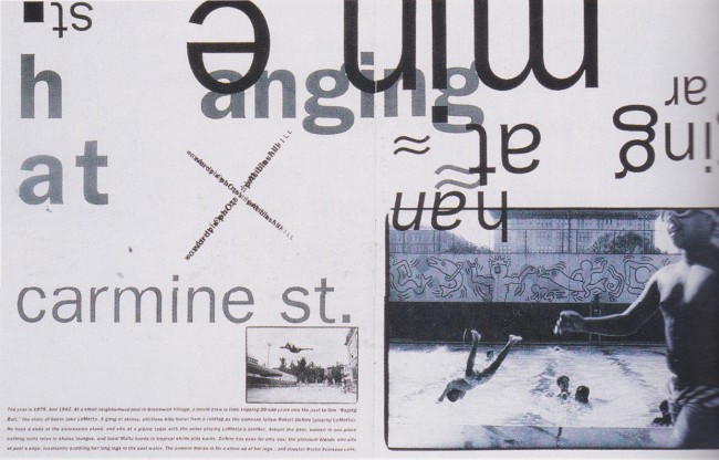
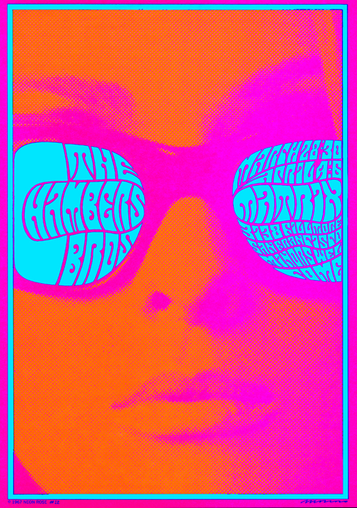
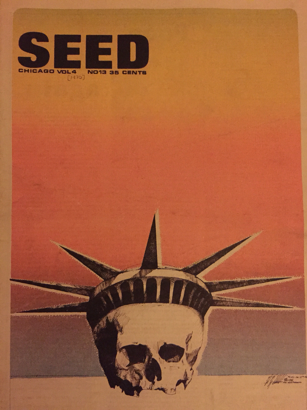
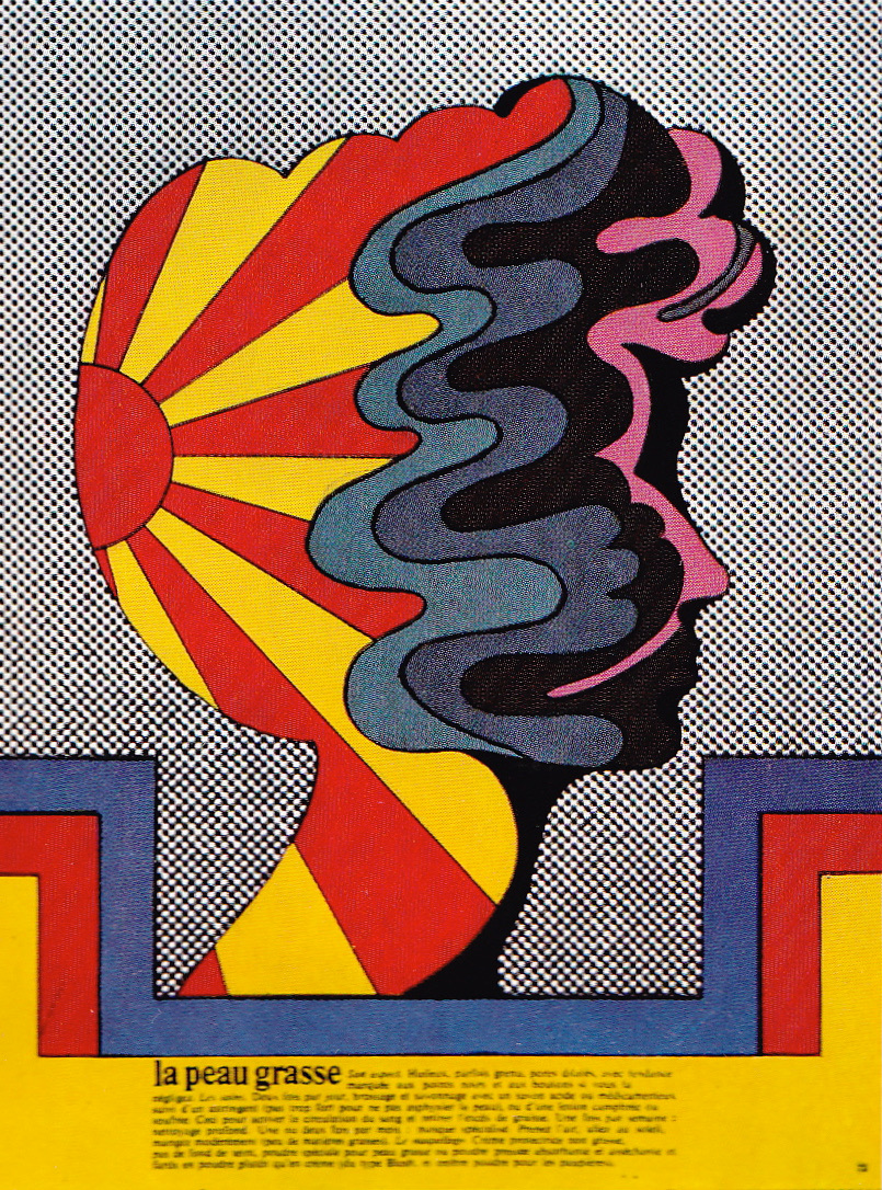
Additionally, research is not the only area I have come to have a better understanding in as I also used that research to look into 20th century movements and various other artists that accompany those movements. Understanding how the artists perceive the world of art and how they move around the rules to create a entirely different world where their art has it’s own laws is highly important informative for my educational future. Knowning all this information about movements and artist authenticity helps preserve my own current knowledge and authenticity as it helps rejuvenate and refresh my inspiration and knowledge. I can know move forward in this degree and formulate and produce a multitude of ideas and designs due to everything I am currently learning. The creative knowledge I previously had is now improving and will continue to improve with this knowledge and information being provided whilst also training myself and my head to research and gather this knowledge independently.

“Graphics is a method of communication that we use to portray our ideas to our audience, and the better we can communicate the more information that they can retain. The easier we make our information read the larger the audience we can ultimately attract, this is important to learn in the process of becoming a landscape architect because we will never know the type of client that we will come across”. – Ewlittle

This quote by ‘Ewlittle’ perfectly explains and insinuates what I believe Graphics Design is regarding communication. The communication skills acquired so far tremendously help give our Graphics work a better narrative by presenting and communication at a higher standards, resulting in better visual explanations.

Overall this Research and Communication side of education here at this degree has helped me grow creatively and educationally. I feel now more confident to create authentic pieces of work and design something with the upmost honesty and minimal inspiration due to the research I am now capable of finding. I believe more set tasks and further research is beneficial to me and to others during our weekly lectures as it’s a continuous healthy amount of information. To continue to improve on educational standards I believe more research and more tasks are crucial and as a personal improvement and goal to follow by I look to be more enthusiastic towards completing research related work and being independent enough and use my intuition to seek out further work for myself.

Ewlittle – “The importance of Graphics”

(https://aqueductfutures.wordpress.com/2013/03/18/the-importance-of-graphics/)

Publish or Perish

The publication I decided to investigate and analyse was a cover from ID Magazine. The reason I chose this publication is because I connect with the way in which the photograph is trying to be portrayed to the viewer. The colour pallet is absent with a replacement of a mono toned black and white. The reason the black and white works so well in my opinion is because the image itself does the talking and the colour isn’t required to fill that role.

Typography that is present is located in the top left hand side in a bold lower case font. Excess text is placed around the publication regarding much less relevant information, hence why it is so small and placed in corners of the page.

The secondary publication choice was a poster for the movie “High Rise”. The cover was illustrated by Samuel Hickson for the Little White Lies weekly magazine. The cover is very similar to actual movies poster however it contains content of Little White Lies typography, fonts and logo layouts.

The typography used here is very interesting as it has maintained the usual logo that the magazine always has within the white circle, however there is additional text over the face of the man in the photo. The colour pallet used here is very strained and has been toned down, there is no vibrancy or impactful presence. I believe this publication is striking in the way it is presented and the minimal contents is very simplistic.

The third publication I went with was an extract double page spread from Craig Ward’s “Popular lies about Graphics Design”.

There is very minimal content to go with however on one side of the double page spread contains altered typography and on the other half there is a minimised box of text with relevant information. The altered typography has been digitally manipulated for a broken effect whilst being on a black background the white typography really stands forward to the viewer.

ID Magazine – “no rivals”

(https://www.designscene.net/2017/08/i-d-magazine-fall-2017-covers.html)

Little White Lies – “High Rise”

(http://cargocollective.com/samuelhicksonillustration/Little-White-Lies-Weekly)

Craig Ward – “Popular lies about Graphics Design”

(https://www.itsnicethat.com/articles/craig-ward-popular-lies-about-graphic-design)

Postmodernism Art

Postmodernism is a movement that developed during the mid- to late 20th century to mark the departure of modernism. While Postmodermism does entail a broad range of ideas it is typically consisted of skepticism and irony.

Shepard Fairey’s “Wake Up” illustration was so impactful it caught my eye quite quickly. Perhaps it was the propaganda style of design or it could’ve been how flat the image is that there’s a sense of depth to it. There’s minimal colour used here, however the rich red that’s been placed at the base of the design brings the illustration and even the idea that’s trying to be presented forward quite significantly.

George and Gilbert’s work here consists of a photograph over a double page spread depicting two men in suits smiling and sitting on grass. The controversial spectacle of the work is within the text that’s stuck over their chests. They used obscene words to summarise themselves and did it in a fashion where it seems out of place and unorthodox being that the environment and atmosphere is positive and the text used is negative.

I took an interest to this photographic piece of work as it really demonsrates the fact The there are no limits within postmodernism work and there is nothing that could be defined as offensive or controversial. These ideologies are really emphasised here in this image.

David Carson’s “Hanging out at Carmine Street” is definitely the most interesting out of the three postmodernism pieces I found. Carson understands the laws of postmodernism, the laws being that there are none. The typography used has entirely been altered and placed about in a completely unorthodox manner to the point of that its almost unreadable.

The way the imagery used ties in with what the text is actually trying to tell you is unique because it’s almost as if you need to the image to understand the text and you then need the text to understanding the image.

Shepard Fairey – “Silent Majority”

(http://www.blackbookgallery.com/store/shepard-fairey-prints/)

George and Gilbert – “George the cunt and Gilbert the shit”

(http://www.tate.org.uk/art/artworks/gilbert-george-george-the-cunt-and-gilbert-the-shit-ar00170)

David Carson – “Hanging out at Carmine Street”

(http://aeqai.com/main/2014/01/postmodern-publication-design/)

Counter Culture of the 60’s and 70’s

Counter Culture in the 1960’s – 1970’s was an anti establishment culture that spread its popularity through the west, most dominantly the USA and the UK. This movement was started to press and break the societal grip around controversial topics such as women’s right, drug use and racism.

Victor Moscoso is the artist behind this vibrant and exaggerated illustration, “The Chambers Brothers”. Moscoso is an artist from San Francisco who is known for his psychedelic designs in the 60’s – 70’s. I picked this Design as a point of interest as it very unique in the way that imagery and type are composed together whilst being accompied by a highly vibrant colour pallet and very flamboyant atmosphere.

‘Chicago Seeds’ are the minds behind this design and various others just like it that follow the Counter Culture idea. Chicago Seed are an underground newspaper run by Don Lewis and Earl Segal during the 60’s. This poster sparked an interest as it is very controversial and doesn’t follow any societal guidelines at all which appeals to Counter Culture area of design.

The text is tucked away diliberatly in the top left hand corner as the main focus is imagery used in the centre. The skull behind replaced with the Statue of Liberty’s head would cause a stir within the common societal audience, however that’s what makes it powerful. Colour here is very mild and soft toned as a sense of death reeks from the imagery and shouldn’t be too impactful for the viewer.

Milton Glaser is another psychedelic illustrative designer based in New York, USA. Glaser’s work immediately strikes the viewer with vibrancy and unorthodox motion with the colours present. The strokes and lines used are very thin but fill with heavy amounts of colours.

This kind of design displays more positivity than other Counter Culture pieces as it doesn’t have anything controversial but still follows its oust set of rules instead of the common design guidelines that would normally be present.

Victor Moscoso – Joint Show, offset litho, 1967 © Neon Rose

( https://www.grafik.net/category/archive/victor-moscoso)

Chicago Seed –  “power to the people”

(https://www.pinterest.co.uk/pin/249316529348657433/)

Milton Glaser – La Peau Grasse

(https://www.pinterest.co.uk/pin/457326537133091767/)


Is it possible to be truly authentic?

Authenticity is measured by your credibility and its overall honesty, however it can only really be evaluated by another individual to really know how authentic it is. You will know yourself how honest your creations are and whether the inspiration you followed didn’t entirely end up on paper without any personal input.

Defining authenticity for me would be to be indisputably originally and honest at its roots. Referencing or being inspired by something can only extended so far before becoming dishonest and recycled. It is possible to authentic at heart for anyone as long as there is a genuine foundation for your idea. Ideas that are created within the spur of the moment or have no inspiration is straight away authentic I believe, even if it’s similar to an existing piece of work. Birthing an idea without intentional inspiration can’t not be authentic as it would then just go against its own definition.

Early 20th century, modernism was a movement that was seeking to reject the methods and the traditions of the past which in turn stopped Society from experimenting with new unique and authentic ideas. Artists André Derain and Henri Matisse are co founders of a movement that looked to break transitional methods. These artists used various techniques accompanied by vibrant colours and exaggerated pieces of work. I believe that people are trying harder to become authentic in turn losing sight of what the art should really be.

Authentic – /ɔːˈξɛntÉȘk/

of undisputed origin and not a copy; genuine.

(https://en.oxforddictionaries.com/definition/authentic)

“Technology is the mortal enemy of art”

“Technology is the mortal enemy of art” is a quote extracted from ‘ Manifesto of the Constructivist Group’. These views were stated by Aleksandr Rodchenko who was expressing his opinion on how Technology is the downfall of art. As much as I am able to sympathise with this view and understand its meanings, I however believe there is a lot more to understand about how art is actually very valuable along side Technology.

Modern art has its traditional background of oil paints, stencil work or inks, however these methods are very rarely seen to be used as they are out of date. Technology I believe then takes its part in restoring order in those dry areas. Modern art fused with Technology works beautifully hand in hand. Evolution of the technology and the art movements should and do move as one.

Technology distances ourself from traditional media’s and by offering us a updated modern alternative that provides a much more efficient way forward. Ultimately as much as a postitive as it may seem, it strips us from the ties with have with the past and its traditional methods

“Is the experience any longer really about art – about looking at, thinking about, emotionally responding to something beautiful, provocative or disturbing, allowing it to change our understanding of the world or to enrich it? The risk is that art, instead, becomes a mere tool of our narcissism, the equivalent of a flattering filter, making us appear more attractive, more hip“.

Holly Williams – Independent – 14/07/16

(http://www.independent.co.uk/arts-entertainment/art/features/art-for-instagram-is-social-media-ruining-art-a7136406.html)


Compare and Contrast


‘Design Butler’ is a multidisciplinary artist who creates minimalistic work through subtle and precise approaches to his artwork. The content fixates on women’s confidence and the delicateness of their femininity through minimalistic fragile portraits. Clear attention is given to the portraits through fine and precise strokes and lines which ultimately once connected together form an interesting piece of work.

The techniques used within the portrait are very sparing generous towards the overall complexity and detail of the piece. The detail is very minimal and yet still brings forth the intended description of the portrait. The way in which this is done is very similar to another minimalist artist, ‘Quibe’ who uses a very restricted use of line and strokes.

The secondary image is a minimalistic portrait created by Christophe Louis ‘Quibe’ using very similar technique and style as ‘Design Butler’. Quibe uses even more simplistic use of line and strokes towards his work, however his overall contents within the image seems forcefully restricted. This contrasts interestingly with Butlers work as they both share the same value in delicacy and precision however one portrays a better understanding than the other.

’Design Butler’ finds an interest within colour to further amplify how it can used to set the mood of a portrait or just to finalise an outcome with vibrant distractions. ‘Quibe’ frequently uses colour but primarily and predominantly just uses white plain canvases for his lonely strokes.

’Design Butler’ – Pink Design (https://goo.gl/images/GfMkSM)

Christophe Louis ‘Quibe’ – Society 6 (https://goo.gl/images/1Zm1Sb)

Terminal Bar

Stefan Nadelman’s ‘Terminal Bar’ (2003) is a biographical short film that insightfully and progressively portrays the story of the occupants that visited the bar through hundreds of photographs over a span of 10 years, all taken by Sheldon Nadelman.

The viewer of the short is taken through a visually robust journey throughout New York’s Terminal Bar’s 10 year history by being exposed to the gritty life of the bars inhabitants. The boisterous audio complements the visuals outstandingly as it amplifies just how times would have been in the photographs displayed.

The photographs taken progressively reveal to us how life was like within the bar and how people came to change and how the area changed with them. Sheldon Nadelman captured these photos with diligence and care as he really wanted to show through his images how one individual can change over a short space of time. The film does a exceptional job of locating the images strong points and correspondingly picking them together in a unique transitional manner where the viewer can be carried through the story with ease.

Nadelman really wanted ‘Terminal bar’ to leave a lasting impression, the film did that justice by portraying the bar in a very unique manner. A later to visit to the grounds where the bar once was alive was a standard urban street no longer full of the bars local loyalists. Nadelman in response to the current status of the bars area just replies with “ Nothings changed; its New York shitty”.