Author Archives: Jhon Rafferty

Task 11

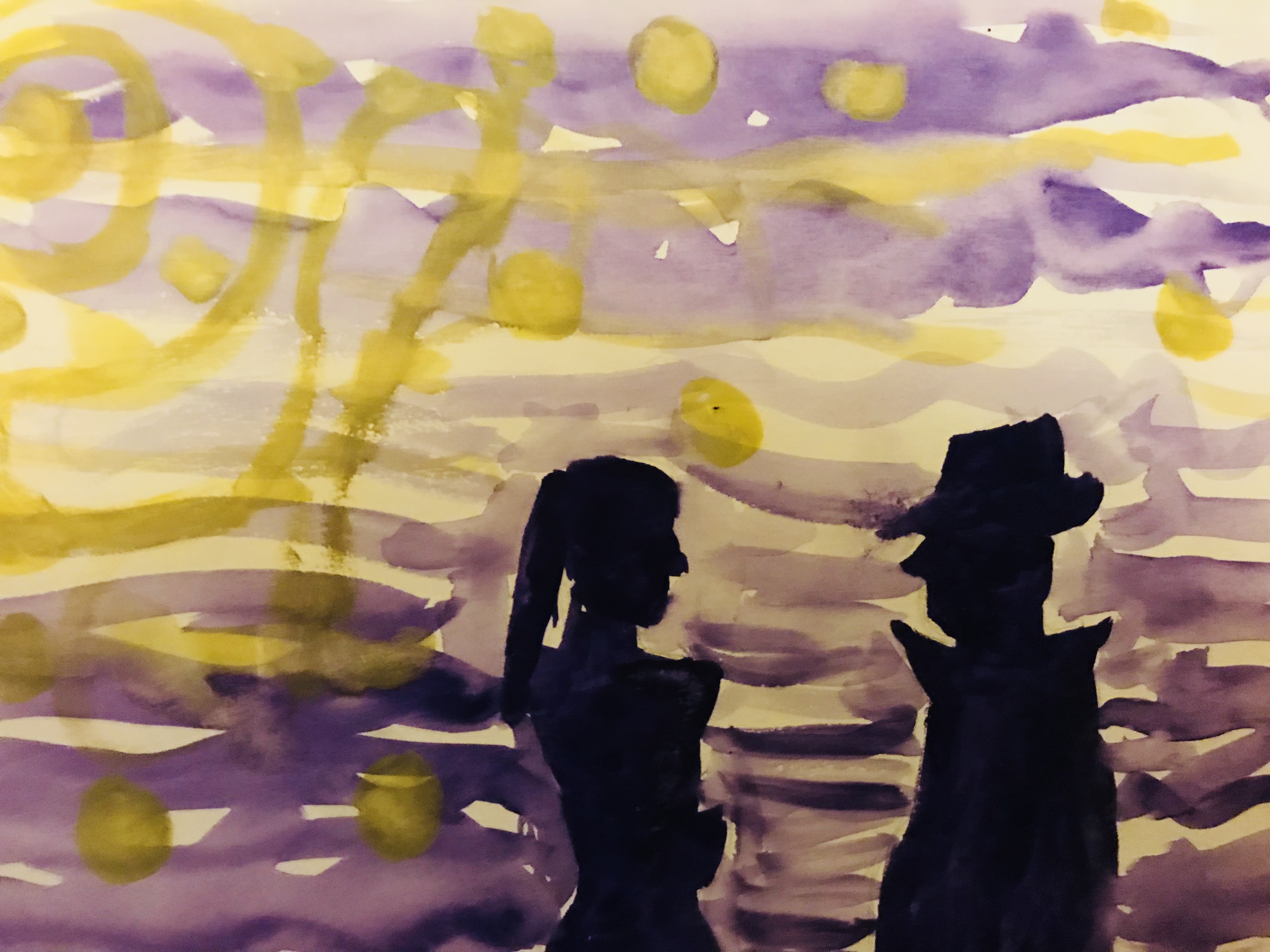
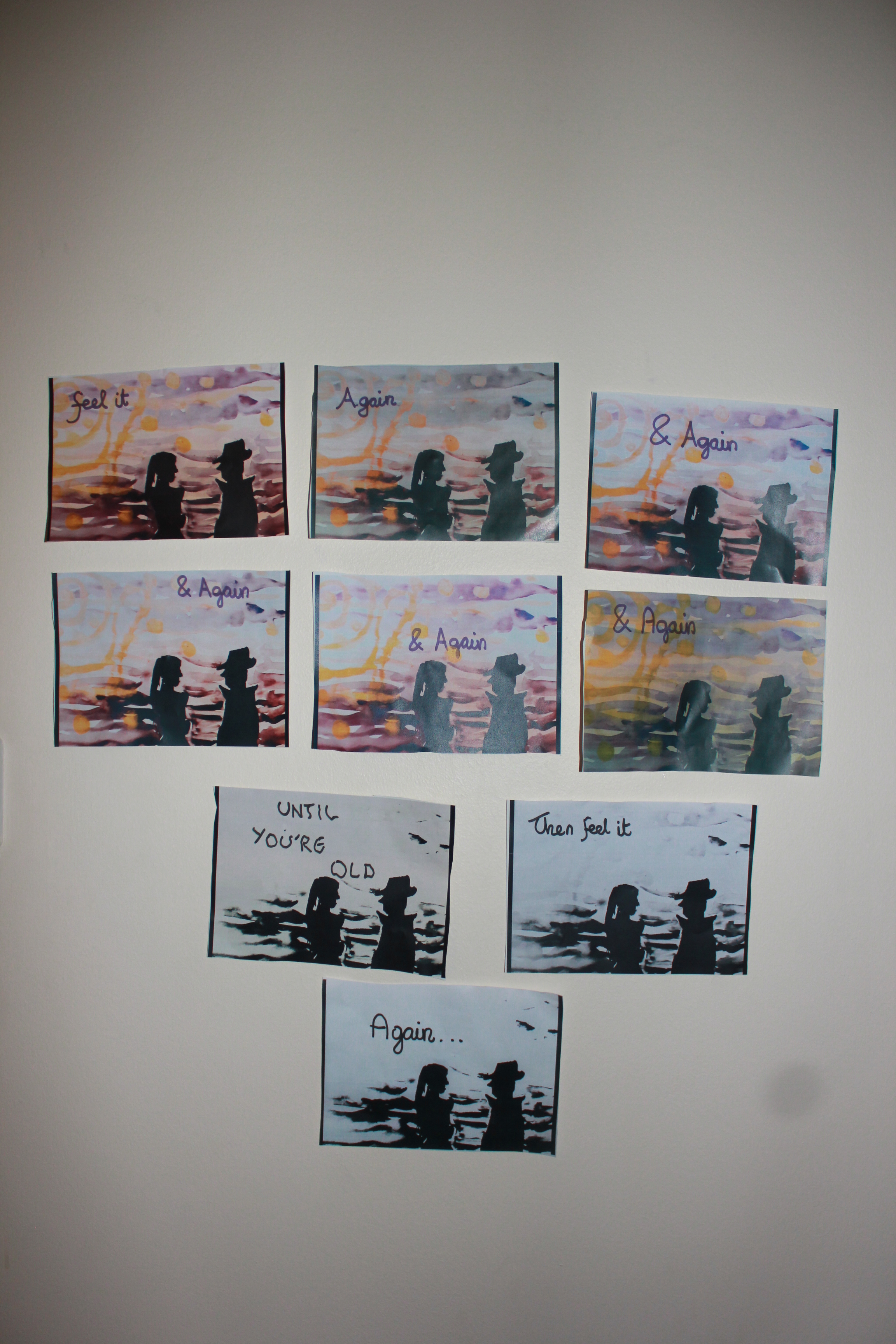
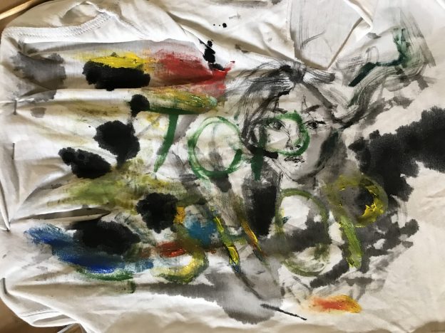
My blogs has covered a wide range of art research skills in the beginning it had ushered in a new emphasis of thinking around the process rather than product and seeing my art works as an open-ended piece specifically in the earlier tasks. It was challenging but these opened a new direction of development of my own practice and to think outside what I already know about art. It helped me refine my analytical and critical thinking skills through ways of seeing art in real life and apply different theories both old and new to art works. It has also encouraged me to create more experimental art beyond a traditional canvas exploring different materials with mixed media, creating art that doesn’t entirely reflect on my usual mode of practice which is etching. Painting is one of my weaker skills, yet the tasks have encouraged me to not concern myself with the outcomes and see my paintings as works in progress which is clearly seen in task 10 when I had photographed an old watercolour paint and processed it through different filters. This gave a whole new nature to the piece that iv always thought was finished. I have more confidence in assimilating another piece of work into my own pieces and in fact it has helped me create more fascinating works from it. The hardest task for me was task 7 where I struggled to interpret the ideas the authors were discussing as it was hard for me to filter the main arguments and conclusions though I learnt a lot about the impact of picture planes and the risks that come with creating sight specific art. Overall I have definitely found it a difficult and confusing at times but I have learned some useful skills and ways of thinking that I has aided me in my art practice and made me more open minded in general when it comes creating art.

Task 2

Jean-Michel Basquiat Dipinti

The book I chose to ‘consume’ is on the works of Jean Michel Basquiat by Gianni Mercurio and Mirella Panepinto. The book outlines Basquiat’s back round briefly and gives us a commentary on why his works gained so much popularity being an outsider of the art world and a black man in 1970s America. In one chapter the book brings up a discriminating idea of why he rose to fame by those who were not fond of his art. They argued that Basquiat had mostly been highlighted for the very fact that he is different in all the convenient ways for the sake of diversity as it says “several American critics sustained, with a certain amount of intellectual hostility, that he had taken advantage of being different”. The book isn’t particularly biased to any side weather it was his art or his back round but narrates it in a factual way. That one quotation from the book accurately reflects on the period in which Basquiat flourished which contrasted to a stereotypical life of an African American citizen as he was one of the earliest of his ethnicity to reach globalised fame as an artist. However, the book talks about the art itself in relation to the artists mind which delves into the fact that the works itself are different rather than the artist. As his paintings are very childish in style but somewhat communicative in a grown up instinctive way. The book emphasises the diversity of his works and talks about its influence from music, urban culture and graffiti rather than on the artists own diversity.


Jean-Michel Basquiat Dipinti by Gianni Mercurio and Mirella Panepinto

Quote from Page 19

Task 12

I had taken a photo of my old a5 water colour painting of a couple with an expressionist style back round part inspired by Vincent Van Gogh made it into a bigger piece of work by photocopying it in different filters and placing them as a collection of scenes but with different atmospheres making it feel like time is passing. The progression of higher contrast in each copy fades out the lighter colours in the back round and eventually the colours have faded and slowly transitions into a black and white scene. This is meant to represent time going by between two people and how they will “feel it again and again” as written in each copy the feeling they have from the very first scene. The colourful beginning represent youthful optimism for a timeless scene but then the colours suddenly disappear as time goes by marking the ageing couple. So i had took a small timeless picture perfect painting of a couple and subjected the image into processes of filters that would take on the role of time passing by for time is a process that cant be stopped. It becomes a bigger concept as a whole.

What i would of done if i could to properly integrate the painting into my idea of time going by is to perhaps made the silhouettes shape seem like they are ageing giving it a more convincing look but perhaps the fact that the shape always stays the same stays true to its original context as a picture perfect water colour painting of relationships.


Task 10

Recent shift in direction. complimentary colours slashed marked people words.

The first few words “recent shift in direction” were meant to reflect on my recent works of marking using multiple mediums.My most frequent practice came under print making especially in the style of German expressionist art and so my current mode of practice drifts away from that and delves into a more contemporary style of art. This art piece in particular was in the beginning an experimental piece of paper where i slashed marks on its not making any specific image. I then decided to play around with some acrylic colours and used green and red which are complimentary to each other. i had been influenced a lot by illustrator Rola Chang recently whom creates ink paintings often in a state of movement and dramatic poses and this is where my slashes come from. The word gore came into mind when i thought of Oscar Murillo’s works which had words, usually ironic to his subject matter, that gave his work more of a suburban look. In the end i a improvised and created a side profile of a face by emphasising the lines that resembled the shape of a nose and lips. My end product was something i didn’t originally think i would make but this has been happening to my recent works recently as i am trying to become more open minded with mixing different mediums together.

Task 9

The work I have chose is an installation by the artist duo Guerra De La Paz from their exhibition ‘Barbed’. The aesthetic theory of art can be applied as it becomes art through the artists carefully thought out arrangements of the clothes and the composition of the overflowing red shirts at the bottom shows intention as well as its clear isolation from the room by its surrounding barbed fences. As a result the installation produces a non-coincidental experience from its aesthetics despite the fact that it mimics and exaggerates the issues over recycling and overflowing rubbish that persists around the world. The thing it mimics, the issue, does not itself evoke any experience from its aesthetics and thus does not evoke much awareness not being an art piece. It has no distinct appearance that draws peoples interests unless either told of its consequences. Therefore the act of using objects that  are subject to the issue of waste to create art is a form of Aesthetics that visualises on a social and economic issue that is very relevant today.

Task 8


The image I have appropriated into my work is an ink illustration by Rola Chang. Her works are dynamic in composition implying rapid movement and intense action. The image I used specifically is called “dragon girl” and I have painted her face in ink on a ripped-up t-shirt stapled on cardboard. Then I had started to use the shirt as a rag for mixing oil paints and testing ink brush strokes while not being concerned of destroying the piece. What I ended up with was a Murillo-esque art piece whom paints on improvised canvasses which are usually difference fabrics woven together and creates a graffiti driven mark making. This piece mimics the practice of graffiti in a sense that it is tagging Rola Chang’s dragon girl over with my mark making. The effects of how the ink bleeds into the shirt and the glaze medium applied with the oil paints gave it the appearance of being stains on a dirty clothe.  The hardest part was painting the face from Rola Chang’s work as I couldn’t control the direction of how the ink set onto the fabric like I could on normal paper. To overcome this i used a dry brush full of ink and lightly dabbed onto the shirt to accurately draw the girl.

Task 7

The extract of Leo Steinberg discusses the ideas around a picture plane and how it has evolved in certain aspects throughout the latter half of the 20th century. It talks about the changes from the traditional vertical picture plane that corresponds to the human perception of the image with regards to the upright posture and everything it is naturally subjected to (gravity) to a radical shift to what Steinberg calls the flatbed picture plane. The name derives from the flat bed of a printing press. Steinberg suggests that it had started to emerge in the early 20th century among pop artists like Rauschenberg in which his works had no longer a sense of right way up therefore that connection of human posture to a picture plane disappears and the image becomes more like a scattered workbench that either makes sense or is just a mess. With a flatbed picture plane, how it is hung up doesn’t seem to be important as it can make sense in any position. This is the biggest difference Steinberg points out between the traditional picture plane like that of the renaissance and the artist of the 20th century.  Steinberg concludes that as a result of this change comes the “change in relationship between artist and image, image and viewer”.

The extract of Richard Serra focuses on the changing perceptions of a sculptor in relation to the process and technological advances within their time. He argues that the tradition sculpture before the 15th century where like components of a wider entity material wise. He states that the more secular views of using materials such as steel as building resources were long gone from sculpture art and as a result, the wider historical context of technological advancement through era’s such as the industrial revolution did little to effect sculptors methods of making. Serra further discusses the concept of the site specificity and how a work has an effect on its surroundings rather than the other way round. The nature of site specific works can be split into the “language” of the work and that of the surroundings. This distinguishes site specific work from that of an art piece in a gallery that isolates itself from its environment and virtually creates its on site in itself. Serra raises the problems of site specific works, in that it is difficult to implement in certain sites that belong to an institution without it becoming a “token of that institution” and thus the work becomes subservient to its ideas rather than being a separate entity with a relationship to its surroundings. Another issue that comes with creating site specific work is its recallability which is often impossible and therefore becomes a less attractive investment and therefore less sanctions by patrons.

Both the essays of Steinberg and Serra explore the topic of perception of art throughout history. They  both propose very similar ideas of the increasing flexibility of how we see art. For Steinberg, the tradition orientations of an art piece with relation to the human posture becomes less objective throughout the 20th century as the development of abstraction started to flourish more than ever. Whereas Serra looks at perspectives of sculptors and how they are separate with their idea of materials as picture making mediums rather than their practical usage as building materials so a a sculptor materials are more than function but also meaning.


Bibliography

Art in theory 1900-1990 an anthology of changing ideas- Charles Harrison and Paul Wood

Leo Steinberg, “From Other Criteria”, Pg. 948

Richard Serra, From the Yale Lecture, Pg. 1124


Task 6

I have thought of two new modes of practice within printmaking specifically with etching and mono printing

The first mode of practice is on dry point etching. I would etch a drawing onto an acrylic plate an example being a face but instead of traditionally inking up the whole plate I would use a think ink card to selectively spread the ink into certain areas. I would then scrub away the ink only in the etched areas and leave the rest to be printed along with the picture. The result would give me a partially revealed print of the face corresponding to the movement of the ink card when I had spread it. I can see how this method can also be used to create more exciting back rounds in etching by inking up all of the etched areas as well as some of the area around it but not the whole plate and rub away the excess ink only in the etched areas again leaving the ink around it to be printed. This could solve problems to the tediousness of creating big blocks of darkness in etching and also dark back rounds would be easier to print.

My second mode of practice is on mono print. A much simpler concept of making marks on the surface you use to spread your ink. So the end piece is actually where the ink sits which has to be an acrylic plate. In other words the canvas is the acrylic plate and thus has to be photographed as you would need to wipe it away so other people can use it to print. It was a happy accident discovered when I had to create quick prints that combined two contemporary artists works together. Firs roll some mono print ink on a plate and start doing your mono prints but the only difference is that you don’t re-ink after prints. The goal is to create as many prints as you can from it before it dries out. Things to consider are that the individual mono prints you create aren’t the main artworks your creating any more and becomes more of the process of an artwork. The mark it creates on the acrylic is what it contributes to the end product. The factors surrounding a good mono print need not apply anymore as dabbing the ink so its not too wet isn’t essential. The fast prints that are made is not our main concern however the pressure needed when making these mono prints to actually mark the acrylic might need to be higher. It all depends on how much ink you have rolled. What we should get is white markings of different prints overlapped in one space. A chaotic composition that reflects truly on the relation between process and product.

Task 5

In my visit to Seth Price’s exhibition, his untitled video on the top floor had caught my interest the most. Isolated from the rest of the series, it was projected into a larger dark room into a centre screen. The video itself was a combination of his previous edited videos that resembled to somewhat of a conclusion of his series of works yet gave a strange feeling of being incomplete. It was practically an exhibition of his works but the whole idea of it was to make previously removed public works that were sold off to different individuals and basically made them public again essentially renewing its public access. These public works of old materials were used in he works downstairs but having them as a compilation in one video strengthens its availability. The dark atmosphere helped amplify the sounds as instead of headphones, the films audio is played on a loud speaker that filled the room. Its separation from the rest of the works into a specified room and its projection to the centre made it appear more important and is fitting as a last exhibit to see for its conclusive yet incomplete nature. Like an open-ended summary of the exhibition as a whole.

Task 4

Seth Price-Circa

I had visited the Seth Price Circa 1981 exhibition in the institution of contemporary arts in London which consisted of film art. I personally have never looked into film and video art exclusively and therefore my visit to Seth Price’s exhibition was both a fresh and baffling experience. The atmosphere of the rooms were naturally dark as opposed to the normal bright lit rooms in a normal museum which enables a full immersion of each films shown on separate screens. What I noticed from walking down the hall was the style of his film pieces which is commonly a combination of reused materials from a diverse range of media such as dated adverts or simply pictures from online to make a single idea.

One exhibit placed on the main hall was a piece called ‘Two for one piece’ I found amusing for its corny style of an Americans 60s/70s commercial break. I wore the headphones provided and fully immersed myself on this relic of an advert listening to the cheesy catch phrases and somewhat exaggerated acting. I could imagine anyone who had lived in that nuclear American lifestyle and had been old enough to remember to feel somewhat nostalgic. I felt it despite only being born years after that era.

Price’s work explore the concepts of recycling past material of media to create his art and use this to reflect on subject matters such as marketing and mass produced goods. But other aspects I found in his exhibition were that of a reflection of dated technology by using raw synth backing tracks. This is found in his piece called ‘industrial synth’ which uses a combination of footage of retro text based games of the 80s and strange abstract animations that all fit together to give a feeling of an 80s era arcade. Seth Price’s exhibition as a collection emphasises a great deal of how tenuous a static image can be on screen when subject to video production as he rarely focuses on a single scene or point in time. The exhibition as a whole was a refreshing look into an unfamiliar practice of fine arts but not something I feel I could be inspired to integrate into my own practice.