Author Archives: Kelsey Lawrie

Bibliography

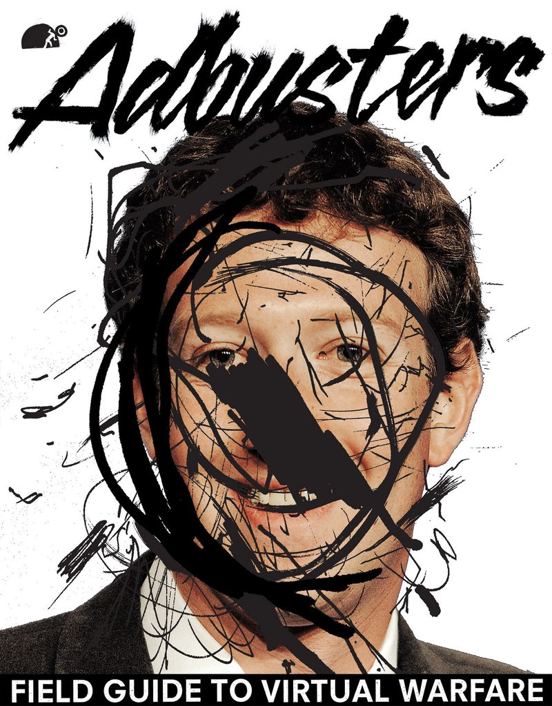
Adbusters (2015) Field Guide to Virtual Warfare. Available at: https://adbusters-culture-shop.myshopify.com/products/ab118 (Accessed: 3 December 2017).

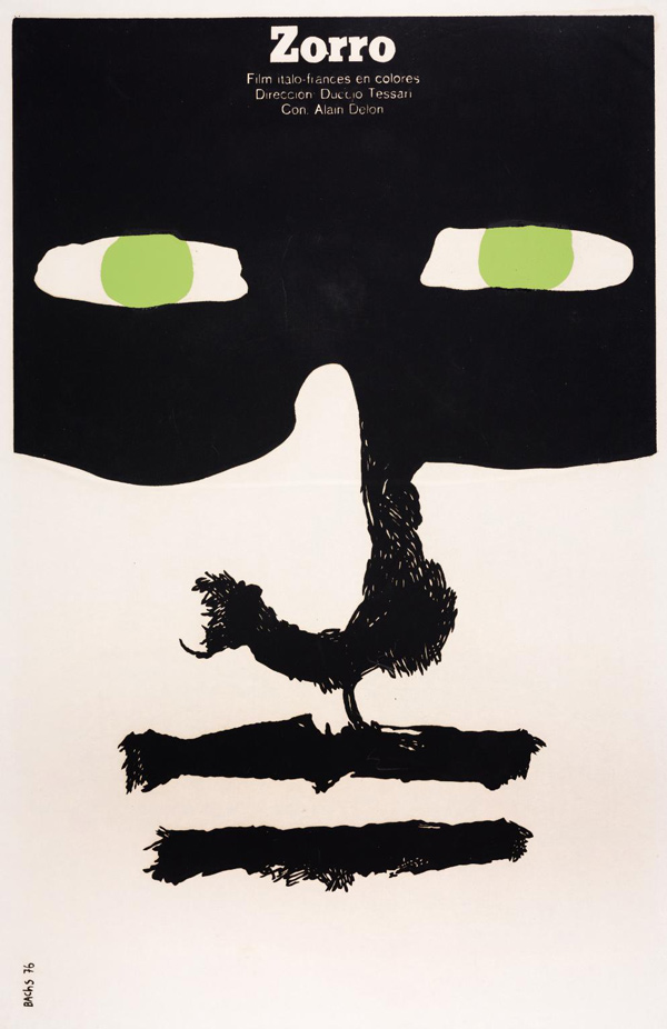
Bachs, E. (1976) Zorro. Available at:  http://50watts.com/Out-of-the-Bachs (Accessed: 3 December 2017).

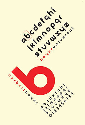
Bayer, H. (1925) Universal Bayer [Poster]. Available at: http://www.theartstory.org/movement-bauhaus-artworks.htm#pnt_3

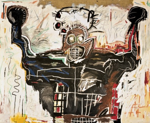
Basquiat, J. (1982) Untitled (The Boxer) [acrylic and oil paintstick on linen]. Available at: http://www.christies.com/lotfinder/Lot/jean-michel-basquiat-1960-1988-untitled-boxer-5147473-details.aspx (Accessed: 26 November 2017).

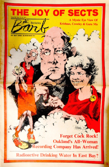
(1977) Berkeley Barb: The Joy of Sects. Berkeley, CA: Mac Scherr, pp. cover, illus.

Christies (2015) Jean-Michael Basquiat. Available at: http://www.christies.com/lotfinder/Lot/jean-michel-basquiat-1960-1988-untitled-boxer-5147473-details.aspx (Accessed: 1 December 2017).

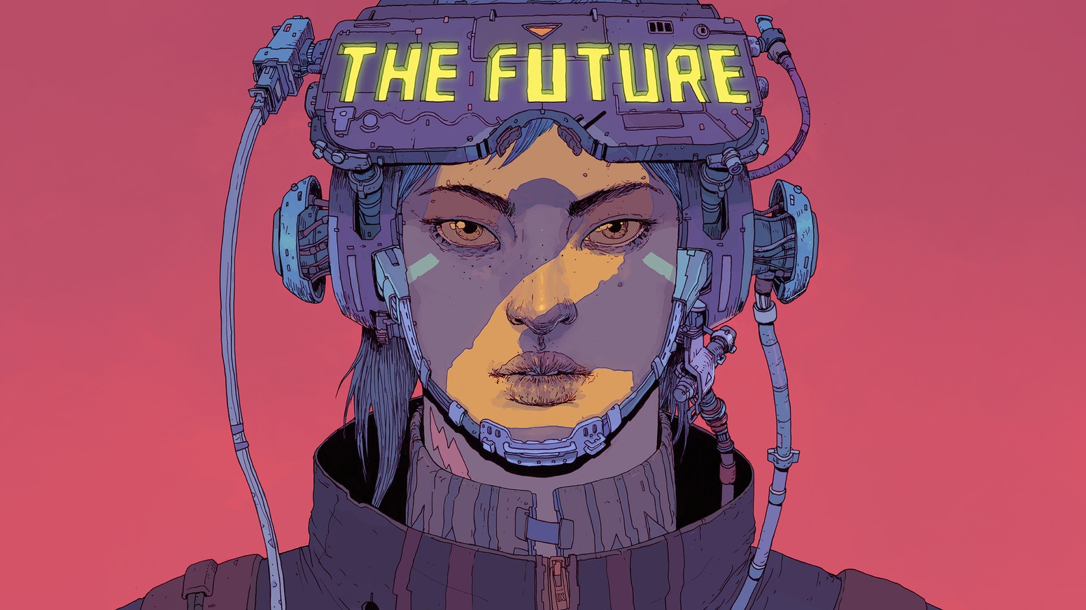
Gonzales, J (2017) The Future is Now Vol 2. Available at: https://ixcitadel.com/collections/all/products/the-future-is-now-neon-rising-vol-2-second-edition-pre-order (Accessed: 26 October 2017)

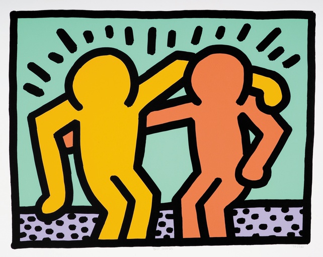
Haring, K. (1990) Best Buddies [Serigraph]. Available at: https://paddle8.com/work/keith-haring/98852-best-buddies (Accessed: 26 Nov 2017).

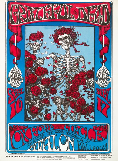
Kelley, A. (1966) Avalon Ballroom [Print]. Available at: www.classicposters.com (Accessed: 26 November 2017).

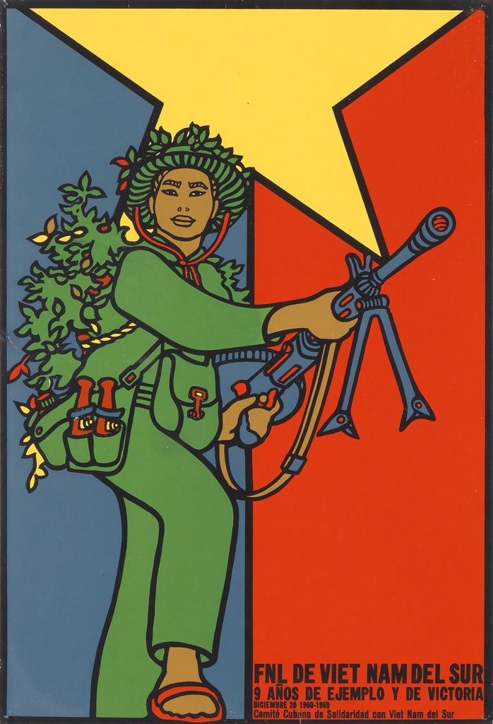
Mederos, R. (1969) FNL de Viet Nam del Sur [Poster]. Available at: http://www.slate.com/blogs/the_vault/2015/05/01/history_of_cuba_and_vietnam_posters_by_rene_mederos.html

Netflix (2017) Abstract: The Art of Design Paula Scher: Graphic Design Available at: https://www.netflix.com/watch/80093802 (Accessed: 15 November 2017.)

Onion, R. (2015) ‘Bright 1970 Cuban Propaganda Posters Urging Solidarity With Vietnam’, Slate, 1 May. Available at: http://www.slate.com/blogs/the_vault/2015/05/01/history_of_cuba_and_vietnam_posters_by_rene_mederos.html (Accessed: 4 December 2017).

Oxford Dictionaries (no date) Authenticity Available at: http://www.dictionary.com/browse/authenticity

Rodchenko, A., Stapanova, V. and Gan, A. (1922) Who We Are: Manifesto of the Constructivist Group.

Stefan Nadelman (2003) Terminal Bar. Available at http://www.touristpictures.com/SHORT-FILMS.html (Accessed October 11 2017.)

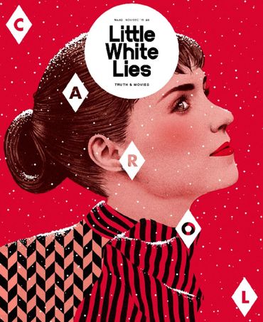
Smits, T (2015) Little White Lies Magazine issue 62 – CAROL. Available at: http://timbasmits.com/#/littlewhiteliescarol (2015) (Accessed: 23 October 2017).

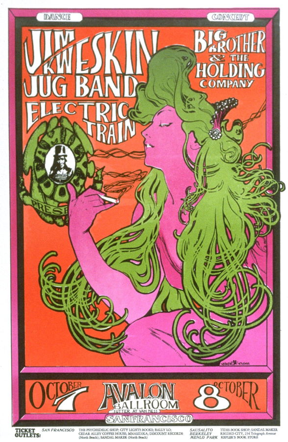
Wilson, W. (1966) Jim Kweskin Jug Band, Electric Train, Big Brother & the Holding Company [Lithograph printer]. Available at: http://www.artnet.com/artists/wes-wilson/jim-kweskin-jug-band-electric-train-big-brother-VPoxNcRhKAH0uR6QgWTSlg2 (Accessed: 26 November 2017).

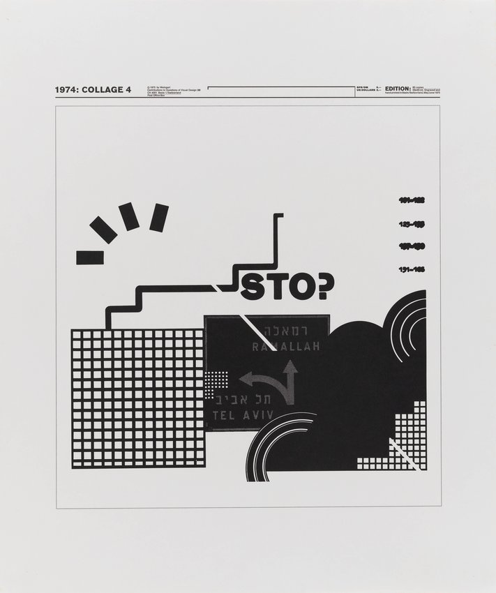
Wolfgang, W. (1975) Collage 4, from the series Nine Collages: The New Graphics by Weingart [relief print]. Available at: https://www.sfmoma.org/artwork/2014.749 (Accessed: 26 November 2017).

Publish or Perish


The first image (Bachs, 1976) is a movie poster for the film Zorro. It is mostly black and white except for the pale green in the eyes. The rough way the eyes are drawn, the negative space that surrounds them, coupled with the green, draw attention to the eyes. This connects the viewer to the art and you get the feeling he is not messing around when you see how serious he looks from the poster. This is a commercial poster so it is intended to draw in and connect a consumer so that they want to see the movie and I feel it has done this successfully. I like very minimal colour palettes, where negative space has been used effectively as it has been here.

The second image (Adbusters (2015) is of Mark Zuckerberg, creator of Facebook. Facebook is among the largest social media sites and the creator is well known so defiling the creator forms associations with defiling the things he has created. The photograph has been covered by scribbles and shapes focused around Zuckerberg’s face, this draws attention to him and so does the white space which surrounds him so there is no question who it is about. I think that this is suggesting to the viewer to question him and not take it all for granted, to fight back as the magazine has done.

The final image, (Mederos, 1969) is a part of a series of work by Mederos, assigned by the Cuban Government, in which he is trying to inspire the Cuban people during the Cold War to act as the northern Vietnamese did during the Vietnam war (Onion, 2015) against the Americans. The colours combine the Cuban and Vietnamese flags, and the green (with the grass on their back) of the person simulates the guerrilla warfare of the Vietnamese and it inspires the people of Cuba to act in a similar resilient way against the same enemy. This shows the story of Cuba at the time, and without any prior knowledge it is easy to see that the focus is on war and stepping up, as the figure is literally stepping up and looking confident. I like the very graphical approach to the figure where the simple colours and the bold lines make sure the message is not lost in translation. This is helped in addition by the small amount of text in the bottom right hand corner.


Post Modernism


The first image (Haring, 1990) is very graphical and colourful. It has consistent thick lines and blocky colour which I like. This gives the impression that it is uniform, but the more random dots at the bottom of the piece show this is not the case and this gives a handmade effect to the piece which I like. I also like the union of the graphical and hand-rendered which I think is held together by the blocks of the similarly-toned colour. The simplicity of the figures are also something graphical I like about the piece. The artist has deconstructed the figure to only show what is necessary and I think this communicates the expression well.

The second image (Basquiat, 1982) is much more hand-rendered than the first, done in oil paintsticks (Christies, 2008) and I like this also. It comes across as very messy and expressive which is a way I like to work and this works well in deconstructing the figure. Basquiat has deconstructed the forms of a boxer in recognisable, human like, shapes. The boxer looks intimidating because of his face and the way his arms are raised, just how a boxer would intimidate their opponent. The mood and atmosphere of a boxer is shown clearly, even though there are minimal realistic aspects, the necessary ones are there. This is the thing I think works well and I could aim to use a similar method to execute an atmosphere in a seemingly simple manner.

The third image (Wolfgang, 1975) looks the most modern of the two, being created much closer to the modernist period. The deconstructive aspect to it is in the largely nonsensical composition where things are placed randomly but they make sense in relation to one another. My favourite aspect to this piece as a whole is the question mark replacing the P in ‘STOP,’ making a command word into a question which I think is very clever. The symbols within this piece point to ‘STOP’ and the alert symbol making these focal points of the pieces, the white space in the work also accentuates this, which is a simplicity I appreciate.


Counter Culture


The three counter culture images I selected were illustrations, one from an underground magazine covers and two from music posters. The first one (Wilson, 1966) drew my attention due to the fact it features a well known artwork from Alphonse Mucha, where the only thing changed is the colours. This is odd to me because even though the use of it applies well to the poster and the era (heavy drug use) due to the colour changes, making her a symbol for marijuana rather than tobacco cigarettes, the artwork retains much of what makes it identifiable. The poster is overall easy to look at because it has 3 colours, in addition to black and white which create contrasts in all of the areas the creator would want you to look while having a spirit in line with the activity.

The second image (Kelley, 1966) drew my attention because of the illustration. The intricacies, detail and selective use of colour make it really appeal to me. The serene aspect to the skeleton with the living flowers (and flower crown,) gives a sense of calm which the band’s music mostly holds. The less psychedelic colours also aid the spirit of tranquility because though they are bright, they don’t scream LSD and drugs like the first image, they are simple primary colours. The skeleton gifting flowers help to give meaning to the event making it seem welcoming to all, and that there is a lot to go around.

The third image (Berkeley Barb, 1977) drew my attention again because of the limited colours. Though for this underground magazine cover, it would have been more of necessity to keep costs down. From what was available, the overall cover is very well drawn and colourful- while having depth and interest. I like the white space in contrast to the other two images because it is much less over-the-top in terms of font choice, giving the illustration more chance to portray the meaning, as this takes up a vast majority of the page. I think this can be attributed to the higher quantity of white and using colour sparingly which is something I can bring into my own work.

Technology is The Mortal Enemy of Art

“Technology is The Mortal Enemy of Art” (Rodchenko, Stapanova and Aleksei Gan, 1922)

Technology is not necessarily the enemy of art.

Technology allows us to share art and make it quicker, while opening a whole new world of processes. In terms of illustration, there are processes only provided by technology such as vector images and image manipulation, and these look much more refined and ‘clean’ compared to its traditional counterparts. But because of this, it may feel like less meaning goes into the art, though this is rarely the case.

However, people may not want to have the refined and ‘clean’ work which is gained in digital work, and would opt for traditional. Traditional methods give a much more natural texture, from the grit of the paper itself and the way the artist would physically apply media, which can outweigh the false effects digital applications have. The handmade aspect to a piece of work is something everyone can appreciate.

Overall, I feel as though technology is a utility to art and does not work against it, but with it. Even though technology is prevalent, traditional methods still exist and hold their charm, perhaps even more than they ever have, against the background of digitally produced illustration. As Paula Scher said (Netflix, 2017), ‘Design exists beyond screens, it has an impact on real life.’ Where art is made does not define it, the impact it has is more important.


Summary

In this module I have learnt about the way art has changed through time. I have been able to see how changes in different socio-political concepts throughout the period also alter the art. I have learnt to see the value in all of the art throughout all of the period and to see how the period before can change the ones after. Most notably, modernism made the crucial move from religious art into art they, the creator, wanted after WW2. This resulted in the Bauhaus (On left below, Bayer, 1925) which still holds up today. The concepts created at this time have impacted more recent art, such as Wolfgang Weingart’s collages (Wolfgang, 1975) created in the post modernism period. He removed the colours of the Bauhaus but much is visually similar between them. This shows to me how important it is to learn from things made in the past, combined with the current socio-political atmosphere, to create good work- as both examples’ are in response things of the past.

However, it is easy to see how these things with such a time difference relate. Although the newer one by Wolfgang Weingart (on the right) is my favourite, I can see how the past has influenced it to make it a better piece of work (making it vertical, with a minimal diagonal streak rather than focusing the whole piece around this) and I wish to implement this idea into my own research for studio work. However, this also shows the concept of modernism being repeated- changing the way you work to be different to what other people would want- though this is more prevalent in other works- it is still current between this example. This is because Weingart has made choices to be different to the work of the Bauhaus, while also being similar in terms of simplicity. This makes modernism my favourite theory because it allows you to look to the past and learn from it to take the best bits, but also to be totally different and grow as a practitioner.

Where I have done a similar thing, applying a theory to my own work, has been in the motion graphics aspect to the course so far. I have found myself being drawn to the colours prevalent in the Counter Culture. The bright blues and reds because of the contrasts and the way they stand out yet somehow harmonise together- I have applied this into my studio work. Although more specifically, I like the Grateful Dead poster (Below, Kelley, 1966). I like how the simple light blue and the more complication illustration come together. The border which surrounds it is a concept I like too, however I would not decorate so flamboyantly because I feel as though the illustration conveys this idea enough. The union of flat colour, complex details and a plain background is something I admire in the illustration and would love to bring into my own work, also featuring a similar bright colour scheme augmented with black and white.


Authenticity

Authenticity, or being ‘genuine,’ (Oxford Dictionaries, no date) is being true to your self and creating something you believe in. Something majorly uninfluenced by other people opinions. However, ‘true’ authenticity is impossible because of the influences which mould a person.

What makes a person authentic is created and grown through their encounters and what they pick up through their life. This makes it impossible to be truly authentic in the sense they are untouched in their opinions. What matters, in terms of authenticity, is that they are not flimsy in their views and stick to what they know and how they like to work.

This means even if they want to change their own ‘style,’ they are staying authentic to their personal desires rather than those of others. A strong character can stay authentic to themselves, in this sense, understanding that others impact them but it is themselves who make the biggest impact.

Modernism, in a sense, was authentic as a movement too. The artists made the move from religious art, made by only the highest classes, into art for a new age after WW1 and in the midst of WW2, notably the Bauhaus, creating what they wanted rather than what people thought they wanted, which in time opened up the artistic world to a whole new view.

1ea8ee89385bffedfbb6230765ec5a6c_original

(Instagram) The Future is Now Volume 2 Front Cover, Josan Gonzales

Timba Smits Carol

(http://timbasmits.com, 2017) Little White Lies Magazine issue 62 – CAROL. Nov-Dec 2015, Timba Smits

The front cover by Josan Gonzalez is for his own comic called The Future is Now (Gonzales, 2017). This is the second book, as shown by the 2 across her face. The book title stands out the most as it is the most vibrant colour and the words it is contained in have the most angles out of the whole cover. The features of the face have the most detail/lines asides from the hair which makes it stand out against the blocks of colour in the background and the head accessories. The crispness of the lines and the blocky colours really appeal to me.

Timba Smits’ magazine cover also features a portrait and this is the main focus, as the magazine is about the movie in which she stars, as is Josan Gonzalez’s about the girl featured on his front cover. However, Smits’ is much more vibrant and a stark white rather than yellow has to be used to create contrast. This was ‘hand illustrated and digitally coloured’ (Smits, 2015), similarly to Josan Gonzalez’s front cover, which I do also. The texture imposed onto the face give a timeless feel in-line with the movie.  Smits’ is mostly a bright red and Gonzalez’s is various colours but they are all similar in intensity, both are things I like a lot. The largest difference between them, excluding colour, is the pose and amount of line. Smits’ has no line quality and this makes it seem more realistic as opposed to cartoony like Josan Gonzalez’s work, both are things I really appreciate and like to incorporate into my work.

Terminal Bar

The short film ‘Terminal Bar’ (directed by Stefan Nadelman,2003) goes through the 10 year narrative of the Terminal Bar using well-paced music, past newspaper articles, well paced music and the photography of  bartender Sheldon Nadelman, Stefan’s father, taken between the years 1972 and 1982.

The film begins by setting the scene of the bar through a newspaper article from 1982 which is being read out as relative photography taken by Sheldon is shown. Rather than being static, these images get zoomed in on and panned over. It is followed by images of the bar itself which get the same panning treatment. This helps to set the scene for the many images of faces which follow on for the rest of the movie. These portraits, however, are paired mostly by video and audio of Sheldon describing stories.

The stories are prompted by perhaps a photo album collection of the photographs of the bar-goers. They are all numbered and the stories told by Sheldon are natural and reminiscent, but would have been in no particular order or narrative had the newspaper not been included alongside the stories. The newspaper allowed the director to have a direction among probably hundreds of interesting stories told by his father. This is mirrored at around 15 minutes where the faces of people not yet mentioned are displayed in a visual break where we have a second to absorb their face and think of the possible stories behind them.

To make a similar project, I could perhaps join publishing, imagery and anecdotes together with the help of audio for pacing.