Author Archives: Maggie Saunders

final summary

From doing these blogs over the past few weeks I have learnt how to constructively create my own opinions on subjects and correctly respond to the questions given I have done this by not only including my own opinions into the blogs, but also researching the subject of the task. I have also learnt from these lectures how to evaluate the work of artists and create an informed written argument of the work they have produced by commenting on the way the work has been made and how it may be relevant to my work as a practitioner.

I have seen the connections between the lectures and how they all link as I’ve noticed we are almost being taken through the time line of art starting from the early 20th century, starting with abstract art all the way through to post modernism. Also, I have noticed with the ideas and my developing practice is that by going through the timeline of art it is extending my knowledge into the history of art and how it’s developed over the years. When doing these blogs, I have been constantly referring back to different notes from other lectures which is almost linking them all together so they flow nicely and make sense.

Theory is the before bit where you plan and research before doing the practical part, this is the connection between the two because it is very difficult to do one of those without the other as you can’t really make a piece without the evidence of planning as people want to know and understand the reasons behind your work otherwise they wouldn’t understand why you have done what you have done. In some cases, it is possible to just do the theory side of things, but again people will want to understand why you may have not completed the work and by showing them that you end up creating a piece to support that evidence.

A key part from the lectures that I have taken and how it has helped my studio based practice is the Netflix series “Abstract: The art of design” that we have watched in some of our lectures because I feel like this has really helped me as a practitioner to see inside the minds of different artists and how they work. In the series, they don’t just focus on what form of art, but many and so far, I have watched the illustrator, stage designer, graphic designer and photographer. I have found this to be helpful as in my studio based practice I look into these practitioners and research them for my theory side of my work to support my evidence in my sketchbooks. Not only that, but I also visually enjoy their work and how they explain the reasons for the work they created.

task 7

My interests as a practitioner mainly consist of photography and illustrative pieces, especially portraits.


I chose a piece made by Chuck Close “self-portrait” I chose this as portraits are relevant to my interests as it is something I really enjoy; Chuck Close is also an artist whom I have admired for many years. I enjoy his work because I find his piece always tell a story within them as he only ever draws friends and family, or himself so he’s always got that connection with his pieces as they are close to his heart and knows them more on a personal level which he may not have had with strangers.

Close, C. (2004). self-portrait. [oil on canvas].


Another artists whose work I really enjoy is Cristina Troufas. I really enjoy her unfinished paintings that she paints onto a coloured background that contrast her work. I like this because it’s different to other work as by giving it the unfinished look especially when it’s the clothes she doesn’t finish it gets you to focus more on the people in the piece allowing a connection between the viewer and artwork.  “The painter uses simple lines and negative space to punctuate her compositions, choosing to highlight the flesh which makes her figures essentially human.” Lesley Frenz, 2012, artsyforager.com.


Troufa, C, (date unknown) pedestal. [Acrylic on canvas]


Platon, (2007) Vladimir Putin, president of Russia. [photography]


Breaking away from the illustrative side I looked into ‘Platon’, a famous photographer. In a previous lecture, we watched a documentary on him and his work and I found him really interesting in the way he works with his models. Platon likes to make sure he has that connection with his model when working with them and by doing this he asks them questions about their life whilst he takes the pictures to show this emotional side otherwise people when looking at his work won’t feel this connection with his pieces, I feel as this quote from his documentary supports my opinion best “taking a picture is very technical, but 99.9% is spent on this connection that allows me to reach someone. And through that connection, there’s just a chance you’re going to feel something too.”  Platon, 2017  , abstract: the art of design.

task 5

Counter culture is the lifestyle of people who reject or are against values and behavior that society is trying to make them follow or be.

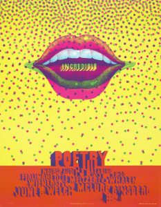
I decided to look into the logos of advertisement in the 1960s and 1970’s as illustration in advertisement is also something I’m very interested in.  The 1960’s and 1970’s were very colourful times with it being a very popular era for hippies so a lot of advertisements, posters and logos were full of colour and detail, ‘the 1960’s was a magical time when people really believed in a new utopia’ sent jumpin’, 2012, Posters article.

Moscoso, V. (1968). neon rose. [printed on white index stock].

This poster by Victor Moscoso called ‘Neon Rose’ I really like this piece because I feel like it represents the 1960s as a whole, with all the bright and neon colours contrasting each other. In my opinion, relating back to the quote about the utopia, the poster as a whole has more of a positive effect rather than a negative because again of the colours as if it were to be the opposite and had duller colours it wouldn’t have the same effect on the audience. This is relevant to my interests as a practitioner because of the illustrative vibe from the poster asa lot of it looks illustrated rather photographed which was a popular thing to do back in the 1960’s as photography wasn’t really used for things like posters.


Caroff, J. (1961). West side story

I then went on to find this image of another poster which is the poster for the film ‘west side story’ and compared to the poster above there are only three colours in the posters with not much detail. I like this poster tho because of the simplicity it shows as I feel if it was too detailed it would be too much to take it in at once but with black and white against the red it’s still eyecatching.


Moving on from the 1960’s I got this movie poster from the 1970s’ from the film ‘Grease’ and although it’s still being illustrated the poster is much more realistic to look at in comparison to the 1960’s ‘west side story’ this being as photography was becoming a more embraced and popular thing to use but they still wanted to keep the illustrative look going. I really like this poster because of the detail and because im aware of what the film is about I see there is more of a meaning behind it as the two characters on the front are deeply in love and are embraced with eachother.


task 6

Unlike modernism which is about getting answers, being original and being constructive. Post modernism is the opposite and is about having doubts, asking questions instead of just finding the answers and deconstructing things.


This image of Richard Hamiltons collage of “Just what was it that made yesterday’s homes so different, so appealing?” using the words that have been given the best word that describes this piece is deconstruct. In my opinion deconstruct is the best word for it because it is a collage and a collage is a piece of work made up of different materials to form one. This piece was made in 2004, so is fairly recent and the piece is questioning itself which is what post modernism does it makes you question the work you are making instead of trying to just find the answers like modernism.

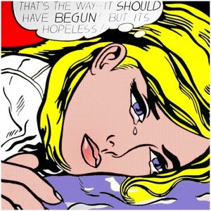
I then got an image of Roy Lichtenstein’s work “that’s the way.. it should have begun,” I feel like the word that describes this piece the best for post modernism is doubt because if you can’t tell the woman in the piece is having doubt in her thoughts. Whom or what she is thinking about is unknown to us so we have to guess what she is thinking about by questioning the art piece itself.  In my opinion I really like this piece, because the way Lichtenstein has made this piece is very intriguing with all the bright colours and minimal amount of detail.


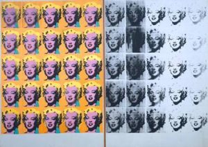
Finally, I got an Andy Warhol piece “Marilyn diptych” and the word that describes this the best would be ‘show’ because of the repetition of the art work it is putting on a show for the audience, by using the same images over and over again it engages the audience in and makes them question Warhol’s intentions of doing this and why did he decided to do it in black and white also.


Hamilton, R. (2004). Just what was it that made yesterday’s homes so different, so appealing?. [digital print on paper] not on display: tate.

Lichtenstein (1968). That’s the Way – It should have begun ,. [Colour silkscreen on cardboard] Bern, Switzerland: Kunsthalle Bern.

Warhol, A. (1962). Marilyn diptych. [silkscreen] Great Britain, tate.

task 4

Is it possible to be truly authentic?


Authentic – adjective

. of undisputed origin and not a copy; genuine.


In my opinion, I think it is very difficult now to be truly authentic without copying something, especially now because a lot of things have been done so it’s quite hard as an artist to do something new and shocking. Unlike before the 21st century so during the 20th, a lot of artists did shocking and new things because everyone got so used to traditional styles of work so that when people did something new a lot of people hated it or rejected the idea of it.


The principles of modernism do hold value in contemporary practice because the rules of modernism are “to modernise”, “to make new”, “to start again” and “to refresh” etc. so this is the idea of making something new and to not keep repeating similar pieces of work so people may keep these principles in mind when they make their work because they want to be authentic.


I believe it is possible to be truly authentic, but like I said before this can be difficult without having something similar to someone else’s work, but to be original you don’t always have to do something completely new but you could do a piece of work on a subject that has been done, but do it differently or with a twist and in my opinion, this can make you authentic because it is almost new and not been done before.


So in conclusion it is possible to be authentic but can be very difficult to achieve.

task 3

“technology is the mortal enemy of art.”


I disagree with this statement as a contemporary practitioner because I believe the day and age we live in today, technology plays a huge role in art. Maybe before in art it would be considered the mortal enemy because technology has really developed dramatically and quickly it would have been hard to adjust easily, making artists feel almost threatened by this as they didn’t want people to lose interest in their work which could have been on the more traditional side of things.


As a contemporary practitioner, I use technology within my work to help me make my work, whether that’s from taking the photo using technology like a phone or a professional camera, or to digitally editing my work by scanning in what I have done.


A movement that probably agrees with the quote is the Dada movement which was a big between 1916 – 1922. Dada was an anti-art stance which created their art alive and to the moment, so back then in the 1920’s technology wasn’t as big as it is now, so this art movement wouldn’t have welcomed technology as openly as we do now because it would’ve been very new to them and where they create art to the moment technology would have been a massive change, so they could have accepted it but most likely rejected the idea of using technology as art back then was still more on the traditional side.


In conclusion technology isn’t the mortal enemy of art and everyone should embrace it more into their art and appreciate it as it does help a lot.


Source intro to Manifesto of the Constructivist Group (c.1922)


100 Artists’ Manifestos From The Futurists to the Stockists (edited by Alex Danchev Penguin, London 2011)

task 2

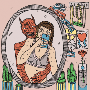
For this task, I chose the illustrative route of graphics and decided to pick an image that relates to the feminist theory from this lecture. I chose an illustrative piece that was created by ‘Polly Nor’ where she focuses on women and their demons. In my opinion, I feel like this piece relates to the feminist theory the most as it is focusing on the roles of women and what goes on. In the image shown it shows the woman in the picture taking a selfie in the mirror only wearing her underwear whilst a demon which actually appears to be her demon is hugging her from behind. This could show that the demon is making her take the picture, but the demon could be representing society and the constant pressure it has on women for them to try and look perfect all the time and flaunt this by posting on social media.

This image on the other hand is from a women’s magazine which links to the first image because it’s a magazine that influences woman to make them feel like they need to look perfect because on the front cover, it shows a woman who is skinny and beautiful which can put the audience, who are mainly women, under a lot of pressure to feel the need to look like this all the time as on a lot of magazines this is a normal front cover so it can be something that is unavoidable in the advertisement industry.

Terminal bar – Stefan Nadelman (2002)

The film terminal bar is a film made up of stills as well as traditional filming where the creator of the film is interviewing his father ‘Sheldon Nadelman’ about the bar as Sheldon documented the photos of the customers who came into the bar.

The stills of the customers were taken between 1972 and 1982 so Sheldon had documented 10 years’ worth of stills. His son asked, “what are you trying to show in these photographs?” and Sheldon replied, “I’m trying to show people what’s happening.” From this I can assume that he wanted recognition for these people and their stories as throughout the film he gave brief summaries of stories of some of the customers and the rumours that followed them.

From this documentary, I similarly might follow the way Stefan Nadelman makes the film where it transitions from the stills to the actual film because I found that this was very effective and kept you interested. The film is also very fast paced going from one story to the other, he also keeps it quite blunt not going into too much detail but giving enough information to understand what went on at the ‘terminal bar’. The music is also fast paced and doesn’t stop at any point during the film even when Stefan is interviewing his father which in my opinion shows the movie is more concentrated on the stills rather than the traditional filming otherwise the music would be more subtle and quiet.

Maggie Saunders.