Author Archives: Gemma Thomson

Final summary

During the Research and Communication tasks I feel I have gained an insight into the cultural and political thinking of artists thanks to exploring different art-movements in their contexts. By looking at artwork isolated in its context and in comparison, to contemporary ideas I have come to understand how the context, purpose and meaning contribute heavily to their success.

I strongly enjoyed the research element of these tasks as new sources helped me develop strong arguments whilst providing me with interesting information I’d not considered before. I believe that over this semester my ability to apply evaluative and critical thinking has greatly improved and it is because of this that my interests have taken a more focused direction towards illustration.

Throughout the tasks I was influenced by the series Abstract to choose a selection of images from a variety of practices rather than disregarding some which weren’t my preference. I found each practice made strong connections to the audience in different ways which is what made the work successful. This began my interest in how the process of creation communicated meaning. I think this interest was strongly consolidated during the modernism and post-modernism lecture. I much preferred the post-modernist ideas of deconstructing and asking questions. It created a new perspective for me on how I could utilise my past and contemporary experiences in new ways.

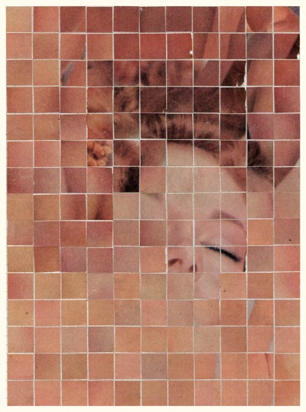
‘The Great Society’ (Image 1)

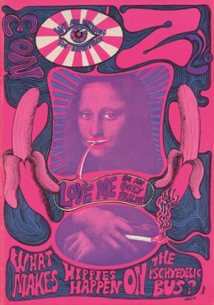
An artist’s quote which has been inspirational to me was by Mark Powell (week two) “I want to keep a distance between the figures and myself because I like the sense of mystery that it creates” (1) (Powell, 2013), from this quote I liked the idea that an artwork was more than aesthetic value and that by changing the medium and method the entire message could be intensified. I consistently returned to this idea, intrigued by art-movements where this came through strongly. I found learning about counter-culture very valuable in contextualising ideas showing how historical context was relevant today. This mainly came through when looking at ‘The Great Society’ poster which I didn’t believe to be visually successful at first but on reflection found the theory behind it, that the layering process of the print reflected more and more resources being layered onto Vietnam- a war which the American people were against, complimented the daunting visual perfectly.

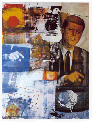
By being able to look at many practices I can conclude that theory is not limited by practice. Within practices, technology has allowed progression- new ways of delivering ideas which create endless possibilities giving no one practice an advantage over the other. Important graphic artists to me were Rauschenberg and Kennard who made big statements simply through their use of images. They provided me with clear examples of how theory and practice go hand in hand; theory creates depth within artwork which allows multiple interpretations to be explored. In this way every individual can project their own meaning onto an artwork whilst the practice provides the means for communication. Without art making personal connections, the meaning becomes lost which ultimately means the work is unsuccessful.

‘Buffalo II’ Robert Rauschenberg (Image 3)

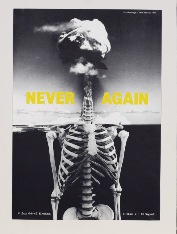
‘Never Again’ Peter Kennard (Image 2)


References:

(1) Holly Simpson. (2013). Mark Powell Interview. Available: http://www.thelondonillustrationfair.co.uk/markpowell-interview/. Last accessed 22/10/17.

Images:

(1)- Anonymous. (1967). The Great Society. Available: https://i.pinimg.com/originals/95/27/b3/9527b334c2cb44b98a8b45e5d8730917.jpg. Last accessed 26/11/17.

(2) Peter Kennard. (1983). “Never Again”. Available: http://media.vam.ac.uk/media/thira/collection_images/2006BB/2006BB5388.jpg. Last accessed 3/12/17.

(3) Robert Rauschenberg. (1964). buffalo II. Available: http://hyperallergic.com/wpcontent/uploads/2013/04/Rauschenberg-320.jpg. Last accessed 2/12/17.

Publish or Perish!

The images I have chosen successfully communicate a story and emotional reaction through different techniques. In my practice I’ve found the most successful creations are ones which create a connection to the viewer as they carry a strong message.

Image 1

I think this is an extremely strong image by the artist Peter Kennard. The use of black and white photo montage makes the image seem frozen in time whilst the contrasting yellow text sends out a powerful message for future generations. The surreal image of the skeleton’s head turning into a cloud of smoke makes the viewer question humanity and makes them feel a sense of responsibility for the fate of the world. A complex story is carried with this image through its context which immediately connects all people together as nuclear warfare is a worldwide issue. I like that the desired effect “is precisely that it does not look real” as it makes the image seem more like a “dark fantasy” (1) (Jones, 2015) than reality.

Image 2

I chose this image from the New Yorker’s money issue as I felt the digital style reflected well on the story and message. In my own practise I try to find processes which support the message. Here I feel the digitally drawn cover reflects the idea of machines rising to power and replacing humans. The composition also adds to the image’s success. I find it interesting that the dog is staring solemnly at the robot dog as if raising the question of how replaceable will things eventually become? I feel it also makes a connection to how people are put out of work by machines and this cover explores how far this will go.

Image 3

This illustration is excerpted from a fairy-tale book. I like how bold silhouettes juxtapose the swirling inky backgrounds creating a sense of magic. As Jan works “He hears the rain – and sometimes hail” (2) (Pienkowski), these sensory stimuli come across in his work as it truly makes the viewer feel. They speak to one’s inner fascination with magic and fantasy.

I feel with a strong story; personal connections follow which makes the work successful.


References:

1 Jonathon Jones. (2015). Peter Kennard review – a thrillingly grotesque montage of modern times . Available: https://www.theguardian.com/artanddesign/2015/may/12/peter-kennard-review-imperial-war-museum. Last accessed 3/12/17.

2 unknown. (unknown). Jan PieƄkowski. Available: http://gabrielfineart.co.uk/jan-pienkowski/4587266546. Last accessed 3/12/17.

Images:

(3) Jan Pienkowski. (2011). The kingdom under the sea. Available: http://gabrielfineart.co.uk/communities/1/004/012/573/911//images/4629169926.jpg. Last accessed 3/12/17.

(1) Peter Kennard. (1983). “Never Again”. Available: http://media.vam.ac.uk/media/thira/collection_images/2006BB/2006BB5388.jpg. Last accessed 3/12/17.

(2) R. Kikou Johnson. (2017). “Tech support”. Available: https://media.newyorker.com/photos/59de87ab55d36754839871e3/master/w_727,c_limit/CVN_TNY_10_23_17RGB.jpg. Last accessed 3/12/17.

Show, reveal, deconstruct

Post-modernism juxtaposed modernism completely by questioning everything with uncertainty. The movement showed a longing to understand by deconstructing ideas whereas modernism provided solid answers.

Image 1

Weingart uses a combination of type and layering to create visual communications. The use of tone builds up depth and contrast within the image. This is complimented by the positioning of type which looks purposefully revealed. The fragmented image creates a sense of incoherence which effectively makes the audience study the work’s entirety. “The way I worked, and the action of my scissor mirrored an inner reality: 
contradictory, 
 erratic- in short, quick snips.” (1) (Weingart,1960’s) I like this process and use collage in my own practice using layers to hide and reveal which makes the revealed more powerful.

Image 2


To me, Rauschenberg’s image embodies multiplicity. JFK died during the creation of this work which meant the meaning suddenly changed. As an illustrator, I like the way emotions are created through a visual journey. The contrasting colour and layering, like Weingart’s work, shows conflict which makes the audience doubt how they feel. The warm colours suggest a celebration of Kennedy as an individual, yet the cold blue hand infers death and failure as JFK didn’t manage to fulfil many policies (2).

Image 3


Drucker’s illustrative type creates confusion. It is only by deconstructing, that we can understand the text. I feel this is a clever way and successfully engages the audience as it traps “the eye in a field of letters which make a complex object on the page” (3) (Drucker, 1996) I like the idea of deconstructing words to become only letters as a metaphor of how easily manipulated language can be and how words hold so much power over emotions and major events.

Post-modernism opened art to multiple interpretations by asking different questions, making it successful because individuals develop personal responses.

References:

(3)- Johanna Drucker. (1996). The word made flesh. Available: https://www.granarybooks.com/book/43/. Last accessed 2/12/17.

(2)- Unknown. (unknown). Robert Rauschenberg, buffalo II, (1964), mixed. Available: https://www.thinglink.com/scene/522501012372586496#. Last accessed 2/12/17.

(1) Weingart, Wolfgang, Typography / Wolfgang Weingart (Baden, Switzerland : Lars MĂŒller ; New York, NY : Distribution USA and Canada, Princeton Architectural Press, c2000), 355. Last accessed 2/12/17

Images:

(3)- Johanna Drucker. (1989). The word made flesh. Available: https://i.pinimg.com/originals/4a/fa/27/4afa270e19ca6543bb477eba66f0f072.jpg. Last accessed 2/12/17.

(2)- Robert Rauschenberg. (1964). buffalo II. Available: http://hyperallergic.com/wp-content/uploads/2013/04/Rauschenberg-320.jpg. Last accessed 2/12/17.

(1)- Wolfgang Weingart. (1960s). Poster page. Available: http://2.bp.blogspot.com/-DALgAs8uS6k/USIKJMSyKuI/AAAAAAAAAM4/4YQlA0k83hs/s1600/Wolfgang+Weingart%255B1%255D.jpg. Last accessed 2/12/17.

Sensibility, spirit, meaning

The Cold War and Vietnam created tension and hostility around the world and in America; especially in the youth and civil rights activists resulting in a rise of protests. In the 1960’s-70’s sex and drugs reflected in rock music were the bases of counter culture. Hippies and Yippies preached ‘make love, not war’ (1) (Rosemont, 1965) in mass rallies. The images I have chosen to connect to my interest of practice in composition and style.

I chose this poster because it connects to my colour style. I feel the bright bold contrasts work effectively to create a sense of danger to catch your eye. Contextually and figuratively this

The Great Society -1967 (Image1)

poster evokes much meaning. I like how the process adds an extra level of depth as I do this too. The devastation of Johnson’s Great Society is shown in ‘the multi-layered complexity of the poster’s message is found in its portrayal of soldiers vs. citizens’ (2). The layering shows how the government poured resources into Vietnam which only stripped resources from social reforms in America.


‘OZ’ satirical magazine, 3rd May 1967 (Image2)

In my own work I like to use line to create a continuous visual journey which evokes meaning. The underground magazine ‘Oz’s’ use of colour and line creates a psychedelic image appealing to the student youth of the sex, drugs and rock n roll era. In this work I feel that the psychedelic style suggests a sense of free spirit as its breaking away from the norm. The repetitive line creates a visual flow mimicking the easy-going attitude of the youth. Professor Timothy Leary inspired his students to ‘turn on, tune in, drop out’ (3) (Leary, 1967) which was often interpreted as ‘do drugs’( 4).


‘Sensibility refers to an acute perception of the emotions of another’ (5). This is a famous image which shows the real brutality of what civil rights activists faced and created sensibility around the world. I think this was such an important image at the time to break the normal conventions and open people’s eyes to the fact that ‘peace does not just mean putting an end to violence or war, but to all other factors that threaten peace, such as discrimination.’(6) (Aung San Suu Kyi).

Protest observer in Birmingham, being attacked by police dogs during a civil rights protest. 3rd May 1963 (Image3)

References:

1- Creative Review. (2012). The story behind Make Love Not War. Available: https://www.creativereview.co.uk/the-story-behind-make-love-not-war/. Last accessed 26/11/17.

2- Mark Vallen. (2016). “Hey, Hey, LBJ…”. Available: http://www.art-for-a-change.com/LBJ/LBJ.htm. Last accessed 26/11/17.

3- Pat Joseph. (2015). Myth of the Dropout: “Turn On, Tune In, Drop Out” Never Really Described Berkeley Ethos. Available: https://alumni.berkeley.edu/california-magazine/spring-2015-dropouts-and-drop-ins/myth-dropout-turn-tune-drop-out-never-really. Last accessed 26/11/17.

4- Pat Joseph. (2015). Myth of the Dropout: “Turn On, Tune In, Drop Out” Never Really Described Berkeley Ethos. Available: https://alumni.berkeley.edu/california-magazine/spring-2015-dropouts-and-drop-ins/myth-dropout-turn-tune-drop-out-never-really. Last accessed 26/11/17.

5- Unknown. (2015). Sensibility. Available: http://www.artandpopularculture.com/Sensibility. Last accessed 26/11/17.

6-Unknown. (2015). 15 inspiring human rights quotes. Available: https://www.amnesty.org/en/latest/campaigns/2015/10/inspiring-human-rights-quotes/. Last accessed 26/11/17.

Images:

(1)- Anonymous. (1967). The Great Society. Available: https://i.pinimg.com/originals/95/27/b3/9527b334c2cb44b98a8b45e5d8730917.jpg. Last accessed 26/11/17.

(3)- Bill Hudson. (1963). Protest observer (Walter Gadsden, 17) in Birmingham, Alabama, USA, on 3 May 1963, being attacked by police dogs during a civil rights protest.. Available: https://upload.wikimedia.org/wikipedia/en/7/74/Birmingham_campaign_dogs.jpg. Last accessed 26/11/17.

(2)- Martin Sharp. (1967). OZ. Available: https://i.guim.co.uk/img/media/1cd00fe3e6f7675a78645fd7699fa27726e5d0ad/47_37_2461_3511/master/2461.jpg?w=300&q=55&auto=format&usm=12&fit=max&s=deac6babf5babf930728cabe0f67dccd. Last accessed 26/11/17.

Is it possible to be truly authentic?

To be authentic in art, the idea must be original and not a copy of someone else’s.
The principles of modernism rest heavily upon the idea of breaking away from old traditions and ‘striving to ignore conservative values of art’ (1) (Kaufman, 2017). Each modernist artist brings a new perspective to the movement and so is successfully authentic.

Henri Matisse strived to create art “of balance, of purity and serenity devoid of troubling or depressing subject matter,” (2) (The art story, 2017) so that viewers could take refuge in it. I think his success lies in his bright, pure colours with gaps of white canvas to create light, as they reflect his model’s personality and express his own emotional state. (3) Despite being a modernist it could be argued that Matisse’s work is not truly authentic.

He had taken a lot of inspiration from his travels to North Africa “he incorporated some of the decorative qualities of Islamic art, the angularity of African sculpture, and the flatness of Japanese prints into his own style”. (4) (The art story, 2017)
However, although Matisse adopted his style from inspiration, his original ideas make his work truly authentic. Authenticity depends entirely on the context. The process of painting is not authentic, yet a painting can be authentic because of new ideas behind it. Therefore authenticity is achievable to some degree but this doesn’t sacrifice the success of the artwork (which is what I think is most important).

Principles of modernism do hold value in contemporary practise because it encourages us to look beyond the obvious and discover an original voice in our work.

Image 2

Image 1


References:

(1)- Mac Kaufman. (2017). 5 Principles of Modernism. Available: https://padlet.com/mkaufman3/110okm5tzqy0. Last accessed 06/11/17.

(2)- Unknown. (2017). Henri Matisse French Painter, Draftsman, and Collagist. Available: http://www.theartstory.org/artist-matisse-henri.htm. Last accessed 06/11/17.

(3)- Unknown. (2017). Henri Matisse French Painter, Draftsman, and Collagist. Available: http://www.theartstory.org/artist-matisse-henri.htm. Last accessed 06/11/17.

(4)- Unknown. (2017). Henri Matisse French Painter, Draftsman, and Collagist. Available: http://www.theartstory.org/artist-matisse-henri.htm. Last accessed 06/11/17.

Images-

(1)- Henri Matisse. (1905). Joy of Life. Available: http://www.henrimatisse.org/images/gallery/joy-of-life.jpg. Last accessed 06/11/17.

(2) Utagawa Toyokuni II.. (Early 1800’s). Tamatoko of the Daikokuyo.. Available: https://i.pinimg.com/236x/4e/29/f6/4e29f6db7678eb6edd15987bc75b02f2.jpg. Last accessed 06/11/17.

“Technology is the mortal enemy of art”

The role of technology in illustration has been undeniably positive. It allows an artist to experiment to achieve new and exciting results in more ways than they could without technology. However, growth has seen the decline in traditional practises created by hand which are transferred directly from illustrator to paper.

Technology makes it easier for more people to become illustrators as there is less reliance on being good at drawing. In an Independent article Simon

Image 2

Prosser says “there aren’t that many great illustrators. It’s rare you can come across someone who can draw” (1) (Prosser, 2012). At the time of Dickens most of his books were hand illustrated but now there are only children’s books which are (2). In her article, Melanie McDonagh implies this can be owed to fewer practitioners being skilled in drawing as they can rely on technology to produce works.

Image1

However, Rodchenko closed his manifesto with “but they have forgotten that all attention should be concentrated on the experimental laboratories” (3) (Rodchenko,2014). I feel that illustration with technology emphasises attention onto experimenting as it allows an illustrator to access more tools which can help give a character personality. When the illustrator Brett Ryder was struggling she “turned to the computer as I thought it could help solve the aesthetic problems I was encountering.”(4) (Ryder, 2006)

This shows how technology can help further progress of illustrations by providing a wider range of tools available to artists.

To conclude I disagree with the quote. I believe in my own work that technology hasn’t hindered my drawing abilities but allowed me to grow and progress further, showing off my skills in new inventive ways.

References:

[3] Aleksandr Rodchenko. (2014). Who We Are: Manifesto of the Constructivist Group. Available: https://issuu.com/rachelgweeks/docs/manifesto_issuu. Last accessed 23/10/2017.

[4] Creative Bloq Staff. (2006). Digital Illustration. Available: http://www.creativebloq.com/computer-arts/digital-illustration-11069638. Last accessed 23/10/2017.

[1] Melanie McDonagh. (2012). Where have all the book illustrators gone?. Available: http://www.independent.co.uk/arts-entertainment/books/features/where-have-all-the-book-illustrators-gone-6291792.html. Last accessed 23/10/2017.

[2] Melanie McDonagh. (2012). Where have all the book illustrators gone?. Available: http://www.independent.co.uk/arts-entertainment/books/features/where-have-all-the-book-illustrators-gone-6291792.html. Last accessed 23/10/2017.


Images:

(1)-Brett Ryder. (2012). Raining Fish. Available: https://www.itsnicethat.com/system/files/032012/4f57834707313913a10007f4/images_slice_large/15_FTraining.jpg. Last accessed 23/10/2017.

(2)-Phiz. (1978). A stranger calls to see me. Available: http://www.victorianweb.org/art/illustration/phiz/dc/40.jpg. Last accessed 23/10/2017.

Comparing images

My images are by graphic artist Anthony Gerace and illustrator Mark Powell who both use elements of the past for different purposes.

Anthony Gerace distorts kitsch vintage photographs from the 1940’s-70’s in collage to create a sense of loss in his series ‘there must be more to life than this’(1). Adding a contextual element of the post-World War 2 consumerism era which was full of prosperity for all and so highlights the relevance of second wave feminism today. The loss of image suggests the loss of past values and a progression towards coherence.

Mark Powell however, uses old envelopes to draw on. He knows nothing about the subject because he wants to “keep a distance between the figures and myself because I like the sense of mystery that it creates” (2) (Powell, 2013). I like the idea of not knowing either the subjects in both pieces so that we can only infer off what the artist has purposefully shown us. I think the choice of medium creates the idea of communication. The highly detailed illustration communicates a visual story of life through the wrinkles on their face. The envelope represents every person and the stories we refrain from sharing.

Image 1- There must be more to life than this

Both use different processes in similar repetitive ways e.g. pen strokes, cutting and placing photos for different aims. I like how they both show the importance of the past today. They raise the question to me ‘how I can use my past influences to make a better change?’ Perhaps through my medium choice or subject matter.

Image 2- Originals


References:

(1) Anthony Gerace. (2013). There must be more to life than this. Available: http://www.hotshoeinternational.com/blog/portfolio/there-must-be-more-to-life-than-this-anthony-gerace. Last accessed 19th October 2017.

(2) Holly Simpson. (2013). Mark Powell Interview. Available: http://www.thelondonillustrationfair.co.uk/markpowell-interview/. Last accessed 22/10/17.

Images-

(1)-Anthony Gerace. (2013). There must be more to life than this. Available: http://paper-journal.com/wp-content/uploads/2013/08/21_tmbmtltt10.jpg. Last accessed 19th October 2017.

(2)-Mark Powell. (2013). Originals. Available: https://static1.squarespace.com/static/52f658d5e4b0b19928bf39b9/t/594c655ad1758edb0c0ab809/1498178910560/MP.jpg?format=1000w. Last accessed 19th October 2017.


Terminal Bar

In the short film ‘Terminal Bar’ Stefan Nadelman uses different cinematic techniques to create a social and visual narrative. The film is comprised of a collection of stills, both portraits and different perspectives around the location of the ‘Terminal Bar’, taken over the course of ten years (1972-82) accompanied by an oral narrative of events which effectively map the physical and visual changes of the location as well as the visitors. This creates a strong sense of time by showing the quantity of customers at the bar. The anecdotes paint a vibrant picture of everyone conveying an appreciation for their character being present at the bar.

Photograph stills alongside newspaper articles and documentary style footage of Nadelman’s father create a strong narrative. The shots change with a syncopated beat creating a mixture of kinetic and smooth transitions from words to pictures in a chronological order. This adds depth reflecting on the way we perceive time to be faster or slower at times. The film ends in traditional filming in colour adding emphasis to the time frame that it was filmed over; stressing to the audience its importance to Nadelman’s father as “nobody would know” (S. Nadelman, 2002) unless he documented it. Therefore, his purpose is to keep the past alive.

Similarly, following the same process and brief I would create a flip book of photographs showing a timeline of a few hours in my favourite park. I feel a tactile object allows a more personal glimpse into the character of the place.

Still from ‘Terminal Bar’ 2002

References:

Image:Stefan Nadelman. (2002). Terminal Bar. Available: http://www.slate.com/content/dam/slate/blogs/behold/2014/10/Terminal%20Bar/00_TBar_frontmatter_p03_0003.jpg.CROP.original-original.jpg. Last accessed 9/10/17.

(1) Terminal Bar(2002) dir. Stefan Nadelman (US) source: http://www.touristpictures.com/terminal_bar/ Last accessed 9/10/17