Author Archives: Georgia Weaver

Task 2: Consume a book.

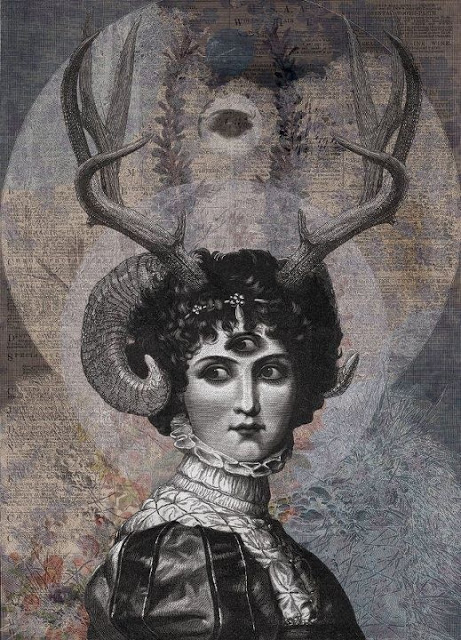
‘Witches and Wicked Bodies’ which was created by the National Gallery looks at the portrayal of witches from the Renaissance period, right up to the 21st century. It features continual speculation throughout about why women may have been demonised like this, whether it be for social, economical or religious reasons.

It is noted within the book that, ‘Witches who fly in hordes to attend Sabbaths are seen as being part of a female collectivity or coven that threatens the social order.” (page 57). This quote is prominent because it specifically mentions that females are the ones being accused, and in particular women that are often seen in groups. This stems back very early on to when King James started his crusade against witches and even paid people to hunt the witches. It is even speculated that ‘Macbeth’ by William Shakespeare was commissioned by King James to spread fear of witches.

Throughout the book, the National Gallery have supplied artwork from various artists that depict witches in contrasting lights. For instance, Paula Rego’s “Witches at their Incantations after Salvator Rosa” (1991) was produced very late on, when witchcraft doesn’t really receive the same fear that it did during King James’ reign. It is interesting as Rego’s piece wouldn’t look out of place with Francisco Goya’s paintings on witchcraft.

However, Edward Burra’s “Dancing Skeletons” (1934) is very brightly painted, and thought to represent Mexico’s Day of the Dead festival. Apparently he was very influenced by visits to Spain in the 1930’s and this played a big part on colour combinations and subject matters. Even though the figures in the painting are dancing, in the background you can see 3 people hanging from the gallows and a face in the moon overlooking the entire performance.


Task 12: Choose a large work and imagine it smaller or choose a small work and imagine it bigger or more or less elaborate.

This is a self portrait that I did as part of the first shared drive project where we sampled different workshops around the university. To create it, I used black acrylic paint and finger painted it. The size of the image is the size of me so roughly 5’1.

If I could recreate this image again I would choose to make it A4/A3 sized. It is very difficult for me to work with really large projects as my height makes it difficult for me to reach the paper. This means that I struggle to get the detail that I’d like to feature in my paintings.

I would also choose to make it more elaborate and in keeping with my own style as an artist. This would mean incorporating lots of blues, purples, pinks and greens into the painting, which would be a lot easier if it was on a smaller scale. However, I do like the black in the painting as it makes it stand out, so maybe I could combine the black paint with the colourful paints.

Due to the size of the painting, it was difficult to get accurate details of my face into it, so I’m not sure that it necessarily resembles me. However, I do quite like the uneven eyes and the blank expression, it is almost a cartoon and perhaps resembles my inner self, rather than my outer self.

Task 11: Summarise your blog and reflect on what you have learned from the process.

Creating a blog has allowed me to reflect on my first term at University and the work that I have been producing. It has also allowed me to focus on specific aspects of the course so far.

The blog forces you to think about your own artwork and the artwork that you are influenced by, which is incredibly useful as otherwise it can be really difficult to reflect on. It is a good way of thinking about the research and communications module as a whole, but it also involves different projects that you are working on.

This process has taught me about the importance of documenting my work regularly. Even if I choose to continue with a blog but it is not electronic or written on specific dates, it is useful to make a blog post every time we are set a new project at least.

In the future, I will try to keep some sort of written documentation of the work that I’ve created and the process that surrounds it. I will also make sure to use the library often because the tasks have really encouraged us as student to use it. The resources are great and cover a wide range of subjects.

Task 6: Modes of practice – the different ways in which artists make work.

Speaking on behalf of myself as an artist, there are a few ways that I make work which I would like to expand on and change. For instance, I prefer to shut myself away on my own to create my work, with background noise from music/film/television as inspiration to convey a mode. Another thing that helps me to create artwork are smells, for instance incense sticks really help to calm me.

In an ideal situation, I would like to be able to produce work this way with some adaptation. It is important to work among your contemporaries. In order to develop my mode of practice I could work in the studio amongst my peers but seat myself in a corner facing the wall or a more empty space to give the illusion of being alone. Although I cannot burn incense in the studio at University, I could maybe buy a reed diffuser to channel calming scents, and buy some headphones so that I can listen to music whilst working, or bring in my laptop and watch films.

My ideal studio would be very quiet, with bare walls that I could hang my artwork from, and this is what I will strive for once I complete my degree.

Task 7: Histories of art.

In Richard Serra’s text, he is saying that the traditional idea of the artist’ studio has been replaced with industrial and urban sites. The way that sculptures were made before the mid-century was manifested through a relationship that the sculptor had with their studio.

Although sculptors may now be mass manufacturing artwork in factories etc., they don’t pay any attention to the habitat where they are creating the pieces or their history, for instance, the industrial revolution. Some artists have based an entire career on mass producing artwork, such as Andy Warhol, and in Serra’s words, ‘by mimicking the strategies of the media, Warhol became the master of art as a commercial enterprise.’

In the 1990’s when this piece was written by Serra, some of the most famous artists were Damian Hirst and Rachel Whiteread. This article could’ve been aimed at them as sculptors, with Serra implying that artists don’t have a relationship between the site where the piece was created and where they may have been relocated.

In “From Other Criteria” by Leo Steinberg, he is very focused on how artists compose their pieces in relation to the natural human form. He states that ‘It is not the actual physical placement of the image that counts.’ This is because in his mind, the piece is positioned as portrait or landscape due to how the artist created it in terms of their form.

Art in 1970’s New York was changing and performance art was becoming very popular, which explains why Steinberg decided to write about the human form in relation to artwork. The way that art was rapidly changing and adapting meant that critics were struggling to determine what was art and what wasn’t.

Task 8: Appropriate an image and assimilate it into a piece of your own work.

In order to appropriate a piece of my own artwork, I decided to cut and paste the Apple logo over the face of the woman I had drawn. I wanted to do a modern take on  ‘The Son Of Man’ (1946)  by Rene Magritte.

The process wasn’t very difficult as I just layered the apple logo over the face of my drawing and then cropped the image down in Microsoft Word. I did consider neatening up the logo more and getting rid of the plain white areas around the apple but I thought that actually the white space worked with what I wanted the artwork to convey.

The simple cut and paste job over the drawing that I’d worked on for a long time is meant to represent the 21st century and how our generation only care about what brands are popular with their peers. It is about capitalism and commercialism. The original painting by Magritte is one that most people recognise instantly and that’s why I wanted to playfully change it a bit.

I hope that this reworked image will make people think about how they spend money on things just for the brand, and about how all of this makes things difficult for independent artists and traders.

If I had more time to dedicate to this project I would really like to paint the apple myself and make it look pixelated so that it has a bit more depth to it.

Task 10: Upload an image of your choice to represent your practice + exactly 10 words.

10 words I would associate with my work:

  1. Colourful
  2.  Morbid
  3. Gothic
  4. Symbolic
  5. Floral
  6. Death
  7. Contrast
  8. Macabre
  9. Illustrative
  10. Baroque

I have chosen this image as a representation of my work because I feel that it includes all of the elements that I usually have in my artwork. I am influenced very heavily by Pre-Raphaelite art, tattoo art and the symbolism movement.

There are usually symbolic imagery in my artwork that represent death; this is because death and mortality is something that has played a huge role in my life and changed me as a person. I choose to make these images bright and colourful, sometimes to make it ironic and sometimes to make it quite macabre. It is entirely how the audience views it.

The most prominent colours in my artwork are purples, blues, pinks and greens. I like to include colours associated with femininity. These colours are also present in most of my tattoos and so it is like I am becoming part of my art and vice versa.

Due to being self taught and the only art qualification I have been an Art Foundation, my art tends to be quite illustrative. It is not always accurate or proportionate but I don’t think this is an important aspect of art, it is the message it conveys.

Music, film and books play a big part in the artwork that I make, as whatever I am listening to/reading/watching helps me to convey a mood to the audience often subconsciously. If I am watching something about serial killers it tends to make my artwork darker, if I am listening to music from the 1970’s I tend to use brighter, psychedelic colours.


Task 4: Soul of a Nation: Art in the age of Black Power

Due to the subject of this exhibition, I was very nervous and also intrigued about what I might see when viewing the artwork.

The exhibition comprised of a variety of different styles of artwork, from paintings to textiles. Included was a famous painting of Muhammad Ali by Andy Warhol. One piece that I found particularly moving was ‘Fred Hampton’s Door 2’ (1975) by Dana C Chandler – the bullet holes in the door were chilling, especially with recent events like Donald Trump being elected as president and with the volume of African American men being shot and killed for no reason. It is shocking that although this piece is from 1975 not much has really changed at all.

Another piece that I really enjoyed was ‘Revolutionary’ (1972) by Wadsworth Jarrell. The bright colours really capture the psychedelic movement of the time. Although the woman in the painting at first glance looks to be singing, with words such as ‘struggle’ and ‘I have given my life’ could mean that she is in fact screaming.

After leaving the exhibition I was incredibly emotional – although I have always been outraged at how the police have treated black people, actually seeing the artwork from the time really made the connection deeper. It was seeing all of the art from the time of these events that brought it to life.

Task 1: Module introduction and developing ideas.

Stag lady – Georgia Weaver

DAN HILLIER -LUNA


The above piece of artwork is something that I began while researching for the contemporary art project.

As part of my research, I began looking at different contemporary artists and identifying themes that they each have that I find interesting. For instance, Dan Hillier’s artwork really appeals to me as it combines mythological ideas along with Victorian imagery. Expanding on this idea, I decided to draw a woman with antlers coming out of her head to show the idea of a half human/half animal.

I gave her skin an unrealistic blue tone to it, and I also gave her purple eyes. The reason I did this was because I wanted her to look like a human but have characteristics that were impossible for a human to have, thus making it seem almost mythological.

The colours that I chose in this drawing are based on colours that I feel celebrate femininity and are present in the majority of my artworks. These colours are: purples, pinks, light blues and greens. I feel that these colours alongside her antlers and glowing complexion gives the woman a mysterious powerful presence. The jewels that she has give the audience an idea of wealth or superiority. I put a spider in the necklace to elude to a darkness or creepiness.

In terms of mediums, I decided to create this drawing with pencils and pens to try and make them contemporary. Artists such as Grayson Perry use marker pens in their work to make their artwork colourful and child like, so I decided to do the same to portray the woman as a mythological and mysterious creature.

In order to develop this piece further, I would like to experiment with different colours, maybe through print making or through digital collage in Photoshop.

Task 9: Philosophy and theory and politics

The artwork of Paul Fryer focuses heavily on aspects of death, religion and the morbid, all themes that are focused on within the symbolist theory.

Although a lot of Fryer’s work could apply to the symbolist theory, it is ‘Ecce Homo’ (2006). This is a sculptural installation that features a crown of thorns, with a golden egg seemingly floating above it. One of the main points of symbolism, as expressed by the 5 main points of Albert Aurier, is that the artwork must be ideative, meaning that it has to express an idea. In this case, the artwork expresses an idea of the impossible, by heaving the golden egg floating. It all appears to be in the photography making the audience wonder how it is possible. However, in another photograph you can see reflections in the glass, thus shattering the illusion for the audience.

Other theorists believed that artists had the ability to offer salvation through their artwork, particularly a group called the Nabis. By Fryer focusing on creating sculptures that appear to show impossible miracles and religious iconography, Ryder might be leading his audience to salvation.

Theorists seem to mostly agree that symbolism should keep the audience in mystery; by using photography to his advantage, Fryer is able to make it look as though the egg is actually floating, as well as keeping the crown of thorns also looking relatively simple. This stops the shattering of illusion for the audience. However, in some of Fryer’s photographs you are able to see the reflection in the glass of the egg and crown. This could possibly be an indication about how religious acts seem genuine, but when they are closely inspected the illusion disappears.

Ecce Homo 2006 – Paul Fryer

Ecce Homo 2006 – Paul Fryer