Author Archives: Hannah Lester

Task 11/12 – Summary

Throughout this module, I have enjoyed most of the lectures, finding them interesting, useful in discovering new designers and introducing me into new areas of fashion design I have not learnt about before. I did find a few tasks difficult and struggles to understand a few points, however did enjoy learning about these areas, even throughout the difficult parts.

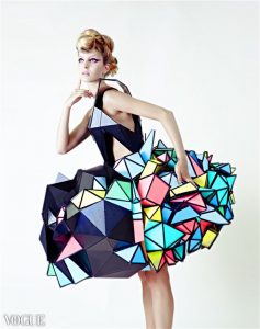
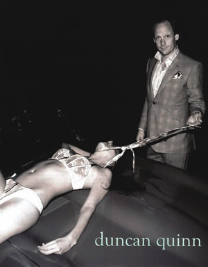
My favourite area to study was the ethics and visual research tasks. I found these extremely interesting, especially the ethics area, I found myself compelled into the different types of advertising and how controversial so many different advertisement campaigns are. This made me open my eyes to all the issues that are involved with advertisement, especially involving women and how they are portrayed. I also enjoyed looking into different fashion collections, coming across new designers I haven’t heard of before, which I have taken further and looked at in my practice.

The area that I found the most difficulty was in the Reflective Writing. The articles that were given to us were extremely articulate in the way they were written, which personally made it hard for me to understand what exactly they were discussing. To help with this, I focused on reading one paragraph at a time, writing down what I thought they were talking about, looking up words, making it slightly easier for me to understand. Even having done this, finding a quote to refer to in this task was very difficult because of the large amount of resources in the library, I did not know where to start looking. However, after getting help, I found it easier to narrow down and find a quote.

Although the library contains such a wide range of resources, I did find that I was not using these resources wisely. This is because when finding quotes for a few of my tasks, I referred to the internet or newspapers/magazines instead of going to the library. I think this is because of the overwhelming amount there is, I found it much easier and less time consuming referring to magazines and articles I have found instead. In the future, I would like to use the library more to get the information; which the reflective writing task did help me practice how to locate what you specifically want.

At the start of the year, I managed my time well, doing the first task as they were set. However, I became stuck when Task 5/6 was set, which then made my time management not very efficient. Even when asking for help, I put off completing this task week after week, which then made me put off the other tasks which were set after. This then put me behind, making it more stressful for myself. Taking this into the future, I will make sure that when I ask for help, I get all the information I need to make sure I can efficiently do the task before the next one is set, making sure I am not put behind again.

Task 9/10 – Ethics

This is a very infamous advert done by Duncan Quinn, which turns out to be his very first advert, selling men suits. There have been multiple complaints about this and is extremely controversial, because of the style of this advert. The most common ethical issue in advertising is the use of women, either sexualised or making them look weak or objectified. This image is meant to be promoting Duncan Quinn suits, however raises many questions as to how people will understand that this is meant to be promoting suits. An issue with this image is that it shows masculine control/ male domination. I see the woman as a sex slave or under control of the man. The man is presented in a fancy suit, looking smart, business-like, holding a tie which is wrapped around the woman’s neck, who is in lingerie. This shows the man of a better class, better dressed, and more powerful looking. This very much shows the dominance of the man, with him in control of the woman. The tie objectifies the woman as a dog/animal, as it is used as a lead, again showing this control. In many media’s, women are almost always portrayed as the victim, which, in this particular advert, in my opinion, shows the woman as a victim to the man, by the use of the tie.

The Male Gaze Theory, suggests that’s “the male gaze denies women human identity, relegating them to the status of objects to be admired for physical appearance.” [1]

The man’s gaze in this advert is directed at the audience, with a smirk on his face. The smirk directs my attention to what is causing this, which to me, is the woman which he is ‘possessing’. In a way, he seems to be boasting about the fact he has this woman in lingerie in his possession. The woman is portrayed as a object he has won and now owns, relating to the Male Gaze Theory were the woman is seen as a sexy human with no identity to her; her face is not shown in this advert, which furthers her lack/loss of identity.

“Research also found [in advertisement] men are more likely to be shown as leaders
” [2] This does show how men overpower women in mostly all media,  which is clearly seen in this ad. We are constantly bombarded with images like this through advertisement in the street, bus stations, magazines, etc, and people don’t realise what this is actually doing to people and their perception of how others should be seen and treated. “When it comes to creating out ‘regular ‘ads for our ‘regular’ clients, we forget about women.” [3] I agree with this statement as they completely forget about women, and how women will see these ads where other women are sexualised in that way. In advertising, woman are nearly always presented in a exotic, sexualised and/or elegant way, making it extremely hard for ‘regular’ woman to connect with this image. This damages many woman and their self-confidence, trying to ‘be’ one of these women in all these adverts.

In my opinion, I believe that this advert is completely wrong and insensitive to others, especially women, and should have not been able to be published for others to see.

[1] – Loreck, Janice, (2016) The Male Gaze Theory, Available from: Theconversation.com                              [Accessed 28th November 2017]

[2] Gee, Rachel, (2017) The Representation of Women in Advertising Hasn’t Improved in a Decade, Available from: https://www.marketingweek.com/2017/06/21/representation-women-ads/ [Accessed 28th November 2017]

[3] Thompson, J. Walter, (2017) Unpacking Gender Bias In Advertising, Available from: www.jwt.com  [Accessed 28th November 2017]


Task 7/8 – Reflective Writing

I chose to read the chapter Taste, Fashion and the French Fashion Magazine by Sanda Miller in the book Fashion Media, Past and Present, which talked about fashion and taste during the 18th century. It believes that French fashion magazines “have been truthful mirrors of their time,” [1] believing that they are a storage of fashion and a measurement of individuals fashion taste.” I do agree with this as when you look at old and new magazines, you are able to see the change in what was considered fashionable and what people loved in fashion at those particular times.

Some of the themes in this chapter are the role of fashion magazines, how different people view objects, and what was seen as fashion in different time periods. One of the main points were how taste for an object changes depending on who is looking at it; that beauty is subjective. Shakespeare’s “beauty is bought by judgement of the eye” [2] and David Humes’ “beauty in things exist merely in the mind which contemplates them” [3] relate to this idea of taste as they are also commenting on how different people have different tastes of things; what one might find stylish, to another could find it ugly.

This chapter also mentions there being no common denominator in taste, and say that there should be one. However, I do think there is a common denominator in fashion, as there are people in the world who like the same type of fashion as you do, meaning your tastes is extremely similar/the same. Although it is a small amount of people who may share this liking, there is still a slight common denominator. But, I believe having no common denominator is also a good things, as if everyone liked the same thing, I believe fashion would then be boring as everyone starts to wear and look the same, meaning expressing your taste doesn’t mean much.

Jukka Gronow comments in her book The Sociology of Taste that fashion taste is socially determined based on various groups and classes of society. She talks about the way social circumstances can determine what your ‘taste’ is. I agree with this as I believe that if you were high up in the social ladder, you are exposed to more higher-class/ more expensive fashion than others who may not have that privilege of being able to buy designer pieces. I don’t believe class only determines peoples taste, as they can also be exposed to designer wear through magazines, however they might not like it as much due to other aspects such as money. She also commented “fashion does not have to decide whether to be or not to be” [4], which I interpret as her saying that maybe we are to decide whether fashion is to be or not, not fashion itself.


[1] Bartlett, D. Cole, S. and Rocamora, A. (2013) Fashion Media Past and Present, London, Bloomsbury Publishing Plc.

[2] Shakespeare, W. Love Labours Lost (1588)

[3] Humes, D, (2015, First published 1777) My Own Life, New York, Cosmo Classics Publication

[4] Gronow J. (1997) The Sociology of Taste, London, Routledge

Task 5/6 – Visual Research


This is a collection done by a label called Marry Me – Jimmy Paul. Their collections are inspired by their own made up and real stories, worlds, people and their view on current and the past pop culture, creating extremely vibrant collections. This specific collection was inspired by the Riviera; of the sun and the vitality and glamour of the rich Riviera lifestyle; they created this collection with elaborate prints, textures and shapes.


The reason I chose this photo of one of their pieces is becauseof the massive amount of colour and texture which has been thrown all into one. All of the labels work is extremely colourful and ‘out there’, which is what attracted me them in the first place. The garment has multiple textures, with the top half being big, soft and full of feathers, giving off a warm feeling to it.  Whereas the bottom half if quite padded with multiple sections of different patterns, which does not give off the same warm feeling. There is a mixture of different animal patterns on the garment, and also has a splash of bright colours of purple and red, which connects the skirt colours to the top half.

There is a lot going on in this image, not only with the garment, but also with the background. Normally with garment images, the background is plain so all the attention is on the garment, however in this picture, the garment does not stand out as much as it would on a plain background. This is because of the repeated colourful patterns used as a backdrop, which are similar to the colours in the garment.

Although for some people, they would not like this type of fashion, this is the type in which I love and would take this collection as inspiration for fashion pieces of mine.


Task 3/4 – Academic Integrity

IMG_5441
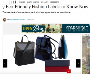
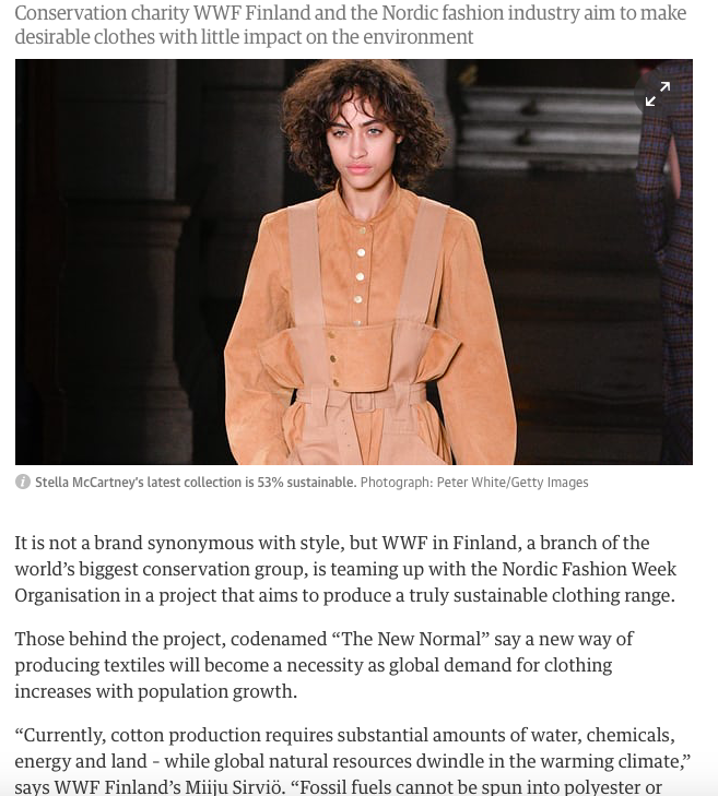
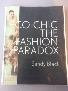
[1] I chose the book Eco-chic the Fashion Paradox by Sandy Black. The reason I chose this book is because I am interested in environmental/sustainable fashion. I love to see all the different ways fashion companies use environmental strategies to help minimise the amount of waste they are creating within this type of industry. This being both the footprint and waste areas; as this is a very fast-forward industry where what is fashionable is changing extremely quickly.

Screen Shot 2017-10-24 at 14.22.12

[2] Looking at multiple different sites on designers who use sustainability to promote their sustainable clothes, I thought this was a good website because it tells you about multiple different designers who are interested in creating sustainable clothing. These vary between jewellery, garments and bags. Consumers are asking more for sustainable clothing as people are becoming more aware of the damage the industry has on the environment. I think this is important to know about as designer’s are trying to make a change for their company for the better. Screen Shot 2017-10-24 at 14.32.07

[3] Looking at newspaper articles about the impacts that the fashion industry has on the environment, and what designers are doing to help minimise this impact, I came across this article, which contains statistic and facts about the damage. I thought this was a great article to read if you are interested in this area of fashion. Telling us about the water production and how  synthetic fibres are one of the biggest problems, and are found in 60% of clothing, producing three times more CO2 than organic cotton, taking decades to decompose and badly polluting marine life. It’s interesting reading about just how sever this problem is, with many people being unaware of the actual effect it is having.

[1] Black, S (2008), Eco-Chic the Fashion Paradox, London: Black Dog Publishing.

[2] Dawson Hoff, V (2014), 7 Eco-Friendly Fashion Labels To Know Now. Available from: http://www.elle.com/fashion/g8913/best-eco-friendly-fashion-brands/?slide=3 [Accessed 24th October 2017]

[3] Walker, R (2017), Fashion in new bid to be truly sustainable, The Gardian. (Accessed from: 24th October 2017)


Task 1/2 – Online Resources

For this task, I started in the library looking at all the different sections, deciding what to choose as my primary source. I came across a book on Cubism, which contained photos and information all about the different artists who use cubism in their work. “Cubism is an early 20th-century style and movement in art, especially painting, in which perspective with a single viewpoint was abandoned and use was made of simple geometric shapes.”[1] I came across this painting called ‘In The Hold’ by David Bomberg, which is a very colourful geometric framework of multiple cubes and triangles, divided into sections, to create one whole image. When reading the description, it is said that you are able to see little images, such as person in a hat, however I am not able to find this myself. This picture caught my eye because of all the different colours and shapes that were used; I get a sort of pop art feel from this image. The multi coloured squares really draw your attention to the whole piece rather than just one area of the piece. The image looks better as a whole rather than separate sections of colour. The style of cubism breaking down a specific view point was extremely influential is many artists. It is a very popular way of art used by many artists in pieces such as Les Demoiselles d’Avignon by Pablo Picasso.

Going on the internet to search for my secondary source, I came across many incredible fashion garments which were inspired by cubism. The one that I chose was my favourite out of all of them; made by an upcoming fashion designer from Japan called Wynn Zyou. He created a cardboard fashion inspired cubism piece; which caught my attention because of how animated it looks. When you look at the garment, you would think that it was edited of Photoshop or is a cartoon, however the thought of it being an actual garment surprises me because of this sort of optical illusion. This reminds me of JumpFromPaper’s optical illusion bags, because of this unreal, cartoon like design. The way that the design stands out, like the In The Hold painting, really draws your attention to all of the garment, especially the skirt part of the dress, rather drawing your attention to one area of the piece. This due to the large range of colour and shapes throughout the whole piece instead of it being dull in some areas and colourful in other. You are able to tell exactly where his inspiration came from, even without knowing beforehand or being told. The garment is extremely fun and colourful, like the Bombergs’ painting, which is what I believe really brings these two pieces together.

I did really enjoy looking at all the fun garments people have made, which are inspired by cubism because there is such a huge range of ideas from fun and colourful to extremely elegant pieces. With this, it would make a perfect idea to use as a project brief.

In The HoldCubism Inspired

[1]  http://www.tate.org.uk/art/art-terms/c/cubism – CUBISM