Throughout this module and the RCA lectures I feel I have found them helpful for my understanding of research and communication. IO have found certain tasks in this module challenging and I have required help on a few occasions. If I’m honest there was more tasks I did not enjoy than tasks I did enjoy.
Starting of the module I was worried that I was going to struggle with certain tasks as I suffer from minor dyslexia. The first few tasks in the module soothed my worries as I didn’t feel like it was that much of a struggle. When I came to the more in depth writing tasks I began to worry, one in particular being the, ‘reflective writing task’ I felt the words used in the article where very high-end words and I spent more time researching what words meant rather than undergoing the task itself. I was focusing too hard on reading the sentences there for the information I was reading was not staying in my head, this may be due to my minor dyslexia or the fact the article was I bit too hard. I tackled this issue by selecting a little part of the article and I reviewed that one section in depth.
Also, I feel that the tasks I found easier was the ones I enjoyed, these being, ‘Ethical Issues” and the one which included creating a mode bored. If the thing I am writing about is something that actually interests me, I go into a zone where I could happily exceed the word count. When it is something I don’t enjoy I struggle to maintain focus on what I’m doing and I run out of ideas very quickly.
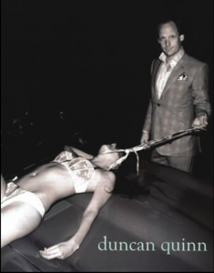
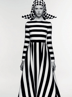
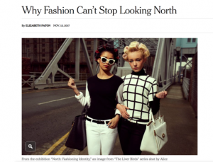
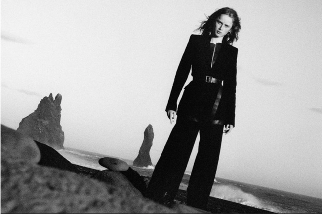
The ethical issues task I thoroughly enjoyed as I found myself caring and having a strong opinion on stuff I never thought I had an opinion on. These opinions being equal rights and feminism. I enjoyed analysing the image and coming up with things that that the company could be trying to get across to the audience. When It came to deadlines and partaking in all the lectures, I wasn’t very consistent. Not turning up to a couple of lectures put me in the dark for a few of the tasks and I missed out on notes that could have proved valuable when it came to writing them. Also allowing the tasks to build up on top of each other just pilled on extra stress on top of my practical work.
If I were to redo some of the task or even for future tasks/research I want to make more use of the library as I didn’t use it nowhere near vas I intended, I relied on the internet a lot in this module.
Overall I feel that this module has done me the world of good going forward into the second semester in terms of research for my projects. My skills such as referencing and identifying what is legitimate and what isn’t has grown tediously.
Biblography
- https://www.vam.ac.uk/exhibitions/balenciaga-shaping-fashion
- https: //www.harrods.com/en-gb/designers/alexander-mcqueen?cid=PPC_UK_GGL_alexander_mcqueen_exact_nb_d_alexander_mcqueen&_cclid=v3_ab2cb8f7-45b6-551d-ba64-018a20eab79a&gclid=CjwKCAjw7MDPBRAFEiwAppdF9PJIZue7qsSzWbxLWAEsFk9NfWskEGYa9V5ATmSEnYoOQY45zGS9pRoCPpcQAvD_BwE
- https://ebookcentral.proquest.com/lib/soton-ebooks/detail.action?docID=1986627
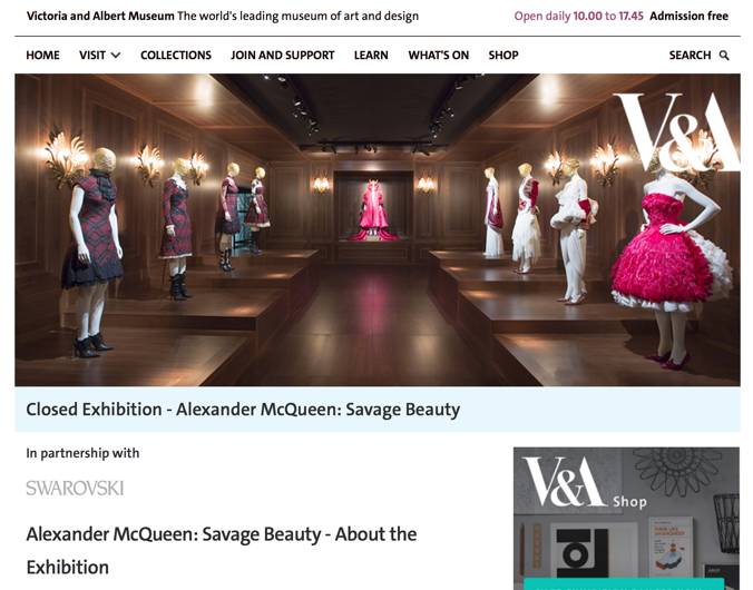
- http://www.vam.ac.uk/content/exhibitions/exhibition-alexander-mcqueen-savage-beauty/
- https://www.allsaints.com/
- https://www.nytimes.com/2017/11/13/fashion/exhibition-london-somerset-house.html
- https://matthieubelin.myportfolio.com/
- http://www.carlosnunezphotography.com/
- https://www.trendhunter.com/trends/duncan-quinn-suit-ad-depicting-strangled-woman