Author Archives: Snigdha Magon

What I have learnt

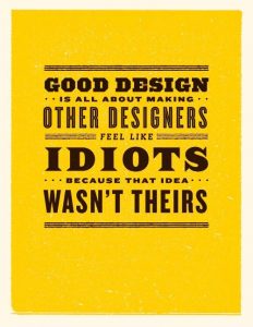
In these ten weeks on Research and communication lecture, I have learnt, researched and explored a lot, my idea towards art has totally changed and improved. I was able to identify how I could improve my work by getting an opportunity to explore different kinds of work by various designers. I have obtained a lot pf inspiration by looking at other successful designer’s work. My favourite tasks included the tasks where we had to write about Counter Culture, Publish or Perish and Technology is the mortal enemy of Graphic Design. Through these tasks I was able to find a deeper sense of the types of design techniques I like working with, which are- Typography, Photo manipulation, minimalistic posters etc. I am very sure that now when I will start working on new projects my thinking and creativity would totally be improved. The presentations and videos shown to us in the class have been proved to be very useful for my area of interest. Before this class, my area of interest was only limited to Graphic Design, but by getting to know about other types of art I feel my knowledge and interests towards other disciplines has increased effectively. The relation between the Research and Communication Skills lecture and the studio based lectures is very strong, because by attending the Research and Communication lectures I was able to give a higher and more creative input in my studio skills. The documentary of Paula Scher shows to us in the class was my favourite one, and after that day, I have and referred that documentary to many of my other friends in Canada who are also Graphic Designers. It was very inspiring to watch the documentary and it gave me a new perspective and a benchmark for what I aim to become in future. I have also improved in the area of writing through this module. Now I am confident in exploring other disciplines as well, as I have gained a lot of knowledge about all the four pathways of Graphic Arts. I have totally realized how influential a design, a photograph or a text can be. Through the use of good design we can influence a large number of audience.

This module has proved to be very beneficial for me, I am very inspired by each lecture providing the opportunity to explore different fields which earlier I was not familiar with. I had no interest in Illustration, but after this module, I have gained a lot of knowledge about this pathway which has made Illustration one of my pathway choice. I am sure that after getting the opportunity to enhance my knowledge in all the four pathways I have become a better designer and my approach towards designing and way of thinking/creating has totally improved.

Publish or Perish


The first image I chose is one of the best-selling novel in India called- The three mistakes of my life, the story revolves around three friends whose characters are young, ambitious and passionate and have the same moral, social and religious dilemmas as many of the young Indians today. The poster of this novel totally resembles the plot of the novel as it’s cover shows the silhouette image of the three main characters in the novel. In this poster, I like how snippets of the text from the story has been used in a poster, which is giving the poster a very refined look. The placement of text in the bottom is also very balanced with the entire poster. The incorporation of the ball in the poster however seems to be unnecessary. The background is very bright and soothing. Due to the balanced combination of typography in the background, colour selection and character placement the poster of this novel looks very balanced and appealing.


The second poster I chose is a billboard advertisement of Tim Horton’s, which is the most famous coffee brand in Canada, and after brands like Google, Apple, Microsoft, Facebook, YouTube, Visa and Walmart, Tim Horton’s is the eighth most influential brand in Canada. This advertisement clearly shows the reasons why it is the one of the most loved brands in Canada. This poster is a good example of promoting the brand over the audience, as it shows the actual reasons along with a percentage, which proves how influential this brand is. I love the colours used in this advertisement, these are similar to the coffee cup, bags and even the stores of Tim Hortons which use “red” as their main theme colour.


The third image is a minimalist poster of the main character of The Simpsons show- Homer Simpson, this poster uses typography to display the phrases that Homer Simpsons uses the most. I like how the creator was able to use all the famous phrases of Homer and combined them inside the minimalistic portrait of him. The poster has a very appealing look.


http://www.livemint.com/Consumer/jMIN1mn63tv6qMnzzR0ASJ/Book-review–The-3-mistakes-of-my-life.html

http://marketingmag.ca/brands/the-10-most-influential-brands-in-canada-ipsos-165968/

http://www.brainerddispatch.com/sites/default/files/styles/16x9_860/public/fieldimages/42/0929/0b7rw7divrmlxam14a2pusersvwm.jpg?itok=mggT_DpN

https://pin.it/sm4wixvwlextwr

https://pin.it/wvmkyflxvf55hi

Postmodern Images


The first image I chose is a creation by Barbara Kruger, whose work mainly includes things related to consumerism and feminism. All of her work has a true meaning hidden in them. The phrases in her works often include pronouns such as “you”, “your”, “I”, “we”, and “they”, addressing cultural constructions of power, identity, and sexuality. In this case, it directs to consumption. Her works are mainly ethical, social, political, economical and humanistic based. In this particular poster, I like how she has used red, black and white colours. Red is a dominant colour and to promote a message to a large audience, red is a colour that can be very useful. I love how she has combined few images and has created a poster out of it. This particular poster of Barbara Kruger was and is still very famous and popular among audience.


This is the second postmodern image I chose, this has a lot of techniques related to photo manipulation which is one of my favorite areas of design to work with. I like how the creator has used multiple images to create a poster. The background seems to be plain and simple which is totally matching with the objects placed on the foreground. This poster has a variety of colors used in it. The combination of different images used to form a poster in this is totally balanced, which gives the poster a refined look.


This is the third postmodern image I chose, it has a combination of designing techniques like addition of typography, photographs and objects in it. The placement of all the objects seems to be refined. The colors used in this poster give the poster a very bright, colorful and artistic look. In terms of visual mapping, the poster seems to follow the correct visual mapping pattern as the visual mapping starts from the upper right corner and ends smoothly towards the bottom left corner.

This poster could be an example when I create my projects as it has a balanced combination of typography, photographs, colors and other designs.

http://www.theartstory.org/artist-kruger-barbara.htm

http://ucresearch.tumblr.com/image/47883063847

Counter Culture


The first counter culture image I chose is the original Broadway poster of the Biltmore theater for The American Tribal Love-Rock Musical- Hair, it is a product of the hippie counterculture and sexual revolution of the late 1960s, several of its songs became anthems of the anti-Vietnam War peace movement. Visually this poster, looks very creative and appealing. The combination of colors totally brings out the spirit of the theme behind the poster which is to promote the musical.


The second poster I chose is the official poster of Star Wars, we can call the posters of Star Wars “a visual history” because there were around eight posters created for the movie in the 1970’s itself, but this is the one which was admired by most of the people. From the placement of the Star Wars logo to the visually appealing background, everything in this poster seems to be perfect. Even in terms of visual mapping, it follows the correct pattern as the visual mapping starts from the upper left corner and ends smoothly to the bottom right. In terms of the colors used in the poster, they totally balance with the theme of the movie and the character placement is also done properly. My field of study being Graphic Design, I am inspired by this design and the fact that this was created in 1970’s as the design approach used in this poster is still used by a lot of designers.


The third image I chose has more of a typographic approach of design, and that is one of my favorite type of design. This poster has different types of fonts and text sizes. The placement of the text is also done in different ways. The main heading that has the text- “The Human Be-In” doesn’t really seem to be placed properly, because visually “the” doesn’t look like a part of the heading. The use of leading in the upper half of the poster seems to be more appealing in terms of designing than the lower half. The background color selection gives the poster a refined look.


https://pin.it/scikxgbn6pr4ic

https://pin.it/5whlu3fprjeach

http://www.vintag.es/2013/01/star-wars-theatrical-posters-around.html

https://en.wikipedia.org/wiki/Hair_(musical)


Is it possible to be truly authentic?

According to me, the easiest way to describe authenticity is that, authenticity is something that is genuine, not replicated or plagiarized. In terms of art, I do not believe that it is possible to be truly authentic. There are various artists who usually use ideas and concepts of other artists and try to replicate the design with a twist of their own and some also try to something that is more relatable to the modern society. But, there is a huge difference between replicating and creating. An artist who replicates other artists work basically shows their studio skills and an artist who creates something from scratch shows their creativity, for example- The replication of Leonardo da Vinci’s The Last Supper artwork has been done multiple times, one of the famous replication of this artwork is by Andy Warhol.

By Leonardo da Vinci

This is the original artwork of The Last Supper by Leonardo da Vinci, he is one of the most famous artist and his work has been admired worldwide.


Replication by Andy Warhol

As we can see in this replication by Andy that there are not many changes, and it does not show much as creativity as the original painting. There is also a term ‘genuine fake’ where the work of the original artist is recreated by a fake artist but it is usually hard to identify since it seems to be authentic. So, although we can say that this is a replication but it is definitely not authentic.


https://www.leonardodavinci.net/the-last-supper.jsp

https://www.flavorpaper.com/wallpaper/murals/last-supper-mural


Technology is the mortal enemy of Graphic Design

Technology plays a major role in the field of Graphic Design. The impact of technology in the field of Graphic Design is both positive and negative.

In earlier times, when technology was not evolved, the approach towards meeting the clients, getting to know about their ideas and getting the designs approved was more personal and communication based, but now since the evolution of technology the approach towards this has become more digital based though the use of text/email which has both positive and negative impacts.  The positive impact would be that the process of communicating has become much simpler, for example- if a client needs to get some designing work done by a graphic designer they can simply email/text them and they can get their work and discuss about ideas easily. It has also become easier to display your work on various websites but again if we do so the chances of plagiarism are very high. On the other hand, the negative impact would be that even though due to the easy process of communicating through the help of technology is useful but it increases the chances of mistakes, because an idea explained by the client through email/text could easily be misunderstood by the designer and vice versa. As quoted by Frank Chimero, “Good design is all about making other designers feel like idiots because that idea wasn’t theirs.” So, because of technology, there are a lot of websites which display various designs and allow us to purchase that design, these services are impacting the graphic designers because even if someone doesn’t purchase the design file, they can easily duplicate the idea of the designer by creating the exact same type of design by their own.

In a nutshell, even though there are many advantages that come with the evolution of Technology, but at the end Technology is definitely the mortal enemy of Graphic Design and various other fields.

https://pin.it/gnk3i3x5xzdhwu

Comparing Posters


At the first glance, this movie poster of The Dark Knight Rises looks really captivating. In terms of the colors used in the poster, it has a balanced color contrast and temperature.  The background of the image is dark orange which seems to give a dominant color contrast which matches to the title of the movie perfectly. The entire poster has the incorporation of triadic color scheme and analogous color scheme. The font used in the poster is bold and the font choice seems to be matching with the name of the movie and the way the character is displayed in the poster. In terms of visual mapping, I feel, that this poster does not match the correct visual mapping pattern, as the visual mapping is not starting from upper right corner and ending smoothly at the lower left corner. But, due to a good combination of colors, font choice and character design, it totally seems as if the dark knight is rising.


The poster I am comparing the first poster with is a still from a trailer, the colors used in the poster are bold and dark. The background with an exploding effect totally captures the movement and heat between the characters of the movie. The combination of color contrast, effects and motion used in this totally balance with the scene.

http://imgfave.com/view/1880235

http://collider.com/batman-vs-superman-new-posters/

Terminal Bar

Terminal Bar is an award-winning American documentary short film directed by Stefan Nadelman. It is about a bar located in the Times Square in United States of America.

The entire documentary revolves around the owner of the bar and various customers of that bar. One of the thing that makes the documentary interesting is how the bartender, shot over 1,500 black and white portraits during his ten-year stint there from 1972-1982, and how those portraits are used in creating a film. The entire content of the movie is basically made of stills, black and white portraits, short scenes/interviews, audio, newspaper information and write ups, this is the reason that it is very interesting to see how a short film can be created using just these things. All the information presented in the movie is clearly understandable because of the way all the elements are presented and the way the information is zoomed in/out which makes it easier for the viewers to understand the visuals. One of the other interesting thing about the creation of this documentary is how the entire audio used in the film is connected to the content from starting till the ending, also the audio totally represents the hustle bustle life of New York City.

This documentary is a perfect example of how a short film can be created by using a proper combination of audio and visuals. For my projects, I could use a similar process of creating a layout that is particularly based on stills and text.