Bibliography:
Task 2
- Yan, B. (2013) Travis. [image] Available at: https://hcgart.com/collections/wocp2-ol/products/travis [Accessed 18/10/17]
- McMennamy, S. (2016) flowers & hand + tree. [image] Available at: https://instagram.com/p/BEezgaRnGxg/ [Accessed 18/10/17]
Task 3
- Breathed, B. (2007) Exclusive: Berkeley Breathed Speaks!. Interviewed by Jamie Reno for Newsweek, 3rd June. Available at: http://www.newsweek.com/exclusive-berkeley-breathed-speaks-100929 [Accessed 25/10/17]
- Breathed, B. (2015) Bloom County 2015. Bloom County 2015, July 20, 2015. [image] Available at: http://www.gocomics.com/bloom-county/2015/07/20 [Accessed 4/12/17]
Task 4
- Josselsohn, G. (n.d) Landscape 1. [image]. Available at: http://glenjosselsohn.com/portfolio/ [Accessed 01/11/17]
Task 5
- Wilson, W. (1967) BG-56. [image]. Available at: http://www.wes-wilson.com/bill-graham-presents.html [Accessed 08/11/17]
- Glaser, M. (1967) Bob Dylan’s Greatest Hits. [image]. Available at: https://www.miltonglaser.com/the-work/444/columbia-records-poster-for-bob-dylans-greatest-hits-1967/ [Accessed 08/11/17]
- OZ Magazine (1967). Theological Striptease. OZ Magazine issue 01, February 1967, Front Cover. [image]. Available at: http://www.wussu.com/zines/ozimages/oz01cov.jpg [Accessed 08/11/17]
- Ramaswamy, C. (2016) Return to Oz: the most controversial magazine of the 60s goes online. Available at: https://www.theguardian.com/media/shortcuts/2016/mar/06/return-oz-most-controversial-magazine-60s-goes-online [Accessed 08/11/17]
Task 6
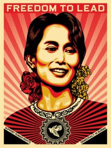
- Fairey, S. (2009) Aung San Suu. [image] Available at: https://obeygiant.com/prints/aung-san-suu-offset/ [Accessed 15/11/17]
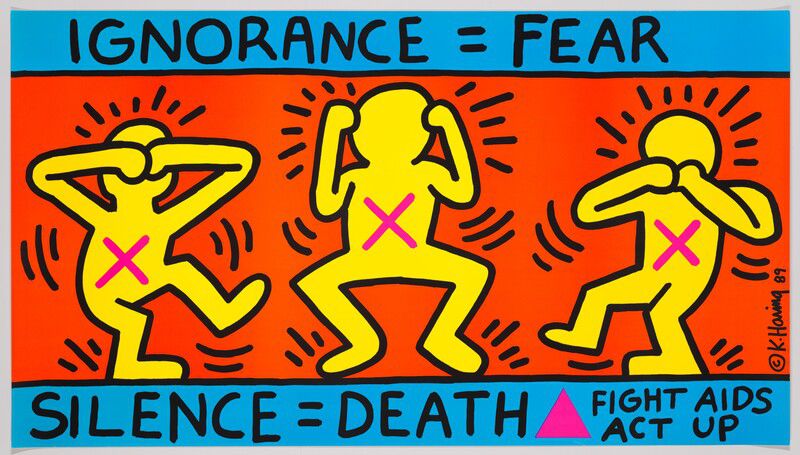
- Haring, K. (1989) Ignorance = Fear. [image] Available at: http://www.haring.com/!/art-work/253#.Wh7mUsacZ-U [Accessed 15/11/17]
- Adamson, G. and Pavitt, J. (2011) Postmodernism: Style and Subversion 1970-1990. London: V&A Publishing, page 9.
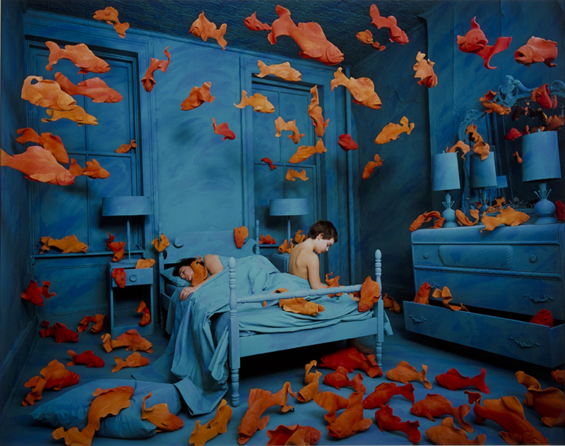
- Skoglund, S. (1981) Revenge of the Goldfish. [image] Available at : https://akronartmuseum.org/collection/Obj1713?sid=1&x=65153&port=289 [Accessed 15/11/17]
Task 7
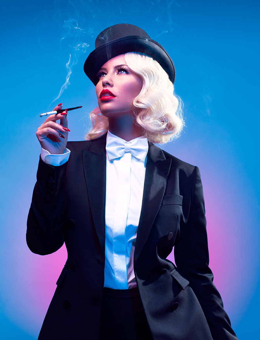
- Rutherford, C. (2015) Amber Rose as Marlene Dietrich. [image] Available at: http://www.papermag.com/amber-rose-feminist-heroes-1-1488371818.html?slide=PDJAIV [Accessed 29/11/17]
- Ward, C. (2012) Popular Lies about Graphic Design. Barcelona: Actar Publishers, page 58. [image]
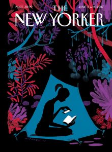
- Niemann, C. (2017). Christopher Niemann’s “Enchanted Forest”. Interviewed by Francoise Mouly for The New Yorker, 29 May. Available at: https://www.newyorker.com/culture/cover-story/christoph-niemanns-enchanted-forest [Accessed 29/11/17]
- Niemann, C. (2017) Enchanted Forest. The New Yorker, June 2017, Front Cover. [image]
Task 8
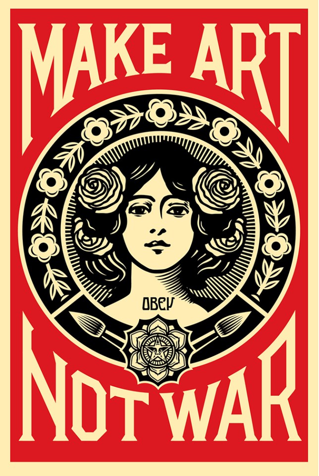
- Fairey, S. (2015) Mark Art Not War. [image] Available at: https://obeygiant.com/prints/make-art-not-war-offset/ [Accessed 3/12/17]
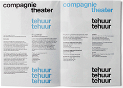
- Experimental Jetset Studios. (2005) DTC / Te Huur. [image] Available at: https://www.experimentaljetset.nl/archive/dtc-te-huur [Accessed 3/12/17]