Author Archives: Brandon Hutchins

End of module summary

Through this lecture and research based module I have experienced a number of techniques and concepts which I will continue to apply throughout the rest of my career. This module proved to embody the reasons why I chose this course in the first place, I knew that theory based learning was the foundation of intelligent and effective design practice. One side of the module which is vital is the historical element. Over the course of weeks I sat through a crash-course on the some of the most significant moments in design in the past one hundred or-so years which helped me to better understand – in essence – what it is to be a graphic designer in 2017. I now know a bit more about the innovations, the struggles and the cultural shifts that have occurred in the past so that I can be more aware of why the creative world is the way it is today.

I have been educated on some important tools that are vital to not only researching more effectively to my academic benefit but also to maintain credibility. This term has not been the first time I have had to familiarise myself with the Harvard standard of citation as I previously took an art and design foundation diploma, which eased me into more consistently researching alongside visual practice. However, recently I have been schooled on the importance of avoiding plagiarism and becoming a more ethical designer. The importance of quotes is also reinforced for me as it provides evidence for readers of my writing so that they can take my work more seriously and also understand my ideas and perspectives better.

For me the connection between this theoretical side of practice and the practical side of things handled in the other module is a no-brainer. One must constantly be looking for visual inspiration from all sorts of sources. To explain my opinion of this metaphorically – the way I see it is as my academic vocabulary expands so does my practical vocabulary. By analysing images of existing work I can come up with more ideas that are more carefully considered and also more diverse. Outside of looking at purely visual ideas, exploring the theories and philosophies of artists and designers can better my understanding of what it is to create and what role I play in the world by creating.

Unsurprisingly to myself, the sources looked at over the past weeks that have resonated with me the most have been the episodes of the Netflix documentary series: ‘Abstract: the art of design’. The fact that learning by watching audio/visual works is the most effective for me is something I have made peace with. Information sticks with me more immediately if it is communicated audibly by people who really care and it certainly helps if the film is entertaining. What specifically has inspired my own practice is seeing others actually working, specifically in episode 6 seeing Paula Scher sketch wherever she goes reinforces the importance of experimentation and iteration to me.


Abstract: The Art of Design, Season 1. (2017): Netflix.

Publish or Perish!

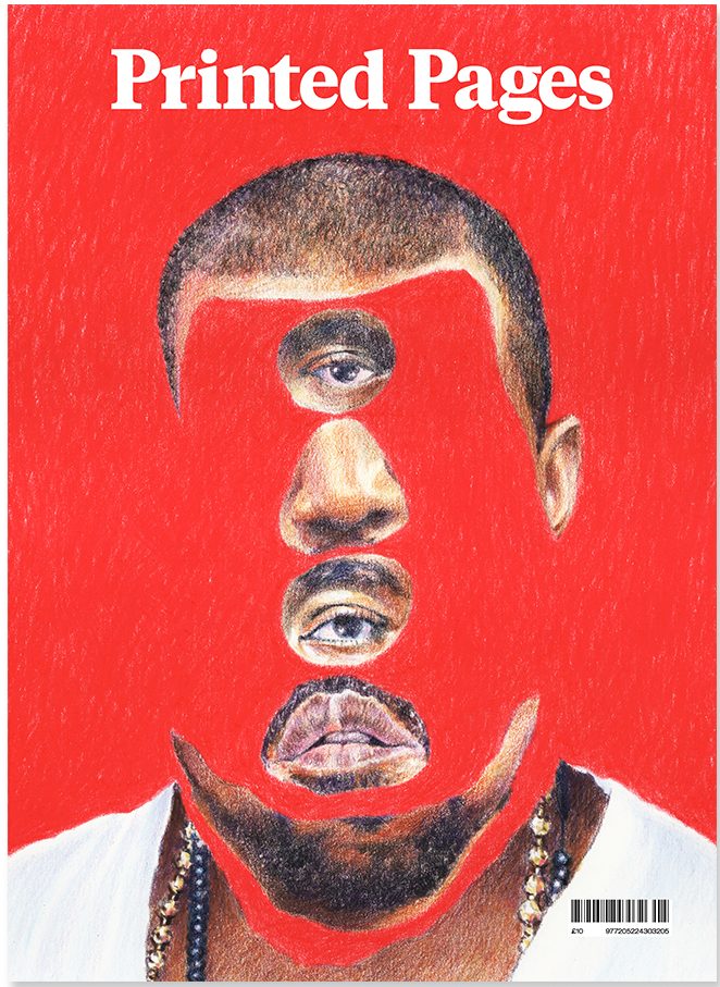
Printed Pages A/W 2015 cover. Original image: Yahnker, E. (2012). Kanye Stack. [coloured pencil on paper].

If this image did not exist physically in the world as it does on the cover of the Autumn/Winter 2015 issue of Printed Pages AKA The It’s Nice That Magazine I would not have chosen it. I like to collect published images in the form of books, albums and magazines as I feel a personal connection with works of design that I myself can own and hold, a sentiment I share with the people behind this magazine: “By name and by nature, Printed Pages has always been a celebration of print”. Outside of being a published image it has a story to tell, one of fame and distortion of perception.


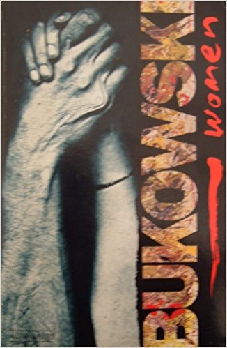
Rozycki, P. and Keates, M. (1993). Charles Bukowski – Women (cover artwork). Virgin Books.

Similarly if I didn’t physically own a copy of the 1993 Virgin Books edition of Charles Bukowski’s 1978 novel, Women, I would not be able to talk about it now. It was a struggle to find an image of it online and the only one I could find is slightly blurred with a level of glare showing up on the glossy cover. It’s a great shame because it’s one of my favourite book covers of all time, that’s why I immediately thought to include it. The bizarre combination of imagery ranging from a scanned photocopy image of a tender embrace between a man and woman rendered through blunt realism and the wild but painterly type helps to evoke some of the feeling that the story is bursting with.


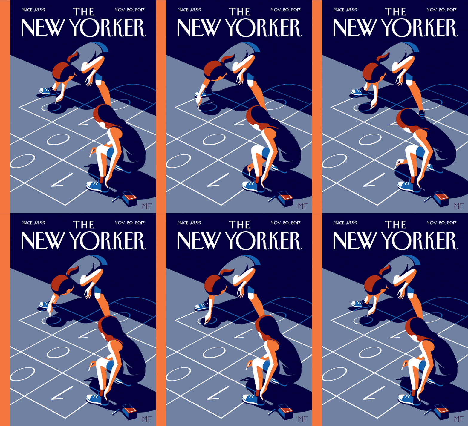
Favre, M. (2017). The New Yorker November 20, 2017 Issue (cover artwork/online animated version).

Seeking out another cover I found something very indicative of the fastly advancing world of publishing supported by technology. Similarly modern was the a New Yorker cover by Christoph Niemann which was featured on the Netflix documentary series: ‘Abstract’ and supplemented by augmented reality technology. The message behind this image that is also supported by the cover story in of the issue has to do with discrimination in the code business and the importance of educating children in an increasingly demanded skill.


It’s Nice That. (2015). Printed Pages AW 2015. [online] Available at: https://www.itsnicethat.com/publications/printed-pages-aw-2015 [Accessed 7 Dec. 2017].

Abstract: The Art of Design, S01E01 – Christoph Niemann: Illustration. (2017). Directed by M. Neville. New York City: Netflix.

The New Yorker Videos. (2017). Christoph Niemann’s Augmented-Reality Covers. [online] Available at: http://video.newyorker.com/watch/introducing-christoph-niemann-augmented-reality-covers.


Post_M0dernism


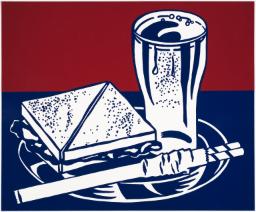
Lichtenstein, R. (1964). Sandwich and Soda. [screenprint on polystyrene] Liverpool: Tate

It’s Roy Lichtenstein’s lesser known works that still appeal to me on a deeper level these days. It’s his simpler illustrations that tackle mundanity and everyday irony more tactfully in my opinion. Pieces like ‘Sandwich and Soda’ are relevant to me and others existing in an era of increasing levels of playfulness and sarcasm being accepted in the art world. What’s also inspiring is what was occurring outside of the single image. By choosing to screen-print this image he could manufacture hundreds of copies thus reaching a wider audience, blazing a trail for artists to come.


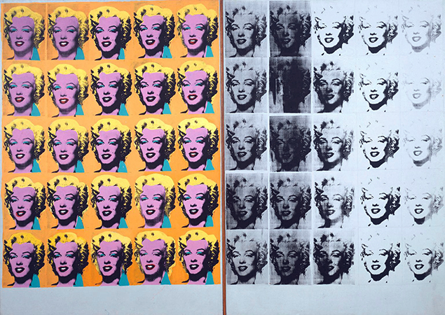
Warhol, A. (1962). Marilyn Diptych. [acrylic on   canvas] London: Tate Modern.

The meaning Andy Warhol’s most famous works, in my opinion are still as pertinent as ever in my opinion. Among those works is the Marilyn Diptych. It was a bold response to the 60s zeitgeist of celebrity culture, a public spirit that never really went away. By deconstructing the image through repetition in two different ways he reveals the meaning it has in the world. “The color contrasted against the monochrome that fades out to the right is suggestive of life and death, while the repetition of images echoes her ubiquitous presence in the media”. His firm grasp on the world around him is something that any designer should aim to replicate in way that’s appropriate for them.


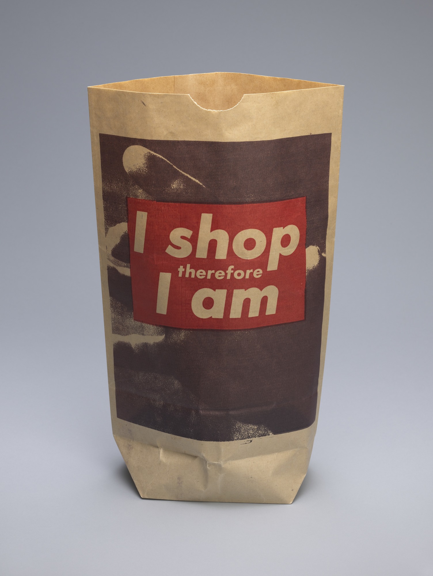
Kruger, B. (1990). I shop therefore I am. [photolithograph on paper shopping bag] New York City: MoMA.

As a work of art from the 90’s I feel that it ‘I shop therefore I am’ by barbara inherently retains more relevance to me as a designer in the 2010’s. Her punchy type and simple graphics combined with found imagery is something that I feel a strong connection with. Because of where she chose to show the design it reveals more about the design itself and what she meant.


Abstract: The Art of Design, S01E03 – Es Devlin: Stage Design. (2017).

Directed by B. Oakes. England: Netflix.

Tate. (2017). ‘Sandwich and Soda’, Roy Lichtenstein, 1964 | Tate. [online] Available at: http://www.tate.org.uk/art/artworks/lichtenstein-sandwich-and-soda-p77811

The Art Story. (2017). Postmodern Art – Modern Art Terms and Concepts. [online] Available at: http://www.theartstory.org/definition-postmodernism-artworks.htm#pnt_1

The Museum of Modern Art. (2017). Barbara Kruger. I shop therefore I am. 1990 | MoMA. [online] Available at: https://www.moma.org/collection/works/64897

Counter Cultural Design – spirit, sensibility and meaning

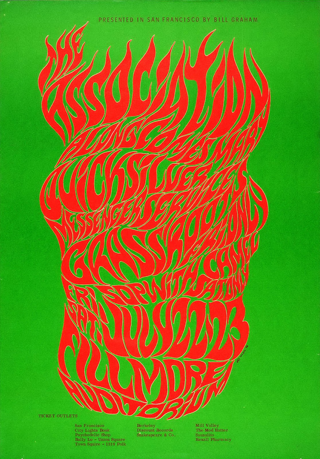
Wilson, W. (1966). BG-18. [screen printed poster] San Francisco

While I could have chosen any number of Wes Wilson concert event posters to make a point of how spirit and sensibility are key to effective graphic design, this one from 1966 perfectly compliments my favourite quote from legend Paula Scher: “Typography is painting with words”. This image embodies what made the psychedelic posters of the 60s and 70s so radical and that is their emphasis on feeling over rational design. As is the case with many of the posters Wilson made for concert promoter Bill Graham as well as with work from his counter-culture contemporaries Victor Moscoso and Rick Griffin, the typography is incredibly expressive, more so than legible. The fiery and free-form lettering evokes a wild sensation and does enough to illustrate the spirit of the advertised concert without any accompanying imagery and that is more important than abiding by traditional design conventions.


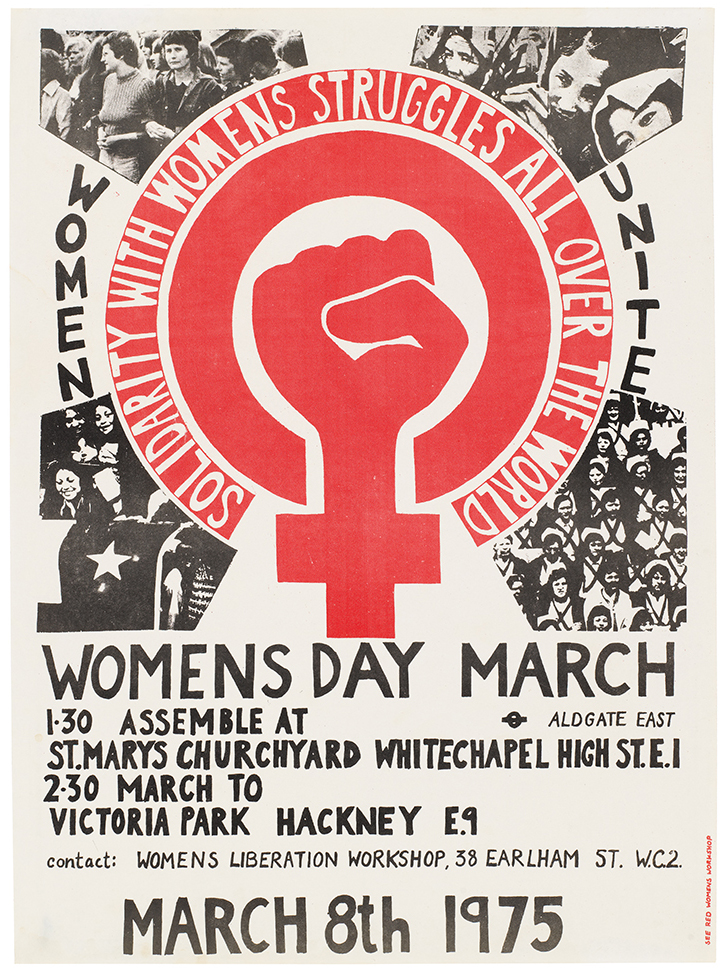
International Women’s Day Poster 1975. (1975). [Litho print poster] London.

This was the first design commissioned by the See Red Women’s Workshop and it boldly champions the grass-roots, populist spirit of the counter-culture movement that was occurring in 1970’s London. It’s imperfect hand-crafted aesthetic is key to it’s benevolent intentions and general sensibility. I believe that if someone sees an image that they believe could have been made by someone that shares their social class or situation then they will feel a natural appreciation towards the work. Though the production values of this poster may not have been a much of a choice at the time, they are what make this poster relevant to me in 2017. The meaning behind the sharp illustration is also a powerful aspect.


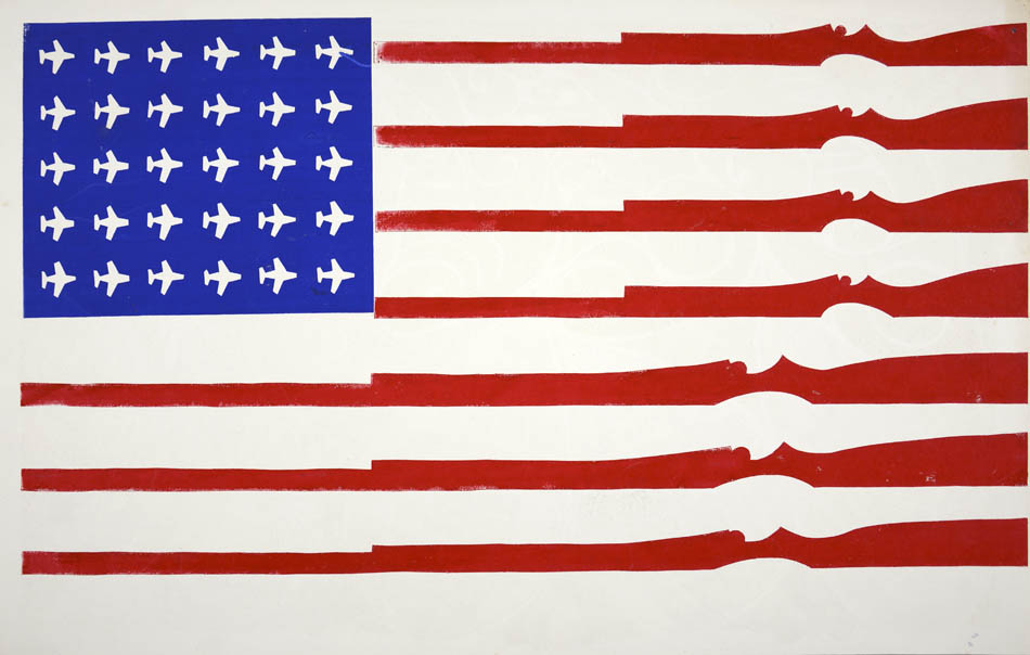
American Flag (untitled). (1970). [Screenprint on recycled calendar] Berkely, CA.

This is a potent image that conveys meaning through little detail and no words. Screen-printed by a student at California’s Berkeley university it conveys their feelings they had towards their country. The artist has vandalised the US flag with American tools of destruction, USAF MiG fighter planes being used in the escalating Vietnam war and national guard rifles, a common sight for many student protesters – “…We would go down to People’s Park and stick flowers in the national guard’s rifles.”


Abstract: The Art of Design, S01E08 – Paula Scher: Graphic Design. (2017). Directed by R. Press. Netflix.

Wes Wilson. (2017). Bill Graham Presents. [online] Available at: http://www.wes-wilson.com/bill-graham-presents.html

Bromwich, K. (2016). Poster power: 1970s anti-Vietnam war art by California students. [online] The Guardian. Available at: https://www.theguardian.com/artanddesign/2016/jan/30/poster-power-anti-vietnam-war-art-berkeley-california-students-exhibition-shapero-modern

“Technology is the mortal enemy of art” or is it?

It seems that the quote “Technology is the mortal enemy of art” from Russian artist Aleksander Rodchenko sounds like fearful rhetoric. Considering , however considering the technology-centric modernist principles of the Constructivist movement, this message was probably poised as a challenge to the traditional art landscape at the time.

Personally I can understand this bold statement being interpreted other both ways. The effect technology has on art will always be a double-edged sword. Advancements in technology and commercial invention constantly push the boundaries of what’s possible in art and design as well as how it is consumed and interacted with which is great. On the other hand with the barrier to entry for artistic expression lowered and specifically the tools for graphic design available to anyone with a computer the world is saturated. In the world of design there existed many roles that today can be performed by one aspiring publisher or entrepreneur which can mean more work overall can be unleashed upon the world. The professional quality of which can vary wildly.

From the book ‘Just My Type’ by Simon Garfield I learned about the boost in freedom afforded to designers in the latter half of the 20th century. In one chapter it talks about how consumer products like Letraset lettering sheets empowered amateur designers to take full control over their typography, setting professional looking type in their own homes. Another chapter chronicles the inception and impact of the digital typeface Comic Sans and how its use by amateur designers has caused “revulsion or loathing” through misuse by unwitting amateurs.

Brandon Hutchins

Brandon Hutchins


Garfield, S. (2012). Just my type. New York: Gotham Books, pp.Chapters 1, 11.

Danchev, A. (2011) 100 Artists; Manifestos. London: Penguin Books.

Authenticity and modernism today

Authenticity is something of a hot-button issue for the creative world. For many creative enterprising individuals, the work they endeavour to put out into the world is what sustains them financially, so attempts to appropriate another’s art for the purpose of personal gain are widely reviled. If something is authentic it is simply not fake or fraudulent but now thanks to the internet, art is more visible to all than ever so it’s difficult to pass existing artwork or designs off as authentic without being called into question by the community.

The more divisive counterpart to authenticity is originality. I believe the debate over what constitutes harmless inspiration or unfair appropriation is what remains more pervasive and significant in my time. This can lead to the question ‘is it possible to be truly authentic?’ or original for that matter. As designers we actively seek historical and contemporary sources of inspiration through research in order to learn to be design more effectively and create more interesting things. One can decide whether or not they want to borrow any kind of idea from past work they’ve seen and alter it enough to make it their own new thing. What is not decided is how knowledge attained and visuals experienced influences our ideas without us even knowing. True authenticity must be consciously strived for as it was by many modernist artists in the 20th century through the rejection of strict normality. Even today there are still boundaries to push and conventions to test and modernism remains a school of thought that artists can subscribe to in order to strive for authenticity.

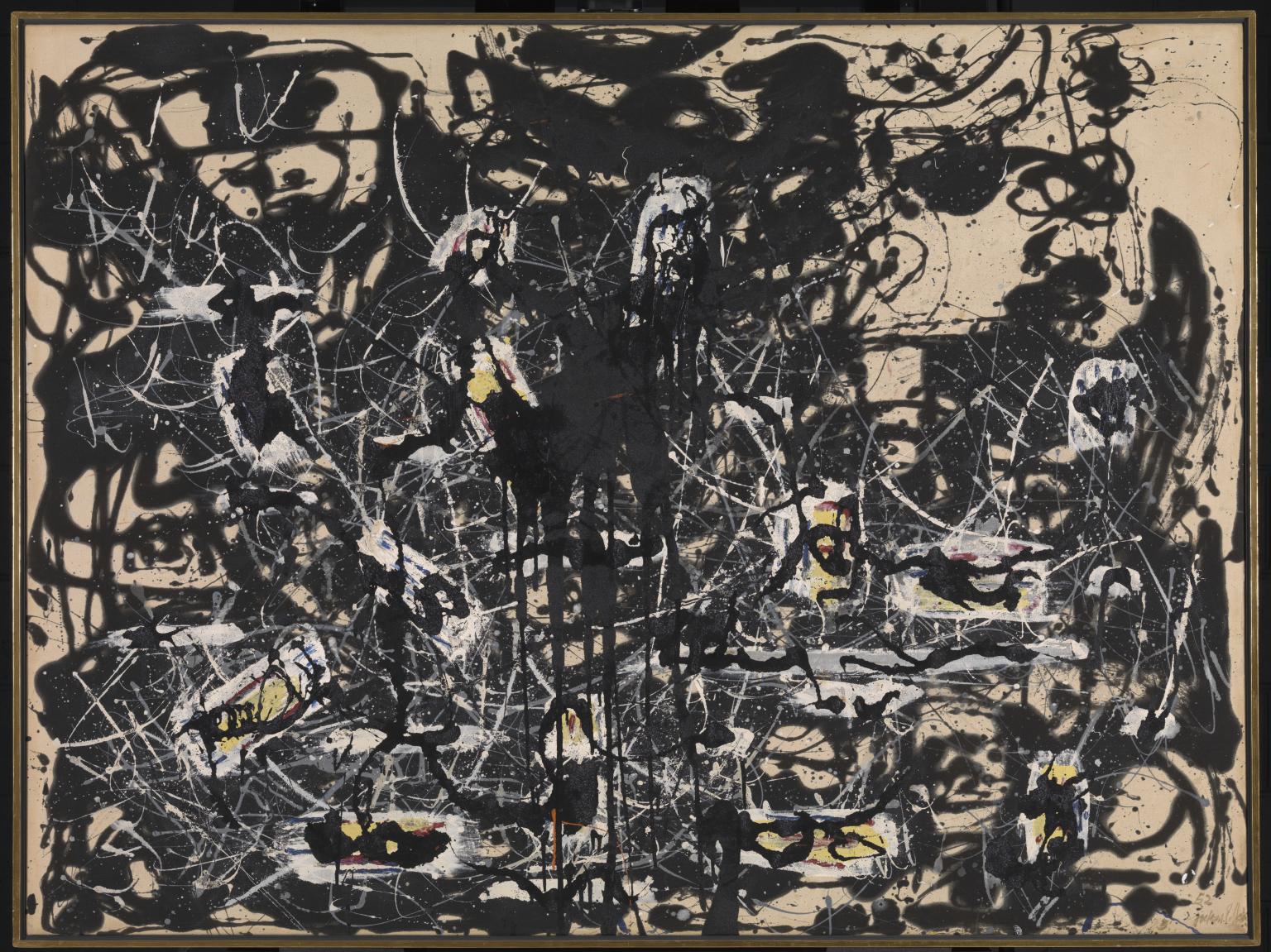
Yellow Islands 1952 Jackson Pollock 1912-1956 Presented by the Friends of the Tate Gallery (purchased out of funds provided by Mr and Mrs H.J. Heinz II and H.J. Heinz Co. Ltd) 1961 http://www.tate.org.uk/art/work/T00436


Comparison of Images – Album Cover/Fan-Made Movie Poster

In my opinion the cover artwork for Björk’s 1997 album ‘Homogenic’ was her most daring and confrontational yet. Abiding by a formula shared by many of her albums, all the way up to her upcoming ‘Utopia’, the cover consists of a waist-up photograph of Björk herself adorned in inspired, original attire. This art direction for this album was headed up by high-fashion legend Alexander McQueen and fashion is how the artwork captures the spirit of the album. Björk was quoted as telling McQueen that the person on the cover “had to become a warrior. A warrior who had to fight not with weapons, but with love.”(Gibsone, 2017) so she is shown dressed in a Japanese style Kimono with a with a stony expression on her face evoking a kind of fierce geisha. Her unsettling appearance belies her romantic intentions.

Björk – Homogenic (album cover) A.McQueen, N.Knight, Me Company

Moving away from classic, renowned musical art to fan-made art, I chose this poster of the 1973 French/Czech animated sci-fi film Fantastic Planet or Le Planete Sauvage created by Australian student graphic designer Joey Klarenbeek. The first thing I notice about this design is the strong influence of legendary psychedelic poster designer Victor Moscoso. The concentric lines combined with the vibrating yet inhibited colours point to notorious event poster designs Neon Rose #2 while the type borrows from Neon Rose #12, both Moscoso pieces. The type could also be compared to type from contemporary 70’s designer Wes Wilson, typos aside.

Psychedelic Poster – Le Planete Sauvage (1973) Joey Klarenbeek

The clear similarities between the two pieces seem to end at the shared themes of centrality, symmetry and character. An obscure link is that they both focus on strange individuals, both appearing part human, part alien.

Gibsone, H. (2017). Björk’s album artwork – in pictures. [online] the Guardian. Available at: https://www.theguardian.com/music/gallery/2015/jan/22/bjorks-album-artwork-in-pictures-vulnicura-biophilia

Terminal Bar. (2003). [video] Directed by S. Nadelman. New York: Tourist Pictures.

The first thing that struck me about Terminal Bar was that it was not the kind of film I had been expecting. It was not entirely live-action footage but instead mostly animation. In the description of the video on YouTube it credits Stefan Nadelman as both director and animator, this confirms for me that Terminal Bar is at its core an animated film.

The way Nadelman constructs his narrative centred around the Denizens of the titular establishment is for the most part through scenes constructed from the collection of photos his father, Sheldon amassed over his ten-year stint as a barman at Terminal Bar. He also includes newspaper extracts and interview footage with his father: the amateurish quality of which is the only aspect I feel ages the film. He employs many different techniques to build an exciting visual narrative using those photos, sometimes mimicking traditional cinematic tropes such as establishing shots and split screen and sometimes going into a freestyle, playfully arranging and animating the monochromatic portraits to dance about the frame accompanied purely by the original score which fits perfectly.

In one scene around the 17 minute mark Nadelman animates a wonderful sequence in which reverb-soaked guitar takes over and compliments the black and white kaleidoscopic visuals perfectly. The key focus here seems to be on the impressive size of Sheldon Nadelman’s pictorial collection with over a hundred individual portraits being shown at one point.

Looking into Nadelman’s other works it’s clear his expertise are firmly in motion graphics. The techniques and style of this documentary are what appeal to me over the story and what I will think about when I myself involve myself in that field of design in the near future.


Brandon Hutchins