Author Archives: Jake Kenyon

Final Blog Post – Evaluation

During this research and communications project, I have slowly but surely regained a love for writing. I feel that finally being able to write about things I am interested in has made me passionate about writing again and made me want to continue. Before I saw writing as a chore but now I see it as a tool which I can use to express my love of certain artist and photographers etc. That is not the only thing I have gained during this project either, I have discovered many new photographers and photographs which I want to research further and have built up skills I never really had before such as Harvard Referencing (which shockingly I had never really come across before.)

One blog post I was really interested in was “Publish or Perish!” I am fascinated by famous images that have gone “viral” and it was interesting to read into them. A lot of the time these images were images I had always seen around and knew about, but I never knew the photographer or deeper meaning behind it. By doing these blogs I have grown a respect for the photographers and now always make sure I consider the deeper meanings of an image when I like an image. It fascinates me why some images just seem to get it right and become famous worldwide.

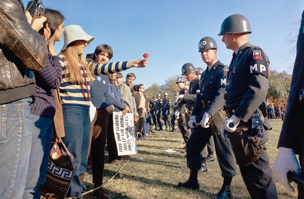
I also feel I have developed my style of writing over the last weeks which has really helped when I’ve had to dig deep into the meanings behind a particular image. One example of this was during the blog about Movers and Shakers/Countercultures, I really delved deep into the meanings behind photos during the Flower Power era and went as far as focusing on the position of the flower; something I would never have done before this project. This was the same for the comparison blog in Week 2, I really analysed the similarities and differences between the images which has helped in developing my writing and overall analyse.

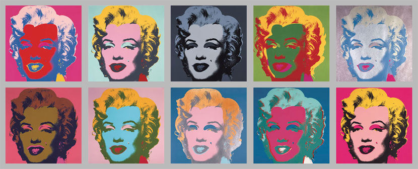
My least favourite blog post looking back is the Postmodernism one. If I was to go back I’d use other artists rather than just Andy Warhol to allow a better compare and contrast, however I do love Andy Warhol so it was good to be able to write about why I liked his work.

Before this project I was not a fan of writing at all and in all honesty the thought of doing something like this was not appealing. However, by doing it weekly and in smaller chunks I have remained interested and have remained motivated. If this project was to sit down and do 2000 words straight away I think I would have struggled and maybe lost interest. Moving on from this I am excited to research new and exciting artists and photographers and being able to do it in a more practiced and professional manor. I also want to go back to my blogs and see where I could improve, may it be my referencing skills or description skills. Overall however I am happy with my blogs and the knowledge I have gained.

Publish or Perish!

Image result for the falling manThe first image I was interested is “The Falling Man” which was photographed by Richard Drew on 11th September 2001. This image shows one of the 9/11 victims falling from one of the Twin Towers and was widely published across worldwide media in the aftermath of the horrific events. This one image tells a story of someone who lead a normal life and the image looks so still and peaceful even though we are all aware of how chaotic it must have been. This links to my interest because I am fascinated by how an image or any type of graphics can create such a powerful feeling or emotion.

The Falling Man, Photography by Richard Drew, 11 September 2001 http://100photos.time.com/photos/richard-drew-falling-man

My second image is the iconic photograph of Che Guevara taken by Alberto Korda in 1960. I feel that this picture is successful because it really captures who the person is and therefore creates a connection between him and anyone looking at the image. This image has been reused and recycled so many times in pop culture, posters and much more. I am intrigued by portraits of people and think it is important that a portrait tells a story and really lets you into the persons life.

Guerrillero Heroico, Alberto Korda, 1960

https://en.wikipedia.org/wiki/Guerrillero_Heroico

Image result for sailor kissing nycMy third and final photo is this one which was taken by Alfred Eisenstaedt. It is a photograph of a sailor kissing a woman in a street of New York City. The image represents the excitement at the end of the war. The reason I was attracted to this image was because of its nature. Originally no one knew the identities of these people which shrouded it in mystery. For me I like this because it shows us that this was no set up and that it is genuine happiness. The feeling of joy is really showcased here and by also capturing the people in the background walking towards the camera it gives you the idea that this sort of thing was going on everywhere – everyone was moving and celebrating.

I believe that a successful photograph is one that manages to replicate a feeling, emotion or person in one, still, shot. I feel that these 3 are all successful in doing that and that is why they have ended up being famous, published images.

Sailor Kissing a Woman on the Street, Alfred Eisenstaedt  (1945)

http://edition.cnn.com/2013/09/01/world/gallery/iconic-images/index.html


Postmodernism

  “A late 20th-century style and concept in the arts, architecture, and criticism, which represents a departure from modernism and is characterized by the self-conscious use of earlier styles and conventions, a mixing of different artistic styles and media, and a general distrust of theories.”

https://en.oxforddictionaries.com/definition/postmodernism

For this piece I wanted to focus on Andy Warhol who was often referred to as the renaissance of the 20th century. I admire his work for many reasons such as the use of colour, combination of real life and almost cartoon styles and for how adventurous and creative it is. I have always gone to his work for artist research and inspiration because his pieces have a timeless feel to them. The first piece I looked at was his paintings of Marilyn Monroe. The images are so minimal which help to reveal all Marilyn’s flaws and faults. This stripped-down approach really makes this Hollywood royal appear to be someone like you and me. On the other hand, the use of colours reminds us of her Hollywood status.

Andy Warhol’s Marilyn Monroe Series (1962, 1967)

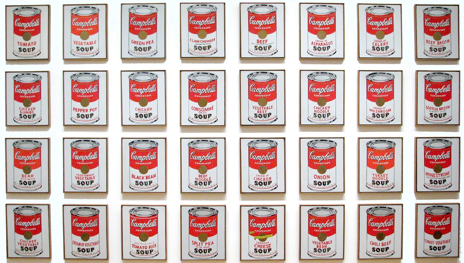
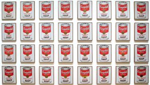
The second piece of Andy Warhol’s work I looked at was the soup cans piece. I love this piece because it is a very random thing to paint but the style, colours and repetitive pattern really draw you in. Warhol used the same style he used in the Marilyn Monroe series (the repetition) which is a running theme throughout his work.

Andy Warhol, Campbells Soup Cans, 1962

The third piece of Warhol’s I looked at is his painting of Michael Jackson. In the 20 years between the painting of Marilyn Monroe and the painting of Michael Jackson you can see that nothing has really changed with Andy Warhol’s style of painting. The paintings still deconstruct the colours and show a more abstract form of the person being painted. One thing I really liked about this piece was the yellow outlines on the hair, this colour really stands out on Michael Jackson’s hair and is a technique you wouldn’t have really seen in artwork before, yet its mixed with a traditional, modernist, portrait style of painting. These postmodernist approaches, not only in Warhol’s work, allow for some really creative and amazing pieces.

Andy Warhol, Michael Jackson (1984)

Movers & Shakers

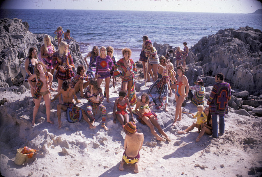
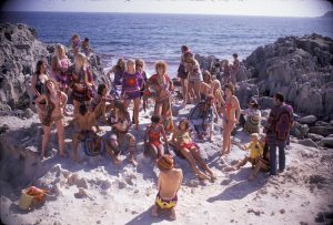
A Counterculture is “a way of life and set of attitudes opposed to or at variance with the prevailing social norm.” During a time of rejection these photos show how these groups of people used to each other to stay strong and carry on.  This photograph taken by Karl Ferris really captures the spirit of these people and shows the importance of being who you are, even if everyone else seems to be against that. Initially I was attracted to this image because of the use of colour photography. I felt that this was necessary because these are bright colourful people. Another thing that attracted me to it was the stances of the characters and the off-guard
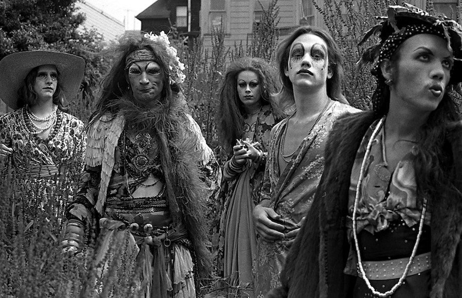
 look. It shows they are just “normal” people like everyone else, going about their business.

“Hippie Royalty on the Rocks,” Ibiza, 1969. Photo by Karl Ferris, featuring crocheted designs by 100% Birgitta. Courtesy of Museum of Arts and Design.

I chose this second image because there are fewer people in it which makes you focus on their ensembles and individual characters. Muhammad Yunus claimed that “People create culture; culture creates people”. For me this image proves that. These cultures that are created help others feel excepted and worthy of something. The framing of the photo and stance of the people in it attracted me to it because I felt that the main purpose was for you to focus on them and them only.

“The Cockettes in a Field of Lavender,” 1970. Photo by Fayette Hauser. Courtesy of Fayette Hauser and Museum of Arts and Design.

The third and final image stands out the most to me because of how it represents the hippies. They are represented here as peaceful, kind and loving. The most powerful element to me is how the invisible barrier between the police and them is broken by the simple yet effective flower. This action was known as Flower Power and was very common due to protest against the Vietnam War. Compared to the other images I feel that this is willing to make this counterculture group appear normal, they want what everyone else wants; peace.

Summer of Love (1967) Photographer unknown.

Comparison of two images (week2)

The first piece I chose was a photograph taken by photographer Hughes LĂ©glise-Bataille called “A stroll in Paris”. The reason this image interest me is because of the illusion of the face. I find pieces like this interesting due to how certain angles and the placing of objects can create a whole new dimension within the image. Photography is a pathway I am considering so I felt this piece would be good for me to talk about to express my interest in the topic. The other image I have chosen is Salvador Dali’s “Mae West” which is also a face created from illusion.

These pieces share a common ground, in this case it is perception. For me perception is very important, it draws you in closer to the work and builds that relationship with you and the artist. It also allows the onlooker to decide what they see in the image, they may see something completely different to what someone else sees.

One difference between the two is of course the technique. Whilst Mae West is a sculpture (then painting) purposely created to create the illusion, “A Stroll in Paris” is a photo, which based on the surrounding environment, has by chance created an illusion. With these illusions also comes the rarity of them, if you were to move the camera or paint from a different angle, the illusion may shift or vanish completely. That’s why these moments either caught on camera or paint are so intriguing as they are so mysterious and rare.

References

  • Salvador Dali – Mae West (1937) JPEG digital image. Illusion.scene360.com [Online]
  • Hughes LĂ©glise-Bataille – “A Stroll in Paris”  (2006) JPEG digital image. www.flickr.com

Technology is the mortal enemy of Art

In recent history technology has really changed the way we perceive things and has had a huge impact in art. It has paved the way for new techniques never seen before and given artist abilities they could never have used before. If you look at the development of art over the years, there have been many ground-breaking changes throughout the times. Technology is one of these revolutionary changes and traditionalist are simply trying to hard to preserve the “standard” and “traditional” ways of creating art.

However, with technology comes the ability to cheat in a sense, some may say that it has made art creation easier. Are you creating the art or is the computer creating the art? These days it seems anyone can get access to a computer and draw away. Despite these criticisms I still believe that art should be evolving just like we are, along with the technology.

A long time ago paint was the new revolution which changed the face of art, now we just see it as a basic and standard utensil of artwork. The same goes for technology. Despite the fact people may see technology as an enemy of art, the relevance and importance of traditional medias still lingers. This is seen in the thriving usage of these techniques and even in the replication of these effects in technology. Technology has allowed us to really experiment more and do things such as layering and editing, we should be excepting technology and really taking full advantage of it.

Authenticity

To be authentic means to be original and not copy. Although part of me does agree that it is possible to be authentic, I do feel that there is a running theme within all work that showcase an element of copying. One piece of “art” that always sticks in my mind is ‘Fountain’, which was produced by Marcel Duchamp in 1917. I always wonder how it is authentic as he wasn’t the one who designed a urinal in the first place. Saying this I believe that authenticity is a very personal thing and the creator/artist is the one who knows whether their art is truly authentic.

I always question the meaning of authenticity, especially in art. Everything has a basis and therefore everything is in a sense is copied. With art I feel we need to celebrate the recycling of ideas and maybe come away from the idea that everything must be authentic since authenticity is a hard thing to achieve. Trying too hard to be authentic could take away from the art itself if people feel limited.

Modernist Art is a rejection of history and conservative values. Despite this I do feel it holds a place in contemporary practice as this rejection in my opinion is another branch of art, it allows people to be more expressive and free and is really changing the way we see art.  On a personal note some of my favourite artists are modernist and I think these expressive forms are really important.

Terminal Bar

While watching Terminal Bar, a film produced by Stefan Nadelman’s, one thing that caught my attention was how the piece flowed from frame to frame. The smooth transitions gave the illusion of it being a standard video and for me is what makes the Winner for Best Short at the 2003 Sundance Film Festival stand out the most.

Another thing I picked up on was towards the end when face shots of Terminal Bar regulars were displayed. Two or more almost identical frames were used instead of a still image, the flickering of these similar images created a three-dimensional layer and brought a lot of life to the people in a very simple way, something I believe the film wanted to portray. These little movements are very small but have a huge and meaningful impact. The underlying musical beat also aided in the flow of the film as it kept it going at a steady pace, this was also helped by how in time the images/frames were with the beat.

The social commentary is broken up with a kaleidoscope of visuals which in an abstract sense gives the film more of a story and makes it more entertaining, this visual kaleidoscope is also complimented by the format of the film which simply consists of a beginning, middle and end. This chronological element, combined with the smoothness of the frames and music really creates something that is interesting to watch and reflective of the story being told. The beat and movement keep you tied in and for me are what make it a very clever film.