Author Archives: Tilly-Rae White

final task

From these research tasks I have learnt that there is more to art than the design. There are different categories, such as modern and post-modern art that determine the style of design. It is important to research the meaning of the design if any as it could be different to what you presume.

Completing these blogs has given me the skills to write in the Harvard style and consider different opinions for art work. I will use this style of writing within my future annotations and when completing research tasks. Looking into reviews and articles on art pieces has given me the opportunity to find new information and give me a whole new opinion entirely. Using quotes within my work also helps me to elaborate and express my opinion.

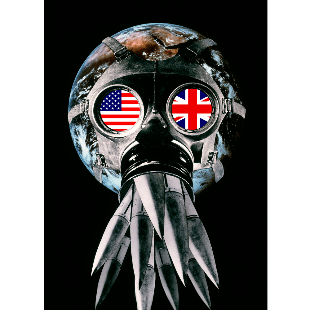
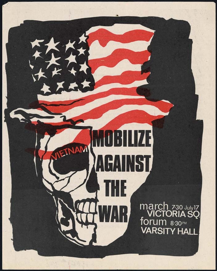
My favourite lecture was looking into post modernism as the art included within the talk caught my eye and was interesting to hear how they are related to other post modern pieces. We viewed my favourite subjects photography and graphic design which I am strongly into. To complete the blog from this lecture I looked into Nick Knight and Shepard Fairey who I have previously looked into in past projects. Both of their work are bold, eye-catching and create conversation. They both understand the power of red within art work and use it a lot to create an impact on their viewer. I have also learnt from looking at all the different pieces of artwork through the lectures that contrasting, limited colours such red and black creates an amazing impact on the design. For my illustration project we looked at using the photocopier to print out designs in black then using spots of design to overlap red. Doing this created an great effect that i will be using in future outcomes.

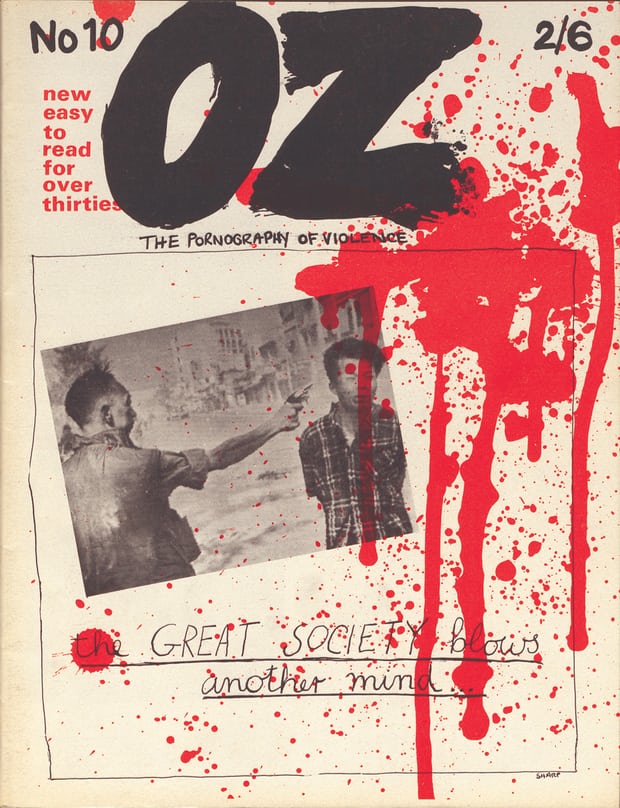
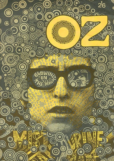
For the task looking into underground artwork I researched into the Oz magazine. I found it very interesting to learn how their brand was banned for being explicit with their designs but have recently been recovered and shared online. This shows how society have changed their opinion on explicit art work. This generation are much more accepting and willing to share so Oz have seized the opportunity to post and display their magazines online. From doing this they have been able to reach a wider audience but this will also degrade the physical magazine value as it can be viewed by everyone online.

From looking at photographers within the tasks I have been inspired for my next photography rotation. I have seen a variety of images also mixed with graphic work that could be used to influence my own photography work. I have even considered choosing Photography as a pathway as I can see how amazing photographs can change a view or even a persons life.

From completing these tasks and researching so many different artists will expand my influences and consider being more adventurous within my practical work.

comparing – task 2

T

These two images are used for advertisement but they have both been created using different materials. Photography and illustration are a great way of advertising a product as they attract different target audience groups. The illustration has focused on using colour, shape and pattern whereas the photograph has kept it quite simple using smoke to highlight the shoe.

The photographer has tried to think of a way of making the trainers the focal point so they have used a black background and focused lighting. The illustrator has used a faded white background to bring out the colours of the trainers. If they wanted to focus on one shoe and brand they could repeat the shape but change the pattern and colours.

I have chosen these images as I am into illustrating over photographs and photography.I believe a mixture of both of these techniques within advertisement is very popular and successful within industries at this moment.

From my own love of trainers I am able to recognise the shoe brands in the illustration, however in the photograph it is harder to tell. i think this is important within advertisement, especially if there is no information or text added to the poster.

Bibliography

https://www.pinterest.co.uk/pin/155163149645020354/

https://www.pinterest.co.uk/pin/456130268499766360/

task 4 – is it possible to be truly authentic?

Over the past century art has developed, changed and become extensively popular within society. In this generation appearance is a major factor within our lives. Meaning our own appearance, the things we do, where we live and where we go are judged. We feel the pressure to fit in and copy others to earn a higher status. This means we are finding it hard to be authentic. We use a mixture of different materials to create a so called perfect appearance but lack to create our own.

Within the art world we are discovering new things every day. However, we struggle to make them popular so we refer to original ideas and techniques that have been successful in the past. As most people are thriving to be better and different there is such a struggle to be spotted amongst the crowd, so much so we end up losing our authenticity because we are too focused on being the best.

It is incredible how much art and fashion has changed over the years. We can see how different elements have reappeared within the modern day but adapted to fit in with today’s society. I believe we will struggle to be authentic within the next few years as we have discovered so much already. However, machines and technology are evolving and becoming more powerful then ever that we may discover new and much more modern styles that us humans haven’t been able to create or discover yet.

task 7 – publish or perish

Barnbrook creates amazing graphic pieces full of colour, typography and his opinions. He uses a mixture of photography, 3D layouts and animation. Everyone one of his designs are different but his style remains the same. in this piece ‘Stop American Cultural Imperialism’, Jonathan expresses his negative opinion on Americas and their culture. He sets an image of Americans being greedy by using photographs of greasy fattening food and money. Using large typography he creates a strong message to the viewers that we must change the stereotypical view Americans. i believe this view on Americans is very dated and this opinion is beginning to fade as time goes on but this may be why Johnathan has used a dated style for this poster. During an interview with Sean O’Toole/Design Indaba Johnathan mentions “fonts are one of things that unconsciously show ‘the spirit of the age'”, which i strongly agree with.

This photograph captured during the 1968 Mexican Olympic games of Tommie Smith and John Carlos is full of emotion and significance. The two American sprinters bow their heads and raise a black gloved fist to protest against racial discrimination. I am a strong believer in standing up for what you believe in and this is a perfect moment in history when this was performed. This was a very important moment for the sprinters as they planned and successfully carried out their peaceful protest during a time it would be seen by thousands of people. They had a dream and seized their moment and this beautiful image captures that.

Peter Kennard has created a series of photo-montages seeking to reflect his involvement in the anti-Vietnam war movement. This is an impressive and powerful piece of lithography. Using an image of the world draws in everyone and everything to the seriousness of the piece. I have an interest for war history and believe art like this is a great way of attracting the worlds attention to destressing issues like this.

Bibliography

‘Stop American Cultural Imperialism’, (1999), available at: http://www.barnbrook.net/work/virus-japan-poster/

The Design Virus, (6/12/17), available at: http://www.designindaba.com/articles/interviews/design-virus

Black power salute (1968) available at: https://en.wikipedia.org/wiki/1968_Olympics_Black_Power_salute

Peter Jennard, 2003, available at: https://www.pinterest.co.uk/pin/138626494755144527/

task 6 – postmodernism

From what I can see post modern art is a reaction to modern art. Post modern art is bold, unique and unusual. It is there to create a reaction from the viewer and open a new eye to art. Post modern art adds a twist to basic art.

This wall art completed by Shepard Fairey reveals a deeper meaning to the use of guns and violence around the world. Shepard has transformed a poster design into a mural within the streets of It stood out to me as I am a big believer in banning guns within certain countries, the aesthetic of the painting is also pleasing. the use of red black and white creates emotion and contrast. The blood reflects blood but the white sheds light and hope against the flowers/peacefulness.

Nick Knights ‘Skinhead’ photojournal looks into fashion, culture and the lives of east London youths within the late 70’s, early 80’s. His photographs capture interesting moments and events that have great outcomes and create amazing photographs. Using the black and white filter helps the viewer focus on the meaning behind the photo. Subcultureslist article on the book share the opinion of “the pictures are uniformly excellent”, “they all have a suitably grainy, gritty quality that works quite well, and many are taken in close-up, with wide angle lenses that give a literally in-your-face and confrontational feel.”

Ed Fella i an artist inspired by typography, shape and colour. He is creative with his designs and I am inspired by his uniqueness. Ed is adventurous with his layout within his designs and doesn’t use any rules to please the viewers eye. Ed deconstructs the meaning of graphic designer and makes it his own. He uses a range of materials to create pieces that are childlike but professional. Ed is a great artist to look at for influence when creating illustrations.

Bibliography

https://www.pinterest.co.uk/pin/75505731223605339/

http://showstudio.com/project/nick_knight_image/skinheads

https://www.pinterest.co.uk/pin/557039047638515329/

Nick Knight Skinhead review, available at: http://subcultureslist.com/skinheads/skinhead-books/nick-knight-skinhead/

task 5 – underground artwork


Oz magazine created controversial yet amazing front covers to feature on their articles. The image featured on the cover above was taken during the Vietnam war. It portrays a solider to be heartlessly threatening the citizen, as the viewer we have to knowledge of what may have happened next. The ink splatter across the page builds a dramatic and shocking view of what could have happened. I like the use of two colours within the cover as it focuses on the aim of the designer. This style of designs intrigues me and i believe they are a great way of expressing world problems through art.

The second Oz cover looks into using shapes, colour and typography to create an image perspective. This technique interests me as it takes a lot of planning and thought to create this kind of outcome. The style of font and repeated circles create a hippy design perfectly represents the era of its creation. The colour yellow was popular within design in the 60’s as it signified positivity. This design appears hand rendered but professional and neat which can be a hard thing to create.

‘Mobilize against the war’ was created in 1966 as an anti-Vietnam war poster. This design attracted me as I loved the use of layering different colours and shapes. Illustration mixed with typography creates a great effect especially when aiming to create an impact. The designer has made the purpose of the poster clear as he has included the word ‘Vietnam’ and the American flag. The font used on the poster is bold and strong like the message the words are portraying.

Magazine covers and posters designed within the 60’s were very controversial and definitely create an impact on the viewer. Problems within the world at that time were highly reflected into the artwork and used for negative and positive reactions. As time has gone on and adventurous art is now more socially acceptable Oz have been given the chance to re-show their controversial yet amazing magazines. The guardian share this within their article of Oz magazine covers,  “Oz is a record of the cultural revolution. Many of the issues it raised, such as the environment, sexuality and drug use, are no longer contentious. In fact, they have now become mainstream.”

bibliography

‘Return to Oz: The most controversial magazine of the 60s goes online’, March 2016, available at: https://www.theguardian.com/media/shortcuts/2016/mar/06/return-oz-most-controversial-magazine-60s-goes-online

http://ro.uow.edu.au/ozlondon/10/ 

https://nzhistory.govt.nz/media/photo/anti-vietnam-war-poster 

https://www.theguardian.com/artanddesign/gallery/2012/sep/09/magazine-cover-design-in-pictures

‘Technology is the mortal enemy of art’

New styles and techniques of creating art are being invented every day. However, original artistic techniques will never be forgotten. The simple brush and paint will never die. Even if it means using this method then developing the piece with software such as Photoshop to give it a finer and professional finish. Technology has given us the opportunity to broaden our resources and develop hand made pieces of artwork.

Aleksandr Rodchenko had documented his opinion against technology claiming ‘Technology is the mortal enemy of art’ in his book ‘Who We Are: Manifesto of the Constructivist Group’. Technology and the internet gives us a much wider audience for viewing our work. All it took was to enter the Title of Aleksandr’s book and I was given access to several different copies.

‘Artists today find it more challenging than ever to present original and innovative ideas, and they need to exert themselves and stretch their imagination to succeed.’ As technology and the internet is so broad this means there is a lot of pressure to create the next best thing making sure it has been edited to have the perfect outcome. I believe original techniques of brush to paper gives a more meaningful and original piece.

Technology has given art a higher pedestal however it has created an expectation for art pieces to be the highest quality. There isn’t much appreciation of how much development it takes to create a digital piece as there is with a canvas decorated using original techniques.

Bibliography 

Author- Mohamed Zaher, 20/10/17, available at: http://www.midanmasr.com/en/article.aspx?articleID=200

Terminal Bar

The Terminal Bar is a short film/documentary directed by Stefan Nadelman. The documentary features 2,500 portrait photographs of customers visiting the bar taken by the bartender at the time and father of Stefan Nadelman. During the short film Stefan is shown to be telling the stories behind the photos and what happened during the customers visits. Stefan carried out this project from 1972-1982 although the style of the photographs stayed the same we as the viewers can see the change of the bars nature throughout the years.

The layout of the film has a very unique style. Showcasing newspaper articles written about the bar, highlighting key moments such as the complexion of the bar and it coming to the end of business between slideshows of images along with music chosen to link with the stories behind the images. This style of production is very successful and helps the viewer understand and picture what the bar was like.

Stefan’s aim was also to document the state of the bar and what surrounds it. Drunken and homeless people were left lying on the streets while well dressed workers walked past without a care in the world. Several bars were also set up around the Terminal meaning there was a lot of room for crime to take place.

This film is a beautifully set out piece that reflects what life was like for a majority of people living in Manhattan during the 70’s. It is interesting to see how Newyork has change over the years.