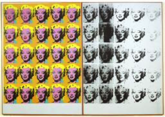
Author Archives: Samuel Hanikene

Task 12


Andy Warhol

‘Marylin Diptych’

1962

Acrylic paint on canvas

2054 x 1448 x 20 mm each panel

Andy Warhols ‘Marylin Monroe’ works are incredibly well known, and it could be argued that they are the face of Pop Art. However, what some people do not know is the sheer scale of the work. More often than not, they are displayed with other very similar works (depicting Monroe), which only adds to the overall size. Warhol created the prints in the years following Monroes death, due to s a substance overdose, throughout Warhol’s work we can see two strong themes; death and the celebrity sect. Here we have an interesting union of the two, the repetition enhances the idea of over publicized and fame while the black fading signifies death. The strong colours and vibrant face on the left contrasts heavily with the distorted monochrome features on the right. If we take the space between the two as ‘death’ (and read from left to right) then the fading of the face could be suggesting that the world is going to forget Monroe. The scale of the work puts the themes right in the viewers face, to the extent of unavoidability. This again hints at the idea of fame, it is a large inescapable object that draws you in with its clean vibrant colours, and could almost be seen as advertising. So if we were to shrink the image down to a quarter of the size, 513.5 x 362 x 5 mm, we have a very different piece. We would still have the same themes of course, but we would look at them in a completely different light, firstly, and most obviously, it would be altogether subtler. The themes wouldn’t be screaming and shouting for attention. For me this is a large part of the work, so to take its size would in effect be taking its message.


Bibliography:

http://www.tate.org.uk/art/artworks/warhol-marilyn-diptych-t03093

Task 11

I have always been interested in the History of Art as a subject, and studied it for A-Level. During this time I fell in love with writing long essays debating different theories, how art has changed according to politics of the time and so on. To be honest, I expected the same sort of thing from this module, instead I was pleasantly surprised to find a much more ‘contemporary’ course. Although I still thoroughly enjoy writing long essays I have found the ‘blog’ technique very freeing in comparison, in the sense that I don’t not feel confined to certain ways of writing. I have similarly learned to think more broadly when critiquing an artwork, instead of looking for a standardized set of features within a work, such as tonal values, scale etc, which I utilize throughout the course, I have learned to look at each work with a fresh outlook. That does not mean however that these ‘standardized’ features are irrelevant, instead they are just a platform from which this course has now taken me further. By this I mean that the blog has given me another opportunity to study and assess art and thus has taught me a new refreshing way of evaluating art.

Task 10

Simple, bold imagery embellished with meaningful but somewhat unclear text.

 Recently my work has become increasingly text based, although I still find a strong importance with images. As well as text playing quite a large role in my work, I have been using simple bold, and often high contrast, imagery; I really enjoy creating a relationship between text and image, specifically complimenting simple images with short statements. I have found that using text gives the viewer an extra nudge towards the ‘theme’ of the piece, or equally does the complete opposite and draws the viewer away from the subject by undermining logic. I have been investigating this relationship a lot, and have been using group crits and reactions from peers to determine what, where and when certain aspects of this relationship are either significant or irrelevant.

Task 9

Paul Delvaux, ‘Crucifixion’ – oil on wood- 1952

In the 1950s Delvaux painted a series that revised an old subject that was prolific during the Medieval and Renaissance eras, the Passion of Christ. He did, however, not want to recite the same imagery as paintings from earlier periods. He decided to paint all the figures as skeletons, in nearly all of the paintings. He uses the skeletons to represent the fragility of life, and employs them as a tool to shock the viewer into being reminded of life and its fleeting absence. In this way we could easily look at the painting as a Vanitas. This specific painting from the series shows three crucified figures above a number of fully armoured centurions. The middle figure is illuminated, strongly suggesting that this is Christ, could this represent significance is still present after death? Or is it simply for aesthetic reasons? This painting raises many questions, and takes time to properly understand. Usually depictions of the crucifixion of Christ are in a countryside landscape, as Christ was crucified on top of a hill, whereas here we see a strong contrast to this as it is set in a built up area. The strange architectural shapes create strong hard lines throughout the image, and give the painting a more ‘modern’ film. This could be Delvaux trying to transport the theme of the ‘Passion of Christ’ into a more contemporary era, carrying the message to the viewer that these old Vanitas values still apply.


Task 8

I have always been a great admirer of David Shrigley’s drawings. To me, they represent a fast flowing style that comes straight from the mind, an image that isn’t thought through meticulously for days or even weeks on end. Although I find this important with some aspects of practice, I feel that artwork like Shrigley’s is needed within the art world to keep it ‘sane’. A large proportion of his drawings clearly have a deeper meaning, but they are depicted in a lighthearted manner. I have always enjoyed creating drawings similar to Shrigley’s, I find that fast mark making, combined with a small caption of text, therapeutic, more importantly for me, it is a very quick and easy way to visualize my thoughts and ideas. Shrigley’s text is often somewhat confusing, in the sense that it doesn’t explain the image accompanying it, give specific opinions or give any real narrative. Even though I find this manner of text intriguing, I wanted to do something different. I decided to start regurgitating sayings and clichĂ©s from my childhood. Many people would have heard similar things during their upbringing; they ranged from strict do and don’ts from adults or teachers, to certain equations and formulas that are forever stuck in my mind. In honesty, I started using this text as I couldn’t think of what else to write, but I soon realised that it accompanied the fast scribbly drawing style very well.

Task 7

Leo Steinberg (b.1920) from Other Criteria pp. 61-98

Richard Serra (b. 1939) from The Yale Lecture

The two texts, in essence, are describing specific changes in two different disciplines of art. When it comes to writing styles, the main difference is that Serra seems much more argumentative when getting his point across, maybe this is because he is mostly talking about himself.

Steinberg discusses the shift in characteristic picture planes that took place in the 1950s. He describes that before this point paintings had a sense of memory, that their image had once been actually seen (even with Cubist paintings). Steinberg states that paintings like this must be vertical, as that is the natural way.

Serra, on the other hand, explains the importance of site-specific sculpture. He first states that modernist sculpture has forgotten the importance of a durable self-sustaining structure. He claims that modern sculptors, for the most part, have ignored the advances in industrial technology, and in doing so have turned a blind eye to reliable manufacture. Serra speaks of the importance of site-specific work, most prominently how a sculpture cannot be created in a studio as the environment it is to be placed is of the upmost importance, and could impact on the work heavily.

The two texts speak of new mindsets when approaching age-old disciplines, in this way they are very similar. They could also be viewed as similar as we could swap the message of each with the discipline of each; making painting site-specific and sculpture not on the floor but on a wall. This just shows that the two texts, and disciplines, are very alike and could be easily integrated together.

Task 6

I have always ben immensely fascinated with printing techniques and different printing media, ever since I was first introduced to the practice during GCSEs. Since then I have worked with a large range of printing techniques including; Lino, Drypoint etching, etching and screen-printing. And within each of these disciplines I have explored the ‘common’ methods of mark making on the plate/screen etc. While these methods are a perfectly acceptable way to create great works of art, personally, I find it difficult to stand out when the same ‘style’ of printing is being constantly regurgitated. Something that I touched on while studying my A-levels, is combining different printing processes in the same image, for example, I created large scale screen prints then printed and etching over the top. I really liked this approach to working and developed it as much as I could until my ideas surpassed the resources I had at my disposal. Now that I am at university, and thereby have many more facilities to experiment with, I wish to further my investigations in terms of print. Although I have combined different printing processes on the paper, I have not yet combined them on the plate. For example, I am currently exploring different forms of Lino printing, and I have the idea to create a ‘standard’ Lino printing plate and then using an etching tool to etch onto the same plate. If this ‘works’ then from there I can experiment with the order in which I print (cut Lino, print, then etch etc.), different inks and varying scale.

Task 5

Nina Vatolina- Fascism, the most evil enemy of Women, Poster- 1941

Nina Vatolinas imagery is scattered with depictions of empowered women. It is clear to see why this is one of the most famous Soviet posters of this time period. The simple but bold palette, high contrast and sharp text really makes the work stand out. The fluid movement of the figure is emphasized by the fluidity of the dress and the background. This draws the eye in from across the room and encourages the eye to scan the image. I have seen this specific poster before online and in books, and after seeing it in the flesh the two do not compare. Through second hand images the colours are not quite right, in person the red is extraordinarily deep and vibrant, whereas online it often has an orange tint to it. in person the contrast was also much clearer, which quite possibly was down to the large scale of the poster. This is the primary purpose of a propaganda poster such as this; firstly to draw attention, then to inspire. The emotive features of the face emanate with calm confidence and sureness. Personally, I feel inspired by this work, not by the political message that it flaunters but of the sheer hard working determination that the figure shows. If we take away from the overall message and pull out the figure alone, we get a depiction of a strong, hard working but also naturally beautiful women, something that most women, especially at the time, would aspire to be. This strikes a stark contrast to the representation in the background; a woman weeps over her, presumably, dead husband and child. This contrast is accentuated by the tonal values throughout the image. This seemingly represents the horror of which the fascists will ensue, and the red woman, representing the soviets, rising above stronger and more determined than before. (The two women could almost be seen as the same person but in different time frames). I have found that this contrast between this despair and unparalleled confidence is quite common in propaganda posters of the time; this includes Nazi propaganda. This intrigues me as the posters are admitting to extreme hardships and then smothering them in positive imagery. I suppose, in a way, it was impossible for the governments to cover up the poverty and hardship with positive imagery alone, as nearly all of the general public was experiencing the same hard times.


Task 4

Red Star over Russia, Tate Modern 2017-2018

Overall the exhibition was, for me, inspirational in a sort of melancholy manner. The imagery displayed throughout the exhibition was spectacular and the deep historical background that it represented supported it further. This to me was very significant and it reminded me of the importance of meaning in my work, because of the emotions, or lack of emotions, that an artwork could create. By supporting the works with historical content the curator has provided a great context for viewers to recognize. This makes the exhibition as a whole much easier to understand and, more importantly, gives the viewer a better opportunity to make their own thoughts and opinions on the relevance of the work at the time. The exhibition had a real emphasis on informing the viewers on the historical and political history of soviet Russia, I feel that this strong historical part of the exhibition was integrated perfectly with the ‘artistic’ side of the exhibition. It would have been easy for the exhibition to have a ‘museum’ like atmosphere, but this was not the case.

Task 3

Muntean / Rosenblum

Untitled [Everything was as it had been a minute ago…], 2001 [painting]

At first glance I get a very stark and bright feel from the painting. The overall ‘look’ of the image is quite flat and the only really dark values are in the green robe in the centre. This draws the eye in to that specific place in the painting, and in turn, the central figure. I find it intriguing how this arrangement of seated and standing positions look rather strange together, each figure looks as though it has been taken from somewhere else. This is reinforced by the fact that if we separate each figure they are in very ordinary positions. It has a certain ‘unnerving’ air surrounding it, a stillness that makes the viewer slightly uncomfortable. This uncomfortable feeling is exaggerated by the glare of the three figures, looking out from the surface and engaging the viewer. From the text we can tell that the artist has tried to encapsulate a feeling of stillness, a snapshot in time that gives no indication of what might happen next. I think that the artist is trying to capture an exact moment that expresses a great feeling of illusion and where very little, in terms of narrative, can be deciphered. The clock on the wall also suggests the theme of time.

I like the general composition and shape of the painting, the slight rounded edges of the image itself and the text being placed below, gives the sensation that we, as viewers, are looking into a screen, exhibit or a cell. The text below could almost be seen as mocking the little plaques that are found in art galleries and zoos, as this text contains no real ‘information’.