Looking into topics that have impacted on cultural and art based theory has enabled me to apply and practice different approaches to thinking creatively, making my work more sophisticated and meaningful. A variety of different research findings have helped me to add a purpose to my work and motivate me to experiment and develop ideas, whilst learning about myself.
Whilst questioning ‘Can work be truly authentic?’, I came across Theo Van Doesberg’s view on artists being influenced by other artists. This inspired me to recycle old ideas and adapt them. Doesberg’s idea that, ‘the new artist does not imitate, he creates’ (Wilk, C ,2008), encouraged me to revisit old artists I had been influenced by such as David Carson, and using new technical knowledge I had been taught in Semester one to experiment with negative space and the postmodern style in a more professional way. This enabled me to produce a sophisticated set of two posters for my Graphic rotation which focused on a play of words, where I used Adobe InDesign (a programme I have never had confidence to use) and considered technical skills such as gridding, scale, alignment and type face to finalize this. It has taught me that reflecting on old influences does not affect the authenticity of the work, but that recycling old successes into something more exciting and up to date can also help me see how my skills and knowledge have developed.
One thing in particular that I felt was an important skill to take away from the lectures was to investigate chronologically how artists responded to cultural and social issues. Historical movements such as Avant Garde were discussed and presented, enabling me to reflect on how an artist reacts to contemporary issues. Being of a younger generation, I felt it was important to learn about such events so that I can consider my own culture and society in future projects.
Something I found to be influential in the lectures was discovering and comparing techniques in other fields of Graphic arts such as Illustration. The pieces of illustration presented enabled me to pursue my illustration rotation in a confident manner. In particular, a task comparing a piece of graphic design with a piece of illustration. ‘Funhouse’ a graphics poster by Michael George Haddad uses a screen printed, black and white half tone effect of mugshots to advertise a DJ. Camilla Perkins illustration of ‘Kayleigh and Steve’ uses details in her illustration to build a visual story of the couple and to express their personalities. Looking into a piece of illustration enabled me to consider how to create a visual story through detail. For instance, adding detail to the background of the hotel kitchen to reveal my character was a butcher. Also, after looking deeper into screen printing, I pushed myself to screen print my final piece, giving it a gritty, underground aesthetic which is what I liked about Haddad’s piece. It also linked well with my story line being a comedic horror.
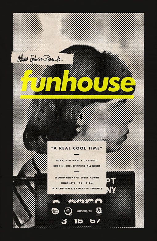
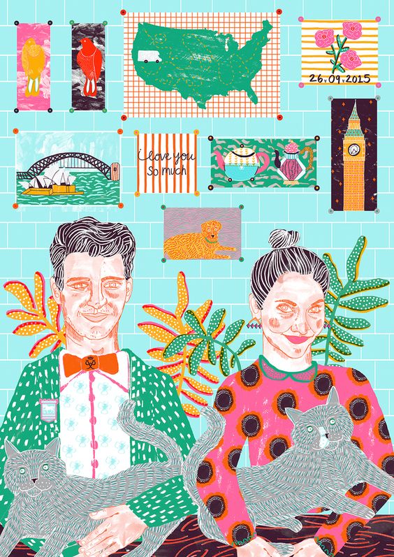
Left: Funhouse by Michael George Haddad, 2013. Right: Kayleigh and Steve by Camilla Perkins, 2015.
Bibliography:
Wilk, C (2008). Modernism: Designing a New World : 1914-1939. England: V&A Publishing.