I looked at two artists who both use paint but in very different ways. Robert Holyhead paints with bright colours and leaves texture from the paintbrush. He also leaves white squares seemingly placed randomly across the image. The white squares look like they have been cut out where they are so precise. I think that the image could be a person’s mind; the brushstrokes represent thoughts, feelings and memories. There are memories that people forget over time, like childhood memories. The white blocks could represent these memories that are forgotten.
The other artist I looked at was Secundino Hernández. The painting that I focused on was an untitled piece that looks like paint thrown onto the canvas in a rushed manner. Most of the paint is focused in the middle so it looks like a dark void on the canvas. The appearance of this piece makes me think of feelings and emotions of a confused state or mixed emotions.
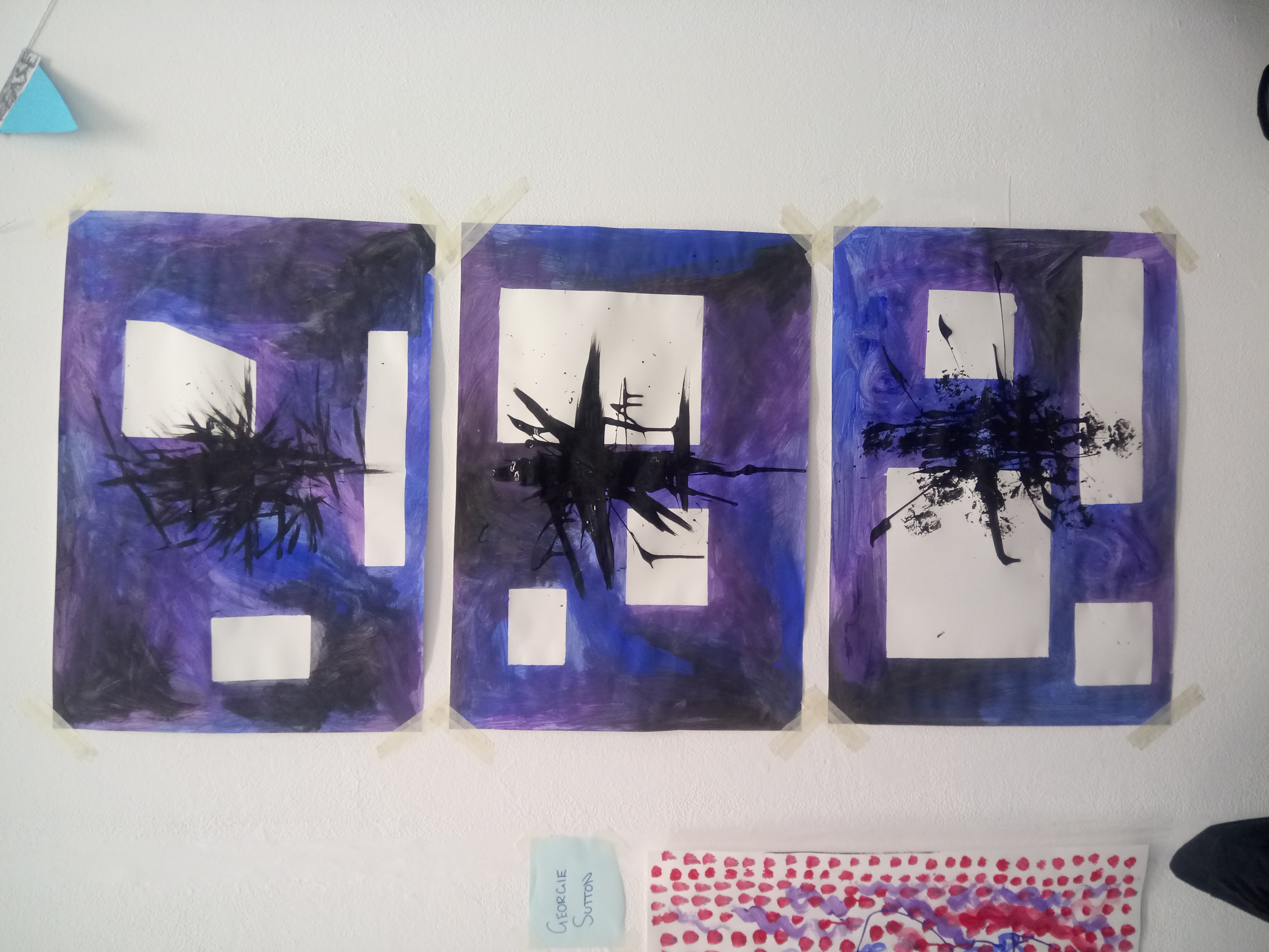
Although the styles of painting are very different, they remind me of similar themes. I thought that they could work together well, so I decided to try combining them. I used masking tape to mask off areas that would be left white. I then used purple, blue and black paint with evident brushstrokes to colour the paper like Holyhead’s work. I took the masking tape off the paper and painted a similar pattern to Hernández piece over the top. I made three of these paintings, experimenting with the black patch of paint in the middle of the image. The first one I just painted straight on using a paint brush. The second one I dripped the paint from the tube then moved it around using a paintbrush. The final piece I dripped the paint from the tube and didn’t move it with the paintbrush. On all three of the paintings I flicked paint on with a paintbrush, and used tissue to make a speckled appearance.
I really liked how these paintings turned out. I think the two styles, even though both very different, work well together. I chose to use the same colour scheme on all three of the paintings so they would make a series, also I wanted to focus more on the black patch of paint over the top than the background.
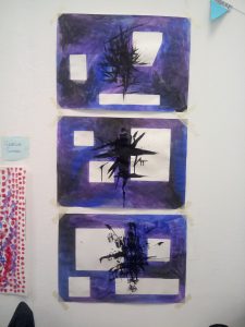
This is a photo of all three of the paintings displayed together
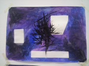
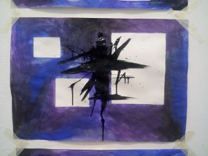
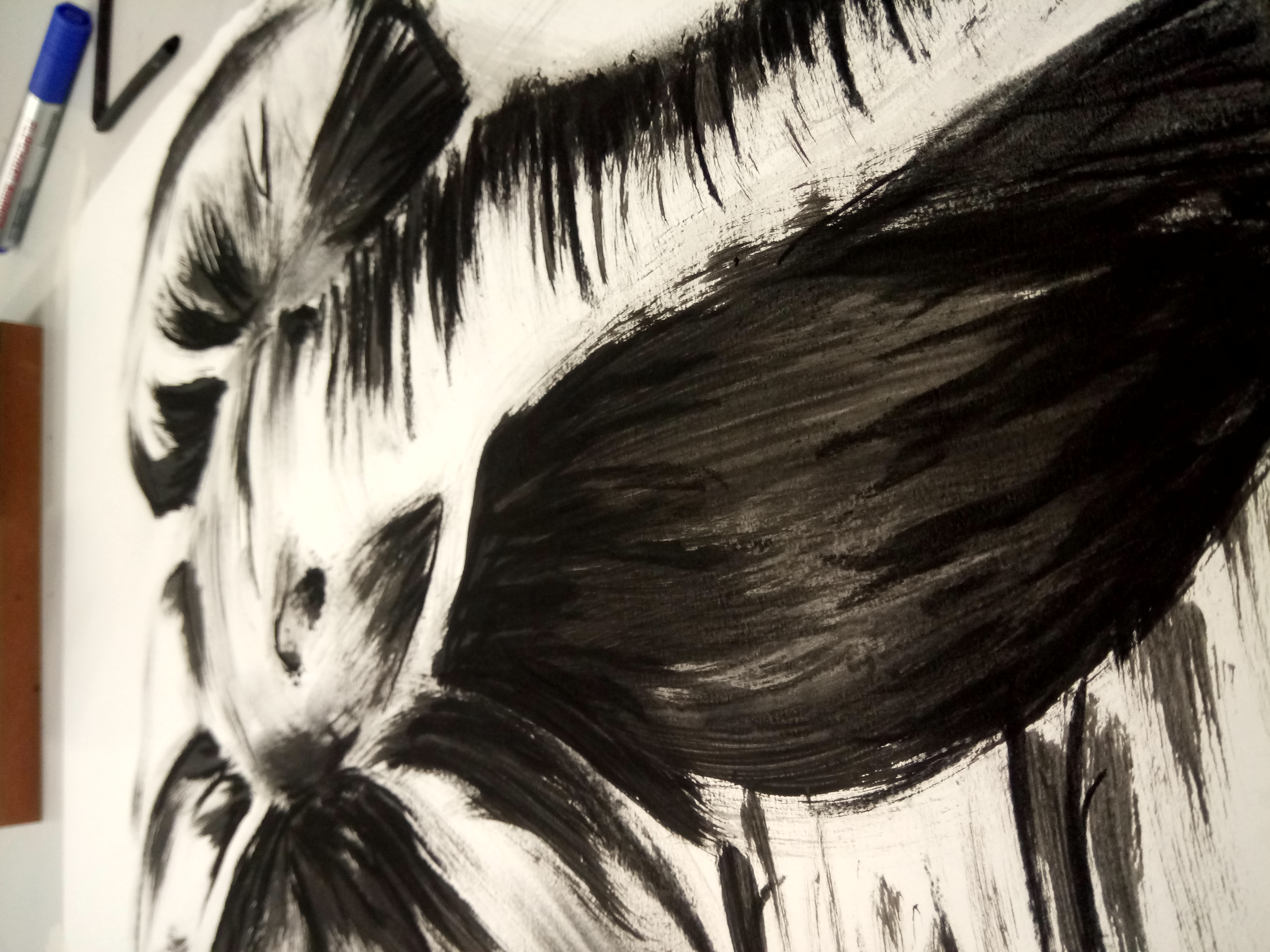
Image 1
Image 2
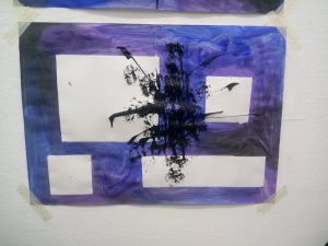
Image 3
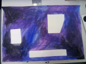
Image 1, only the background