Author Archives: Jasmin Young

Task 12

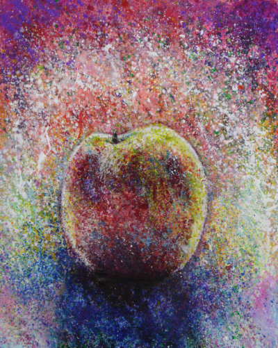
For the piece I’m talking about I chose one of the pieces I have done in my self-directed study which is painted in acrylic paint. Increasing the size of this piece would help us see the details better. When put in an exhibition it would stand out more because the whole piece is very colourful, therefore catch the eye better. However, due to the impressionist qualities to the piece it would lose the tones created in the piece when bigger, unless it is in a very big space. This would be true in a public space too.

In contrast, making the piece smaller will lose details that a human eye can see and make it hard to tell that it was an apple anymore. If exhibited it would lose the intensity in the piece because such qualities like textures and detail have decreased, due to making the piece smaller. But this means it has made the piece look smoother and could be argued from the point above that it actually looks more like an apple. Furthermore, this depends upon how much the piece has been decreased in size. However, it may engage the audience more, due to need to be closer. I think the piece looks better bigger because compared to making it smaller the process shows the mark makings of the piece better. In this piece I think that showing this quality is important because it shows the process of the making the piece better. If this was smaller this would no longer be obvious. Another factor we need to take into account is if we increase the piece too much we will not maintain the resolution.

If the piece was smaller, I would have repeated it to create a series so it would stand out. If the piece was bigger, I would apply more detail using layers of paint.


Task 11

Summary of blog

The range of the questions in the blog has helped to develop my understanding of Art Practice. This has been further informed by reviewing exhibitions; Art pieces, texts/books and reviewing own practice. I found task 3 very useful because I had never took the opportunity to review an exhibition that I have been to before and this helped me understand and enjoy the exhibition further. I found task 7 most challenging due to the language and length of the texts. As I am interested in Art history, it made me want to read more books related especially related to my areas of interest. I found the tasks which involved practical work most enjoyable because it helped me engage with the text. I have tried to link tasks I can to my own practice in the studio. I have achieved this in tasks 2, 6, 8, 9, 10 and 11 which has developed my work further. This has linked to my practice because it has helped me reflect on my work more and has given me the initiative to read more about the artists and contexts around the themes I am looking into.

Task 10

“Archive, memory, colour, organise, chaos, food, objects, layering, repetition, consumerism”

In my work looking into everyday objects, food I eat and colour has been very important. One of the ways I have developed this is through layering of different styles of print, collage, ink and paint. I thought the investigation through print was important because it linked to mass production, packaging and artists like Warhol. I have archived objects such as my pencil case to sweets I own, where I have extracted the colours and manipulated it through more free ways of working such as splashing paint to more controlled ways such as looking into pattern and repetition. I think the investigation of colour has been very focused in my practice because it gives the sensations of flavours and emotions that cannot be portrayed through just black and white and shape. I intend to develop the project further by manipulating pieces I have already made by changing it shape, colour and pattern. I should look into ‘installation’ as a form of presenting my work as a collective. Going to Ilya and Emilia Kabakovs Exhibition “not everyone will be taken into the future”, where many of their works were installation-based and showed elements of both organisation and chaos. This has inspired me to look into ‘installation’. Additionally, I have started working in 3D using different coloured matchsticks which has developed my practice because making the work links to everyday objects in a different approach to before.

Task 9

Ilya Kabakov- The man who never threw anything away

This piece is an installation by Kabakov who collected objects in his studio and hung them up with string and labels/narratives. In contrast, the table’s tops were full of unorganised stacks of pencils and art stuffs. Additionally, there were also cabinets where objects were presented as if they were in a museum with every object numbered and catalogued.

The number of objects in one space gives a sense of chaos. But the way Kabakov has catalogued the work is very systematic and clean. The angular nature of the objects hung by string and the lighting created shadows which I think intensifies the feeling of chaos because it makes the space look fuller and creates an illusion there are more objects in the space than there actually are. This installation was first presented in 1988 when an installation using everyday objects which was not as common. ‘Installation’ first emerged in the 1960s but was not common until the 1990s, with the rise of conceptualism.

Kabakov in this series called himself the “garbage man” meaning that all these collected objects are rubbish and unneeded, which he has purposely archived them. Perhaps the sentimental values he had towards the objects grew due to their use in the installation. In a text I read from “The Archive” Kabakov says society is “boundless dump” and “fragments of culture” which I think that he thinks the same for this installation. One of the aspects I can see from the piece is showing a consumerist society and the obsession with hoarding that an average person has. The act of archiving objects leaves history, traces of yourself, and others. Kabakov has done this in “the man who never threw anything away”.

The man who never threw anything away (image 1)- my photo I took in the “Not everyone will be in taken in the future” exhibition (November 9th 2017)

Bibliography

Merewether, Charles, (1 Oct 2006). The Archive: Documents of Contemporary Art. Whitechapel Art Gallery (1 Oct. 2006), page 37

Task 8

Firstly in this piece I drew cans inspired by Warhol’s work through mono printing. Then I layered it by a lithography print. Additionally, I printed out Warhol’s coke bottles in black and white and then went over it with coloured soft pastel. I did this because simply printing out Warhol’s coke bottles in colour would not make them my original pieces. Warhol made his work original by adding bright colour and by repeating and manipulating the image. By putting the different coloured soft pastel I believe I have done something similar. I also added actual packaging of sweet rappers to layer the piece further. The process of repetition which was continuous through all the stages was enjoyable to do and I thought it has made the piece more interesting to look at and gives the feel of consumerism and capitalist society better. It was the first time I have incorporated an Artist’s work into my own so I felt it was important to still make the work feel like it was my own. However, due to the cans and the coke bottles we can still feel the identity of Warhol’s work present in it.


Task 7

In Steinburg’s text he first says that Art is constrained by the perspective of the vertical alignment of the human frame and that this is true even through cubism and abstract expressionism. The notion of the ‘flatbed picture frame’ has been coined by the author to describe an innovation that was introduced from the 1950s by artists such as Rauschenberg. This is illustrated by his piece of ‘square patch of growing grass held down with chicken wire’ displayed in ‘nature in art exhibition’. The horizontally flat grass patch was rotated ninety degrees into traditional vertical plane for viewing art. We still hang these pieces vertically just as we do ‘maps’. However, there is no longer equivalence with the human visual frame but instead with ‘operational processes’.

Rauschenberg ‘proposed the flatbed or work-surface picture plane as the foundation of an artistic language that would deal with a different order of experience’. He explored different processes such as: ‘turning his back on the model’; ‘objects placed on blueprint paper and exposed to sunlight’; ‘used newsprint to his prime canvases’; ‘included intrusive non-art attachments’; ‘photographic transfers’; ‘collage elements’. According to Steinburg, ‘perhaps Rauschenberg’s profoundest symbolic gesture came in 1955 when he seized his own bed, smeared paint on its pillow and quilt coverlet, and uprighted it against the wall’.

Richard Sierra built site-specific works in steel. He had supported his education working in steel mills. He brought consideration of manufacturing processes to sculpture, seeking to become ‘active producer within a given technology’. Site specific work reorganises the concept and perception of the site. He never sought to ‘decorate, illustrate or depict’ a site. The work is constrained in concept and perception by the specifics of the site and its social and political characteristics. One should be watchful of ‘governmental, corporate, educational and religious’ parties who seek to corrupt for their own purposes.

Considering similarities between Art based on the flat bed picture plane and site specific sculpture, there is some conceptual equivalence between the picture plane and the site. Both provide the context for the work. There is also a focus on the producing process.


Task 6

Prompted by my self-directed study in the studio, I have realised an opportunity through the accumulation of objects every day.  By studying different aspects of these object collections, I explore particular aspects in different contexts. I organise and contrast these studies to explore emotional resonance.

I will address this approach by investigating objects through extracting the colours and textures. I intend to do this using printing, acrylic, inks and soft pastel. I believe that bright colours in the work are more effective as they convey packaging and represent more emotion. In my work layering has been effective and developing this further could bring an additional dimension. It is also important that these objects are owned by myself because I have a closer connection and would want to explore them further.

It is also important that I work in the studio on a daily basis so I would always be thinking and engaging with the work. This would help me reflect on my practice and I will record in my journal and sketchbook. Also I intend to work on a bigger scale than the sketchbook so I would not be restricting myself. This would allow me to be more expressive with my mark makings as well. Additionally I will try new surfaces such as painting on objects.

Task 5

Tate Britain- A Bigger Splash, David Hockney,1967

In many of Hockneys pieces he has painted water. I thought ‘A Bigger Splash’ was one of the most striking pieces within this series. The painting is of a Californian swimming pool where there is a splash, which is implying someone has jumped into the pool. The idea of capturing movement in a ‘still’ is something we cannot do in real life and seeing it in a painting is satisfying. I think this painting is one of the most memorable contemporary paintings I have seen, due to the simplicity and the colours cleverly used in the painting. When I see Hockney’s photo of his paintings they look very smooth but in the flesh have much harsher strokes than expected. This piece had a smoother surface compared to the

rest of his pieces in his exhibition. I believe it needed to be smoother because in the piece there is a use of a lot of solid colour and without the brush strokes being smooth the painting would have not had the same finish. The piece was also much bigger than anticipated and the size of the piece created further impact. The marks around the canvas were not clean which surprised me because I always tried to clean up around the canvas by going over it in paint. But this showed part of the process of making, which was interesting to see.

The first thing we are drawn to by looking at “A bigger splash” is the splash in the pool. Compared the rest of the images we can feel more movement and energy. The shapes compared to the splash are very rectangular, which emphasizes the movement. Such artists like Jean Dubuffet and Bernard Cohen has inspired Hockney how to draw the movement in the water. Additionally, it is also the placing of the yellow diving board contrasting with the blue making the water look more vivid and alive.

A Bigger Splash 1967 David Hockney born 1937 Purchased 1981 http://www.tate.org.uk/art/work/T03254

Task 4

Tate Modern- Soul of a Nation: Art in the Age of Black Power

The exhibition includes works starting from 1963, when the civil rights movement started. Martin Luther King and Malcolm X are associated with many of the pieces in the exhibition. The works were challenging and confronting the attitudes towards black people at the time. A broad range of works such as ‘vibrant paintings, powerful murals, collage, photography, revolutionary clothing designs and sculptures made with Black hair, melted records, and tights’ are exhibited. The majority of visitors were black people (70 percent) which are very rare sight.

The exhibition included critiques of Abstract Expressionists works which said that their work did not truly represent what a black Art work should be, due to use of bright colours. However, these were the works that I appreciated the most. They were not as shocking as the more provocative pieces such as Benny Andrews’ work which was directly aimed at White Americans. Additionally, they were in contrast with the majority other works in the exhibition which were dark or monotone. This showed that black work could be just as colourful and free. The large difference in approaches in Black Art shows the disagreements between artists in topics and thought. Also the clashes in the civil rights movement between peaceful protest( Martin Luther King) and violent protest(Malcolm X/ Black Power) was the biggest demarcation lines in the exhibition and the ideology behind the works.

Task 3

Renée Cox, Hot-en-Tot Venus, 1994, photograph

The piece is not a traditional representation of a ‘Venus’ because the woman is black and the breasts and buttock are emphasized by plastic. She bought these body parts from a Halloween shop. People did not think these body parts were offensive until included into the ‘Hot-en-Tot Venus’. Black women in previous pieces would have been portrayed as slaves and would have never been the central figure. This strikes a very high contrast with other previous ‘Venus’ pieces, which makes this piece appear very shocking to the general public. Additionally due to the piece being a photograph, its realism conveys a message more strongly. This piece challenges views in society concerning race and gender. The key focus when you first look the image is the breasts and buttock. She has done this purposely to show how women are portrayed in society. The stereotypical meanings behind this could be that the woman is a sex object. Therefore, the piece is trying to express the exploitation of women through the context of race and sex.

Cox is reacting to the under representation of black people in European Art history and also by extension of European history. For example, the fact that West African Moors brought toilets and building technology to the Visgoths of Spain is generally overlooked. So she takes the iconic “Venus” figure and augments the breasts and buttock. She may well be emphasizing the stereotypical attributes of African women through the device of the “Venus”. She is saying that these “hot-en-tot” proportions are just as desirable as the more traditional European Venus. Her straight gaze from the women looks asserting and she is suggesting that African women should be proud of their bodies. Therefore, this piece has a very strong effect which would probably change people’s opinions in society in the 1990s.

Bibliography

Renée Cox: A Taste of Power

Video of the Week: After Hot-En-Tot: Two conversations with Artist RenĂ©e Cox