Author Archives: Francesca Brucciani

Task 11/12: Summary

At the start of the semester, I was a little unsure as to what to expect from the Research and Communication module as I had no previous experience of writing about fashion and design. However, as the weeks progressed I found myself actually enjoying the tasks we were given since I felt I was acquiring more in-depth knowledge of my subject that built my confidence.

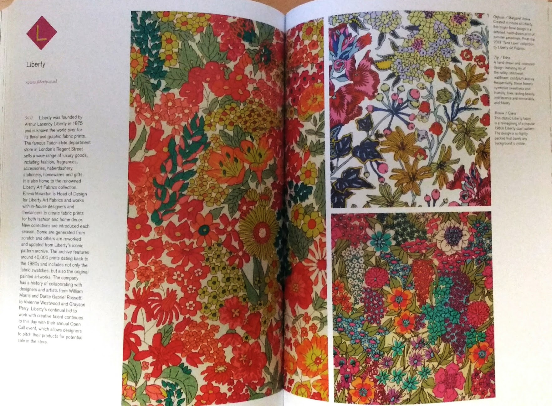
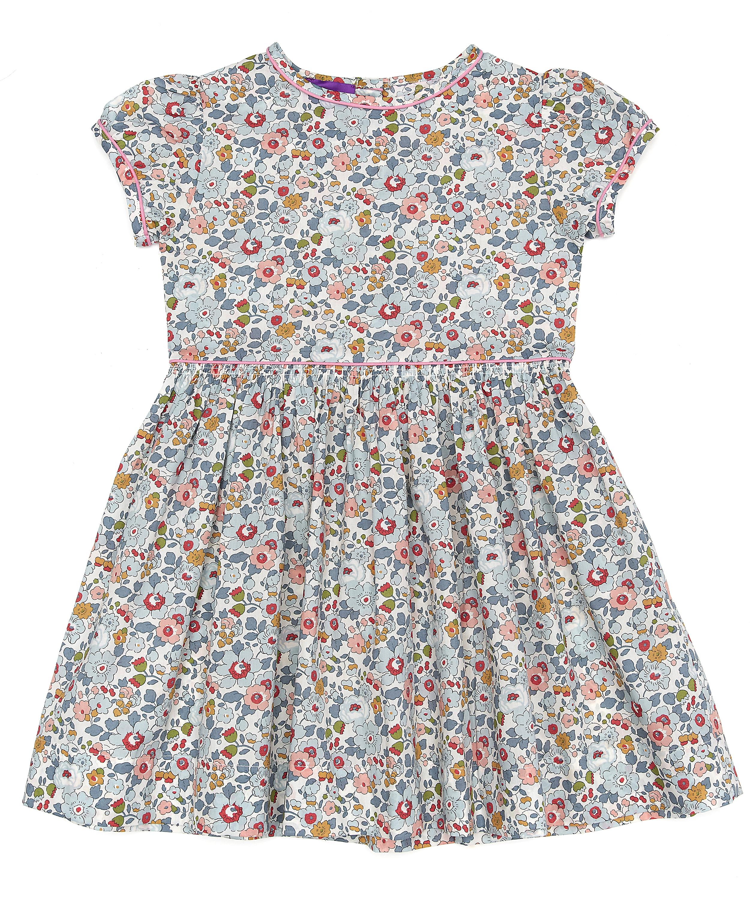
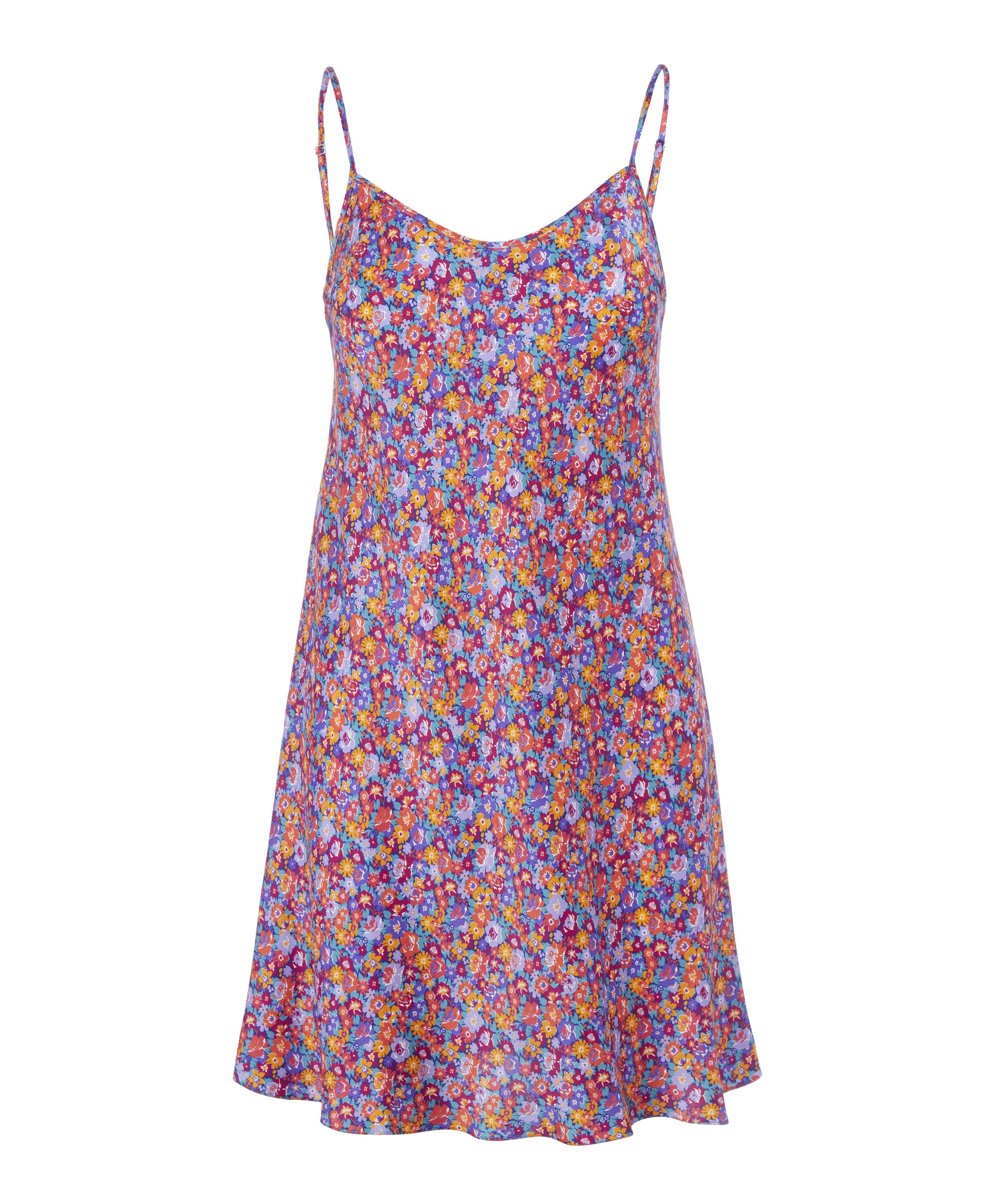
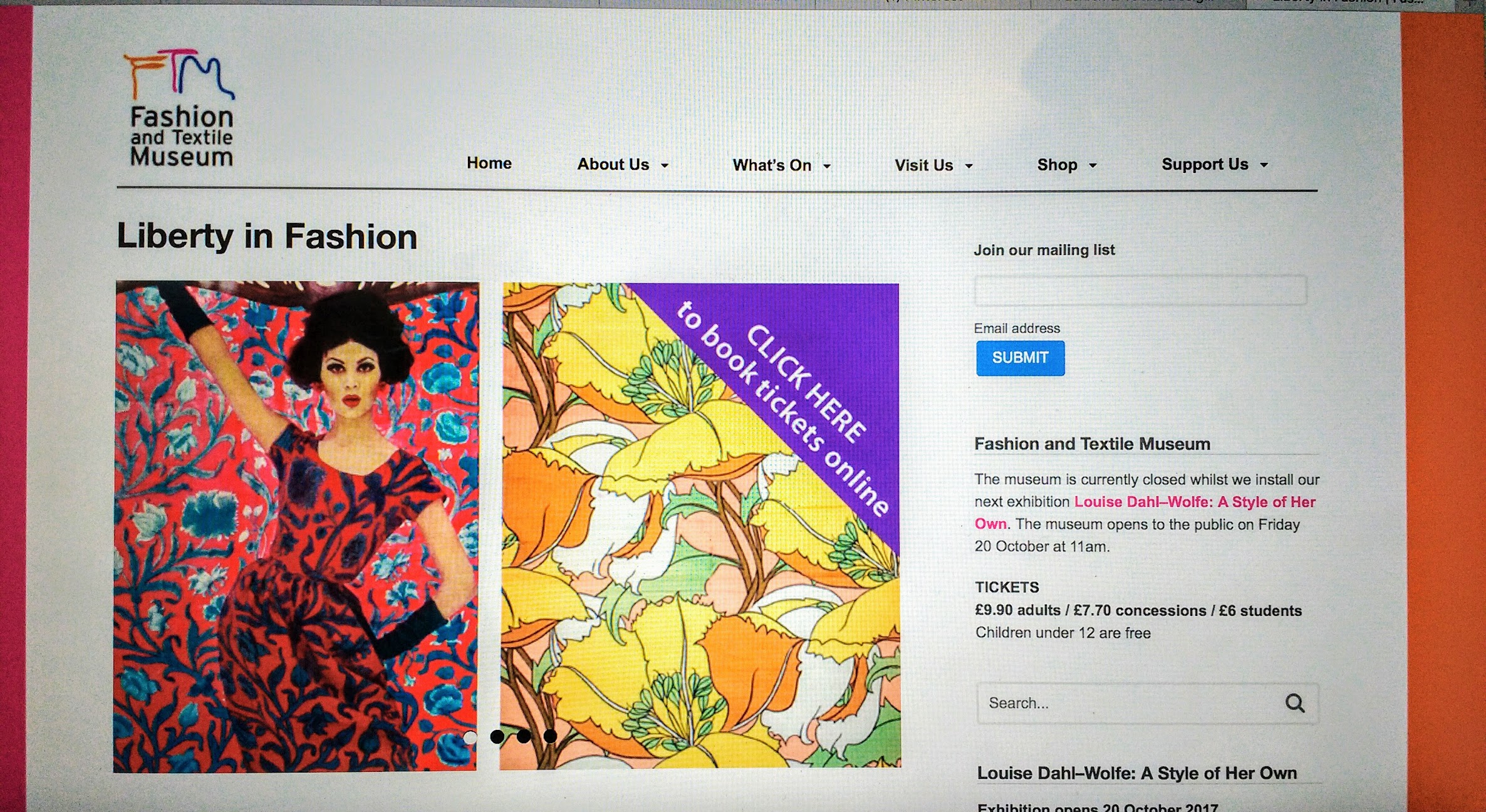
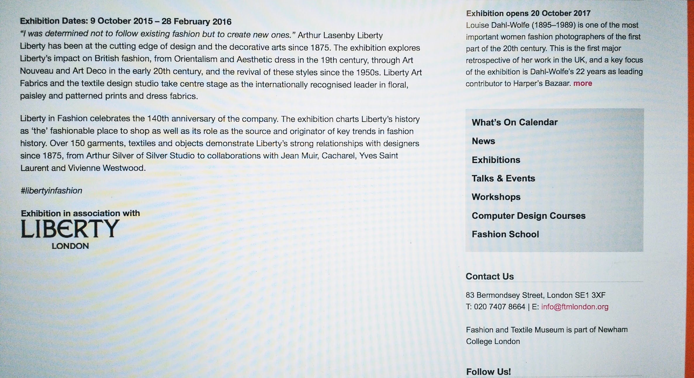
The first task ‘Online resources’ helped me to familiarise myself with the library and reliable internet sources. We were asked to find a book, website and article, caption each source and write a brief summary of the research process. I chose the brand Liberty because as a textile student I was intrigued by the company’s timeless success and popularity. During the process, I learnt how research can lead to new sources of inspiration: for example, I discovered that there had been an exhibition on Liberty at the V&A, which encouraged me to be more aware of current shows and events. The second task ‘Academic Integrity’ taught me to correctly reference any quotes or imagery that I used in my work to avoid plagiarism. Although I didn’t find these tasks very interesting, they were beneficial to the extent that they enabled me to identify relevant and reliable sources of information, but I wanted to try something a little more challenging.

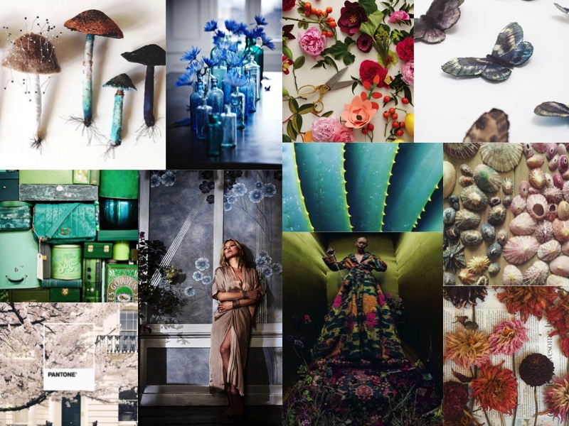
For the next task ‘Visual Research’ we had to choose a designer and identify at least ten references that influenced their work, then write a short analysis of one selected image. I chose to learn more about the textile artist Clarissa Hulse: her colourful and flamboyant style appealed to me and as she’s a contemporary designer, I thought that I could use social media platforms to support my research. I struggled a bit with this task, possibly because I wasn’t satisfied with the relevance of the images I’d used. I concluded that my choice of designer had limited the range of available sources and had I researched a more celebrated brand the work would have been easier. The analysis, however, was more interesting as I love deconstructing designers’ work and acquiring a more informed knowledge of the piece.

The ‘Reflective writing’ task was a little more time-consuming but perhaps the most interesting topic we were given. Sanda Miller’s chapter on “Taste, Fashion and the French fashion Magazine” included a lot of background history that I was previously unaware of, and so appreciated all the more! I thoroughly enjoyed this task as it presented many interesting issues and concepts. But I felt I had too much to say and my writing perhaps suffered for it. If I had focused on one or two specific ideas from the text, my analysis would have been clearer and more structured.

The most recent task we were given, ‘Ethical issues’, I found the most difficult to write about. I feel very strongly about this topic and struggled to keep my analysis relevant and objective. It definitely enhanced my awareness of contemporary issues whilst underlining the ethical responsibility of designers who have a very public role in society.


Throughout this module, I have learnt to communicate my ideas in an academic context by practising self-expression in a more structured manner. In my studio practice, I have come to appreciate the library as a rich and reliable source of information. I also hope to use the research skills I have acquired to gain a more extensive knowledge of the industry in which I hope to work.
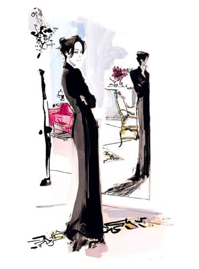
Task 9/10: Ethical Issues

This advertisement for the men’s tailoring company Duncan Quinn is both disturbing and offensive. It first appeared in 2008 causing much anger and resentment and quickly became known as the “strangler” ad.

The primary figure is, of course, the man: dressed in one of Duncan Quinn’s suits with the shirt collar slightly askew, he is the incarnation of the designer’s phrase “everyone’s part gentleman part rogue”, though the term seems a little mild in this case. Although his torso is still turned to the body in front of him, his clean-shaven face is directed towards the camera, staring at the viewer with a smirk. His posture is casual, holding the tie that strangled his victim loosely in one hand whilst almost posing for the photo. He appears oblivious to the horrific scene, that seems to have taken place on the hood of an expensive car. The setting also lends to the appearance of debauchery and libertinism.

The second figure is the woman. She is laid on her back with her face yanked backwards by the tie, and the position of her arms and legs suggests that she had tried to lift herself up to loosen the pressure around her neck, before hitting her head and bleeding onto the car bonnet. She is dressed only in white lace lingerie, and the fact that her face is forcefully hidden from view accentuates the impression that she is nothing but a sex object, placed there to attract the attention of possible clients.

The entire scene is disgusting and shocking: the presence of the well dressed ‘gentleman’ sneering over his victim and the woman dragged violently onto the car are pornographic and completely irrelevant to the product supposedly being advertised. The only message that might be interpreted from this image is that Duncan Quinn suits enhance men’s superiority over women, to the point where she is a disposable object only there for him to relieve his aggression and sexual impulses. Quinn told interviewer Jill Di Donato that inspiration for his design work comes from “movies and music, cops and robbers”. Perhaps in this image, he was trying to create a James Bond feel: it’s centred on a well-dressed man surrounded by expensive automobiles. But everything about this advertisement just screams violence and abuse. Mary Wollstonecraft, a late eighteenth-century writer and advocate of women’s rights, condemns the female subjugation to man in her famous book ‘A Vindication of the Rights of Women’: “Rousseau declares that a woman should never, for a moment, feel herself independent, that she should be governed by fear to exercise her natural cunning, and made a coquettish slave in order to render her a more alluring object of desire, a sweeter companion to man, whenever he chooses to relax himself.”

Furthermore, in addition to the offensive and degrading figure of the woman, the way the man is portrayed could also cause resentment: such an image naturally arouses feminist groups and journalists, and once again sparks the campaign against men as the ‘dominating’ sex. Duncan Quinn seems to be promoting his suits as a key to unlocking the “rogue” inside every man, consequently directing people’s attention to cases of abuse, at the expense of the innocent.

Of course, this advertisement is ethically unacceptable. It is offensive to both sexes and as a world-class designer brand, Duncan Quinn has a corporate responsibility for the respect and protection of people’s rights.


BIBLIOGRAPHY

‘The Art of Style According to Duncan Quinn’  video interview with Jill Di Donato, Culture Trip website, updated 23rd May 2017 [accessed 4th December 2017] https://theculturetrip.com/north-america/usa/new-york/articles/the-art-of-style-according-to-duncan-quinn-2/

Wollstonecraft M. (1792)  A Vindication of the Rights of Women (Chapter 2 §24),  London, Printed for J. Johnson

Task 7/8 Reflective Writing ‘Taste, Fashion & the French Fashion Magazine’

In this text Sanda Miller demonstrates that fashion magazines have a double function in society: they are not only “repositories of the progress of fashion and culture”, but also “self-styled barometers of taste”. She bases her argument on the historical evolution of the fashion magazine, that she traces back to its origins in 1672 (Jean Donneau de Visé’s ‘Le Mercure Galant’). Given that its apparition coincides with the birth of philosophical aesthetics and the emergence of the art critic in the midst of the Salons, Sanda Miller proposes that the role of the fashion magazine is more complex than a simple portrayal of popular dress. It can instead be a testimony of dramatic transformations in society. Furthermore, Miller concludes that it is the only source to encompass every aspect of change in eighteenth-century society, thus justifying the attribute “mirrors of their time”.

Miller reflects on the role and meaning of fashion as it evolves through the centuries. To take her idea further, it is also important to understand it’s significance today.
Ayesha Barenblat, the founder of Remake and slow fashion enthusiast, published an article in the Huffington Post on 26th July 2017, entitled “Three Ways the Fashion Industry Is Changing the World”. She describes her family’s background in clothing factories, stating firstly that fashion is for her “a way to create jobs with dignity that empower women”. She then goes on to say that fashion can be considered as “an extension of our identity” in that our choice of clothing and accessories can define (to a certain extent) our values and personality. Ayesha Barenblat views the role of fashion from a more subjective angle that Sanda Miller, but it is no less true.

As she demonstrates the theoretical worth of fashion, Miller discusses the subject of taste. Her definition of the concept (based on the writings of the eighteenth-century philosophers) describes taste as “an inborn special evaluative faculty”. But this seems to defeat the purpose of fashion magazines: why do we need to be told what is tasteful if this faculty is “inborn” and universal? Why has ‘fashionable’ become a synonym of ‘tasteful’? It could also be said that the idea is contradictory to another aspect of fashion that is personal expression: surely we all have our own individual tastes and shouldn’t have to adhere to popular preferences? In response to this, Jukka Gronow paraphrases Colin Campbell in her book ‘The Sociology of Taste’, stating that fashion “can be said to form a universal standard of taste which, however, allows for the singularity and subjectivity of individual tastes”. Fashion has become another word for popularity but it does allow for different styles that cater to individual preferences. The charm of novelty and status that fashion endows ensure it’s continual influence on our society. But when Miller goes on to say that “fashion is a functional equivalent to the principle of good taste”, her argument seems a little thin. It is evident that fashion forms a standard of taste but how to determine whether it is good taste remains unclear. A little further on Miller does nuance the statement by focusing on the word “functional”, but the question remains: how do you determine the intrinsic value of an object?

And so the appearance of philosophical aesthetics does, as pointed out by Sanda Miller, seem linked to the development of the fashion magazine and the concept of taste that it presented. But then if her final claim that fashion magazines are “mirrors of their time” is also true, what does current fashion, often described as rich and diverse yet transitory, say about our society?

BIBLIOGRAPHY
• Barenblat A. “Three Ways the Fashion Industry Is Changing the World” Huffington Post, 26th July 2017
• Gronow J. (1997) ‘The Sociology of Taste’, (Chapter: The Social Function of Style and Fashion), London, first published by Routledge

Task 5/6: Visual Research

Clarissa Hulse Mood board

De Gournay: Design Collaboration 2017 ‘Anemones in Light’
Portrait of Kate Moss by Nikolai von Bismarck
Available from https://degournay.com/kate-moss-de-gournay-design-collaboration-2017-‘anemones-light’
[Accessed 2 November 2017]


I recently discovered the textile designer Clarissa Hulse and immediately fell in love with her colourful and flamboyant style. Strongly inspired by nature, her contemporary botanical designs include luxurious materials like velvet and silk. I did some further research on her influences and came across this portrait of Kate Moss taken by Nikolai von Bismarck.

Kate Moss is standing in front of a new wallpaper design called ‘Anemones in Light’ that she designed herself. She worked with de Gournay to create this piece that depicts the anemone flower in muted blue-grey tones and beams of light printed with sterling silver metal leaf.

Leaning slightly off centre, the model mirrors the shape of the bouquet on the left and breaks from the perpendicular lines created by the panelling. Posing in a nude coloured, silk dressing gown with her face tilted back towards the light, she gives the image a luxurious and sensual feel. By using strong contrasts mixed with cool, silvery tones, the photographer was able to create that chic, glossy look that is recurrent in de Gournay designs. The whole composition of the photograph is carefully thought through, from colour to line and shape: the scene is a harmonious blend of contrasts.

Nikolai von Bismarck has photographed a number of celebrities and in this image he captures the elegant style of de Gournay, one of the high-end designer brands in the décor market. The marriage of classic, artisanal Chinese style and modern, sexy glamour is studiously and artistically depicted.

Academic Integrity & Plagiarism Task 3&4: David Downton

Downton, D. (2010),  Masters Fashion Illustration.  China:  Laurence King Publishing

Downton, D. (2010), Masters Fashion Illustration. China: Laurence King Publishing

I have always enjoyed researching fashion illustration both as a means of promoting designs and as an art in itself. I found this book by David Downton who had put together a collection of illustrations by fashion artists across the years. I particularly liked this piece by Bernard Blossac: the seemingly effortless lines and shading give the drawing a sense of ease and refinement.  I love how Blossac uses nothing but pencil to accentuate the elegant curves and shape of the garment, whilst evoking a whole world of luxury and style. As I progressed through the book I appreciated more and more the commentaries that Downton had written beside each piece, and I decided to learn more about some of his own work.


David Downton website (by Oro Design) Dior Couture 2010 Available from:  http://www.daviddownton.com/couture/ [Accessed 23rd October 2017]

David Downton website (by Oro Design)
Dior Couture 2010
Available from: http://www.daviddownton.com/couture/
[Accessed 23rd October 2017]

I went to David Downton’s own website and found an interesting interview that he’d had with Tony Glenville. He describes his style of draughtsmanship as “controlled spontaneity”. In his work, he aims to achieve strong drawing skills and fluidity, saying that “when the drawing looks right I start to eliminate, to de-construct if you like. My mantra is to keep working until it looks effortless.”


IMG_20171023_183707

By Vogue magazine  (2011) David Downton: 15 Favourite Fashion Illustrations 17th February (accessed via webpage: http://www.vogue.co.uk/gallery/david-downton-15-favourite-fashion-illustrations )

By Vogue magazine (2011)
David Downton: 15 Favourite Fashion Illustrations
17th February
(accessed via webpage: http://www.vogue.co.uk/gallery/david-downton-15-favourite-fashion-illustrations )

Downton’s bold and classy fashion illustrations have featured on the covers of high-end fashion magazines. I researched commissions he’d done as well as exhibitions and found an article in Vogue magazine called “David Downton: 15 Favourite Fashion Illustrations”. It features fifteen portraits of various models and actresses including Cate Blanchett, Amanda Harlech and Paloma Picasso, and presents a rich collection of artwork that ranges from minimalistic monochrome to big and colourful brushstrokes.

Learning how fashion designers’ work is developed and brought to life by different artists cast a new and exciting light on my perception of art and design. The idea that an artist’s creation can constantly grow, that it can be transformed by different media and developed into a whole new style highlighted the constant metamorphosis that art undergoes and how it touches each individual in a personal and unique way.

Research and Communication Skills Task 1&2: Liberty Prints


Clockwise Margaret Annie, Edna, Ciara Print designs created in-house at Liberty, Image from the book Print & Pattern Nature by Bowie Style, published 2017

Clockwise Margaret Annie, Edna, Ciara Print designs created in-house at Liberty, Image from the book Print & Pattern Nature by Bowie Style, published 2017

Having previously admired Bowie Style’s book collections of artists’ work, I found these bright and cheerful prints by Liberty in a book I have at home. It provided a brief history of the brand as well as Liberty’s design processes. The company was founded in 1875 by Arthur Lasenby Liberty, hence the designers are able to draw on a vast collection of artwork from Liberty’s renowned pattern archive. Their annual Open Call event, inviting new designers to collaborate with the brand, also means that whilst maintaining their characteristic style, Liberty is able to bring fresh and exciting designs to each collection.


Betsy Dress 2-6 Years and Carolina Silk Chemise Liberty prints from http://www.libertylondon.com/uk/department/liberty-products/

Betsy Dress 2-6 Years
Liberty prints from http://www.libertylondon.com/uk/department/liberty-products/

000551082-R138592006-1

Carolina Silk Chemise Liberty prints from http://www.libertylondon.com/uk/department/liberty-products/

I then went through the Liberty London website to see how the brand sold itself to the public and found these simple-cut garments in a similar style of print. The website is home to a selection of designers, with an emphasis on Liberty products that range from fashion to food and homeware. This iconic brand uses luxury materials such as silk and bold, striking patterns that immediately set them apart from the crowd. A large percentage of their designs include floral patterns that have always been popular whilst contributing to the brand’s signature style. The fact that Liberty is so recognizable underlines the importance of designer identity. Intrigued, I looked for any previous or current exhibitions that could clarify Liberty’s timeless success.


Fashion & Textile Museum website: http://www.ftmlondon.org/ftm-exhibitions/liberty-in-fashion/

Fashion & Textile Museum website: http://www.ftmlondon.org/ftm-exhibitions/liberty-in-fashion/

Fashion & Textile Museum website: http://www.ftmlondon.org/ftm-exhibitions/liberty-in-fashion/

A search online revealed that the Fashion & Textile Museum in London had previously done an exhibition on the brand, called “Liberty in Fashion” from October 2015 to February 2016. It explored the history and development of the company, as well as its role as an international leader in the fashion industry.

“Liberty is steeped in British tradition,” said the head of the museum, Celia Joicey. “But it has always been, and still is, hugely avant-garde.”

The exhibition included garments dating back to the 19th century, Liberty-designed costumes that featured in various films and a huge selection of over 150 garments, textiles and objects. Liberty’s design influence escalated very quickly and is even credited in part for helping to develop the Art Nouveau and Arts and Crafts movements. In addition to promoting business through their website, having their work published in books and articles and featuring in exhibitions has enabled Liberty to establish itself as a leading designer brand, whose presence in the fashion industry shows no sign of diminishing.


Starting with a page from a book at home, I was able to build up a quick view of Liberty’s background history, style and international influence. In addition to finding inspiration for my work from various sources such as libraries and the internet, I feel that I have now learnt how to use these tools as a means of developing my fashion and design awareness on a much broader scale.