Author Archives: Rebecca Newsum

Task 11/12 – Summary

Whilst completing the ‘Research and Communication Skills’ tasks, I have learnt about a variety of topics within the Fashion and Textiles industry as well as how to use different sources to help with my essay writing.

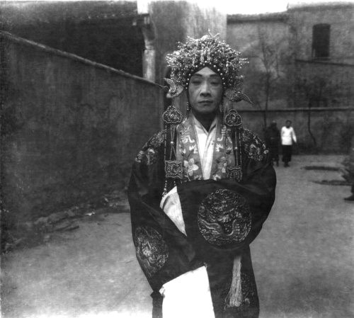
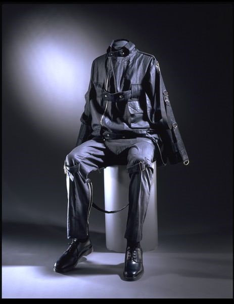
A few of the tasks involved me going to the library and finding other sources to help broaden my knowledge and back up my work. I generally found these quite challenging at times especially the ‘Reflective Writing’ task. This task required me to go out and find two other sources to critique the main article I read. I found myself wandering round the library, looking at nearly every section as I didn’t know exactly where to find relevant books. In the end, I used books I had bought with me as they related to the course and I had read them however, I had trouble locating the quotes I wanted to use so spent a lot of time flicking through the books to find them. I also found it difficult to find contrasting opinions within the different sources as most of them said similar things. A new technique I learnt was Harvard referencing, which I initially found confusing and quite time consuming as I had to keep checking which order the information went in as well as how to use it within my writing when using quotes. Another task which required multiple sources was ‘Online Resources’. This was the first task we got set where we had to find a source from a book and one online that related. I ended up restarting this task as the first time I found an image in a book from the V&A and then proceeded to find more information online from the V&A’s website which I thought wasn’t a wise use of the internet as I was technically looking at the same information. For the second time, I chose a random book and flicked through it until I found an image I liked which I found more enjoyable. However, when it came to finding an online source, I found very limited information about the image so found it hard to write about and reach the required word count. Even though the ‘Academic Integrity’ task involved me finding sources, I found it a lot easier to complete compared to the others. I think the lower word count helped a lot as I had struggled with the previous task to reach it. When completing these tasks in the future, I will make sure to plan and make notes especially when finding quotes so I don’t waste time looking through the books multiple times.

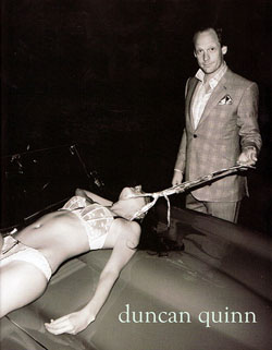
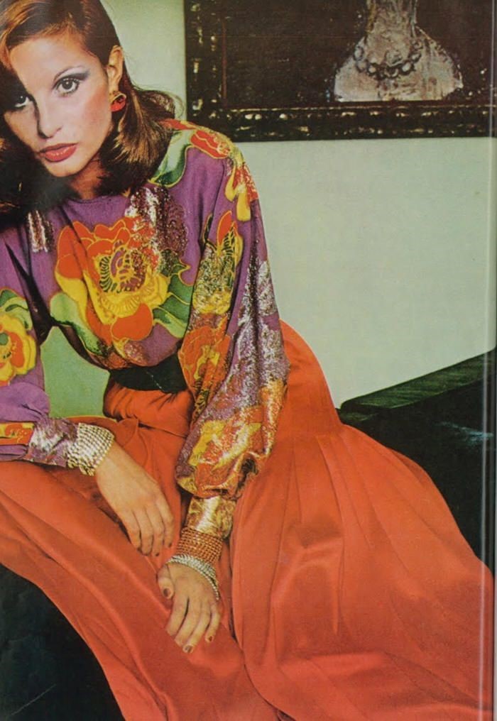
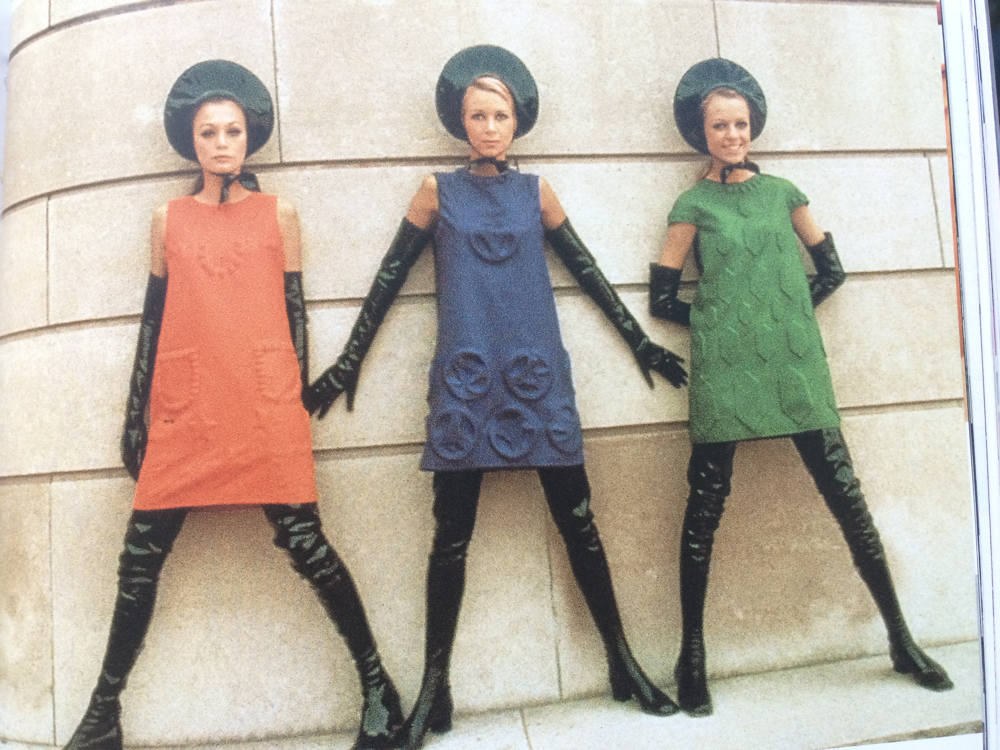
The tasks that required me to analyse an image and give my opinion I found a lot easier to complete. I enjoyed writing the ‘Ethics’ task as I found the topic really interesting so found the chosen image easy to analyse. I found finding an academic quote for this task surprisingly easy as I knew where to look for one and as it was talking about the same issue it didn’t take me too long. For the ‘Visual Research’ task, finding a designer’s inspiration was quite easy however, when I came to analyse one of the images, I found that a lot harder than I thought as I didn’t want to analyse it incorrectly. I also couldn’t find a lot of information about the artist or the painting which made it even harder for me.

Overall, I have enjoyed this module and I feel the ‘Reflective Writing’ task helped me a lot as it has taught me useful ways of finding different sources as well as ways to improve my writing. The diverse range of topics I have learnt has expanded my knowledge and understanding of the industry.

Task 9/10 – Ethics

The advertisement I have chosen is for Duncan Quinn, who is seen as a high-end tailoring company. I chose to analyse this image as I found it to be the most shocking and degrading out of the two adverts. When first looking at the image you can see a well-dressed man with a smug look on his face. You can also see a woman dressed only in her lingerie lying on a car bonnet, being pulled with what looks to be a tie around her neck like a dog on a lead. I was initially disgusted by this as the woman has been portrayed as submissive under the control of the man. The way the woman is lying on the car suggests she is perhaps unconscious as her body looks limp and lacks any sort of life. The way she is positioned on the car also suggests that she has no control of her actions and is being controlled by the male. The woman wearing only her underwear creates the impression she is a sex slave and is inferior to the male who looks as if he is somewhat proud of what he is doing judging by his expression. The contrast in how the man and woman are dressed could also show how superior the male is as he is in an expensive suit which suggests money and wealth. As well as how the two are dressed, the way in which the man is standing above the woman gives the impression of class and social status and that he has the power to control the female. I the image, the three focal points are the male, female and car which creates a mysterious feel to the advertisement. The fact that the background or rest of the car is not visible makes the whole thing a lot more unsettling as it is unknown where they are and the addition of the black and white filter creates a sinister feeling for the viewer.

As Duncan Quinn is a high-end brand, you would expect their advertisements to be more sophisticated and send out a positive image as more people would see them. However, it comes across as if brands are creating more controversial ad campaigns to put them ‘squarely in the limelight, for better or worse’. Other brands such as American Apparel have also been scrutinised for their portrayal of women in advertisements as they have often depicted ‘young women in suggestive, sometimes vulgar poses’ which has resulted in complaints. However, on the other hand, these images have been used to raise ‘public awareness of important social issues’, as well as bringing the attention of other ethical issues. In John Berger’s book ‘Ways of Seeing’, he comments about how the ‘social presence of a woman is different in kind from that of a man’ (Berger, 1972) which highlights the problem of how different men and women are perceived in society. Later on in the book, the author suggests that ‘women watch themselves being looked at’ (Berger, 1972), indicating that women are seen as an object to be admired and that they have brought this upon themselves.


BIBLIOGRAPHY:

[1] WWD (2014) Where Has It Gone? Available from:
Fashion Advertising: Controversy — Where Has It Gone?
[Accessed 27th November 2017]

[2] Berger, J (1972) Ways of Seeing, London: Penguin Classics

Task 7/8 – Reflective Writing

For this task, I decided to read the chapter from the book ‘Fashion Media: Past and Present’ by Djurdja Bartlett, Shaun Cole and Agnes Rocamora. I chose this extract because I thought the topic would be more interesting to research. After reading the chapter once, I got a rough understanding of the key themes and ideas that were discussed. One of the main ideas was about taste and how people changed the way they saw art to make it more personal to them hence the saying ‘beauty is in the eyes of the beholder’ (Bartlett et al, 2013, p.14). The Enlightenment (a movement influenced by philosophers) played a major part in getting people to have individual opinions about art instead of following tradition. This change proved that not everyone had the same likes and dislikes as it was just a ‘matter of preference’ (Bartlett et al, 2013, p.14). The Salons were introduced in 1737 and art critics were developed so people could view and enjoy the artwork that was on display. Another main idea topic was about the first French fashion magazines and how they helped to sculpt taste by telling people about dress, interiors and entertainment. Their aim was to ‘represent the latest outfits worn at the French court’ (Bartlett et al, 2013, p.17) as well as ‘representations of “real life”’ (Bartlett et al, 2013, p.17) women from different classes. After the French Revolution, fashion magazines became ‘increasingly well – informed’ (Bartlett et al, 2013, p.18) with the latest news and developments in fashion.

The concept of taste is also present in the book ‘Fashion Brands: Branding Style from Armani to Zara’ by Mark Tungate from the line ‘you can dress from head to toe in Gucci if you like – it proves you’re rich, but it doesn’t prove you have taste’ (Tungate, 2004, p.45). For me this proves the point that class doesn’t matter when it comes to fashion as just because you have money and can afford high end brands, doesn’t make you any more stylish than someone who is less fortunate. In the book ‘Adorned in Dreams: Fashion and Modernity’ by Elizabeth Wilson, it states that fashion became the way in which people displayed their ‘unique individual personality’ (Wilson, 2003, p.156). Also in the book however, it mentions about the ‘rapidly changing styles’ (Wilson, 2003, p.16) which created a negative impact as people were criticised for adapting the different styles to make them their own.  Fashion has also had bad connotations linked to it, especially for women. In ‘Adorned in Dreams’, Wilson speaks about how a female fashion writer called Doris Langley Moore tried to get men to have ‘conservative attitudes towards women’ (Wilson, 2003, p.48) as she found they had ‘coy, sometimes amusedly patronising, sometimes downright offensive’ (Wilson, 2003, p.48) opinions towards women because the majority of the writers at the time were male. The French fashion magazines also used women in a negative way to mock the victims of the French Revolution by using ‘a young lady seen from the back wearing a white muslin dress with victim-style crossed bands’ (Bartlett et al, 2013, p.20). I don’t agree with these statements as now women play a major part of the fashion industry and it’s sad to see how they were treated in the early years.

After reading and analysing the topic in depth, I have a clear understanding about how taste developed and became personal to the individual as well as the evolution of the fashion magazine in 18th century France. I have also found and acknowledged other sources that contrast and compare with the common themes and issues I felt were important.

BIBLIOGRAPHY:

[1] Bartlett, D., Cole, S. and Rocamora, A. (2013) Fashion Media: Past and Present. London/New York: Bloomsbury

[2] Wilson, E. (2003) Adorned in Dreams: Fashion and Modernity, 2nd ed. London/New York: I.B. Tauris

[3] Tungate, M. (2004) Fashion Brands: Branding Style from Armani to Zara. London/Philadelphia: Kogan Page

Task 5/6 – Visual Research

gucci1 gucci2 gucci4 gucci3 gucci5 gucci6 gucci7 gucci8 gucci9 gucci10

gucci5

Whatson, M (2015) Butterfly, Rome [Accessed 30th October 2017] Photographed by Blasetti, A

My chosen designer is Gucci. The image I chose is of a piece of artwork by Martin Whatson. It is a painting of a butterfly with colourful graffiti wings inside of a wooden frame which is hung on a wall of a derelict building. I liked this image as I liked the way the painting, which is of something natural, was placed on something manmade. I also like how the butterfly and the frame around it is in perfect condition, where as the building is a contrast with peeling paint and rust.

The artist used acrylic paint and spray paint to complete this piece. His background was a large canvas measuring at 80cm x 101cm. Whatson used spray paint to create the graffiti style patterns within the wings as well as the thicker black areas of the butterfly, shown by the small specks around it which gives the effect of shadowing. Behind the butterfly, is a light wash of colour with faint white lines painted over the top to create texture and to make it realistic like the butterfly has landed on something. The photographer, Alberto Blasetti, has shot the image at eye level with the art work slightly off centre. He has created a sense of depth in the photograph by including the walls of different rooms in the building. The use of the wide angle gets the viewer to look at the whole image instead of just focusing in on the art, which has become embedded in the photograph. From looking at Blasetti’s other images in his ‘Art’ collection, I have noticed a similarity in the angles of which the photographs were taken. The majority of the shots have been taken at eye level however, the images of art work taken in a gallery have been taken at a side angle to include the shape of the room. I have also noticed that all the other photos have a white background so the eye focuses on the art however, with the outside butterfly image, the photographer has purposely used it as part of the whole composition.

Task 3/4 – Academic Integrity

IMG_1411IMG_1401

Buxbaum, G (2005) Icons of Fashion: The 20th Century.
London: Prestel.

I decided to base this research task around fashion in the 1960s as I am interested in the different styles created throughout the decade. I started off by going to the library and flicking through various books until I found an image that caught my eye. The book I chose was ‘Icons of Fashion: The 20th Century’ by Gerda Buxbaum, which included information about 1960s fashion that I wanted to explore further. I also chose this book because I noticed one of the contributors was Christopher Breward who is the head of research at the Victoria and Albert museum, so I know all the information would be correct. I selected an image which shows a few minidresses designed by Pierre Cardin as I liked the colours and 3D patterns created within the garments.

pierre

V&A Museum (2016) Pierre Cardin. Available from:
http://www.vam.ac.uk/content/articles/p/pierre-cardin/ [Accessed 21st October 2017]

I then wanted to find out more about the designer of the dresses so decided to find a website for more information. I found a page on the V&A’s website which gave details about the designer, how he set up his own business and his inspirations behind the designs. I chose the V&A because I know it is a reliable source and the information on the website would be correct.

telegraph
The Telegraph (2011) Pierre Cardin: a history. The Telegraph, 21st October

I then went and found a newspaper article about the designer. I came across an article called ‘Pierre Cardin: a history’ which included a timeline of events that happened in his life from 1922 up until 2010. I chose this newspaper because the layout was easy to read and the addition of the years gave me a better understanding, even though the information wasn’t that detailed.

Task 1/2 – Online Resources

IMG_1385

Photograph of Vivienne Westwood in 1977, book chapter ‘Outsider’, photographer unknown Blackman, Cally (2012) 100 Years of Fashion, London

The book I started off with was ‘100 Years of Fashion’ by Cally Blackman. I liked the look of this book because it went through a lot of the different styles in the various decades and included iconic photographs from them. I flicked through the pages and came across a photograph of Vivienne Westwood from 1977 which caught my eye. I was intrigued by the style of the clothes and wanted to find out more about the main influences at the time as well as the designers inspiration. After some further research, I found out that the ‘Bondage Suits’ were part of Vivienne Westwood’s Spring/Summer 1976 collection and comprised of a matching trouser and jacket set. Westwood was inspired by elements of combat and fetish wear but mainly influenced by Punk which was popular with musicians at the time.

suit

‘Bondage Suit’ S/S 1976 By Vivienne Westwood and Malcolm McLaren https://collections.vam.ac.uk/item/O72586/bondage-suit-vivienne-westwood/

As the book had little information on the collection, I then started to search the internet for more information on the garments. I decided to look at the V&A collections as I knew it was a trustworthy source and came across a suit similar to the one worn in the original image. It was featured in an exhibition called ‘Vivienne Westwood: Punk, New Romantic and beyond’ which centred around Vivienne Westwood and her involvement in the Punk era where she created her trademark look. After reading further, I found out that she created garments that she and McLaren sold to young people who were brave enough to wear the edgy style. The use of imagery on the garments were often seen as controversial as they show unclothed parts of the body as well as images that were classed as pornographic. Also the use of a photograph of the Queen with a safety pin through her mouth and a quote saying ‘she ain’t no human being’ was seen as a rebellion against the Royal Family.

https://www.vam.ac.uk/articles/vivienne-westwood-punk-new-romantic-and-beyond