Author Archives: Max Evans

Summary

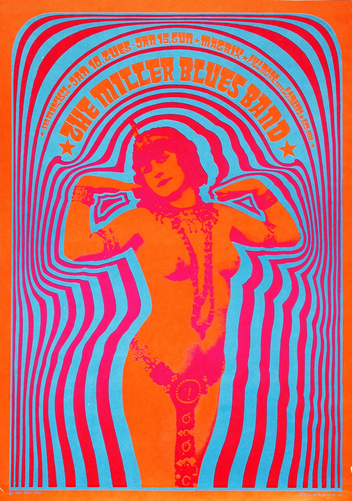
During this semester the Research and Communication Skills course has broadened my view on graphic arts immensely. Improving on my contextual knowledge of how and why art movements and various other styles came through has been extremely empowering. I feel that knowledge and understanding is where all good design comes from so for me it’s paramount for my own practice and my career as a whole.

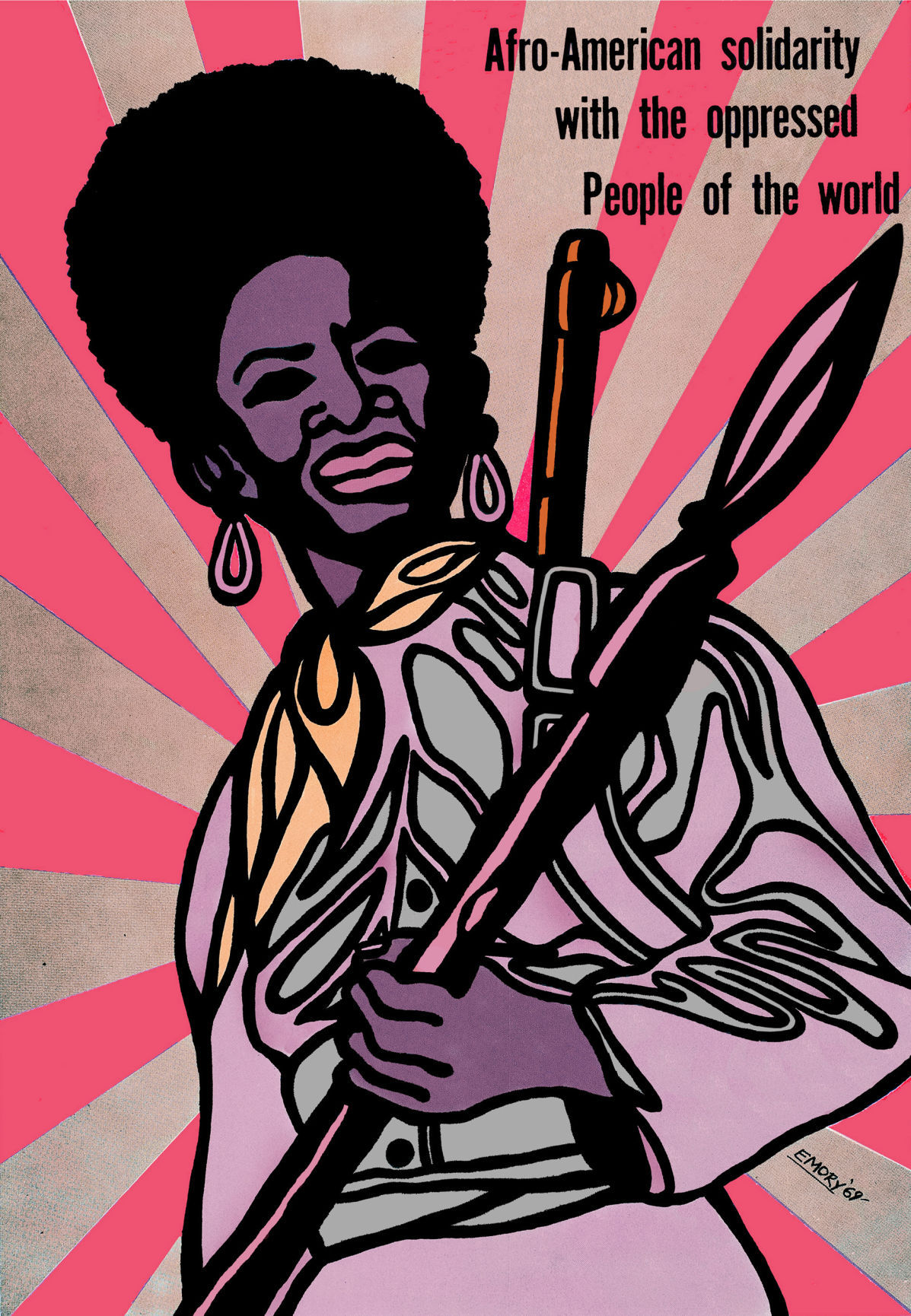
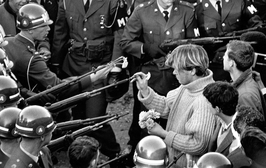
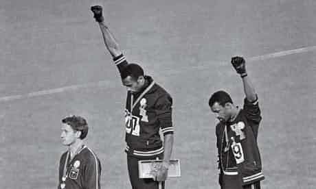
I have found the use of graphic design has played such a huge part in our society, good and bad. The bad use of design from the confusion at Palm Beach county polls where Al Gore supporters mistakingly voted for Pat Buchanan due to the poorly executed layout by Theresa LePore. As well as accelerating the civil rights movement by information being spread to the people on the masses. Emory Douglas, a graphic artist for the Black Panthers, was able to spread the words of their manifesto and spread propaganda aimed at the police, shifting the movement in huge ways. Motifs like the black power salute are still being used to this day and have been adapted for various uses.

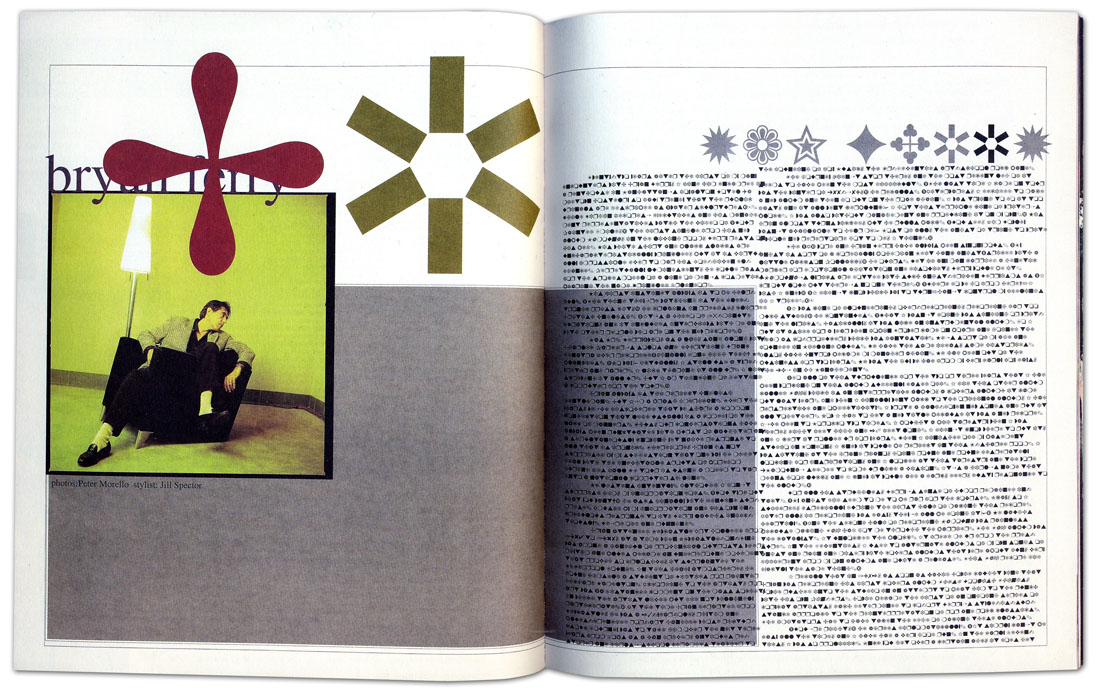
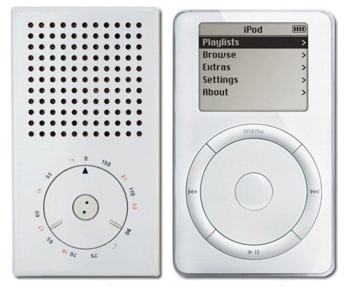
The swiss designers from the modernism movement really made me think about what good graphic design is. Dieter Rams ten principles for good design made a lot of sense to me therefore I have began to implement the ideas into my own practice.

  1. Good design is innovative
  2. Good design makes a product useful
  3. Good design is aesthetic
  4. Good design makes a product understandable
  5. Good design is unobtrusive
  6. Good design is honest
  7. Good design is long-lasting
  8. Good design is thorough down to the last detail
  9. Good design is environmentally friendly
  10. Good design is as little design as possible

I found it quite amazing that I have not been the only one inspired by Dieter Rams work, as has the designers at apple. Consequently very closely replicating some of Rams work in the early editions of apple products. Researching this in week 4, I found both a compliment and an insult of his work, going against his own principle of good design is honest. Learning and seeing the shift between Modernism to Postmodernism has been very interesting. Although Postmodernism cannot be directly defined, I can now strongly say I understand the basis in which it was built.

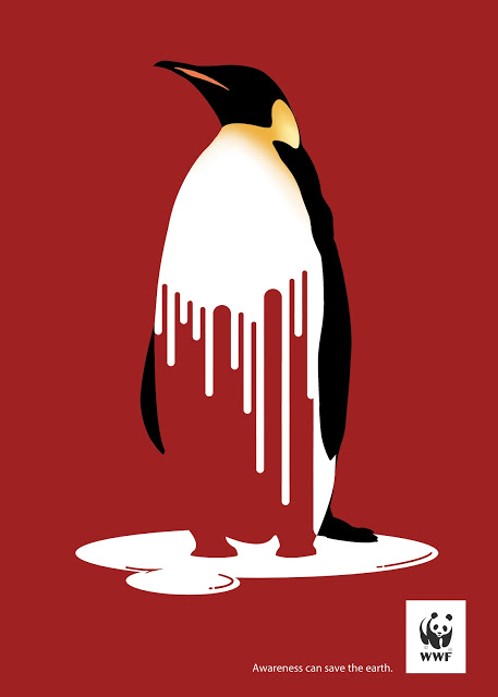
The weekly tasks I have completed have allowed myself to think about what kind of design I want to be and how I want to impact people. In recent tasks I have been drawn to simple designs with complex messages. The WWF global warming poster I analysed is extremely effective and does the job it’s supposed to, connect to the audience and raise awareness of the impacts of climate change. Through this journey I have been able to conclude for myself what pathway I want to follow for the rest of my degree, Graphic Design. However I welcome the use of other practice as I want to continue my love for Photography and learn more about Motion Graphics.

Rams, D. (2013). Ten principles for good design | Design Principles FTW. [online] Designprinciplesftw.com. Available at: http://www.designprinciplesftw.com/collections/ten-principles-for-good-design [Accessed 7 Dec. 2017].

The Guardian (2012). Mexico City Olympics. [image] Available at: https://www.theguardian.com/world/2012/mar/30/black-power-salute-1968-olympics [Accessed 7 Dec. 2017].

Publish or Perish!

Within the Abstract series made for Netflix, Planton, a photographer opens the film with ‘what’s important is the story, the message, the feeling, the connection, how do you make this reach people? It’s a combination of graphic simplicity and the power of spirit and soul.’ The soul purpose of Graphic Design is to portray a message to an audience through typography and image. A well executed piece of graphic design has the power to change the fait of history as demonstrated with Emory Douglas’ work.

‘Emory Douglas was an integral part of the Black Panther Party, joining as minister of culture in 1967 and designing artwork that became potent symbols of the movement.'(The Guardian) The Black Panthers stood for human rights for everyone, they promoted gender equality and many women were members of the movement. Gender roles were often swapped with a woman in the poster shown holding a spear and a gun strapped to her shoulder and men would often cook free breakfast for children. Douglas certainly made an impact upon the western world at the time as well as in the present. receiving an AIGA Medal for his work ‘recognised for his fearless and powerful use of graphic design in the Black Panther Party’s struggle for civil rights and against racism, oppression and social injustice’ (K.Wolgamott). The black panther party were so influential and seen as a threat to the FBI, consequently the movement was destroyed.

Another organisation that use the power of graphic design in their favour to convey their messages are WWF

This poster convoys the effects of global warming on a few levels. The melting of land ice and the loss of biodiversity across alpine and tundra regions. This piece of graphic design is very clever in how it shows its message. The red background contrasts with the white melting ice/penguin resulting in what looks like dripping blood, symbolising the death of fauna due to the loss of habitat. The organisation also uses an animal that is not necessarily a keystone species but creates a connection with the audience. A cute and cuddly animal in danger will create that bad feeling towards the audience and in turn will create more of an impact.


The Adbusters Media Foundation is a Canadian non profit organisation founded in 1989 in Vancouver. Their manifesto follows ‘We are a global network of artists, writers, musicians, designers, poets, philosophers and punks trying to pull off a radical transformation of the current world order.’ (Adbusters) Taking the idea of the Mcdonalds ‘happy meal’ and asking the question ‘Are we happy yet?’ next to a massively oversized burger, they are addressing the idea of consumerism and asking us, are trans national corporations really making our lives any better in quite a powerful way.

Adbusters | Journal of the mental environment. (2017). About – Adbusters | Journal of the mental environment. [online] Available at: https://www.adbusters.org/about/ [Accessed 7 Dec. 2017].

Adbusters ‘Are we happy yet?’. (2013). [image] Available at: https://dshiellsedwards.wordpress.com/2013/10/20/adbuster/ [Accessed 7 Dec. 2017].

Anon, (2017). [image] Available at: http://mindblowingresources.blogspot.co.uk/2012/09/30-mind-blowing-posters-against-climate.html [Accessed 7 Dec. 2017].

Douglas, E. (2015). Afro-American solidarity with the oppressed People of the world. [image] Available at: http://journalstar.com/entertainment/visual-art/black-panther-minister-of-culture-emory-douglas-on-graphic-art/article_5e37c607-88bc-553a-824e-a4cd8af1f8c9.html [Accessed 7 Dec. 2017].

Wolgamott, K. (2015). Black Panther Minister of Culture Emory Douglas on graphic art and social change. [online] JournalStar.com. Available at: http://journalstar.com/entertainment/visual-art/black-panther-minister-of-culture-emory-douglas-on-graphic-art/article_5e37c607-88bc-553a-824e-a4cd8af1f8c9.html [Accessed 7 Dec. 2017].

Postmodernism

‘In art, postmodernism was specifically a reaction against modernism, which had dominated art theory and practice since the beginning of the twentieth century. The term postmodernism is also widely used to describe challenges and changes to the established structures and belief systems that took place in Western society and culture from the 1960s onwards.’ (Tate) Within the ‘classic’ style of post modernism design I think of the multiplicity that combines various styles into an ordered chaos including styles of ed fella, April Greiman and frank gehry.

Designers deconstructed the norm and a paradigm shift began from straightforward answers in modernism to questioning what was in front of you in post modernism. German designer Wolfgang Weingart is a pioneer of graphic posters that used these ideologies into his practice. Getting rid of the grid system and ordered typography, shifting towards a fragmented design. Emphasizing on design for the designer rather than for the user. The focus of the work was

‘The semantic value of design, rather than its utilitarian qualities. In other words, it is the meaning of a product, rather than the uses to which it is put, that is the primary criterion in its conception and use.’(J.Heskett 2002)

Another very good example of this is David Carsons spread on musician bryan ferry in ray gun magazine. Upon reading the article, Carson found it tiresome and so as a solution, he converted the text into Zapf Dingbats typeface, which is made up of symbols rather than letters. This was going against all the rules, leaving the article illegible and following the characteristics of post modernism. Nonetheless, the text was presented in an understandable font at the back of the issue with the asterisk motif.

The Postmodern movement influenced the western world on a huge scale, from art, design and philosophy. Within product design, taking on the movement created open doors for designers to be free from their normal boundaries. Objects took on arbitrary forms, which favored form over function but justified by their meaning. Italian company Alessi along with a plethora of household utensils, presented the ‘Juicy Salif’ designed by Philippe Starck. Alessi describe the product as ‘A truly iconic object and symbol not only of Philippe Starck but of Alessi itself, this citrus squeezer – as revolutionary as it is surprisingly functional’ (Alessi) However the product is exceptionally lacking in its practical use and has become more of a fashion statement.

Alessi.com. (2017). Juicy Salif – ALESSI. [online] Available at: https://www.alessi.com/gb_en/juicy-salif.html [Accessed 6 Dec. 2017].

Carson, D. (n.d.). David Carson Ray Gun. [image] Available at: https://processandskills.com/2013/04/21/david-carson-and-his-notorious-use-of-dingbats/ [Accessed 6 Dec. 2017].

Csun.edu. (2017). David Carson. [online] Available at: http://www.csun.edu/~pjd77408/DrD/Art461/LecturesAll/Lectures/PublicationDesign/DigitalTimes/David-Carson.html [Accessed 6 Dec. 2017].

Heskett, J. (2002). Design: a very short introduction. New York: Oxford university press inc.,New York, p.38.

Juicy Salif. (n.d.). [image] Available at: http://store.alessi.com/aus/en-gb/catalog/detail/juicy-salif-citrus-squeezer/psjs [Accessed 6 Dec. 2017].

Tate. (2017). Postmodernism – Art Term | Tate. [online] Available at: http://www.tate.org.uk/art/art-terms/p/postmodernism [Accessed 5 Dec. 2017].

Weingart, W. (n.d.). [image] Available at: http://www.historygraphicdesign.com/the-age-of-information/postmodern-design/538-wolfgang-weingart [Accessed 6 Dec. 2017].

Movers and Shakers – Counterculture

The counterculture movement of the 20th century was kick started in the 1960s and marked the last half of the previous century as a time of activism, social movements and arts. In order for something to be counter to something, the other needs to exists, and in this case, it is a mainstream culture of the US and Western and Northern Europe of that time.

Bernie Boston | Flower power | 1967

Bernie Boston, an American photographer took a black and white shot of a Vietnam War protestor, also in front of the Pentagon. Named “Flower Power,” a young man gently inserts the stem of a flower into the barrel of a gun. This era was in opposition to war and a protest against the Vietnam war. Many graphics and pieces of art were designed with an emphasis on ‘get out america’ and ‘peace and love’

This was a time of sex, drugs and rock n roll. The contraceptive pill, women liberation and the mini skirt were all on the rise and all this was being demonstrated within the art and graphics being created underground.

Dan Stiles| Arctic Monkeys | 2014

Victor Moscoso | Neon Rose #2 | 1967

Neon Rose #2 ‘My first psychedelic pin up and the first to carry the ‘Neon Rose’ name. One of my more popular posters back then and now. It was printed 3 times.”

The psychedelic art style influenced by hallucinatory drugs, such as LSD, with design motifs including abstract swirls of intense colour usually opposite ends of the wheel chart with curvy typography with an Art Nouveau influence. This style has had an effect on, not just on art, but also on many aspects of pop culture. This included style of dress, language, art and literature. This style of design has had a lasting impact on contemporary practitioners. Above is a poster created by an American graphic designer, Dan Stiles, for a Arctic Monkeys concert at Artpark Outdoor Ampitheater on June 18, 2014. This has a clear reflection of 60’s psychedelia.

Martin Sharp | Exploding Hendrix | 1968

‘Felix’s poster collection was very personal; he collected what he liked, rather than obsessively ticking things off a list. As a consequence he concentrated on artists he really admired such as Martin Sharp, the first graphic designer of Oz as well as a good friend and the principal artist for Big O posters. His Exploding Hendrix, based on a photograph by Linda Eastman – soon to be McCartney – is among the most evocative and iconic images of the 1960s’

Boston, B. (1967). Flower Power. [Photograph].

Moscoso, V. (1967). Neon Rose no.2.

Sharp, M. (1968). Exploding Hendrix.

Stiles, D. (2014). Arctic Monkeys. [Screen print].

the Guardian. (2017). Kiss the sky: psychedelic posters of the 60s and 70s – in pictures. [online] Available at: https://www.theguardian.com/artanddesign/gallery/2016/oct/06/psychedelic-posters-1960s-cultural-traffic-felix-dennis [Accessed 21 Nov. 2017].

Widewalls. (2017). Counterculture in Society and Art. [online] Available at: https://www.widewalls.ch/counterculture/ [Accessed 21 Nov. 2017].

Is it possible to be truly authentic?

Is it possible to be truly authentic?


Designers and artists all have their own way of working however have no choice but to let every piece of information around them sink in, to then regurgitate that information in their own way. Michael Bierut talks about this even in his own work in ‘Seventy-nine Short Essays on Design’

‘Did I think of it consciously when I designed my poster? No, my excuse was the same as Kaavya Viswanathan’s: I saw something, stored it in my memory, forgot where it came from, and pulled it out later-much later-when I needed it.’

This happens in various degrees in art and design all the time. Innovation is what design is built on. In the 1960s, Braun became renowned for its iconic designs for its devices created by Dieter Rams. Rams later wrote the ten principles of good design, of which went on to influence many designers. Jonathan Ive, Apple’s SVP of Industrial Design since 1997, is a good example.


Good design:

  • Is innovative.
  • Makes a product useful.
  • Is aesthetic.
  • Makes a product understandable.
  • Is unobtrusive.
  • Is honest.
  • Is long-lasting.
  • Is thorough down to the last detail.
  • Is environmentally friendly.
  • Is as little design as possible.


Braun T3 pocket radio (1958) and first-generation iPod (2001)

It is very clear that the Braun devices have influenced Apples. They have an undisputed modernist style influencing them in confirming principles of modernism holding value in contemporary practice.


Bierut, M. (2012). Seventy-nine short essays on design. New York, NY: Princeton Architectural Press, p.198

Braun T3 pocket radio (1958) and first-generation iPod (2001). (2012). [image] Available at: https://cdn.cultofmac.com/wp-content/uploads/2012/09/tumblr_lvfwsw1rFd1qzywsco1_500.jpg [Accessed 8 Nov. 2017].

Technology is the mortal enemy of art

Technical innovation is a hugely important part of society and will always move forward no matter what your industry. We are curious creatures striving to learn and push boundaries. Some would say technologies are making our race lazy, some would go as far to say ‘technology is the mortal enemy of art’ (A. Rodchenko, V. Stapanova, and A. Gan). As written in ‘Who we are’ manifesto of the constructivist group, the artists argue that technology has taken something away from art. I believe there are reasons for and against this.

‘This is I, the machine, manoeuvring in the chaotic movements, recording one movement after another in the most complex combinations, freed from the boundaries of time and space, I coordinate and and all points of the universe wherever I want them to be. My way leads towards the creation of a fresh perception of the world, thus I explain in a new way a world unknown to you.’

man-with-the-movie-camera

This was taken from a manifesto written by Dziga Vertov, a Russian film director who made a film called ‘The man with a movie camera’ (1929) His film was groundbreaking and all about the editing of moving images from obscure viewpoints. Focused on ordinary objects and scenes, yet from angles inspired by the constructivist movement that no one had seen documented before. The invention of the camera and other technologies has changed not only what we see but how we see it. Going back to the constructivists statement ‘ technology is the moral enemy of art’, technology has definitely changed the way we see art. As original paintings have become reproducible, they have changed in how we view them. We no longer see them hung on a wall, in their own surroundings. We can see them on our screens in an instant, in our own surroundings. ‘the meaning of a painting no longer resides in its unique painted surface, which it is only possible to see at one place at one time, its meaning has become transmittable. It has become information of a sort.'( J. Berger)

I believe that in this sense, art has lost and gained. Art can now be seen by millions of people at the same time, connecting with people and allowing them to creatively innovate. Technology has also enabled us to become efficient in our day to day life. Technology cannot create better design, but it can speed it up tremendously.

Berger, J. (1972). Ways of seeing. [image] Available at: https://www.youtube.com/watch?v=0pDE4VX_9Kk [Accessed 26 Oct. 2017].

issuu. (2014). Who We Are: Manifesto of the Constructivist Group. [online] Available at: https://issuu.com/rachelgweeks/docs/manifesto_issuu [Accessed 26 Oct. 2017].

Monoskop.org. (n.d.). Monoskop. [online] Available at: https://monoskop.org/images/6/66/Vertov_Dziga_1922_1984_We_Variant_of_a_Manifesto.pdf [Accessed 26 Oct. 2017].

Rideout, T. (2017). [image] Available at: https://themindreels.com/2017/07/09/man-with-a-movie-camera-1929-dziga-vertov/ [Accessed 26 Oct. 2017].


Squamish Valley Music Festival Posters

Dan Stiles is an artist and designer from Portland, Oregon. he has collaborated with a plethora of people from indie bands to major corporations in creating posters, identities, advertising, packaging, and limited edition collectable art. Some pieces of his caught my eye in his book ‘One Thing Leads to Another’ concentrating on the Squamish Valley music festival, which he had created posters for, three years in a row.

squamish_lg

The three day music festival had a bear for a mascot as Squamish is located in prime bear habitat, British Columbia. This is classic Dan Stiles style, clean cut shapes filled with explosive colours you have no choice to be drawn to. As this was the first poster Stiles created it has everything in about the festival. The mascot, the setting, the acts whereas the next one is a little less literal

squamish_2014_600

‘in 2013 we did a friendly bear poster, so for 2014 we decided to go for a more aggressive look’ (D.Stiles). The majority of Stiles’ work is design as art yet serves a purpose at the same time. His work normally revolves around the art and so on a communication level it isn’t the most accessible compared to a straight typographic poster.

squamish-2014-poster-design

Designed by Elyse Dodge, this may not have the same impact as the previous posters, however on a communication viewpoint it’s far better. I prefer Stiles’ take on the poster as i think its more engaging and digging for the information on his becomes more interactive.

Dodge, E. (2014). Squamish valley music festival 2014. [image] Available at: https://blog.designcrowd.com/article/491/33-poster-designs-from-the-worlds-most-iconic-music-festivals [Accessed 7 Dec. 2017].

Stiles, D. (2014). [image] Available at: http://www.danstiles.com/mainshop/squamish-valley-music-festival [Accessed 7 Dec. 2017].

Stiles, D. (2015). [image] Available at: http://www.danstiles.com/mainshop/squamish-valley-music-festival-2015 [Accessed 7 Dec. 2017].

Stiles, D. (2015). One thing leads to another. powerHouse Books.

Terminal Bar

Directed by Stephan Nadelman, Terminal Bar (2002) is an award winning american short film depicting a ‘photographic record of New Yorks most notorious watering hole’. After two years of filming and ten years of photographs (1972-1982) of the Hells Kitchen crowd that entered the bar, they were combined into montage of moving stills against dynamic music that synchronised beautifully. Set on Eighth Avenue, a plethora of punters were associated with the bar, most commonly heavy drinkers.

Sheldon Nadelmans was the barman at Terminal Bar and the filmmaker’s father; his face shots brought the quality to this film. The black and white raw images are extremely kinetic, always on the move. Zooming into the image and backing out into a larger version of the image gives the film some depth and a sense of layering. Images move in all directions, some like a photo reel, others layered on top of each other and flash in and out of the foreground.

The fast pace mosaic of portraits moves to the techno beats flawlessly and fits exactly with the BPM. The music also acts as a break towards the end of the film to the narration. Narrated my Tom Cliffard, whose strong New York accent gives an authenticity to the short. Narrations of newspaper articles also appear on screen as they flicker in and out of the photographs.

I enjoyed the documentary for its use of photography and how the images would come into and out of shot. The music and moving image synchronisation is very effective and well worth a watch.

Anon, (n.d.). [image] Available at: http://www.papress.com/html/product.details.dna?isbn=9781616892135 [Accessed 7 Dec. 2017].