Author Archives: Steven McKenzie

Summary

Throughout the research and communication skills lectures I have learned a lot about the history of art and how it has developed through the years, from the counter culture underground movement to how post modernism has developed into the art we have today.

In particular I enjoyed the ‘Abstract’ Netflix series we watched, which featured artists such as Platon, a famous 35mm film photographer who captures mainly powerful world leaders and many celebrities up close to capture their personality. Or the work of Christoph Niemann, an illustrator, graphic designer and author, it was this episode that really grabbed my attention with how graphic design can really be used in the real world.

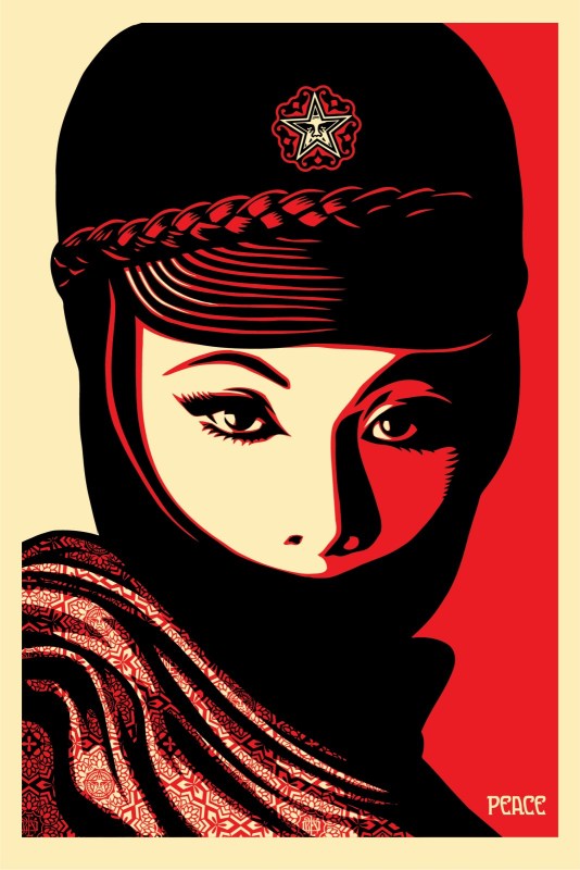
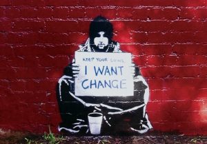
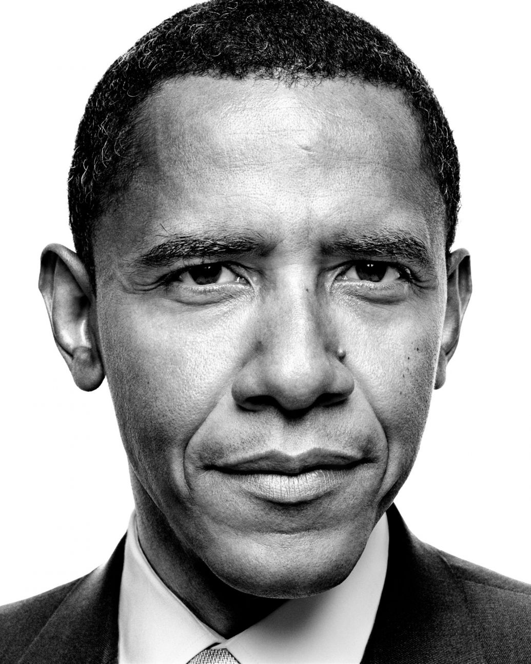
Being able to research a lot more in-depth artists that I can relate to and engage interest into their work has aided my work to be able to use the same techniques from them and learn how effectively I can incorporate this into my practice. One of my favourite current artists is Shepard Fairey who is predominantly a street artist, however also a graphic designer and illustrator. He creates very large wall murals, often to make a statement with a message behind the image he creates, he was recently put under fire for using a photo of the former US president Barack Obama that wasn’t his photo, which he manipulated to create the poster titled ‘Hope’.

Copyright was something else we learned about within our lectures and how it is a very touchy subject in the real world as there are many different laws that state whether you can or cannot use someone else’s piece of work to then manipulate and use as your own. This has taught me that I have to for the most part use my own photography and imagery for my own work to avoid plagiarism.

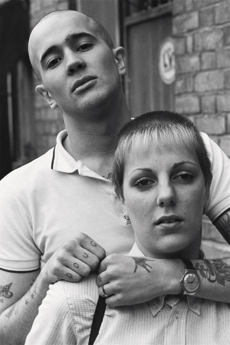
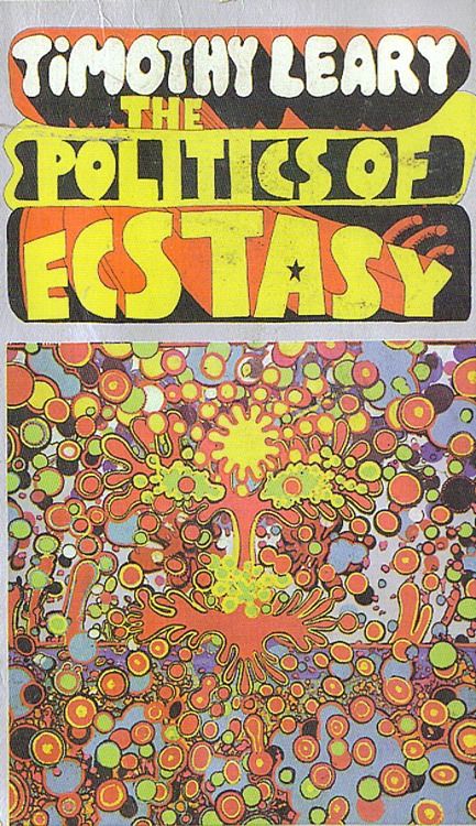
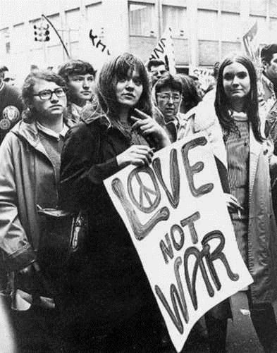
Post Modernism and counter culture were something that also caught my attention, especially the Skinhead and Mods movements as these carry a now typically retro theme which I am quite fond of using this word within my studies as it can be used very broadly to represent any time from the 1950’s- early 2000’s. The word retro can Include a lot of objective themes such as colours, styles, cultures, items of the time, film, design and typography, these are all very broad topics which I could use within my practice and I am very keen on exploring further. The research tasks we have been given have helped me to further new ideas within this area, using books, magazines and the internet very wisely to find out.

Researching movements such as the Avant garde and counter culture have allowed me to learn more in depth about them and be able to understand how the movements were born and how they developed into the next movement of the time. To further my practice and use the knowledge I have gained from these lectures, I plan to push my work further by using new methods and techniques I have found.

Post Modernism

This photo taken by Nick Knight for a series titled ‘skinhead’ shows two young people with their heads shaved or partly shaved to be a “skinhead”. This was a part of a subculture in the late 60’s in London which later grew worldwide in the 1980’s, motivated by it being something that wasn’t in the mainstream. Knight photographed this culture movement and created a book from it (1994) to reveal the people involved with the subculture, in particular showing how they dress as part of a fashion photography series. The book captures their behaviour, fashion and their attitudes towards the police, government and school.

http://showstudio.com/project/nick_knight_image/skinheads

The piece above is by the street artist, illustrator and graphic designer Shepard Fairey. When creating his pieces, he very heavily uses stencils and layers to deconstruct the image into a select palette of colours of usually red, black and either a pale yellow or white. Deconstruction is something very typical in the field of graphic design and illustration as it allows us as designers to create new shapes from images like the one above Shepard has created. Through my own practice this can also be achieved through typography to give the text depth and perhaps emphasize the meaning of the text. When fairey creates his work, he uses limited colours and keeps his work consistent to show which colours are the foreground and background.

Mujer Fatale Offset

Roy Liechtenstein’s work is often considered postmodern as it includes features of modernism, full of colour and shapes and heavily using primary colours, focusing on foreground and background details. Post modernism is shown through subverting something away from its original purpose to help us understand it more. Roy’s work shows this through this piece above as showing a scene of a woman however he uses different shapes to create texture and create a sense of misdirection of the piece’ meaning and show the painting for what it is. Through my own practice I can apply this way of thinking when creating images to show what the piece is as an object and make the audience question the meaning of it.

http://www.wisegeek.com/what-is-postmodern-art.htm#pop-art-in-the-style-of-roy-lichtenstein

Week 7

This is a photo montage by Peter Kennard which depicts the MP/former prime minister of the United Kingdom Tony Blair holding a mobile phone up to take a selfie of himself with an explosion in the background whilst laughing. The photo shows a connection between the artists feelings about politics and his feelings towards Tony Blair and the then current issues within the government and bombings in Afghanistan. Overall the image creates a feeling of mixed emotions as it is meant to be humorous however it has a serious meaning to it that Tony Blair was dropping bombs left right and centre to take out the Taliban in Afghanistan at the time.

Photo Op

This is a piece by the mystery artist Banksy which shows a homeless man sat with a cardboard sign saying ‘keep your coins, I WANT CHANGE’. Again, this piece is about connecting the artists feelings towards politics and communicating his message through graffiti on walls. Banksy is very mysterious and no one actually knows his true identity, in comparison, he likes to create a feeling of questioning his work so the viewer leaves thinking about his statement within his piece, more often than not a political issue, more recently he produced a huge wall mural in response to Brexit which evoked lots of issues as it shows someone removing a star from the EU flag as we prepare to leave the EU.

Keep Your Coins, I Want Change


This is a picture of the Former US president Barack Obama, taken by the famous photographer Platon who takes Images of celebrities and people with power in the government. He does this to capture their personalities through the lens by using very close up images with a 35mm film camera. The amount of detail produced by using this method of photography makes Platon able to produce very large-scale photos/murals. Platon likes to tell a story through his photos, for example in the Netflix series Absract, he visited a hospital with lots of women who had all gone through a sexual trauma of some kind, creating lots of feelings to the viewers of the photos to capture their message.

http://platonphoto.com/gallery/portraits/politics/barackobama/

Two photo comparison


This is a piece by Barbara Kruger, I have chosen this piece as it includes two things I am particularly interested in; photography and graphic design/typography. Barbara often uses found imagery from magazines and layers over small phrases of text often ironic to the photo behind it, she uses the typeface Futura Bold for her works. To show her expression of the text, Kruger uses a white typeface inside red boxes almost showing anger through the use of the colour to express her opinions. The phrase shown in this piece communicates a post modernistic approach as the audience won’t understand the meaning at first glance however the photo behind works with the text to show someone holding the piece of text, this could connote someone holding something whilst shopping.

http://www.arthistoryarchive.com/arthistory/feminist/Barbara-Kruger.html

Man ray is a photographer and painter, being a huge part of the Dada and Surrealism movements, also the only American artist to take the lead in launching those movements. This photo is a piece titled ‘Rayographs’ which he has used a darkroom to produce photos using found objects, in this photo he has used 3d blocks with letters cut out of them. These letters don’t typically spell anything in particular, however the style is similar to that of Barbara Kruger. They aren’t influenced by one another in any way, although the way a letter is shown inside a box works quite well as it gives quite an informal representation of the text for the audience to understand it.

http://www.all-art.org/history658_photography13-16.html

Authenticity

The meaning of authenticity is very broad as it could suggest a number of standards to use within a practice, as if there are certain uniform ways in which to construct, create and make a piece of work. When applying the word ‘authentic’ to my own practice in graphic design, it is hard to choose a truly authentic way of creating a piece of work, to be able to apply a uniform way of creating a piece of graphic design. The constructivists believed this to be true as according to Hans Neuberg, ‘a design is developed out of the subject matter and is unique to each job’ he then explains how designers use functional principles that serve its function rather than being formalist and be truly authentic.

Chris Nielman works in a very simplistic manner and uses the resources he has around him, in particular I like the way he uses Lego to create very simple block/cube style shapes and objects. He does this by choosing form over function to create city scenes or items of food out of very simple shaped blocks.

Concluding the meaning to be truly authentic is hard as within my practice as a graphic designer depending on the subject matter we have to choose function over form or vice versa. To be truly authentic in my opinion doesn’t hold much value today as the majority of graphic design has to be functional to serve its purpose for the recipient or audience.

Avant Garde

After reading the Avant Garde manifesto, I have deduced that they thought very highly of themselves within their work/practice and belittling anyone else who uses their ideas without crediting them. We can tell this from the following quote “but they have forgotten that all attention should be concentrated on the experimental labatories, which show us”. Within the manifesto they have only used three colours: black, red and ivory, perhaps to show the correct hierarchy of the information given to us: black being the most prominent and important information, red being just below that and the ivory being the colour of the paper which the manifesto is printed upon. They have also used the same margin size across all the pages except the contents page which they used a rectangular thin shape to fill the space and also as a page breaker so you can clearly see it’s a contents page.

In particular I like how they have used small and subtle illustrations within the heavily text based pages, showing squares and lines the demonstrate parts of the sentence. Furthermore, they have used a variety of different typefaces and different sizes with some that work and some that in my opinion make It look a bit untidy. They are very heavily against the use of technology which they describe it as the “mortal enemy of art” this can also be backed up by the quote “previously- Engineers relaxed with art, Now- Artists relax with technology”

Counter Culture

This image shows an illustrated idea of the effect of taking ecstasy, this isn’t the right message to be putting out as it makes it look fun and crazy to be taking drugs, the whole image doesn’t have any sensibility about it and is quite playful, especially as it uses different typefaces alongside many, many colours. The spirit of this piece shows that drug taking was a culture of the time making it common practice and not against any laws to create posters and advertisements like this to promote drug use. The meaning of this poster/book cover is to illustrate the ins and outs of taking ecstasy by the author Timothy Leary. The design of this is very true to the time using lots of bright colours and shapes, the layout also doesn’t have a uniform to it, this could relate to the use of the drugs in question.

I quite like this piece as it is very simple and effective, using only three different colours, this was a logo that could be recreated very easily. On the other hand, this was the logo for the Acid drug taking group/culture which could be seen as a bad image. The circle in the middle of the square is very uniform and sensibly placed. This image shows a happy spirit which could be conveyed as the same as being happy when taking the drugs.

This photo above from the 1960’s shows a group of teenagers in protest of war in the very popular hippie movement. There Is sensibility in the photo as it seems to be a very peaceful protest, even including the peace symbol in the word Love on their poster. The people in the photo look very spiritual with the hippie movement and are quite content with the peaceful protesting to forward their opinion. In particular, the whole image taken in black and white, is aimed to focus on the poster in big black letters with the background mostly grey in colour to distract the viewer focus onto the centre and read the only type in the image.

references:

Terminal Bar

This video has demonstrated a popular bar on the corner of a busy New York street.

The quality of the video is typically quite poor but that references well to the theme/ era of when the video is set. Throughout the video is a constant piece of jukebox style music being played quite loud over the top of the narrator so it becomes hard to hear them.

In particular I find it really interesting how this video was created using many stunning portraits of the bar users and how they all change over the course of ten years whilst heavily drinking thus changing their faces.

It became a very popular bar for a variety of cultures and had many regular visitors as this was a place they could all gather without any bother from each other. In the video, the photos mainly focus on people doing things, whether that’s mid conversation, walking down the street, drinking, laughing, looking ahead, it works really well that the photo subjects are very well thought out yet seem so candid and swiftly taken in the moment. There a few slight pauses in the video showing newspaper articles about the Terminal bar, specifically about how it was the toughest bar in New York city. These pauses were very typographical with a very old-style newspaper, relevant to the time, showing heavy serif fonts.

The man narrating was the owner of the bar and worked there through the ten years to which he tells the whole story of his time there.