Author Archives: Louise Dollery

Summary Post

Over the last ten weeks, I have been able to constructively analyse a range of art from different disciplines and time periods and have learnt about different movements that have helped to shape the world in which we now live. In particular, I have learnt how photographs and animations can been turned into short filmed, enabling space for greater comparison, such as within ‘Terminal Bar’. I have been able to see how art has influenced and aided these movements, from propaganda posters which were mass-produced to stand alone photographs which have become symbols of revolution. From this project, I have been able to obtain a better understanding of just how powerful art can be and the wide range of topics that it can be used for.

Adding a deeper meaning to my artwork is something that I wish to continue with, working different layers of subtlety to create a piece which is ultimately stronger. By looking at this project and all the different forms of art, I have begun to realise that I need to think more about the smaller details, like the choice of the typeface, colour and symbolism which will all aid to produce a more powerful piece. I should also research my chosen topic, before jumping straight to the design. This way, I believe I would be able to produce a piece which is more informative and that I could hide information also, incorporating it into the visual design. I feel also that I now have more courage to start experimenting with different techniques and disciplines, after looking at all the different results which can be produced.

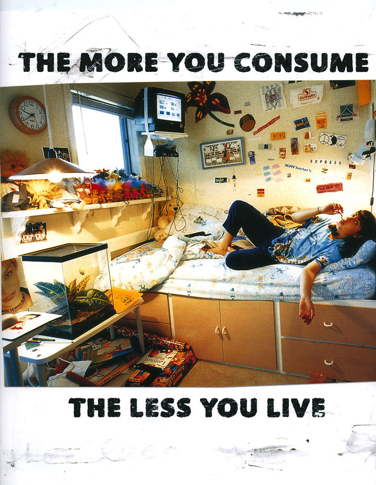
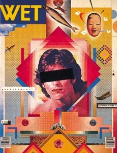
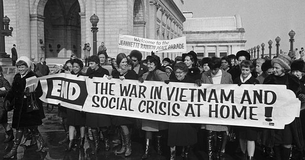
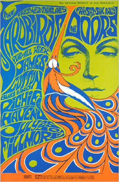
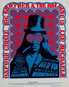
I feel that I have been most influenced by the subcultures of the 1960’s; how they denied following the set rules, how they challenged and experimented with colour, typography and a new way of living. I found it fascinating to see how it was able to accumulate to such a grand scale despite not having all of the technology we have available today. Additionally, I enjoy learning of current protests today, how meaning and symbolism has been translated into our own consumer society. One particular example of current protests is the company ‘Adbusters’ who commonly play on phrases set by big businesses and highlight negativity or corruption.  I admire all the courage and defiance put in to making these pieces of art and hope to bring these ideas to my own future work, particularly with the theme of veganism. I was amazed at how one piece of art could spark such a radical change.

Overall, I do feel that this project has been beneficial for me. I have gained a greater knowledge of the history of art, terminology and of all the disciplines available on this course. I have also been able to reflect upon my own work and compare it to professional practitioners, gathering inspirations and targets for improvements.

Publish! – Story, Message, Feeling, Connection

With so much corruption and problems within our modern world, it is only natural for people to create art with strong meanings and connections, whether they are clear or hidden. These often connect with a wide range of viewers, sparking a reaction and a call for change.


I greatly enjoyed the irony within this piece and the direct contrast to the magazine and the subject. I feel it relates to the irony most people feel within times of war – how can we create peace by using weapons and bloodshed? The addition of the missing teeth portrays a shocked emotion upon the skull which only adds to the irony. I also admired the use of the dark background, emphasising the dark atmosphere and meaning. Furthermore, I liked how it wasn’t pure black as if the subject was placed into a void; there are smudges and scratches which make it appear more life-like but also as if someone was trying to wipe away and hide something.


For me, there is a large depth of contrast within this image. We see a young boy, who normally is full of connotations of innocence, points the gun at the viewer with an expression so full of anguish. This contrast sparks a call for change regarding gun laws. The power play in this photograph is interesting; the viewer has become victimised, the gun so close that it is no longer in focus, as if we are unaware and searching for the reason behind our fate. We see a character in the background with their back towards us, as if this is a daily occurrence which we have become immune to. I feel that the use of the smaller boy is also key, he looks to the older child in admiration and we regret that he will most likely follow in the same path. However, he has his hand upon him, is this in support or to stop the event?


The business and clutter within this photo directly relates to the way the majority of the population lives their lives – following the crowd, buying into consumerism. The lifelessness of the female on the bed along with the small and cramped conditions of the room help to reinforce ‘the less you live’. She is alone within the photo and has become victimised by the society we live in. The use of the second person within the text also directs the image at the viewer and I liked the wordplay of the title ‘Buyological Urge’. It is not within our human nature to desire these objects, it is because of marketing that we have fallen into this downward spiral of misery.

Image one: Protect and Survive, Peter Kennard (1980)

Image two: William Klein, Gun 1, New York, (1955)

Image three: Adbusters, Buyological Urge


Postmodernism – Show, Reveal, Deconstruct

Marking a departure from Modernism, Postmodernism is a philosophical movement that was characterised by scepticism, a general suspicion of reasoning and of maintaining political and economic power. Questions were being asked, ideologies and objects were being deconstructed. We began to truly understand and appreciate objects for what they are.


I liked the amount of emotion Kruger was able to capture within this piece and how the typography brings in elements of graphic design, rather than just photography. Additionally, the ‘not’ is a lot smaller in size and not cut up, meaning that it could be easily missed, bringing double meanings to the piece and highlighting how the subject feels. I thought that the broken text reflected the imagery of the shattered mirror, showing that the subject could be perhaps feeling that her life is falling apart. The addition of the tear drop reinforces this.


I liked the composition of this piece. Although there are lots of random objects that don’t seem to fit together, the piece is balanced. The viewer is automatically drawn to the portrait in the centre, due to the composition, and due to the layered triangles surrounding the image. However, most crucially, we are denied the emotion of the eyes which makes this a very ambiguous piece, allowing the audience to depict it with their own connections. This highly saturated and contrasted portrait appears in some of Greiman’s other work also. Although I find it hard to work in a collage manner, I do like the effect which is created, everything has become deconstructed and disjointed but still remains comfortable. The pyramid shapes at the bottom on the piece also bring a spiritual element which seems to question our existence.


The fundamental element that stands out in this painting is the ring around the subject’s head, along with the wings. These additions give the painting connotations of Jesus Christ and his crown of thorns, raising spiritual questions towards the meaning of life. The hidden phallic symbol could also be included in these questions whilst the child-like imagery and lack of definitive lines bring innocence to the image, hiding some of its deep meaning. The ring could also be linked to Basquiat’s crown icon. The intensity and the speed of the painting could also be influenced by his intoxicating drug use and gives a feeling of struggle and suffocation.


Image one: Brenda Kruger, 1981, ‘You Are Not Yourself’

Image two: Cover for WET magazine, designed by April Greiman, 1979

Image three: Jean-Michel Basquiat, Untitled (Fallen Angel), 1981

Counter Culture – Sensibility, Meaning, Spirit

The 1960’s was a time of unsettlement in both Europe and America. Men were being forced to participate in the Cold War and people began to distrust their government. This lead to using art within protests and people going against the sociably accepted culture. Due to this, strong meanings came through the images being used which highlight the depth of emotion of the time period. Additionally, due to the high level of drug use, a lot of spiritual elements became included.

As a passionate member of the vegan counter culture, I feel that I can partly relate to this sort of way of living. I do a lot of charity work and take part in petitions fighting for animal rights. I also hope to use my artwork to influence others in the future, perhaps using similar ideas to those circulating in the 1960’s-70’s.

I particularly liked how this event was called a ‘Peace Parade’, contrasting the war and the fighting which they were protesting against. Additionally the rain puddles, coats and boots emphasise the dreary atmosphere, despite the smiling faces, and shows how these women wouldn’t let anything stop their protest. The banner is clear to read, with words such as ‘crisis’ to highlight the disruption the war has been causing. In terms of the photography, I liked how the artist hasn’t taken the shot from above to emphasise the amount of people taking part, nor taking it from below, showing their strength. The fact that the artist has taken the photo at the same level of the participators shows how they are all equal, emphasising their protest for freedom.

The complementary colours initially stood out to me in this poster, heightened by the use of a green background, which ties the two closer together. Additionally, the face has been kept simplified to not distract away from the text which flows next to the peacock feathers, becoming almost hair-like. I thought the feathers were also a nice way to shape the face and to cut off different parts of information. The use of the woman, and feathers, also represents the audience this piece would have been targeted at, and it becomes more personal. The half-closed eyes could be linked to the high drug use within the counter culture, the feathers being a fashion icon. Although this piece does not directly relate to my own work, I prefer to create hyper-realistic pieces, the idea of incorporating breakages into the design to separate the text, rather than just using blocked lines, would be beneficial in future typographic work.

Victor Moscosco greatly plays with the idea of psychedelics within this poster. Viewers would naturally be drawn to the eyes of the subject but we are denied of the emotion, instead there are circles blend the character with the background. The simple use of the two colours is most striking due to their vividness and their contrasting natures. The typography upon the subject’s jacket is slanted and squashed making it hard to read and demands time for the viewer to

 understand the information. This is also apparent in the previous poster and is something that I feel I could look at in the future. I find it interesting how just the shape of the letters can alter how it’s read and how the information becomes translated.

Image one: Gabriella Benavidez, Counterculture of the 1960’s

Image two: Bonnie Maclean Yardbirds, Doors, Fillmore Auditorium, San Francisco 1967

Image three: Victor Moscoso Avalon Ballroom 1966 Big Brother and the Holding Company


Is it possible to be truly authentic? Do the principles of Modernism hold value in contemporary practice?

In a world where we have all been programmed to follow the same basic routine tasks, to follow the same lives, how can anything we do now be classed as ‘authentic’? How can anything we create be original? We all wake up, go to work, buy into capitalism and come home again. We seem to repeat this routine day in, day out without question.

Over the past 100 years we have seen a radical change in the way we live our lives and this is dramatically shown by the change in art styles. We have gone from very traditional drawings of portraiture and landscape to very simplified and abstract pieces showing hurt emotion.

The rise of technology greatly aided to the idea of ‘Modernism’; the introduction of machines meant artists had to strategically re-think their practice. Items were now available to be mass-produced, making artwork easier to distribute, though in a very different style. There have been countless revolutions in the past which have called for change through art but now we seem to have hit a brick wall. We have just become robots, following one day to the next without any challenge to the norm. Today, we do see principles of Modernism like ‘form follows function’ (Louis Sullivan, 1896), but we only see products being improved, not reinvented. Just like phones and computers, for example. We have run out of original ideas, we have run out of rules to challenge.

There will always be people out there who want to create something new, who want to become known as an inventor and to be ‘authentic’. But, it would appear that all the good ideas have been used up.

Image one: C.A. Hannaford RBA – Early 20th Century Watercolour, Canal Landscape

Image two: Mark Rothko, Light Red Over Black, 1957, Oil on canvas

“Technology is the mortal enemy of art”

Within my own practice, I would have to disagree with this statement; I use various pieces of technology on a regular basis, all to aid my work. Of course, technology does have its flaws along with its strengths, but I would not by any means call it an ‘enemy of art’.

Through the use of the internet I am offered a vast range of reference images, inspiration and knowledge (much wider and more accessible than found in books) which I can use to enhance my creativity and technical abilities; I am able to watch tutorials through websites such as ‘YouTube’ where I can learn in my own time, without the need of a tutor and I am able to listen to music on demand for inspiration. Yes it is not as personal, but it is more accessible. Having technology allows us all to take photographs. It enables us to capture a moment of pure joy or sadness, a moment of expression. Technology also enables me to use programmes such as Adobe Illustrator and Adobe Photoshop to enhance my illustrations, or even to create new ones, as shown by this logo I created for myself within Adobe Illustrator.

Furthermore, through social media, I have the ability to share my work and to express my opinions to a wider audience, potentially gaining more viewers and buyers, or even just receiving more feedback to benefit my work.

On the other hand, solely relying on technology to create work or to view an image, rather than seeing the display in person, can have a negative effect. So many pieces of art are enjoyed due to the scale of them, but this element is greatly lost on a print or digital screen. Despite this fact, technology does not disable the chance of viewing artwork in person, it only extends the opportunity to more people.


Image – ‘Louise Dollery Illustrations’ logo.

TASK 2: Comparison of Images

To create the first illustration of the horse, Anne-Baukje used the grid method, placing a grid over the initial reference image and creating a larger grid for her illustration. Many artists use this method in order to capture a better representation of the physical likeness and anatomy of the subject. One famous example being Chuck Close. Due to the grid being hidden or erased in the final outcome, the artist is left with a very natural looking and realistic piece that is highly effective.  Although I work more with watercolours as opposed to pastels and pencils as Baukje does, this is very much like my own style of working, it gives me confidence in the initial sketch and encourages me to continue into colouring. I’m also currently working on my own realistic wildlife series, with minimal backgrounds, after working on human portraiture.

 In contrast, to create the typographic piece artist Jeannie Dickson drew her design freehand, actually disregarding the need of the grid; the letters of each word do not sit on a single line or fit into a column and they overlap in places. However, I like the natural atmosphere it conveys as it brings out the bouncy and joyful characteristics of the design, heightened by the appropriate yellow colour choice in the background. The natural elements are also emphasised by the contrast between the thick and thin lines and the curves Dickson has put in place. This effect and style is something that I’m trying to replicate myself in my own modern calligraphy experiments.

Both designs convey strong natural atmospheres but for different reasons. It is this naturalness that attracts me to them both, as it key in my own work.

blog week 2 image 1 blog week 2 image 2

Terminal Bar

A boy inspired by his father’s photographs of ‘New York’s Most Notorious Water Hole’, and the way he talked about the numerous customers years later, of whom he seemed to know on a personal level. This lead Stefan Nadelman to countless research of newspapers describing ‘Terminal Bar’ and its surroundings. This allowed Stefan to follow in his father’s footsteps; he created this piece because he wanted people to know about what happened in the ‘Terminal Bar’ from 1972 to 1982. As his father said, “nobody says nothing”, they just walk over the bodies in the morning, unless something is done about it.


The constant moving and changing of the photos replicates the energy inside the bar and, in addition, the continuous punching out to black could represent the fights and death that took place surrounding the bar. This is all only exaggerated by the beaty music and the car horns in the background, showing the busy New York setting. The narration is also key to the film as, although the viewer is able to see the newspaper which is being read, hearing the words as well exaggerates the parts Nadelman wants us to hear, mostly about the violence and dirt surrounding the building.


Furthermore, the layering of the images helps to show the ever-changing movement of the bar; initially it was intensely rough, Irish street fighters continually breaking damaging the bar but the atmosphere became more tranquil, over time turning into a ‘Gay Bar’ and ultimately into a video store. Despite this however, Sheldon Nadelman, the photographer and father, claims that nothing had changed regarding the atmosphere of the town when he returned years later. Â