Author Archives: Chloe Withers

Task 6- Post Modernism


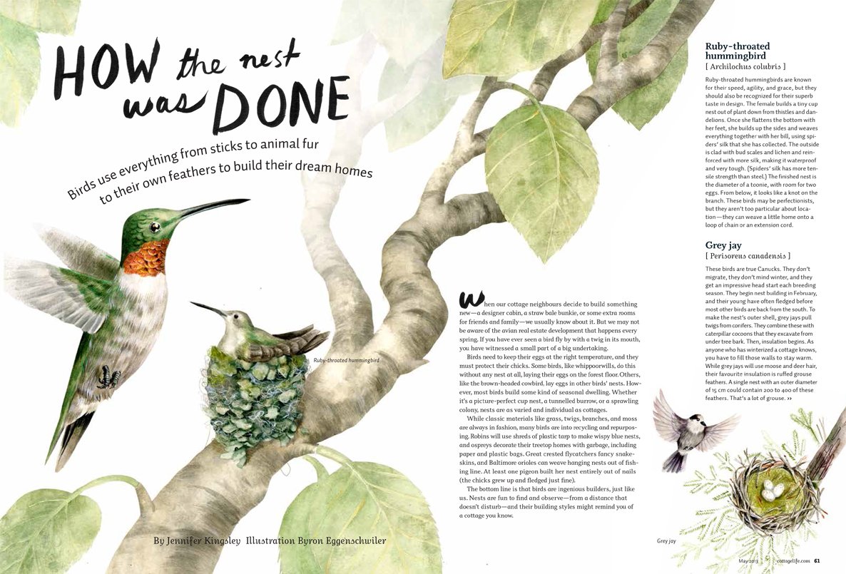
Postmoderism was born as a reaction against moderism. While moderism focused on technique, form, and realism, post modern art focuses on the subjects and the message it’s trying to tell. It introduced a era of freedom within art. One of the post modern art movements that stands out to me is surrealism, for these reasons. In my own interests surrealism seems to be a reoccurring theme so that’s what I focused my research on.

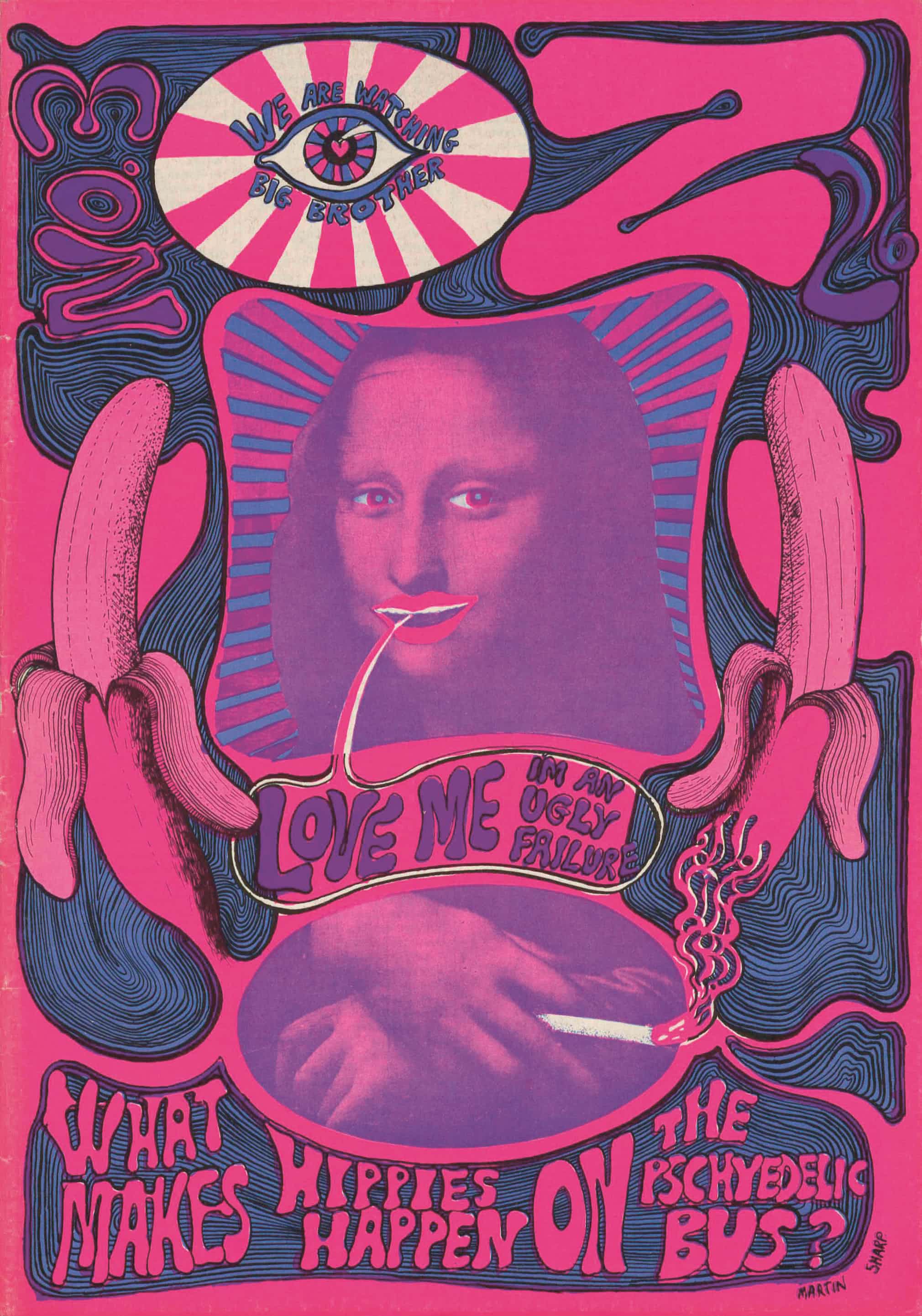
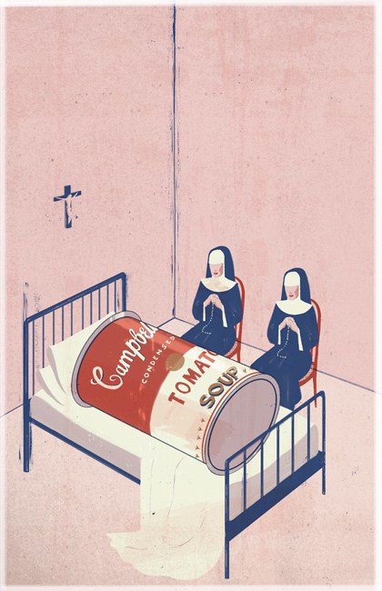
The first image is an illustration by Emiliano Ponzi, titled “The Death of Postmodernism”. I think the title speaks for itself- the literal death of a Campbells Soup can, one of the most famous pieces of postmodern art. I think the imagery of the two nuns praying over it is effective, and the style in which the illustration was drawn is very similar to pop art, so the whole image is consistent and the soup can doesn’t feel out of place. I also like how Ponzi kept the rest of the colours very simple and pale, so the red and white of the can stands out in the illustration. What stands out to me from this illustration is that its self aware.

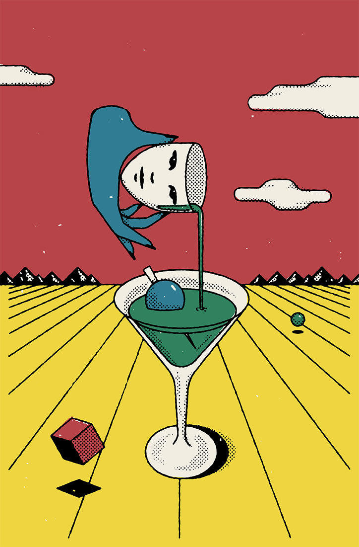
The second image also fits in with the pop art style. The illustration was used to advertise a new bar, and feature dreamlike scenarios together- reminiscent of the surrealism movement. Because of my interest in surrealism this image appeals to me, and I especially like the imagery and colour scheme; the colours contrast against each other really well and I like the whole hyperreality aspect.

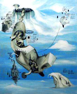
The third artist is Ian Quirante, who also works in surrealism. He shows different forms and shapes in his paintings, and cartoon figures that reflect his psychological state. Each of his paintings tell a story; you need to look for all the little hidden details to fully understand what he’s trying to communicate. His work reminds me of Picasso and cubism because of the shapes and simplified forms. Like Haddad, his work also features a hypereality aspect, however Quirante’s style is a lot more realistic than the other two images, since he works in oil paint, and not screenprinting.

Ponzi. E, 2011, The Death Of Postmoderism, [image] Available at <https://www.emilianoponzi.com/portfolio/death-of-postmodernism/>

Haddad. M,2017, Unnamed, [image] Available at  <https://www.itsnicethat.com/articles/michael-haddad-illustration-240817>

Quirante. I, 2009, Unnamed, [image] Available at <http://www.artesdelasfilipinas.com/archives/75/ian-quirante-a-postmodern-artist>

Task 7- Publish or Perish

The first illustration by made by Byron Eggenschwiler, and published in a magazine called Cottage Life. The message is an educational one- the illustration accompanies an article about birds and how they made their nests.  The illustration, I think painted in watercolour, really draws the viewers eyes in, and the double page spread catches your eye when you’re reading it. I think the colour scheme is effective; the range of pale greens and browns is cohesive and is pleasant to look at, as bright colours would just be overwhelming.

The second illustration was published in fine art magazine called Maisonneuve, and by an artist called Selena Wong. Her piece “OId Wounds” won gold in the lllustration category. I’m not sure what style her illustration would fall into- it has aspects of surrealism and pop surrealism, but I think her imagery is very effective. The story behind the piece is to show the struggles of aboriginal woman with domestic abuse, and the woman’s hair being twisted around the trees shows the message of being trapped, with only half of her face showing like she’s hiding. At first I didn’t understand what the illustration was trying to show, but when I read the article I suddenly understood all the details in the painting. I think it’s a very powerful image.

The third and final illustration is by Christian Northeast, published in Global Brief, an affairs magazine. The piece is titled “India does go grand strategy” and is screenprinted. What stands out to me about this illustration is the aesthetic and the overall look of it, it reminds me of an old circus poster. I can see how this links in with the content of the article- elephants and tigers are animals found in India, however I think if he included some mandala patterns the link would be more obvious. To be honest I think the illustration doesn’t go well with the message- the colours look dirty and muted, whereas Indian culture is very colourful and vibrant. However I didn’t really understand the article, so maybe that’s why I can’t appreciate the little details in the illustration.

Eggenschwiler. B, 2015, How The Nest Was Done, Published in Cottage Life Magazine, Available < at  <https://blog.magazine-awards.com/2014/05/15/top-10-canadian-magazine-illustrations/>

Wong. S, 2016, Old Wounds, Published in Maisonneuve Magazine, Available at < https://blog.magazine-awards.com/2014/05/15/top-10-canadian-magazine-illustrations/>

Northeast. C, 2016, India does go grand strategy, Published in Global Brief.  Available at <https://blog.magazine-awards.com/2014/05/15/top-10-canadian-magazine-illustrations/>


500 word summary

During the research and communication project I have learnt how to research and analyse other artists and art movements, and not just the art work, but also the political climate and other events that influenced the artwork and artists at the time. This understanding of art history is crucial and has helped me to see where artists got their inspiration from, and I understand how art movements have developed. For example during task 3, I researched how technology and the invention of the camera has impacted the art word, and pushed the development of art movements such as impressionism, as they captured something that a camera can’t. I also wasn’t able to distinguish the features of art movements, such as the different between modernism and post modernism, and how different they were. Now I feel confident in recognising art movements. 

After seeing a wide range of mediums and work, it will help in my developing practice, giving me a wide range of inspiration and artists which to reference my future work from. I found task 7 about published images very useful, as I want to do illustration, and it pushed me to see the links between the article and the work, and how the artist chose the imagery to communicate the message. I mostly focused on illustrative work for all the research tasks, which now I realise was a bit limiting, and I should have includes some photography or graphic design as well, to broaden my horizons. Taking inspiration from a range of mediums would be beneficial, I think.  

Regarding theory and practice, an understanding of art theory is crucial for creating successful pieces of art. I think that understanding previous art helps us improve our own, as we see what is successful and what is not. We have to have a certain understanding of the rules so we can break them and create something new and original. This can be seen in Post Modernism, and the whole point is trying to build off of previous movements and morphing it into something that hasn’t been done before.

I found the third lecture quite thought provoking, discussing if technology is the mortal enemy to art. At first I agreed with the statement, as traditional and portraiture art is now being pushed aside for modern art and abstraction, but then I realised that without technology I wouldn’t be able to create my own art. I also discovered that without the invention of the camera we wouldn’t have the art movements that we have now, and that technology has actually helped to push art forward, and create new mediums such as graphic design, motion and other computer based media. The task on authenticity was also thought provoking, and critical thinking is a skill that is essential for critiquing and evaluating others work, and your own.

In conclusion  I have found the lectures and tasks very helpful to develop my thinking and research skills, which will eventually have a positive impact on my practical work.

Task 5- Counter Culture

The three counter culture images I selected are from the magazine “Oz”, and two illustrations from a magazine called “Gandalfs Garden. They were all produced in the 1960’s and were inspired by psychedelic graphics and hippie philosophy. It was difficult to find images relevant to my interests because I’m not particularly interested in this movement, but I do like certain aspects of these illustrations. In the first illustration the subject really surprised me- you don’t expect to see Mona Lisa, a traditional oil painting, surrounded by psychedelic doodles. The colour scheme is also well chosen- it’s bright and gets your attention but it’s not too vibrant and difficult to look at. The artist took LSD and you can see the influence of this in his work.

For the second illustration I admire the level of detail that went into the work. The symmetry in the illustration really gives it the distinctive style in psychedelic art, and I like the collage effect and they used different mediums to create one illustration- for example photography, screen print and traditional drawing. The pastel colour scheme also is not overwhelming despite the crowded illustration- this was a good choice as a brighter colour scheme might have been too overwhelming.

For the final image I like the simplicity of it- just one surreal image of a man emerging from a egg, which fits in well with the psychedelic movement. The colours are simple and complement each other well, and it shows you don’t need over the top patterns and colours to be linked with the psychedelic movement and the art style. The magazine is a spiritual one, and I think that’s why they went for this certain look- it’s so simple and it has quite a calming effect.

Bronwich, K 2017, ‘Covering the counterculture: the 60’s underground press’, Accessed 4 December 2017, <https://www.theguardian.com/media/gallery/2017/sep/23/covering-the-counterculture-the-60s-underground-press-in-pictures>

Gandalfs Garden, Issue no.1, 1968, Front Cover

Gandalfs Garden, Issue no. 3, 1967, Front Cover

Sharp, M, ‘Oz’, Issue no. 3, 1963, Front cover

Task 4- Is it possible to be truly authentic?

I don’t believe that is possible to be truly authentic. All artists and artwork are influenced by something external, whether that be the world around us, other artworks, or previous art styles. Every art movement was influenced by the one before it, for example impressionism was a response to the advancements in camera technology. When you use reference images, life models, or an influence from a external source, that’s not being authentic, because it already exists. Therefore it’s almost impossible to be completely original, without inventing a new medium to work in. It is essential that we copy other artists work to develop our skills and learn different techniques and processes. It’s part of the learning process. Especially in art education, it is hammered in that critiquing and sharing our work with each other is essential, so ideas can sometimes bounce off each other and subconsciously we are influenced by the same things. Especially with the internet and television, we are constantly surrounded by art and design it’s hard for that to not impact our own work.

I think the principles of modernism do hold value in contemporary practice. The rejection of traditional methods and principles are very evident in art today, and an essential feature for contemporary art is the fascination with which its artists uses the modern technology. In art today everyone is trying to be original and create something new, which is a very modernistic view.

Arts Interface 2015, General Characteristics of Contemporary Art, Accessed 4 December 2017, <http://artsinterface.org/general-characteristics-of-contemporary-art/>

Task 3- “Technology is the mortal enemy of art”

I disagree with this statement. Technology has helped to push forward art, leading to new disciplines such as graphic design, motion graphics and other digital media. It has also helped traditional art; and in my experience, without digital media I wouldn’t be able to produce my artwork. For example, I always make a photoshop mock up of a painting before I even start, to use as a reference. This allows me to have a guide to follow, and by editing multiple images together, I am not restricted by traditional art and I can paint things that don’t necessarily exist in the real world. the internet has greatly impacted the art world in a positive way- now artists don’t need to sell their words through galleries, they can have their own business online and reach customers that way.

However technology has threatened art, especially with photography. People no longer need their portraits painted, and realistic art isn’t as needed because we have cameras. This has lead to a decline in the traditional art market. I think this quote sums it up quite well – “Ever since, painting has in some ways functioned in dialogue with the camera. In some cases that dialogue takes the form of rejecting photographic realism, such as in the unnatural colour of Van Gogh.” However in my opinion this isn’t really a threat, and more so it is pushing art forward into new styles- Surrealism, Pop Art and Abstract are to name a few. I feel like because technology has evolved so fast many artists seem threatened by it.

Task 2- Comparing Images


The first illustration is “Bees nest”, by an artist called Kelsey Beckett, she specialises in illustrations in oil paint. Her work features female portraits with a fantasy like atmosphere, incorporating feminine elements and pastel coloursThese articles of the natural world serve as interpretive indicators or symbolic representations of what is going on in the minds of each character. She has a unique style of painting; realistic, but she uses black outlines to give it a slightly cartoon feel. To me it looks more like digital artwork than oils. The painting reminds me of the Art Nouveau movement and Alphonse Mucha, because of the linework and the subject of her painting. 

The second image is a photograph by Steve McCurry, titled “Los Angeles, USA” This photograph is meant to show beauty in a different light, and to give attention to alternative movements and appearances. I like how he used just a simple black background, because the contrast against her blue skin makes the image really stand out. I saw links between this photograph and Beckett’s work because they both feature women with feminine elements, and the fact that the woman is painted blue reminds me of the pastel colour scheme in the illustration. The two serve different purposes as well- one depicts a woman that fits in societies beauty standards and the other is one that rebels against that, however they both find common ground with the way they are both presented- trying to celebrate beauty in both. 

Mccurry, S. (2015) Los Angeles, USA [image] <http://stevemccurry.com>

Beckett, K. (2016) Bees Nest [image]  <http://kelseybeckett.com/#bees-nest>

Ainley, N, Creators Vice, ‘Enjoy the silence in Kelsey Beckett’s Intimate Illustrated Portraits’, Accessed 4 December 2017, <https://creators.vice.com/en_au/article/d74aj7/kelsey-beckett-solitude-illustrated-women-portrait-series>

Terminal Bar

Terminal Bar is a photo driven documentary seen through the black and white photographs of the bartender Sheldon Nadelman over a 10 year period, from 1972 to 1982. The main story of the documentary is documenting the different types of people that came to visit the bar and their stories, and how it changed over time. Narration was through newspaper clippings and and an interview with the bartender himself, but apart from that the documentary was made up entirely of still images.

A number of processes have gone into making this documentary, starting with the photographs being taken, as well as newpapers being kept and stored. Years later, the couple of thousand photographs would of then had to be developed and printed in a dark room, removing any failed photos that couldn’t be developed or that weren’t in focus. Then the successful photographs were sent to the director (Stefan Nadelman) ready to be presented to Sheldon for an interview, which is the basis of the documentary. After this, the editing team would create a storyboard of the photographs to link up with the interview, as well as choosing music and newspaper clips for narration, and record the narration as well. Any addition footage such as Sheldon returning to Terminal Bar at the end of the documentary would also be shot during this time. The end result was be edited together into the final film.

This process I could apply to any project, with the basic structure of documentation and research, troubleshooting, storyboarding, and then the final product outcome.