Author Archives: Alexander Hughes

500 word summary

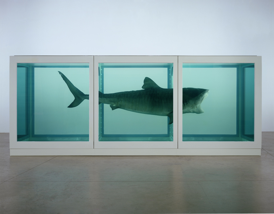
These past 9 weeks have really been educational teaching me the importance of research in my work and how it can shape me as a contemporary practitioner in the future. The research lectures have taught me the history of art and design engaging me in the different art movements through the years and the relevance it had in society. Having this new found knowledge of different art movements it has defiantly given me a new perspective in design and has widen my understanding of what good design looks like. As well as the different movements we had sets of new artists, photographers, illustrators and graphic designers that I found greatly inspirational seeing all the different piece of art gave me a whole catalog of work I could reference and use in my own personal work to develop my style. 

Having had this research and communication skills course it has prepared me for the second semester developing my skills in researching knowing where to look for information in the library, being able to use the facilities effectively and also going online and finding resources and being able to properly reference them using the Harvard referencing. Taking on board everything I have learnt hopefully I can use my skills to to refine my work using research to get a better understanding questioning my work and using the resource I have found to help refer and develop my idea hopefully allowing me to create more in-depth and visually interesting work.

In our publish or perish lecture I was most interested when we watched a video about Platon a photograph on the Netflix series Abstract. In the video Platon says “Taking a picture is technical but 99.9% is spent on the connection” this reminded me that all the software and techniques we learn about is only a small fraction of are working and we have to develop are way of thinking and working to utilise these tools effectively. Story, message, feeling and connection where important roles in Platon’s work shaping the way it looks. By having all this home work of information behind each photo creates a something that speaks to the viewer using only a single frame.

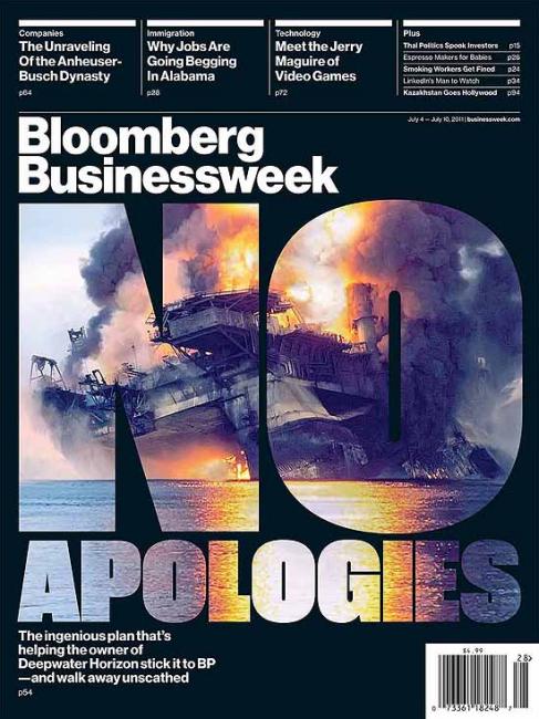
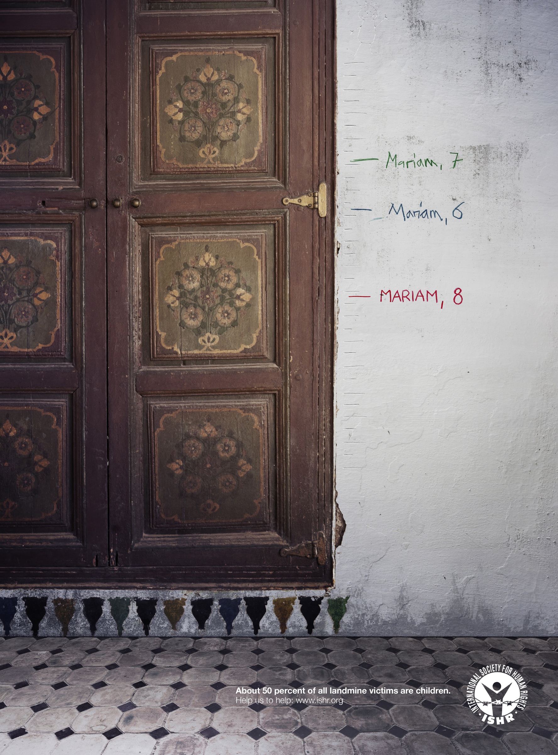
The importance of connection and feeling was reinforced when I had to write up about the publish and perish blog. When I was looking for published work I found two pice that really spoke to me the Bloomberg business week cover titled no apologies and the International Society for Human Rights poster about children victim from the war. For both these piece I read a lot of articles and news stories about each event and really got engaged and interested with the research I was doing. By doing this blog write up it has shown me the importance of message and content behind my own practice.

I think overall the research lecture skills have widen my knowledge in art, expanded my catalogue of artist I’m inspired by and improved my way of researching and approaching my practice.


Publish or Perish

My first published piece I have chosen is of the Bloomberg business week magazine cover. The story behind the cover is of the Deepwater Horizon drilling rig exploding killing 11men and setting of the largest offshore oil spill in American history and yet there has been no apologies from Transocean company. The magazine shows the graphic photos of the event trying to connect with the view showing this tragic event but yet overlays it with the big bold font saying NO APOLOGIES as if they are attacking Transocean not letting them get away unscratched. In the photo you see the horrifying fire engulfing the ship sinking down really capturing the moment in a single shoot. Reading into the magazine you can’t help but feel sorry for the families involved in this tragic event not getting the justice they should.

Design different is a art studio based in Toronto that creates merchandise like posters, T-shirts and books using quotes to make there art work. Ryan McArthur the creator of this work said “words can have such great impacts they can trigger deep emotion”. I think Ryan work cleverly uses the typography to get a sense of depth that works well with Ralph Emerson quote in a minimalistic illustration and using colour and composition to complement it. The use of quotes in Ryans work inspires and get people to think about what the work says.

This advertisement poster from the International Society for Human Rights (ISHR) campaigns for donation to help with there causes of children victims in the war. Although there are no actual photos of the victims you can immediately understand what the poster is implying how Mariam has lost her legs to landmines. This poster uses something most family do at home measuring there children as they grow up and uses that show how the children from these horrible events can’t live a normal life anymore using familiar subjects to allow you to understand and try and empathise with the victims. The scene is shot in possibly a Islamic house with the doors closed suggesting the doors close inside the country.


Bloomberg business week –

Pinterest. 2017. Portada · Bloomberg Businessweek · (US) · No Apologies | Magazine Covers | Pinterest | Bloomberg businessweek, Blog and Editorial layout. [ONLINE] Available at: https://www.pinterest.co.uk/pin/131378514099953787/. [Accessed 30 November 2017].

Bloomberg.com. 2017. Transocean: No Apologies Over Gulf Oil Spill – Bloomberg. [ONLINE] Available at: https://www.bloomberg.com/news/articles/2011-06-30/transocean-no-apologies-over-gulf-oil-spill. [Accessed 30 November 2017].

Design different –

Minimalist Poster Quote Ralph Waldo Emerson | Design Different. 2017. Minimalist Poster Quote Ralph Waldo Emerson | Design Different. [ONLINE] Available at: https://www.designdifferent.ca/collections/illustrative-prints/products/emerson-minimalist-illustration. [Accessed 30 November 2017].

From up North. 2017. Typography inspiration | #821 – From up North. [ONLINE] Available at: https://fromupnorth.com/typography-inspiration-821-921711706476. [Accessed 30 November 2017].

International Society for Human Rights (ISHR) –

From up North. 2017. Serious advertisements | #1001 – From up North. [ONLINE] Available at: https://fromupnorth.com/serious-advertisements-1001-916d4070216a. [Accessed 30 November 2017].

Postmodernism

Jenny Holzer is a post modernism artist based in New York that work with words and type to project them onto public spaces. Her work tries to create a new way of communicating narratives to the audience making impactful projections with here words in large scale installation contrasting against the building work. Holzer work normally covers very sensitive topic in here texts like sex, violence and relgion. This create for a very powerful statements that could be considered very controversial in society revealing ideas people wouldn’t normally think about everyday. Looking at Holzer work you can tell a lot of effort has been put in to the layout and fonts of the words considering how to project it. Each building has been given a completely different tone with the text she project because great understanding of type and composition.

Wolfgang Weingart is a typographic designer and was also teacher at Schule für Gestaltung Basel. His work was highly experimental and moving towards a new direction in typography giving Armin Hofmann interest to let him teach. His typography is all done by hand with metal letters and textures in a hand press later manipulated in the dark rooms editing his work on film. Weingart was becoming board with Swiss typography because it was becoming clean, clear and functional but nothing more. He tried to create work that was engaging to the audience but not trying make the words legible. I think Weingart was a simple designer that made things that were interesting to him then, I think his mentality would help my own work.

Hans Haacke is known for his art installation that cover very critical social and political overtones. Haacke is probably known for being a conceptual artist working in loads of different medium in his life span with different ideas and style through his years. His work dosen’t seem to have a systematic solution but rather ideas that are born in a uncontrollable manner that become the art installations you see. I think Haackle objects provokes intellectual conversations and ideas to his audience.


Jenny Holzer –

Tate. 2017. Jenny Holzer born 1950 | Tate. [ONLINE] Available at: http://www.tate.org.uk/art/artists/jenny-holzer-1307. [Accessed 23 November 2017].

Takashi Okamoto / BuzaMoto. 2017. Welcome — Jenny Holzer. [ONLINE] Available at: http://projects.jennyholzer.com. [Accessed 23 November 2017].

Jenny Holzer – Wikipedia. 2017. Jenny Holzer – Wikipedia. [ONLINE] Available at: https://en.wikipedia.org/wiki/Jenny_Holzer. [Accessed 23 November 2017].

Wolfgang Weingart –

AIGA | the professional association for design. 2017. Wolfgang Weingart. [ONLINE] Available at: https://www.aiga.org/medalist-wolfgang-weingart. [Accessed 23 November 2017].

YouTube. 2017. Wolfgang Weingart: 2013 AIGA Medalist – YouTube. [ONLINE] Available at: https://www.youtube.com/watch?time_continue=55&v=WA5CYRrd8qo. [Accessed 23 November 2017].

Hans Haacke –

TateShots: Hans Haacke | Tate. 2017. TateShots: Hans Haacke | Tate. [ONLINE] Available at: http://www.tate.org.uk/context-comment/video/tateshots-hans-haacke. [Accessed 23 November 2017].

Hans Haacke – 6 Artworks, Bio & Shows on Artsy. 2017. Hans Haacke – 6 Artworks, Bio & Shows on Artsy. [ONLINE] Available at: https://www.artsy.net/artist/hans-haacke. [Accessed 23 November 2017].

Counter Culture from the 1960s and 1970s

Counter Culture in Graphics Arts came out from the post war period. During this period designers were trying to self exprese them selfies breakdown the social norms in the 1960s and 70s through freedom, improvisation and expression.
My first piece I chose was of Seymour Chwast a graphic designer, illustrator, type designer and cofounder of the Push Pin Studios. As a graphic designer typography hold a great interest to me. Chwast typefaces really interests me since it has a sense of quality and understanding of complex emotion. Each one of his typefaces have diffrent tone of message and influence. Rather than thinking about legibility his type is more illustrative thinking about how to create a  visually aesthetic typeface that can work on a poster as an artwork instead of a just type conveying a message across. I think overall Chwast takes on typography in a  unconventional way being playful with his work.

Wes Wilson is a very important designer to me because he invited and popularised psychedelic font. Im in interested in illusion and how I can use them in my own practice since messing with the human psychiatric can be fun and creates engaging work like Wes Wilson work during the Counter Culture period. Wilson also use very vibrant colours and attractive female form to compose his poster creating the iconic rock and roll look that would later be mimicked in the 1970s by other designers. Looking at both Chwast and Wilson work I have a better understanding of type and how I can deconstruct the anatomy of type and reconstruct it.

My final piece I chose was Blue Note Records an American jazz record label. As someone who wants to improve my skills in page layout Blue Note Records was some I could learn of understanding how to use negative space, type layout and photography. The way they have edited the photographs colours with the  orange hue gives the record a funky soul-jazz vibe. Blue Note Records really showed the spirt of jazz through there design and showing off this new and upcoming innovative cool music to the next generation.


Seymour Chwast –

Graphic Design 1: Seymour Chwast Fonts. 2017. Graphic Design 1: Seymour Chwast Fonts. [ONLINE] Available at: http://jgaytan2.blogspot.co.uk/2013/05/seymour-chwast-fonts.html. [Accessed 09 November 2017].

About Seymour | Seymour Chwast Archive. 2017. About Seymour | Seymour Chwast Archive. [ONLINE] Available at: http://seymourchwastarchive.com/about/seymour/. [Accessed 09 November 2017].

Wes Wilson –

Wes Wilson. 2017. A Brief Biography, by Michael Erlewine. [ONLINE] Available at: http://www.wes-wilson.com/a-brief-biography-by-michael-erlewine.html. [Accessed 09 November 2017].

Blue Note Records –

RETROFUZZ. 2017. Timeline | Blue Note Records. [ONLINE] Available at: http://www.bluenote.com/timeline. [Accessed 09 November 2017].

Blue Note Records – Wikipedia. 2017. Blue Note Records – Wikipedia. [ONLINE] Available at: https://en.wikipedia.org/wiki/Blue_Note_Records. [Accessed 09 November 2017].

Is it possible to be truly authentic?

The defntion of authentic is of undisputed origin and not a copy; genuine. To be authentic in todays creative industry is becoming harder since the internet allows you to share all your work at a click of a button meaning the idea you designed by yourself might have already been done before.

Christoph Niemann illustrator for the New Yorker said “people have been singing about love for 500 years” to be authetic doesn’t mean having a new idea it can also be taking something familiar but making appear totally different and true. I think as long as you put your own individuality and soul into your work you can have the same concepts as someone else but make it your own piece.

Damien Hirst an English artist known as a member of the Young British Artists in the 90s created a famous artwork of a tiger shark preserved in a glass steel container. Hirsts work has a central theme of death having a lot of art installation using dead animals that are preserved. His work would probably be considered very authentic although zoological specimens have been used in the history of science from 1817. I think it is impossible to create work having no inspiration our research, surroundings and background are all factors to help influence are work.

In conclusion I think the principle of good design should have inspiration and influence from other work but to allow to your self to put your own individuality  into it creates authenticity.

shark


Tate. 2017. Damien Hirst born 1965 | Tate. [ONLINE] Available at: http://www.tate.org.uk/art/artists/damien-hirst-2308. [Accessed 02 November 2017].

Science Ltd. 2017. Damien Hirst – Damien Hirst. [ONLINE] Available at: http://www.damienhirst.com. [Accessed 02 November 2017].

Londonist. 2017. Art Review: Damien Hirst @ Tate Modern | Londonist. [ONLINE] Available at: https://londonist.com/2012/04/art-review-damien-hirst-tate-modern. [Accessed 02 November 2017].

Technology is the mortal enemy of art

The phrase “Technology is the mortal enemy of art” is a very narrow mind way to think as a contemporary practitioner in today society. To be a successful graphic designer and artist you need to use technology and learn to work with it because we are in the technological era where you have technology around you everyday.

Aaron Draplin is graphic designer who creates logo design for companies. He use digital media to make his logos to allow him to create clean and simple shaped designs for his client.  You can see to some of the he designed logo below. Technology allows logos to be placed onto Instagram, embroiled on jumpers, printed on a business card or even placed on the sides of truck. I think Draplins work is a form of art redefining the definition given by Rodechenko phrase where technology can be a means to communicate your message.

Although I do not completely disagree with Rodechenko Statement. I think by having your work shown in galleries you can create more of an interaction with your audience personalising the experience. Posting your work through social media on a digital screen you can’t get the same sense of interaction.

To evaluate my ideas I think balancing your work is important you should refer back to traditional forms of art for inspiration and creativity but by refining it through digital methods allows you to create a high standard of work and also allows me to show my work off online.


AARON_DRAPLIN_interview_02


Draplin Design Co.: Work Archives. 2017. Draplin Design Co.: Work Archives. [ONLINE] Available at: http://www.draplin.com/work/. [Accessed 25 October 2017].

designboom | architecture & design magazine. 2017. aaron draplin (DDC) interview. [ONLINE] Available at: https://www.designboom.com/design/aaron-draplin-ddc-interview/. [Accessed 25 October 2017].

Comparing Images


Trademarks and symbols by Yasaburo Kuwayama (published in 1973) is relevant to me and my interests I have for logo design. The book looks at more than 1500 trademarks from all over the world arranged in a alphabetical order. In any one of these page a sense of clarity and simplicity is shown. All these logo have already been done but yet it context of 2017 anyone of these logo are still fresh and new and can still work today. This is why a really love old logo designs that work it doesn’t age unlike logo from today where you can’t bring that design back to the start of corporate design. It gives you a great appreciation of designer during that period using pen and paper.


My second piece I chose was by Jordiros a digital illustrator and freelancer. His work use influence from Japan using religion, history and culture to add flavour to his work. The common ground found between the piece of work is that Jordiros use a lot of logos and typography like adidas, Plastation Station, coke and mixture of other name in his work. Using these well known logos gives a sense of period of time and a street art look to his work. Compared to the logos on the negative white space in Kuwayama book  having the logos on these character with vibrant colours and detailed illustration your attention is immediately moved towards the logo making it the centre of the subject working in harmouny with the drawing.


Trademarks and symbols –

Trademarks and symbols by Yasaburo Kuwayama (published in 1973) [Accessed October 19 2017].

Jordiros –

2017. Ha (@_jordiros_) • Instagram photos and videos . [ONLINE] Available at: https://www.instagram.com/_jordiros_/. [Accessed October 19 2017].

Terminal Bar

Terminal Bar is a short film presenting black and white photo driven documentary about a bar situated in the Times Square of New York.

The film begins with single frames of New York streets panning down the screen. In the final pan a photo of the Terminal Bar is shown in a newspaper and the narrator’s voice starts reading the text from the newspaper article. Next the narrator sets the scene with photographs around the area. Following this a film of Sheldon Nadelman the owner and photograph talks about the streets of New York. To highlight the customer’s the narrator introduces us to the catalogue of portraits explaining how Nadelman has been documenting his customers in the bar for the past 10 years.

The opening title sequence appears with visualise of a neon signage and then a montage of portraits. Nadelmon then goes through his customers using faces and numbers to reference them talking about the social history of the bar and how it has changed other time past to present in his own reflection. Towards the end of the film we get a 1 minute montage of all the portraits with music playing breaking up the narrative and film creating a pure visual stimulus.  Finally we get a reflection of Nadelman walking to where the bar used to be and we get a side by side comparison of what it used to look like.

Watching this film gave me a great appreciation for documentation and will influence the way of my working.

The bar shot from the Port Authority, 1981.


Slate Magazine. 2017. Terminal Bar: A Photographic Record of New York’s Most Notorious Watering Hole by Sheldon Nadelman and Stefan Nadelman.. [ONLINE] Available at: http://www.slate.com/blogs/behold/2014/11/03/terminal_bar_a_photographic_record_of_new_york_s_most_notorious_watering.html. [Accessed 13 October 2017].