Author Archives: Lily Prescott

Task 11/12 – Summary

I have found each task interesting and allowed me to explore aspects of my course, opening my mind to new ideas. The module involved researching and analysing texts/ imagery and then uploading onto a blog to collect my findings which showed my skills growing.

Task 1/2 involved researching on a range of platforms to inform and build on one another. This is something I found challenging to do previously but being able to use the library and online resources successfully helped me establish a better research process than before. Building these skills has transferred successfully into my projects, with the library being the first stage of my research which has been beneficial to the quality of my work and expanding my knowledge on different areas.

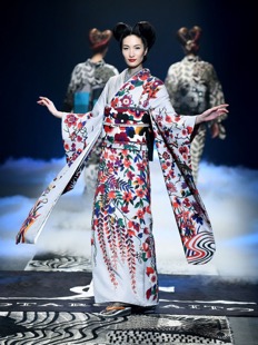
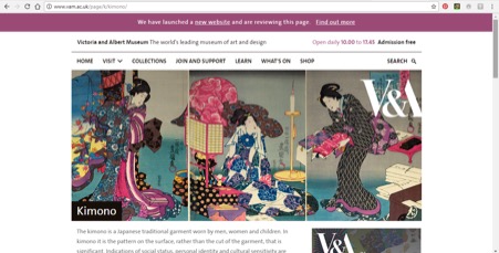
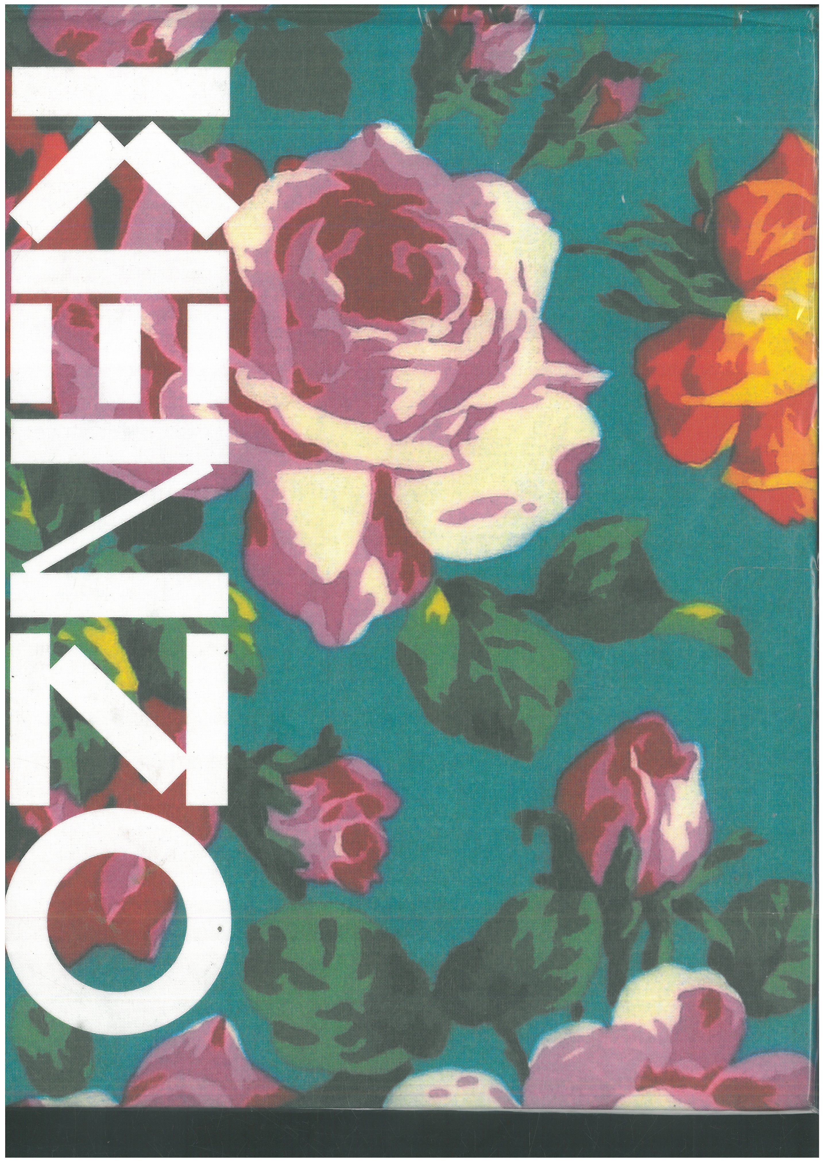
Task 3/4 incorporated the multi-platform research style from the previous task so I had the basic skills for this task. The task helped me find different fashion concepts which I had previously not explored. Most of my work in the past has been inspired by Asian culture and dress (like Task1/2), so being able broaden my knowledge is very beneficial to my work and practice. I incorporated this new knowledge into my project work and have a better database of research for my designs to develop from.

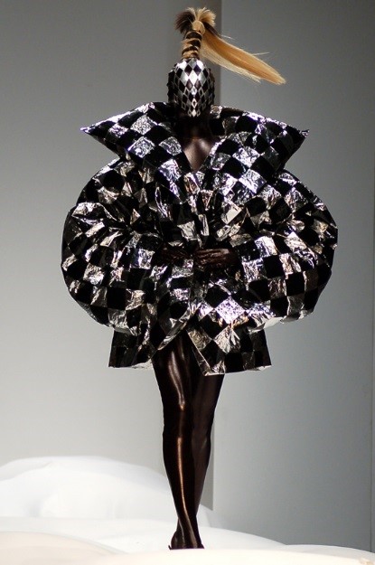
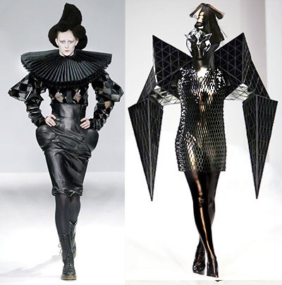
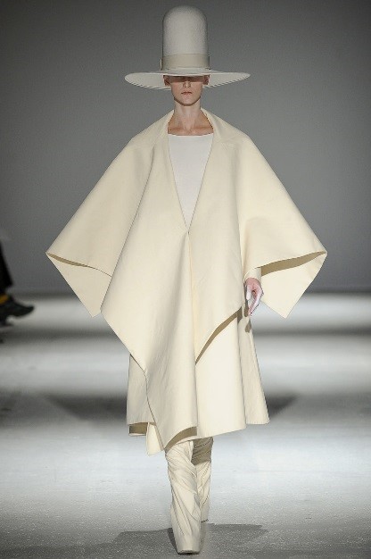
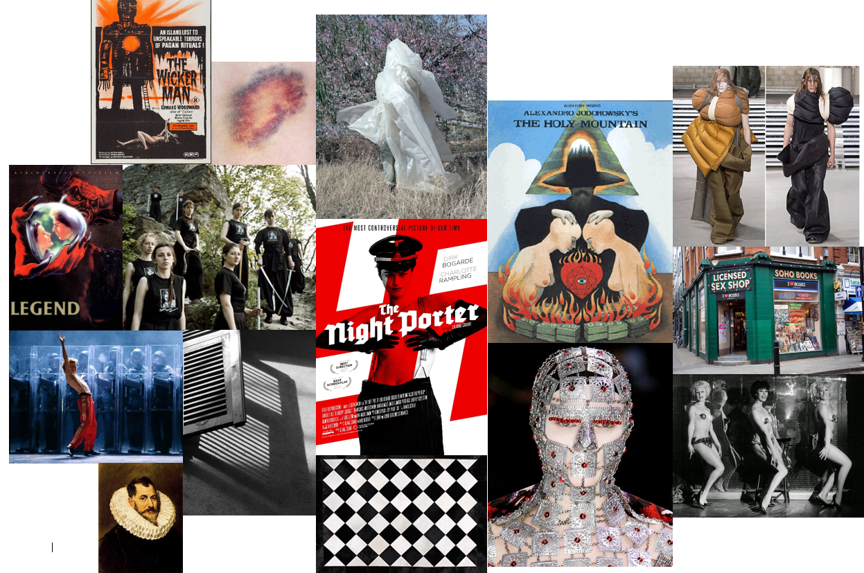
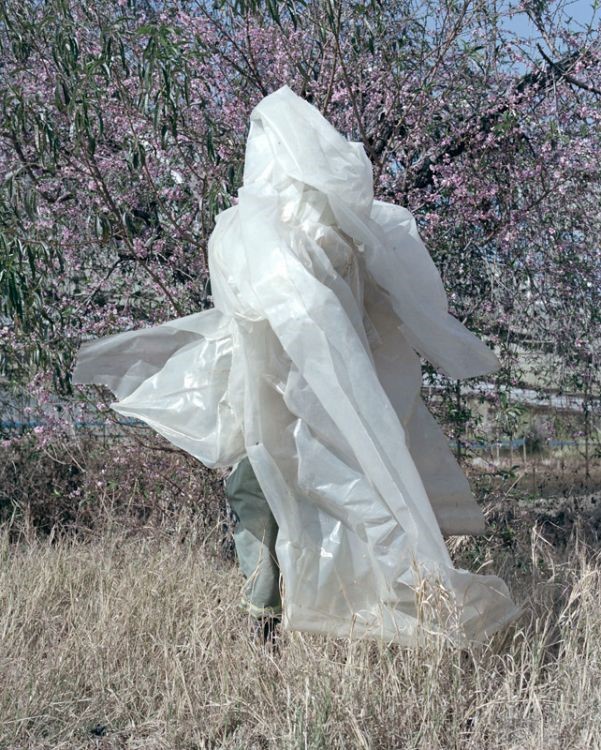
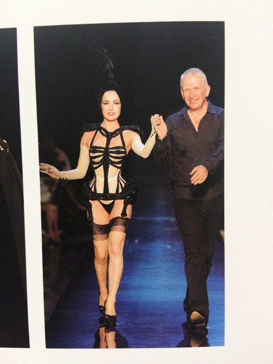
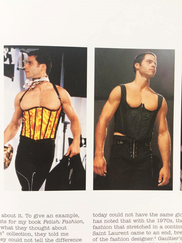
Task 5/6 was to explore the work of a designer and their inspirations. This task was extremely interesting as my knowledge of designers is limited and exploring one in depth really helped this. I read multiple articles and interviews with Gareth Pugh to discover his inspirations and with that I found new resources and concepts which I could work with in future projects. I used this task in my own work by using Gareth Pugh as inspiration for my fashion design project. His inspiration from photography and films has also given me new locations to get ideas from.

Task 7/8 was the most challenging for me as it involved reflecting on academic writing. I understood the writing and the meaning despite the more advanced language. When it came to reflecting I found it more difficult to have a starting point to begin my response. I followed the advice from the lecture by writing and leaving to come back a few days later. This method was very helpful as I got to reflect and analyse my own writing and then improve it. My writing became more coherent and I related my references to it with more accuracy.

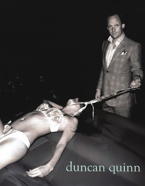
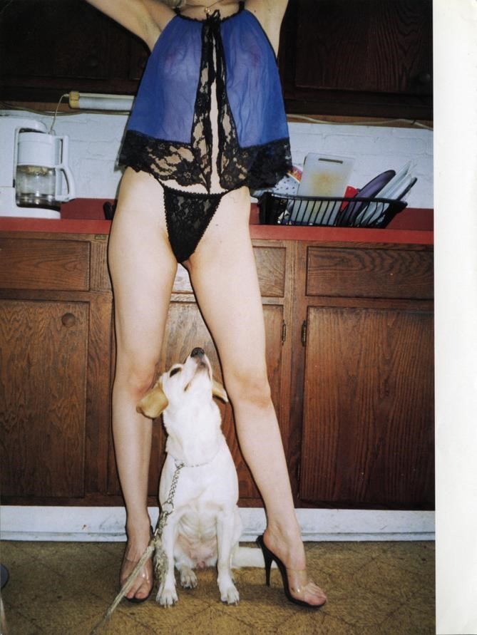
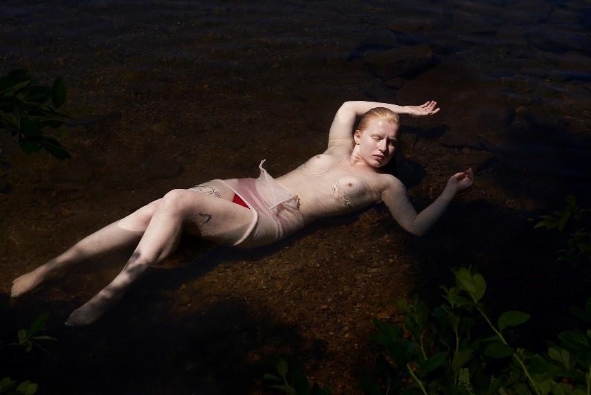
Task 9/10 involved discussing ethical issues and deeper meaning within a fashion ad photograph. This task was interesting as it involved more serious issues within fashion that the other tasks hadn’t involved which helped improve my analysis of the various meanings and symbols within the image. Analysing the faults and neglect for ethics within areas of fashion, has inspired me to be more vigilant in the creating and photographing of my work.

In conclusion, these tasks have allowed me to build new skills within researching and expanding my knowledge and analytical skills for both imagery and text. Building these skills and being able to critique ethical issues has made me more informed as a practitioner and designer. The most important skill I can take from this module is how to research on multiple platforms to enrich and inform my work more successfully.

Task 9/10 -Ethical Issues

This is a 2008 campaign ad by the male suit designer Duncan Quinn. The shot depicts a woman in lingerie on the hood of a car, appearing to be strangled by a man in the brands clothing. When reviewing the brand itself it is clear to see that this is a very classic suit brand for the “man’s man” audience with the website featuring fine suits, fast cars, expensive wines and guns. The website in itself sets up a very dominant male aesthetic which is translated into this image with the well-dressed male dominating over the injured woman who appear to be lying almost lifeless on the car bonnet. In “What should we tell our daughters?” the event of women protesting the difference in the way men and women were dressed in tabloids outside of the Sun offices was discussed, “one journalist summed up the difference between the two with a single word ‘clothes’. (As in men are allowed to wear them and women must be stripped bare” (Benn 2013). This statement is very relevant within this ad campaign as the attire of the female compared to the man suggests a similar shift in their status with the man appearing more put together and less dishevelled than the female which makes him seem more powerful. The combination of this ad and Benn’s statement also implies that there are some serious ethical flaws within modern media platforms in how men and women are portrayed with stark differences in status and modesty.

Height is also another status suggesting feature of the image as the strong pose of the man compared to the woman draped on her back suggests the male is in control. The female model also has what initially appears to be a noose around her neck, however on closer inspection it is actually one of Quinn’s ties. This use of the product is quite sadistic in how it is controlling the female and potentially killing her – this idea is supported by her body positioning and the addition of blood spilling from her head onto the bonnet. A tie for is usually a symbol of power and its use in this image has contorted this meaning into something more grotesque and almost implying that a woman should be controlled by the man by having them on a leash – theoretically or in this case literally – and being submissive.

Another ethical issue raised in this ad is that it stimulates ideas of abuse and rape which is suggested from the female’s attire, the tie and the male models smirk which is unnerving to view as it adds a very sinister tone to the already disturbing image. These ideas of a woman being submissive and suggesting abuse are an out-dated mindset and to be discussing within this campaign as it seems like something from earlier times in history when women “should be in the kitchen” and subordinate to their husbands/men. Ethically this does raise some queries as this is not a modern-day way of thinking amongst most of the population which makes it an even more controversial idea to be suggesting within a fashion campaign as morally it is wrong to control someone, especially like this through physical and sexual violence. In Melissa Benn’s book “What should we tell our daughters?” she discusses how feminism has helped morph societies views from the 1960’s views and mentions the Linda Grant tweet about how “in 1979, she could not apply for a store credit card” (Benn 2013), “unless the form was signed by her husband or father” (Benn 2013). This quotation from Benn’s book illustrates the notion that the type of relationship and status balance between the man and woman in this Duncan Quinn ad is outdated and society – for the most part – has expanded beyond that making this ad ethically wrong in how it belittles societies progress over the years regarding improved equality between the sexes.


References:

Benn, M., 2013. “What should we tell our daughters?”  John Murray Publishers

Task 7/8 – Reflective Writing

Sanda Miller discusses how the fashion magazine and the concept of taste originated in 18th century Paris. The ‘Age of Enlightenment’ built the philosophy of aesthetics and the emergence of the Salons introduced art to a wider audience which established the ‘art critic’. The development of these two areas is argued to have changed how society collectively viewed beauty and style which has developed into the modern age.

For me the most significant aspects were how the concept of taste originated and how it was adapted into society. Through the Enlightenment European philosophers helped stimulate the idea of individual liberty which branched into freedom of press and freedom of expression.  This therefore instigates that the development of freedom of expression within society, helped postulate the notion to express one’s opinion creatively. Miller states that at the time the British Empiricist philosophers helped create a foundation to shift from more subjective appreciation responses “by postulating a special faculty -taste- which provided a rational basis on which such response could be regarded as universal” (Barlett, Cole & Rocamora 2013). I agree with this statement as it is evident that the concept of taste was then integrated into society through the introduction of the Salons in the 17th Century and then having an increased regularity from 1737. This increase of the Salons can be explained by the more developed idea of a universal response – with the emergence of the art critic – towards art and beauty which inspired more people from different educational backgrounds to go to these shows and be exposed to art on a more regular basis than previously seen in history.

From the Salons came the art critic. When the art critic came about they were seen to have a “delicacy of the imagination” (Barlett, Cole & Rocamora 2013) and “must preserve his mind free from all prejudice” (Barlett, Cole & Rocamora 2013). Miller states that “even the critical criteria of such a privileged person could be disqualified on empirical grounds such as insensibility, prejudice or lack of experience” (Barlett, Cole & Rocamora 2013). This idea that the rich and wealthy are not fully qualified to define taste and dictate what is tasteful is backed up by “you can dress head to toe in Gucci if you like – that proves you’re rich, but it doesn’t prove you have taste” (Tungate 2005), this quote illustrates the idea that even if you can afford luxury it doesn’t mean that everything you buy or how you compose it together is evidence of taste, and that it can be seen as distasteful.

The concept of taste also expanded into fashion magazines, with the most notorious being “Courrier de la mode ou le Journal de gout” which was a new type of fashion journal to have a “centrality of the concept of taste” (Barlett, Cole & Rocamora 2013). Miller argues that from these fashion magazines “readership were told how to dress, how to furnish their elegant interiors and how to entertain” (Barlett, Cole & Rocamora 2013) therefore creating “the beginning of what is now referred to as ‘life and style’” (Barlett, Cole & Rocamora 2013). However, I don’t fully agree with the statement fully in terms of how impactful the emergence of “life and style” was on the overall population and even the rich specifically as well. This idea stems from Elizabeth Wilsons’ statement that “at least until the French Revolution (1789) dress continued to be a courtly affair, and rank continued to dictate styles of dress to a large extent from the 14th century to the beginning of the Industrial Revolution” (Wilson 1985). Wilsons’ statement informs that the concept of taste within fashion still wasn’t fully integrated until the more modern age, with the rich mainly following trends rather than exploring their own tastes which is seen more in the art scene with the development of the art critic.

Having analysed Millers arguments and statements about the emergence of the concept of taste I now realise how impactful it was on society and how the philosophers during the Enlightenment period integrating this new concept into society through the Salons and then lightly through fashion magazines and how it paved the way for the modern fashion world which relies heavily on taste and individuality within that construct. I have however been able to see how Miller wasn’t entirely accurate about the concepts immediate impact within fashion through fashion magazines by reading Wilson’s work. From this I understand that the relationship between fashion and taste is a more modern one than previously I thought. As a next step I need to improve my ability to see what is tasteful within my work and how I view fashion as a whole to advance my abilities as a practitioner.


References:

Barlett, Cole & Rocamora (e.d) (2013) “Fashion Media: Past and Present”, London: Bloomsbury

Elizabeth Wilson (1985) “Adorned in Dreams: Fashion and Moderity”, London: Virago Press Ltd

Mark Tungate (2005) “Fashion Brands”, London and USA: Kogan Page Limited


Task 5/6 – Visual Research

Fashion Designer – Gareth Pugh

gp1 gp2 Examples of his workgp3 gp4

Reference Mood Board

mood


Image analysis

gp5

“Gift 2013” from the collection “Terrain”

Photographer: Jackie Nickerson

Shoot location: Southern Africa

The subject of the shoot is a local farmer from Southern Africa who has been immersed in a piece of plastic sheeting to obscure their face and body. The portrait image is a head on shot of the subject which gives it a more intense contrast between the harshness of the plastic and the softness of the natural landscape behind the subject. By having the image in full focus, the viewer can see the harsh folds and lines of the plastic more clearly which gives the image more definition and sense of 3D form. The image has been taken with most likely a DLSR camera and has been probably slightly cropped to allow a stronger point of focus on the subject to make them the focal point of the image more successfully. Nickerson has used the rule of thirds as well to immerse the viewer in the subject of the photo by positioning them in the full 3 centre segments with small pieces of plastic sheeting spreading out to then allow the viewer to observe the natural landscape surrounding the subject. The style of the image is more of an artistic portrait of the subject with them only suggested through the basic form whilst the rest is hidden through the plastic sheeting, however this in itself instigates narrative. Nickerson tends to work with the normal people of Southern Africa such as farmers and workers as the subjects of her images. The tones tend to be faded slightly and there is a common trend of obscuring the subjects face or body in some way to conceal identity. The shoots also normally take place in the landscapes these people work in.

When comparing this image to Nickerson’s other work it is clear to see that they all follow a common trend of obscurity of identity and a focus on the landscapes the subjects work and live in. After reading a review of Nickerson’s work by Jack Shianman I have been able to broaden my understanding of the work, he writes “TERRAIN is about us in the landscape, how we change the world we inhabit at every moment of our being human, and how, for better and for worse, the world that we make, in turn, changes who we are.”. This statement involves a deeper understanding of how we as humans adapt into our environments and effect it both positively and negatively in the process. Nickerson illustrates this concept within what she clads her subjects in – palm leaves, crates, plastic and tangled wood – all of which create their own contrasts and atmospheres when placed within the natural landscapes around the subjects, for example the contrast between the plastic and nature within this image is slightly strange to view and I feel like that represents the current balance between humanity and nature in that its unbalanced and not synced with one another with the plastic being harsher against the softness of the plants behind it. I decided to compare Nickerson’s work to that of Steve McCurry who does a lot of travel portraits of the local people in the places he visits, by comparing the two an interesting contrast surrounding colour was seen as McCurry’s photography was a lot more vibrant and portrayed a more colour side to life and humanity by expressing a variation of culture and what humanity is. This is different to Nickerson whose work is more faded in tone and instead of expressing the subjects face (which McCurry uses to express the life of the subject and connect with the viewer) she instead uses objects to hide them and allow the viewer to develop deeper meaning on the relationships of the elements of the image and how they compare to humanity’s relationship with the surrounding world. McCurry’s imagery also commonly uses a shallow depth of field to focus more on the subject rather than the landscape around them whereas Nickerson uses a wider depth of field to express a balance in her work and relationship in the elements.

In conclusion Nickerson’s work demonstrates a sense of opposite and an unbalanced nature which allows me to see why Pugh was influenced by it for his AW14 collection which features more stripped-down materials and materials similar to the plastic sheeting in the photographed draped onto the model’s body. Through my research into Pugh’s references I found opposites to be a key element which is most likely why he became interested in this image by Nickerson, due to its strange relationship between the subject and the landscape as there was something slightly off about it but it’s hard to describe which I feel is a common element of Pugh’s collective works.

Bibliography

http://www.dazeddigital.com/fashion/article/11272/1/20-qas-gareth-pugh

http://www.dazeddigital.com/fashion/article/23560/1/gareth-pugh-a-visual-history

http://www.dazeddigital.com/fashion/article/20252/1/gareth-pugh-s-labyrinth

http://garethpugh.blogspot.co.uk/p/collections.html

http://www.jackshainman.com/artists/jackie-nickerson/

http://stevemccurry.com/galleries

http://www.jackienickerson.com/work.php?pid=1&mode=4

Task 3/4 – Academic Integrity


(Book)

The Fashion World of Jean Paul Gaultier: from the sidewalk to the catwalk 

jpjp2jp3

(Webpages – Fashion Photographers)

Terry Richardson                                        Drui and Tiago

jp6      jp4

Jason Kibbler

jp5

(Article from i-D magazine)    Sofia Hattingh

jp8 Photograph by Frances Carterjp7

I started with the Jean Paul Gaultier book as it had a large collection of his work which allowed me to draw some themes from this to take forward in the rest of my research. The main pieces displayed in the book that I focused on were the ones that involved eroticism and heightened sexuality as I wanted to explore how designers incorporated eroticism and fetish within their works as I found this to be a key feature of Gaultier’s work. I selected a few images from the book to illustrate this point such as the male corsets and the structured female piece which was more of a deconstructed corset which is a piece that embodies both the themes I wanted to explore.

I researched into eroticism and fetishism with fashion design however I couldn’t find that much that had a whole website or webpage for it so I decided to research into fashion photographers who explored sexuality within their work as this was a more fruitful research option. I found my 3 photographers by looking at sites which had collections of fashion photographers who were currently working and very successful. Terry Richardson was one of the main photographers I wanted to look into as he was involved in the scandalous Tom Ford campaign which was banned in multiple countries due to it over sexualising the female body to advertise the cologne. After looking into the more extreme end of the sexual fashion photography I looked at slightly softer examples such as Drui and Tiago and Jason Kibbler both whose work explores a more dignified expression of the female body. Whilst both photographers explore nudity and suggestive sexuality it doesn’t hold the same intensity and atmosphere as Richardson’s work which feels more expletive and intrusive which is more intimidating to the viewer.

For the newspaper article section of my contextual research I found an article in i-D magazine which had an interview with Sophia Hattingh who in 2015 made glasses which had pubic hair put in them. This magazine article related very well to my other research as it involved fetishism within fashion which was more controversial and made a statement about how society reacts to sexuality displayed in the media. Through researching into this article I was able to see how Hattingh wanted to push the boundaries of fashion materials and societies acceptance of sexuality by putting more controversial materials into her work.


Reference bibliography

Editorial Portfolio- Drui and Tiago (2017) Editorial Portfolio – Druiandtiago. Available from http://driuandtiago.com/Editorial-Portfolio [Accessed 25 October 2017]

Terry Richardson Official Website (2017) Terry Richardson Official Website. Available from http://www.terryrichardson.com/archive/#/vintage/39/3 [Accessed 25 October 2017]

Jason Kibbler (2017) Jason Kibbler. Available from http://jasonkibbler.com [Accessed 25 October 2017]

Sarah Gooding (2015) reframing gender, identity, and sexuality in fashion with sophia hattingh. i-D Magazine, 16 January, https://i-d.vice.com/en_au/article/mbvp73/reframing-gender-identity-and-sexuality-in-fashion-with-sophia-hattingh

Menkes, S (2011) The Fashion World of Jean Paul Gaultier: from the sidewalk to the catwalk. Unknown: The Montreal Museum of Fine Arts in association with Abrams

Task 1/2 – Online Resources

Kenzo Autumn/Winter 08Kenzo 08

Images of Kenzo’s 2008 Autumn/Winter collection (page 122 in book). There is clear influence of traditional Japanese Kimono with the back of the garment modernising the Obi belt of the traditional garment.

Image on left is from the Kenzo book published by Rizzoli New York, photographer unknown

Image on right is from http://www.elle.com/runway/fall-2008-rtw/g17649/kenzo-225307/?slide=45 (The book didn’t have a front picture of the garment so I wanted to find it to support the evidence of Kimono influence)


Jotaro

https://www.japantimes.co.jp/life/2016/03/26/style/designer-jotaro-saito-seeks-free-kimono-confines-tradition/#.Wed_R1tSzIU

Tokyo fashion week March 2016 Jotaro Saito Photographer unknown

Image shows how kimono has been redesigned and adapted into high fashion concepts. “I represent the third generation of kimono makers in my family, and we have always worked more like designers than shokunin craftspeople.”


VA

Then I began looking for an archive which would broaden my understanding of Kimono and its history. I found that the V&A has a large collection of Kimono in its archive and a lot of information on the topic with separate articles on the topic as well which is very helpful at broadening my understanding of the Kimono and the culture behind it. The collections on the website are also effective at providing reliable information. http://www.vam.ac.uk/page/k/kimono/


From conducting my own research in the library I found Kenzo’s book by Rizzoli New York which contained a vast amount of his collections over the years, with his 2008 Autumn/Winter collection standing out the most to me. I applied my own contextual knowledge when observing his work to find that he took inspiration from traditional female Kimono in the way he had adapted the obi belt into his piece by having the fabric form a back detail in his garment as this is similar to how obi is tied. After I researched into what the front of the garment looked like I also found it to have a play on the neckline of kimono as well.

I extended my research from these initial images in the library by exploring how other high fashion designers have taken inspiration from Kimono in their designs but made it modern and put their own personal style on it. This was done by doing an image search of Kimono on google which led me to find Jotaro Saito’s work in his Spring/Summer 2016 collection which was heavily inspired by traditional Kimono but designed with a modern outlook in its designs and pattern cutting. This image took me to an article about the designer in the Japanese Times where it was explained that he is a third generation kimono maker in his family who have always made kimono but with a “designer” state of mind rather than a more traditional one which interested me greatly as it shows how tradition has been rethought within his family to create something visually stunning and captivating.

With Jotaro having ties to traditional Kimono construction and design through his family heritage I decided that it would be beneficial to research into an archive which had more information on the traditional dress in its raw form. This lead to me finding the V&A’s Kimono archive which is extremely vast and in-depth with many pieces being displayed within it ranging from more common clothing to more lavish pieces which was very beneficial to my research as it demonstrated the range of different cuts and designs within Kimono itself and how culture and society effected these qualities. The V&A have a specific home page for their Kimono archive which branches off into different articles and pieces relating to the subject addressing different topics surrounding it. These articles are packed with reliable information about Kimono and inform me of things about the traditional dress style which I didn’t know previously.

This contextual research journey has been beneficial to my approach to research as I can see how a small piece of information such as my library image can expand into new topics and information which I didn’t know previously and can help inform my designs to make them more personal and knowledgeable. By beginning with Kenzo’s work I have also been able to understand how incorporating your own cultural history and personal experiences into your design work can make help develop a personal style and visually be stimulating for the audience.


Bibliography

http://www.elle.com/runway/fall-2008-rtw/g17649/kenzo-225307/?slide=45

http://www.vam.ac.uk/page/k/kimono/

“Kenzo” By Rizzoli New York   Published 2010    Image chosen is from 2008 Autumn/Winter collection (page 122 in book).

SPR_B63_W2117101211110

Designer Jotaro Saito seeks to free the kimono from the confines of tradition