Author Archives: Clarissa Rogers

Final Summary

For the Research and Communication skills (RCS) module I liked how the lectures expanded my knowledge of the design industry which I intend to be working in. For example, the issue of copyright in the week 3 Academic Integrity and Plagiarism lecture and how it is relevant to my studio practice for the future and also now as a student. Sometimes it could be difficult to grasp the concepts talked about as they needed a different way of thinking and working compared to working in the studio. I found it interesting researching the individual tasks though. The most challenging task was the reflective writing in week 6 as this involved academic reading which I have not done very much before.

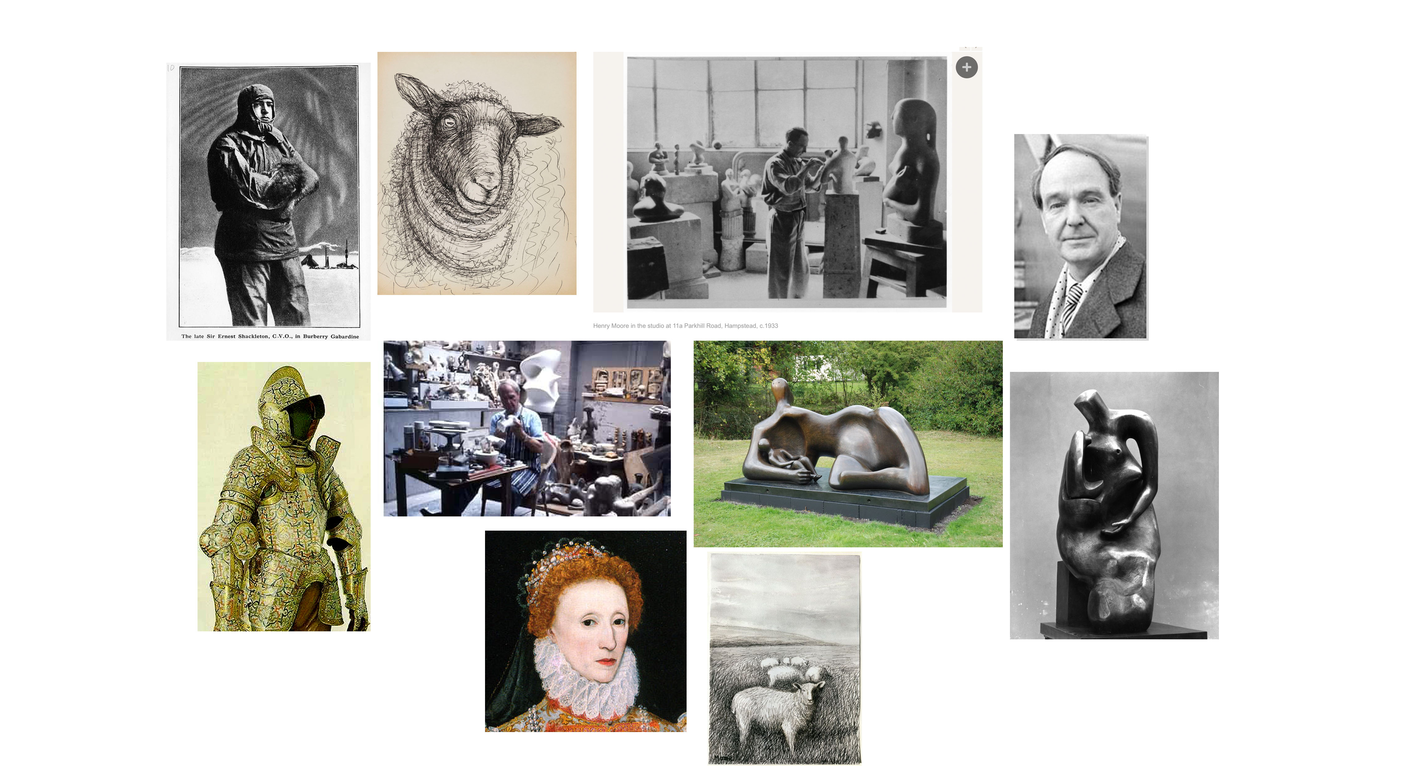
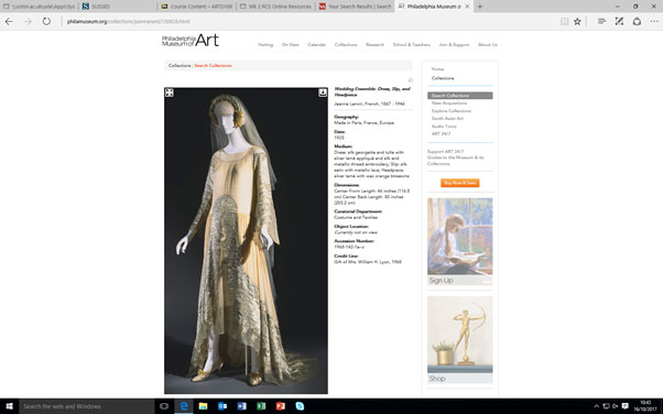
Within the RCS module I became to understand the need for good research and tried to make the most of the library. I realized that by having good solid research I had a better understanding and therefore it made the writing easier. I think this is because I was more confident in what I was writing about. I found a very useful magazine in the library for the week 4 visual research task which included an interview with the designer himself that was relevant to the task. Because of this, it was easier to find the images needed for the mood board than having to search through lots of internet pages that may not have been relevant.

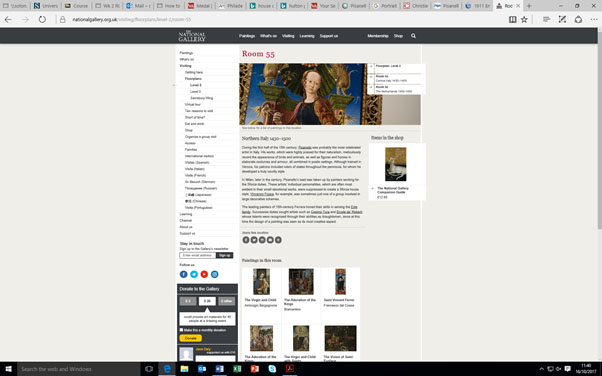
For the task in week 2 of online resources it highlighted how previously I had relied too much on the internet which you cannot guarantee the accuracy of the information on it and therefore can lose confidence in what you are trying to say. As a result, it was also useful to be directed to reliable websites too, and I have now learnt that museum websites such as the V&A are a great resource as they generally have a wide variety of trustworthy information. In the future, I intend to use this way of gathering information, by being more discerning about where I choose my sources of research from. I think that by having a good basis for research, and I hope my work will reflect this. I am already trying this in my studio practice by spending time in the library to gather inspiring images instead of going straight to the internet. With the internet, I am being more particular as to where to look such as using the V&A website.

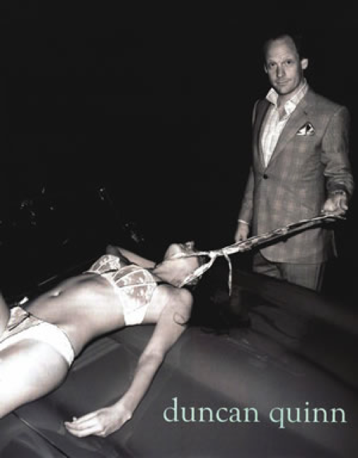
Week 8’s task on Ethical Issues was the most thought-provoking for me. Although I had had some brief thoughts on these issues before, by having the lecture on these issues my opinions became stronger. I had never had to write in this way before though and found it hard to put across an opinion on such an appalling and disturbing image.

To conclude, I have found the subject matter in RCS interesting and useful to learn about. I liked hearing people’s opinions within the lectures on these subjects. The most challenging part to this module was the writing after the lectures but it was good to be able to use the library resource to help with this.

Week 8 – Ethical Issues

Duncan Quinn describes themselves as a ‘bespoke atelier and lifestyle destination for discerning gentlemen.’ They are a high end brand which started up in 2003 most known for making custom fit suits for males. It is interesting that they describe themselves for the ‘destination for discerning gentlemen’. My automatic opinion of this advert of theirs is that the male shown in the advert is the opposite of a gentlemen and therefore so is their brand.

Also, those that are not already aware of the brand may think that Duncan Quinn sells lingerie given the focus on the female’s underwear. My initial thoughts are is why is it so necessary for a so called ‘gentleman’s’ brand to have an unclothed female in their advertising? Surely they should be trying to reflect what a gentleman is? Instead of the complete opposite

In this advert there are many problematic ethical issues. I think that the main issue though is the dominating male. Jennifer Craik writes ‘It is in this way that fashion photogrophy exceeds the seams of the clothes it portrays by playing with current definitions of sexuality and identity. Its conventions are neither fixed nor purposeful, instead constituting a nexus between fashion and selfhood – and above all, embracing the instabilities, conflicts and contradictions in sexuality. As a representational technique, fashion photogrophy has far reaching practical consequences.’  (Craik 1993) This advert definitely ‘exceeds the seams of the clothes it portrays’, The advert is not focused towards the clothes of Duncan Quinn but almost suggesting a lifestyle that will be achieved with buying from Duncan Quinn. This is scary as the suggested lifestyle is the male superior which goes against our common view in the 21st century.  For example in this image, the male is the focal point. He is standing upright, looking directly towards the camera whereas the female is lying down looking away from the camera. He is portrayed as being well dressed in a suit which completely contrasts to the female who is represented with no clothes on.

These contrasts in how the individuals are shown, with the male dominating the photograph almost automatically reflect society and the inequality of the sexes. The general view of society though is working to change this inequality. Therefore this image is shocking as it goes against the general view of society and therefore its viewers of the advert, it is displaying an almost old fashioned view that would make many people nowadays angry.

Another ethical issue is the media and their influence on society with the wide availability of images like these. Most people would be shocked by how this man is acting to the female with his tie tied around her neck, even more so that the female is only in her underwear.  Disturbingly, Duncan Quinn sell ties and for some reason think that this is an appropriate way to display their product, again this is the most opposite to gentlemen like! This pose could almost suggest rape, to the viewer it looks like the female is not in control of herself by the way she is shown. Duncan Quinn should be aware of their influence to whoever will see this image. Jennifer Craik mentions ‘fashion photography has far reaching practical consequences’ (Craik 1993) and I think that this is an example of a far reaching consequence as scarily this advert is available to be seen by everybody, including children. It could give an impression as to what Duncan Quinn seem to consider to be gentlemanly and supposedly ok.

Bibliogrophy:

Craik, J. (1994). The face of fashion: cultural studies in fashion. London, Routledge.

Duncan Quinn (2014)  Shop. Availible from: http://duncanquinn.com [Accessed 28 November 2017]

Clarissa Rogers Week 6 Reflective Writing

Sanda Millers has written the article ‘Taste, Fashion and the French Fashion Magazine’ which describes the introduction of the Fashion Magazine and what happened as a result of this. A main concept she talks about is the effect the fashion magazine has had on society’s ‘taste’.  An example of what she writes is ‘But whilst taste was indeed borrowed from aesthetic discourse, its application to fashion was, we could say, revolutionary, for these fashion magazines became – as pointed out at the beginning – more than repositories of taste; rather, they prescribed it.’ (Miller 2013). This was not the purpose though when the first fashion magazine started which was Le Mercure Galant in 1672. ‘Moreover it could be argued that the emphatic linking of the words fashion and taste in its title testifies to the unexpected role the concept of taste was to play within the newly emerging context of the fashion magazine’ (Miller 2013) Miller hints at how the Fashion Magazine was unsure of it’s purpose.

We are told how the first accepted fashion magazine was ‘initially conceived as a gazette aimed to cover the arts, theatre and literature, as well as society reports and a gossip column’ (Miller 2013).  I think the ‘unexpected role’ most likely came from the popularity of the items discussed within the magazine, such as the theatre as it is likely only the ‘best’ shows would be discussed which in turn gave the magazine credibility for what is good taste. Perhaps the magazines had the credibility to be able to start to ‘prescribe taste’ because they showed the style of the French Courts and Aristocratic circles. With these people’s style included within the magazine, who are so high up in society automatically gives the magazine authority on taste. Also, the way in which the magazines were displayed could almost be thought as tasteful as the fashion illustrations were drawn by famous artists. With this publicity society can now see a new and alternative view on fashion which they come to like, resulting in their opinion on ‘good taste’.

With the fashion magazine ‘prescribing taste’, people want to be able to wear what is thought of as good taste. Elizabeth Wilson explains how ‘Railways, the telephone, the cinema and the mass circulation of newspapers and magazines intensified the rush and pace of modern life 
 This meant that fashion became even more important than it had been in the pre-industrial city. It’s circulation of images was itself a form of mass communication’ (Wilson 1985). I think that this highlights how the fashion magazine makes people aware of style and therefore good taste, with society easily being able to view the popular tastes from all over the country.

‘But it is not simply because la passante distinguishes herself through her appearance that she is an appropriate figure of fashion discourse. Her status as the object of a fugitive encounter captures the ephemerality of both fashion and modernity, making her one of their ideal symbols’ (Rocamora 2009) This again highlights how fashion magazines are so influential on taste. The imagery that is used within the fashion magazine also shows a fashionable lifestyle.

Having read these articles I think that the introduction of fashion magazines did have an impact on societies taste. This makes me wonder how our taste is being influenced nowadays with images so easily available over the internet. If the taste of society changed so quickly with the introduction of railways then our view on what is good taste must be too. However with the wider amount of sources available to us maybe this means we are more accepting of different tastes.

Bibliography

Wilson, E. (1985) Adorned in Dreams: Fashion and Modernity, London. Virago

Miller, S (2013) Fashion Media Past and Present, London. Bloomsbury

Rocamora A (2009) Fashioning the City Paris Fashion and The Media, London. I.B. Tauris & Co Ltd

Academic Integrity & Plagiarism


I am interested in our Royal family’s Fashion, past and present. In the Library I came across a book called ‘Fashionista A century of style Icons’. Aware that Royals have been very influential on our fashion I began to flick through this book to see which ones were mentioned. I came across the Title ‘The Duchess of Windsor’ and with further reading I learnt that just for her honeymoon she took sixty-six dresses!

Looking more into the Royal’s fashion I remembered about an exhibition that had previously been on. I searched this and found on Vogue’s website there was an article about this exhibition which was called ‘Fashion Rules Restyled’ that occurred at Kensington Palace. By reading this it was interesting to find out what the people that designed the Royal’s clothes need to consider such as keeping to one block colour so that the Royal is visible.

I then found an article in Vogues most recent edition which talked about the Queen and her life. Although this article focused less on her fashion It still gave a good representation of the Queen herself which I think intern is reflected into her clothes. They talk about the Queen being ‘a sensible girl’, which I think explains the sensibleness of the clothes she wears. It talks about the Queen’s dresses and explains why they have not changed too much in the many years she has reigned.

Looking at these different articles I found it interesting the different views and scopes taken on such an iconic families. It is a much discussed subject about the way they dress and from this I think that we can see how fashion is important in representing our individuality.

Bibliography

Book:
Werle, S (2009) Fashionista A Century of Style Icons London: Prestel Publishing

Website:
Milligan, L (2016) Inside Three Royal Wardrobes Available from:
http://www.vogue.co.uk/gallery/queen-princess-diana-exhibition-fashion-rules-restyled[Accessed 13 November 2017]

Magazine Article:
Smith, Z (2017) Mrs Windsor, Vogue, December, 135 – 138

Visual Research

Mood Board of Christopher Bailey’s (Creative Officer and President at Burberry) inspiration

Henry Moore photographed by John Hedgecoe , 1966 Photograph: Topfoto

David Hockney photographed by John Hedgecoe, Platinum print, 1971, 9 3/4 in. x 7 1/4 in. (248 mm x 184 mm)

This image is of Henry Moore working in his studio. In this photograph we can see lots of Henry Moore’s creations around him. Moore is placed just off the centre point of the photograph with the background looking busy from lots of his sculptures scattered around him. I think that John Hedgecoe is trying to capture Moore’s way of working with Moore blending into the forms and neutral colours of the sculptures and therefore the busyness of the photograph which could reflect Moore’s way of working. With Moore’s face in shadow helps show how he is intent on his work.

Hedgecoe is known for his portraits of Artists. I think that Hedgecoe tries to reflect Artists way of working with how he captures the image. Hedgecoe is obviously comfortable photographing Artists in their personal environment which could be considered unusual and maybe uncomfortable to others.

This image of David Hockney in his studio is also photographed by John Hedgecoe. Unlike the photograph of Moore who is crouched over almost trying to avoid the camera, Hockney is shown standing upright ‘proud’ of his artwork. Similarly to Moore’s photograph Hockney is also photographed just of the centre. Instead of the other photograph though only a third of the photo is cluttered with Hockney’s artistry tools and he as the artist stands out much more, the photograph almost seems calmer. This could reflect their different ways of working. In Moore’s photograph though he is the focus, all the sculptures are so mixed up with one another it is difficult to separate them whereas in Hockney’s photograph I think the painting is the main focus, almost like Hockney is placed there to give an impression of the size of the painting. It could also be to show that Hockney has just completed the painting. Interestingly, at first glance it is as if John Hedgecoe is photographing 2 people as the painting in the photo is almost life sized.

Photograph of a full length romantic-style wedding dress by Jeanne Lanvin in the book ‘The white dress – fashion inspiration for brides by Harriet Worsley’. Page 131 Photographer Hultun

Photograph of a full length romantic-style wedding dress by Jeanne Lanvin in the book ‘The white dress – fashion inspiration for brides by Harriet Worsley’. Page 131 Photographer Hultun

Wedding Ensemble: Dress, Slip, and Headpiece Jeanne Lanvin, French, 1867 - 1946 http://www.philamuseum.org/collections/permanent/150828.html

Wedding Ensemble: Dress, Slip, and Headpiece
Jeanne Lanvin, French, 1867 – 1946
http://www.philamuseum.org/collections/permanent/150828.html

https://www.nationalgallery.org.uk/visiting/floorplans/level-2/room-55

https://www.nationalgallery.org.uk/visiting/floorplans/level-2/room-55

I’m interested in wedding dresses and how the symbolism has stayed the same for so many years yet over the years the style of them changes. I also like how each wedding dress is personal to the women wearing it reflecting them individually. I decided to look through books on wedding dresses in the Library. When flicking through the books on Wedding dresses I came across this image of Jeanne Lanvin’s design.  I loved everything about the image, how unique the dress was and the pose of the bride. It is unusual to see a bride wearing a hat, not a veil and as a result how the photograph is taken from the side to hide the bride’s face whereas a normal veil would cover the face anyway.  

From finding this photo, I was keen to look at other designs by Jeanne Lanvin, I searched her name and came across this other wedding dress that I thought was so unique. On Philadelphia Museum of Art website, they have one of Jeanne Lanvin dresses in their archive. There is a photograph with information written about this dress.  They write ‘This wedding ensemble, designed by Lanvin in 1925, evokes the feeling of early fifteenth-century Italian fashion; its silver lamĂ© appliquĂ© and embroidered feather design as well as its rounded bridal headdress recall Pisanello’s well-known studies of Northern Italian women wearing gowns with winged, cape like sleeves and oversized turbans.’  

From this I decided to look up Pisanello because he was one of the inspirations for Jeanne Lanvin. Pisanello was believed to have worked in the 15th century as a medallist, fresco and panel painter. There is limited imagery on him because his pieces are so old. He did however create bronze medals that have survived well. Although these do not relate completely to Lanvin’s inspiration, you can still see his use of head dresses in them. The depictions of people on them are all of men not woman but you can still see how he has created exaggerated headpieces for them. I did find this image on the national gallery’s website of one of his works that is painted in Northern Italy estimated around 1430–1500, here you can clearly see how Lanvin’s been inspired. The girl is wearing a headpiece not too dissimilar to the original image from the book I found. Maybe this dress was too inspired by him? Â