Author Archives: Daniella Howe

500 Word Summary

Throughout this 10 week Research and Communication Skills module, I have learnt a variety of skills whilst looking at many topics that impacted art culture as well as art based theories which has enabled me to apply and practice many ways of creative thinking, and making my work more meaningful. Researching has helped me develop my work and give it a sense of purpose and meaning as I have learnt how to support my opinions and exploring new ways of thinking.

Prior to starting the module I was already fascinated with graphic design, specifically typography and was aware of great artists such as David Carson, Craig Ward and Alex Trochut. When it came to week four, and we were asked to explore ‘Is it possible to be truly authentic?’ it sparked my thinking and inspired me to once again explore my interests and push my thinking more. After being taught new skills I began to find how to incorporate what I was learning into my rotations especially Graphics as this was my opportunity to experiment with graphic elements such as kerning, spacing, type, aligning, scale and more. This boosted my confidence in using more Adobe programmes where I was able to experiment. By using old influences I was able to reignite my passion and push my experimenting further in a more sophisticated style. Moreover, the research I carried out allowed me to become more of a critical thinker and meant I was able to reflect upon what these artists were doing and allowed me to interpret it for myself. I feel as though I have achieved a deeper more meaningful understanding of the origination.

The lectures helped further my research on all the tasks and led me to understand the importance of all the art movements as well as how design can play a huge role in society and vice versa. The Netflix series abstract that we watched at the end of lectures helped me understand the topic more as I found visual learning aided me the most, as well as showing how different artists can work and what their influences are. It was fascinating seeing what an average day in the life of a professional designer could involve which helped me realise were I want to see myself. I feel as there is a connection with developing ideas within my practice and with the tasks, it meant I could tailor each of these to my own pathway.

Overall, after researching each task week by week it showed me the importance of previous art movements and the history of art culture. It has aided me in my way of thinking and how to support by opinions as well as looking at artists an understanding my profession to a greater level. Exploring specific artists has helped influence my practice more and has revealed that I want to keep pursing photography and attempt to incorporate this throughout my design work. It has helped me confirm which pathway I want to pursue.

Publish or Perish!

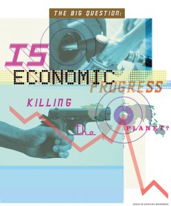
Jonathan Barnbrook uses a variety of graphical elements to create an illustrative, yet sparking effect to reveal the corruption of large corporate companies. Barnbrook uses many different typefaces within his design that mocks the professionalism of the large companies. Designers are powerful as they are the creators of what the public see and can convince them to think a certain way and Barnbrooks designs have very child like features as the colours and typefaces he uses does not match and seems to be purposeless. Barnbrook says ‘They’re choosing to keep their head down and just do the work’ which proves his point that the corporates are focused on themselves and exaggerates this in his designs.

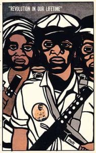
The Black Panther Party was an African American revolutionary group created in 1966. The purpose was to protect the resident in Africa American neighbourhoods from police brutality. They progressed into marxist ideologies and this can be seen in Emory Douglas’s art as he was part of the movement. Douglas states in an interview that “we caught them at a time when we knew the law, we did it within the law, and they didn’t know how to deal with it’, although this may be true it was not viewed this way as African Americans were seen as a minority and struggled to obtain the rights they deserved such as equality with whites. Douglas’s art is powerful and visually impacting as it pushes forward a political agenda.

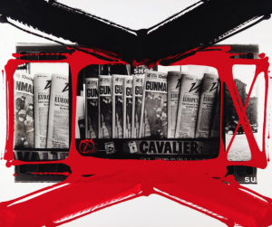
William Klein is an American photographer who has a unconventional style of abstract. Klein’s images break from established modes, such as using medium – grain, contrast, blur, cock – eyed framing, eliminating or exaggerating grey tones, he believed in showing what was possible. Klein uses paint to create more graphical work, which adds structure and experiments. The thick paint strokes add rustic effect, similar to making marks on a contact sheet. The paint work adds another dimensions to the image as it is drawing the eye exactly where Klein wants us to look.

Bibliography:

Gosling, E. (2016). Ad-busting, Bowie and controversial typefaces: a look at Jonathan Barnbrook’s graphic design activism. https://www.itsnicethat.com/articles/jonathan-barnbrook-adbusters-protest-anonymous-200416

Moroz, S. (2014). William Klein: ‘My pictures showed everything I resented about America’.theguardian.com/…/william-klein-my-pictures-showed-everything-i-resented-about-america

Rayner, A. (2008). Fight the Power. https://www.theguardian.com/artanddesign/2008/oct/25/emory-douglas-black-panthers

https://www.britannica.com/topic/Black-Panther-Party

(2007). The Revolutionary Art of Emory Douglas. http://art-for-a-change.com/blog/2007/10/revolutionary-art-of-emory-douglas.html


Task 6 – Postmodernism

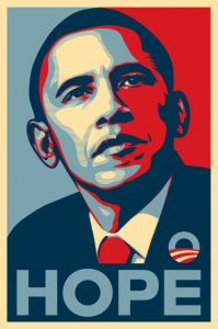
Shepard Fairey – Obama – Hope

Shepard Fairey is a contemporary artist who specialises in graphic design, street art, is an activist and an illustrator, that creates hard hitting art. Fairey became well known for his Barack Obama “HOPE” poster during the 2008 election. Fairey states “I’m not going to be intimidated by identity politics”, as he is an activist and strives for change it’s not a surprise that his work is influenced by politics. Fairey uses screen printing with a variety of layers to achieve clean, pristine lines and gives a posterised affect. This allows the tone to be split from continuous gradation to several regions with fewer tones which is what creates the bold images we see on billboards. Fairey uses Gotham typeface in his poster that reads “HOPE” in uppercase and is a geometric sans – serif typeface which is also simple but bold and gets the message across therefore was chosen well as it fits in with the poster.

April Greiman – 1970s

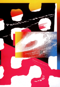
April Greiman is a contemporary Graphic Designer. Greiman was one of the very few designers who embraced the technological change and digitisation in the art world. Greiman pushes the boundaries of typeface and combined with image they reinforce and compliment each other. Greiman is constantly thinking about space within her designs and this can be admired in her posters where she uses type to give her posters dimensionality. Greiman ‘exploited pixelation and other digitisation “errors” as integral parts of digital art,.’ meant that she was able to be a futuristic within her design work and from a design point of you, her work would still be considered contemporary and modern in todays world.

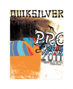
David Carson – Quicksilver – 2011

Carson broke every traditional boundary created within typography and design and rebelled against these ideas to create artwork that is very pleasing to look at as a designer although in theory it should not work. Carsons fascination with the surf world and type resulted in these incredible posters where there is a staggering use of symbols and type overlaying whilst working free of form suites this style of design. Carsons design appeals to all ages as it has a playful feel although still looking professional.

Bibliography:

Butler, A (2014). Interview with graphic designer David Carson. https://www.designboom.com/design/interview-with-graphic-designer-david-carson-09-22-2013/

Delaney, B. (2017). Shepard Fairey: artist behind Obama ‘HOPE’ poster unveils largest work to date in Sydney.https://www.theguardian.com/culture/2017/jun/17/shepard-fairey-artist-behind-obama-hope-poster-unveils-largest-work-to-date-in-sydney

Williams, L. (2016). April Greiman – New Wave design.graphicdesignwomen.com/april-greiman-new-wave-design

Zara, J. (2017). Shepard Fairey: ‘I’m not going to be intimidated by identity politics’. https://www.theguardian.com/artanddesign/2017/nov/14/shepard-fairey-new-exhibition-la-damaged


Task 5 – Counter Culture

Artwork from the generation of the 1960s, was about revolution and rebellion and artists of the time created a way of responding to the War and  government through music and art. When exploring ‘counter culture’ more and finding what artists had created in the 60’s and 70’s I found that bold contrasting colours and designs stood out to me the most, whilst I found that the most successful designs were those that filled the page entirely.”From a graphic design standpoint, psychedelia marked the switch from the strict modernist style of clean lines and clear type into a hodge-podge of influences, references and experiences”.

Psychedelic art was influenced by drugs, mostly hallucinatory such as LSD where the world was seen in kaleidoscope patterns including, abstract swirls using complementary colours and influences from Art Nouveau.

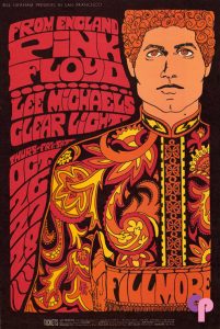
Bonnie MacLean/ Pink Floyd/ 1967

Bonnie Maclean was an artist who adopted the psychedelic style of art that was popular at this time and used it in her work. She predominantly focused on rock and roll poster art. I find that the colours are typical to the time and the style is very common amongst the psychedelic movement. The “spirals could often be found in Psychedelic works as well as concentric circles and a repetition of motifs or symbols” which is true to the movement.

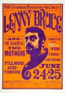
Wes Wilson – Bill Graham Presents/ Lenny Bruce/ 1966

Following on from the movement, another big artist in the psychedelic world was Wes Wilson who’s work I find intriguing as he uses a lot of loose type and allows the letterforms to express themselves, with an illustrational style. Wilson uses the psychedelic style to communicate the radical impact of the underground culture in society. His work could bring people together. He also uses complementary colours within his poster which become more appealing.

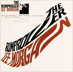
Reid Miles album cover for Lee Morgan uses typography in a playful and simplistic manner. Jazz music was viewed as revolutionary amongst the underground culture, and Miles’s style was seen as sleek and modern for the era, as he was very experimental and always achieved a modern aesthetic. He uses negative space well rather than over using text, and considers scale of type in the piece as a whole.

Reid Miles/ Lee Morgan/ 1960s


Bibliography:

http://www.arthistory.net/psychedelic-art/

http://www.wes-wilson.com/

Duncombe, S. (2008). Notes from Underground: Zines and the Politics of Alternative Culture. Microcosm Publishing.

Dyer, G. (2015). Underground Culture isn’t dead – it’s just better hidden than it used to be. theguardian.com/…/underground-culture-isnt-dead-geoff-dyer

Rawsthorn, A. (2009). http://query.nytimes.com/gst/fullpage.html?res=9D0CED6173FF935A25750C0A96F9C8B63


Task 4 – Is it possible to be truly authentic?

Authenticity is the idea of taking risks, placing yourself in a vulnerable situation and learning to accept failure if it doesn’t work, it means expressing a theme or an idea in a unique and honest way and it’s how you communicate effectively and personally with your audience. The definition of authentic is “of undisputed origin and not a copy; genuine.” In todays world we are tasked with trying to figure out if people are truly authentic as society is altering the minds of all and cloning us so that we are all the same. Artists are not taught how to be truly authentic, so were we ever really authentic or do we just claim that we are?

This being said, the key to being authentic is people themselves. The level of authenticity lies in the ideas people have with the reasoning behind them. Authentic people create authentic work and these are the designers who stay true to themselves and don’t change to try fit into society. These designers however, run few and far between, and are slowly dying out as there is no longer much creative freedom in that clients tend to have specific ideas of what they want, which not only creates hold backs but also suppresses our creativity which can be detrimental to artists.

Authenticity doesn’t mean that you have to reinvent a craft entirely, it means be yourself in it’s simplest term, which is why I believe it is possible to be authentic.

Bibliography:

English Dictionary 

Task 3 – Technology is the Mortal Enemy of Art

Designers have always wanted to push boundaries and strive towards a better way of working. It is important that we constantly outdo one another as this is what pushes us to be better and keep creating. As a designer, I find that “technology is the mortal enemy of art” is a very narrow-minded way of thinking. Although many consider technology to be hindering creativity, it is my opinion that it is doing the opposite. Technology is aiding many graphic designers in their way of working as it allows them to experiment quicker, with more precision and we “artists yesterday constructors today”. However, no matter what specialism of art one is in, no designer will work on technology alone as no designer wants to let traditional art die out; it is an important building bock that every artist needs to utilise to develop into their own.

Technology has helped artists show and exhibit their work on the web as well as even allowing social media to help artists get recognized and create a name for themselves, whereas without social media, this would be a lot harder. Technology also allows designers to explore a variety of  different art  forms and find inspiration for their projects, allowing their studies to be more in depth.

According to an article in the guardian “there has been an explosion of creative activity in the technology space: there are over 3 million apps, and 300 hours of YouTube video are uploaded every minute. According to some estimates, every two minutes we snap as many pictures as the entire population of the world did in the 1800s” this alone shows how much technology has aided creativity and given many people a platform to put themselves on.

Bibliography:

Chamorro, T (2015), The Guardian, https://www.theguardian.com/media-networks/2015/jun/18/technology-creative-creativity-web-content

Task 2

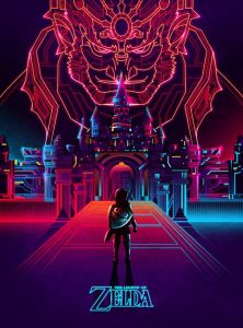
The Legend of Zelda poster created by Van Orton Design caught my attention as I found that the bright neon colours within the poster were striking and drew me to it most. Although Van Orton Design made the title of the game small which is not following the norm, as typography zelda posterusually plays a large part to this type of advertising and is usually where the eye is drawn too, rather they emphasise the actual design of the poster itself which I admire.

The minimal colour scheme helps the eye focus on the poster as a whole but also helps show that the main design element of the city and Ganon towards the top of the poster is the main focus and this is where the eye should go naturally, however by placing the title underneath the main character, keeping both centered, means that nothing would be lost.

Processed with VSCO with a8 preset Processed with VSCO with e8 preset

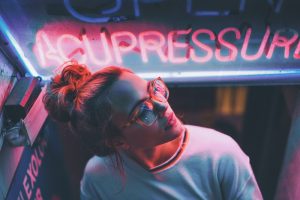
Whilst with Brandon Woelfel’s photography I found just as intriguing in how he photographs his subjects by using light as his main source of inspiration. He is attracted to neon lights and exploring how they can change a person’s face. Although this photograph is much more minimalistic compared to the Zelda poster, it has a similar effect in that both use the neon lighting as their predominant medium. The red lighting in his picture contradicts what he is trying to communicate; it gives the photo a sinister feel rather than warm and friendly, whilst playing on the idea of innocence at the same time.

Bibliography:

http://www.brandonwoelfel.com/photography-1/4r1ya2i7957ittb7xfpaqa8kt39skn

http://vanortondesign.com/WORK

https://www.behance.net/gallery/21814109/The-Legend-of-Zelda

Terminal Bar

Terminal Bar was a film created by Stefan Nadelman in 2002, which explores 10 years’ worth of raw and truthful photography in New York. The photographs were taken by Nadelman’s father, Sheldon who worked at the bar, which allowed him to have a first-hand insight into what antics happened. The photographs taken were personal as the film was created from a series of stills of photographs and gave outsiders a look at to what kind of characters went into the bar on a day to day basis. The photos taken, were mainly ones Nadelman’s father found the most interesting within his collection. Due to the personal feel from the photos it gave the film a passionate feel as you knew this is what Nadelman’s father loved. A key factor that played into the film was keeping the photos in the right order.

The pace of the film is based on Nadelman’s father narrating over the entirety of the movie, explaining the stories behind his photos whilst it was paired with music and newspaper articles. The effect this has shows how the bar changed over the 10 years and what atmosphere it contained within it as well as it accommodating many different type of men, for example the gay male community. What was most impacting was when there wasn’t any narration; only music and the photographs. I found that giving a documentary a personal feel was interesting as it becomes more appealing and intriguing as well as not actually using any video.