Author Archives: Jake Whittle

Three Published Images

William Eckersley in his project “Dark City” captured the connection people have to the city of London during the day creating a new feeling and story along the way. “The stage is devoid of its human players and seems to showcase the scenery’s forgotten beauty, revealing a stark and otherworldly aesthetic in a city drained of its occupants” (Williameckersley.com, 2017). This shows us that Eckersley is painting a picture of how the passer can view London, by highlighting the things that are typically shadowed when the sun is out. Taking away the sprawling human community that would typically pollute vision, allows for us to see deeper into the visuals that the city provides us. We can see the detail in each slab of stone on the floor, the dirt that contaminates the frames on the windows and highlights all of this with the inorganic lights producing cold blues and warm oranges all creating a different feeling and connection to the city.

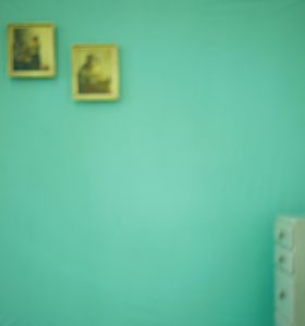
Uta Barth on the other hand detaches us from the safety of seeing what is around us. Instead we are left to interoperate what is there, to really think about what it is why see and not only that think about the feelings that it provokes. “The primary effect of the blur in her photographs is to make a specific image generic” (Tate, 2017). In doing this Barth makes the image more about making the viewer more aware of the conscious activity of looking. Instead of using a camera to take a sharp and crisp image she has used it to create an almost Abstract Expressionist painting.

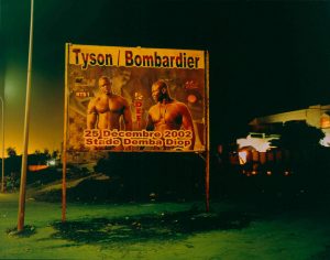
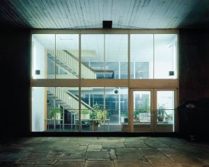
Rut Blees Luxemburg similarly to Eckersley captures during the night, but in her instance focussing on “that which is slightly on the side and on the margins” (Mint Magazine, 2017). In doing this Luxemburg produces a story for a particular thing that the details of which would typically be looked over or ignored. This creates a new connection to the subject that the viewer may not have had before seeing the images she captures.


References


Williameckersley.com. (2017). WILLIAM ECKERSLEY » Projects / Dark City (2011). [online] Available at: http://www.williameckersley.com/projects/dark-city/ [Accessed 21 Dec. 2017].

Eckersley, W. (2011). Dark City. [image] Available at: http://www.williameckersley.com/projects/dark-city/ [Accessed 21 Dec. 2017].

Barth, U. (1997). [image] Available at: http://utabarth.net/work/ground/#image-4 [Accessed 21 Dec. 2017].

Tate. (2017). Uta Barth born 1958 | Tate. [online] Available at: http://www.tate.org.uk/art/artists/uta-barth-2678 [Accessed 21 Dec. 2017].

Mint Magazine. (2017). An Interview With Photographer Rut Blees Luxemburg. [online] Available at: http://www.mintmagazine.co.uk/art/an-interview-with-photographer-rut-blees-luxemburg/ [Accessed 21 Dec. 2017].

Luxemburg, R. (2003). Tyson/Bombardier. [image] Available at: http://www.tate.org.uk/art/artworks/blees-luxemburg-tyson-bombardier-p20267 [Accessed 21 Dec. 2017].

Counter Culture Images

With the prominent counter culture movement in the 1960’s and 1970’s the arts were exposed to an era of works with a whole new meaning and purpose to the medium that brought new spirit and sensibilities along with it.


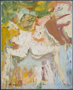
Artists like William de Kooning and Jackson Pollock introduced the world to abstract expressionism “characterised by gestural brush-strokes or mark-making, and the impression of spontaneity” (Tate, 2017). This flew in the face of previous ideologies in which paintings where designed as illustrations designed to represent ideas. This new wave created work that would have painters expressing themselves by attacking “their canvases with expressive brush strokes” (Tate, 2017) to illustrate the raw physical passion that they are designed to convey with splatters and splodges unique to the style. Looking at Kooning’s “The visit” we can see these sensibilities being applied within the painting with the organic looking brush strokes and scratches of paint strewn across the canvas.


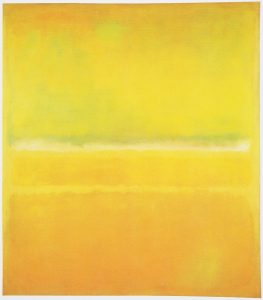
In development of Abstract Expressionism came Colour Field Painting in which artists like Mark Rothko and Barnett Newman led the field. In the work “untitled” we can see Rothko’s dramatic use of block colours used in a similar way of expressionism but with “compositions and thinly layered colours” that where “planned deliberately to induce powerful, even spiritual feelings in viewers” (Hodge, 2012). It is with these colours and tones that produce a new spirit to evoke the human psyche to open up and really question its meaning.


Howard Hodgkin’s “Girl on a Sofa” mixes these ideas abstract expressionism with old fashioned values of modernism. Here we see Hodgkin use the sensibilities that come with the Abstract via his mixture of expressive form of the girl that is on the sofa that makes it hard to make out where exactly it is or how the girl is sat. “this is part of Hodgkin’s objective: to inspire recollections, feelings and sensations rather than solid ideas” (Hodge, 2012).


References


Tate. (2017). Abstract expressionism – Art Term | Tate. [online] Available at: http://www.tate.org.uk/art/art-terms/a/abstract-expressionism [Accessed 20 Dec. 2017].

de Kooning, W. (1966). The Visit. [image] Available at: http://www.tate.org.uk/art/art-terms/a/abstract-expressionism [Accessed 20 Dec. 2017].

Hodge, S. (2012). Why Your Five Year Old Could Not Have Done That. London: Thames & Hudson, p.81.

Rothko, M. (1968). Untitled. [image] Available at: https://www.worldgallery.co.uk/art-print/mark-rothko-untitled-orange-and-yellow-1956-206317 [Accessed 20 Dec. 2017].

Hodge, S. (2012). Why Your Five Year Old Could Not Have Done That. London: Thames & Hudson, p.85.

Hodgkin, H. (1968). Girl on a Sofa. [image] Available at: http://www.tate.org.uk/art/artworks/hodgkin-girl-on-a-sofa-p02300 [Accessed 20 Dec. 2017].

A Look At Three Postmodern Images

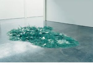
The way in which Postmodernism poses interest to me is that of its revealing nature that can only be accessed upon the deconstruction of the work one may be looking at. Robert Smithson’s “Map of Broken Glass” can be seen from one angle to just be a pile of fragmented shards piled neatly in the middle of the room. But if one took the time to gain an aerial perspective of the piece it becomes clear that “As the glass glittered under gallery lights, the work appeared like a magical relief map” (Hodge, 2012). This new perspective allows for the viewer to see this mythical island that is in fact not just a pile of shattered glass but a doorway revealing a magical sight.

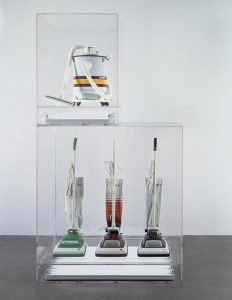
Jeff Koons had a different approach to revealing ideas and concepts to the viewers of his work. In his piece “New Hoover Convertibles, Green, Red, Brown, New Shelton Wet/Dry 10 Gallon Displaced Doubledecker” Koons exposes to us the psyche of the consumer. “Referred to broadly as ‘The New’ these works explored the way our fantasies and desires are transferred on to ordinary objects” (Tate, 2017). This showing us a way in which we as consumers work, we can almost see ourselves using the equipment within the Plexiglas cases.


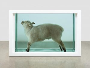
Damien Hirst’s more provocative “Away from the Flock” shows us a more visceral conceptualisation within postmodernism. The Tate describes this work as a combination of “the pure clean lines of classic Minimalist sculpture, with the uncomfortably eviscerated flesh of a portrait by the painter Francis Bacon” (Tate, 2017). This is an immense clash of both modern and postmodern values in which the minimalistic straight white frame is caging this lifeless corpse within.


This idea of Postmodernism “deconstructing authority and the established order by engaging in the ideas of fragmentation, incoherence and the plain ridiculous” (Ambrose and Harris, 2010) truly resonates with me as it is almost a smidgen of what is implemented into my own work. I am passionate about deconstructing media and art as I feel it leads to the reveal of many fantastical and fresh ideas from other artists that can help me develop forward as a practitioner in the field of the arts.


References

Hodge, S. (2012). Why Your Five Year Old Could Not Have Done That: Modern Art Explained. London: Thames & Hudson, p.153.

Smithson, R. (1969). Map of Broken Glass (Atlantis). [image] Available at: http://pictify.saatchigallery.com/137012/robert-smithson-map-of-broken-glass-atlantis [Accessed 20 Dec. 2017].

Tate. (2017). ‘New Hoover Convertibles, Green, Red, Brown, New Shelton Wet/Dry 10 Gallon Displaced Doubledecker’, Jeff Koons, 1981-7 | Tate. [online] Available at: http://www.tate.org.uk/art/artworks/koons-new-hoover-convertibles-green-red-brown-new-shelton-wet-dry-10-gallon-displaced-ar00077 [Accessed 20 Dec. 2017].

Smithson, R. (1969). Map of Broken Glass (Atlantis). [image] Available at: http://pictify.saatchigallery.com/137012/robert-smithson-map-of-broken-glass-atlantis [Accessed 20 Dec. 2017].

Tate. (2017). ‘Away from the Flock’, Damien Hirst, 1994 | Tate. [online] Available at: http://www.tate.org.uk/art/artworks/hirst-away-from-the-flock-ar00499 [Accessed 20 Dec. 2017].

Hirst, D. (1994). Away From The Flock. [image] Available at: http://www.tate.org.uk/art/artworks/hirst-away-from-the-flock-ar00499 [Accessed 20 Dec. 2017].

Ambrose, G. and Harris, P. (2010). The visual dictionary of pre-press & production. Lausanne: AVA Academia, p.197.

Authenticity, Is It Still Possible?

Society is constantly exposed to new things all of the time; through media, art, technology or even music. Things are so new that companies hold them back because they have already created something “better” (N4g.com, 2017). So is it still possible to be authentic, “Of undisputed origin and not a copy; genuine” (Oxford Dictionaries | English, 2017)?

If we look at Modernism, “A rejection of history and conservative values, innovation and experimentation with form with a tendency to abstraction” (Tate, 2017) we can decide what an authentic piece of work is. Apply these values to mobile devices with the edges merged with the screens or films that have shared universes. Ten years ago these things where something un-heard, because they weren’t old or traditional ideas. Just these two ideas can show us that we in fact do live in a world where, actually authenticity is possible.

“Inspiration is for amateurs — the rest of us just show up and get to work. And the belief that things will grow out of the activity itself and that you will — through work — bump into other possibilities and kick open other doors that you would never have dreamt of if you were just sitting around looking for a great “art idea”.” (Fig, 2009) This quote emphasizes this concept of just creating an idea with no inspiration of past ideas and purely developed from what is in your head only, what you then create is solely your own.

That creation, by definition, is Authentic.


References,


N4g.com. (2017). New Sony laser technology 20 times better than Blu-Ray. [online] Available at: http://n4g.com/news/568528/new-sony-laser-technology-20-times-better-than-blu-ray [Accessed 19 Dec. 2017].

Oxford Dictionaries | English. (2017). authentic | Definition of authentic in English by Oxford Dictionaries. [online] Available at: https://en.oxforddictionaries.com/definition/authentic [Accessed 19 Dec. 2017].

Tate. (2017). Modernism – Art Term | Tate. [online] Available at: http://www.tate.org.uk/art/art-terms/m/modernism [Accessed 19 Dec. 2017].

Fig, J. (2009). Inside the painter’s studio. New York: Papress, p.42.

Research and Communication Overview

Throughout the duration of the Research and Communication module exposed me to many different ideas, theories and historical movements that have moulded the way that art is today. The segment I took the most from was within week two during a lecture with Dr Callum Kerr. This is because of the many ways that he presented ideas about critical thinking and critical theories, and how exactly they can be applied to our research and practice as artists or writers. Attending the lecture made me realise this is something I have always attempted similar practice within my work personally. This had begun within my studies in Media as that had exposed me to ideas such as Feminism, Marxism, and Gender Theory. These Theories became the foundations for the concepts of my art projects, be it a political opinion I want to poke fun at or create a humanisation of shunned away masculinity. Dr Kerr’s talk opened up for me the idea that when doing research for my projects I should maybe apply the theories more directly to my work.

 One of the ways I have attempted to connect critical theory to my practice would be when a project was completed designed around a list of words. With these words I wanted to capture the least literal explanation for why these words had anything to do with the photographs that where captioned with them. For this project I had tried to apply the Thing Theory, my photos where more about investigating the objects caught in the shot to decipher the connection to the word. I wanted to get the viewer to interoperate a narrative for themselves within the photographs. Infused with inspiration of works from Uta Bath and Rut Blees Luxemburg, I created work that brought more attention to the minor details on the photo that may explain the narrative I am trying to communicate. For example one of the photographs “Kiss” I did not want to take a picture of a literal kiss but capture a romantic location in which both I and my partner shared. The photo was the view of the city of Southampton from the top floor of her accommodation complex through a small narrow corridor with a window leading out to a dark but beautifully lit landscape of the dockland city.

 With all of this I do believe that the Research and communication module has helped me see a new realm of different concepts and theories to add to my practice that can only help strengthen my work into something more conceptual and relevant to current society. I believe that each of these lectures helps in many ways such as the Terminal bar lecture. Upon researching into how this film was made I discovered how we as practitioners of art should be more open and vigilant on keeping our eyes and ears open so we do not lose any strand of inspiration that could provoke a completely new project all together.


A Short Analysis of Two Images

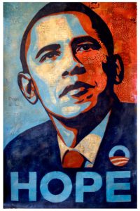
The poster ‘Hope’ (Fairey, S, 2008) used during the “During the 2008 U.S. presidential election” (p50,Heller & Vienna, 2012) was created over a photograph of the candidate using block colours creating gesture of what I can only assume is American dream, supported by the title “Hope” laid across the bottom of the poster. Something provocative for voters during national poverty and political disillusionment. Colours used allude to connotations of “trust, authority, seduction, danger” (Color Matters, 2017) which could subconsciously implant and enforce the idea to vote Barack Obama into Presidency.

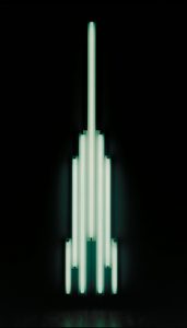
The “Monument for V.Tatlin” is more of a use of “situational” application of the arts to


communicate a tribute to the architect Vladimir Tatlin’s “unrealised Tower of 1920, Monument to the Third International” (p.26, Hodge, 2012). “It was devoid of personal expression” (p.26, Hodge, 2012), this indicates that this work was more for intended to commemorate a design and that only. But looking closer and more in depth it is visible that the use of lights has structured the entire model, lights burn out was this a subliminal homage to the fact that Tatlin ”embraced several technological advances”   in his design .

(p.26, Hodge, 2012)


Applying additional Depth within my work to instil ideas into other’s minds is something I find fascinating. I think use of critical use of theory such as “Color Theory” (Bleicher, 2005) provides contextual depth within work providing deeper narrative going beyond what is solely provided within the image. In addition historical factors to provide background and narrative context into my work.


Fairey, S. (2008. Hope. [Online] October 2008. Available at http://www.iknowtheledge.com/comedy/shepard-fairey-on-the-colbert-report [Accessed 06/12/2017]

Heller, S & Vienna, V. (2012) 100 Ideas That Changed Graphic Design. London: Laurence King Publishing Ltd.

Color Matters (2017) J.L. Morton [Online] Available at https://www.colormatters.com/color-symbolism [Accessed 06/12/2017]

Hodge, S (2012) Page 26 Why Your Five Year Old Could Not Have Done That. London :Thames & Hudson.

Bliecher, S (2005) Contemporary Color Theory and Use. Boston: Cenage Learning 2005

Flavin, D. (1966). ‘Monument’ for V. Tatlin [Online] Available at http://www.tate.org.uk/art/artworks/flavin-monument-for-v-tatlin-t01323 [Accessed 06/12/2017].